Screen Reader Testing: A Founder's Guide to Doing It Right
Screen Reader Testing: A Founder’s Guide to Doing It Right
Screen reader testing means listening to your site instead of looking at it, using software that turns your page’s code into speech or Braille. You pair a screen reader with the right browser, put the mouse away, and check that everything on the page is announced in a sensible order with a sensible name. It sounds intimidating. It’s really a few commands, a bit of practice, and a very humbling first ten minutes (we’ve all been there 🙈).
This guide is for founders and teams building or redesigning a website or product. You’ll get the setup, a repeatable routine, a checklist of what to listen for, and a sense of when a quick DIY pass is enough and when you want a proper audit.
TL;DR
- A screen reader reads your site’s underlying code aloud, so testing finds problems in markup that a visual review never shows.
- Start with NVDA (free, Windows) and VoiceOver (built into Apple devices), then add JAWS, TalkBack or others as your product grows.
- Use the keyboard only, and run two passes: read everything top to bottom, then operate every interactive element.
- Automated scanners catch only a fraction of issues, so manual screen reader checks belong on your critical flows, like sign-up and checkout.
- Retest after redesigns and major changes, and at least once a year.
Table of Contents
- What screen reader testing actually tells you
- Pick your screen reader and browser pairs
- Before the screen reader: the warm-up
- A manual screen reader test, step by step
- What to listen for: a checklist that maps to WCAG
- The beginner trap (and how to dodge it)
- Automated tools and manual testing: you need both
- Which standard are you testing against?
- Our take: test with the people who’ll use it
- Want a hand with accessibility on your site?
- FAQ
- Sources
What screen reader testing actually tells you
A screen reader reads a website or app’s underlying code and converts it into speech or Braille. It’s essential for blind and deafblind people, and it also helps people with low vision, reading disorders and cognitive disabilities. Testing with one is how you detect code problems that get in the way of use.
That last part matters. The goal of your test is to find code problems, not to perfectly imitate what a lifelong screen reader user experiences. Foundational knowledge, a handful of commands and some practice are enough for this kind of rule-based testing. Understanding the lived experience takes real users, which we’ll get to later.
Why does a sighted founder need this? Because the page you see and the page a screen reader hears can be very different. Browsers expose your content through the accessibility tree, which carries each element’s name, role (button or input field?) and state (dialog open or closed). Sloppy markup means a beautiful button that announces itself as nothing at all. Semantic HTML is what makes the tree trustworthy.
ASU’s digital accessibility team describes screen reader testing as standard practice in a full evaluation because it finds barriers other tests can’t, and it’s most valuable when people with disabilities take part in the testing.
Pick your screen reader and browser pairs
Screen readers are tuned to specific browsers. Using one with a browser it wasn’t calibrated for can produce extra bugs or unexpected behavior, which sends you chasing ghosts. Here are the standard pairings:
| Screen reader | Platform | Best browser pairing | Cost |
|---|---|---|---|
| JAWS | Windows | Chrome, Firefox or Edge | Commercial |
| NVDA | Windows | Chrome or Firefox | Free |
| Narrator | Windows | Edge | Built in |
| VoiceOver | macOS and iOS | Safari | Built in |
| Orca | Linux | Firefox | Free |
| TalkBack | Android | Chrome or Firefox | Built in |
| ChromeVox | ChromeOS | Chrome | Built in |
The pairings come from web.dev’s testing guide. The cost column reflects what that guide and the University of Illinois Chicago developer guide say about free options: NVDA, VoiceOver and Orca are free.
Which ones should a startup start with?
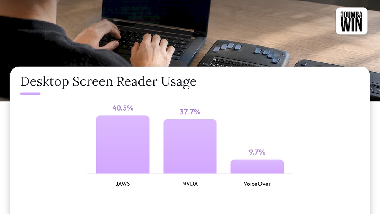
ASU’s data on desktop users puts JAWS at 40.5%, NVDA at 37.7% and VoiceOver at 9.7%, and 70.6% of mobile users use VoiceOver with Safari. That’s a pretty clear map.
A practical starter set for a small team:
- NVDA with Chrome on Windows, your everyday workhorse.
- VoiceOver with Safari on a Mac or, better, on an iPhone, since mobile matters.
- JAWS once you have the budget or an enterprise customer who expects it.
- TalkBack with Chrome if your audience is heavy on Android.
SitePoint’s guide agrees on the order: begin with NVDA and VoiceOver, then expand to JAWS, TalkBack or ChromeVox. The University of Arizona adds a simple rule of thumb: test with at least one screen reader per platform you support.
Before the screen reader: the warm-up
Don’t jump straight to audio. The University of Arizona’s toolkit suggests a seven-step flow that puts the screen reader in the middle:
- Run an automated scan (WAVE or axe DevTools).
- Navigate by keyboard only.
- Zoom to 200% and 400%.
- Test with a screen reader (NVDA or VoiceOver).
- Check color and contrast.
- Review link text, headings and alt text.
- Document results with the WCAG criterion and a severity.
Why the order? Fixing the obvious stuff first means you aren’t wading through noise when you finally put on the headphones. If contrast is on your list, our color contrast workflow covers it in six steps.
A manual screen reader test, step by step
This routine blends the Illinois state accessibility guide and Harvard’s NVDA guide. We’ll use NVDA with Chrome as the example, since it’s free and Harvard recommends Chrome for it.
Step 1: Set up like you mean it
Install NVDA, open Chrome, and put the mouse out of reach. The Illinois guide is blunt: never use a mouse, and rely only on what you hear. Some testers dim or turn off the monitor to force the habit. Where it goes wrong: peeking at the screen to “confirm” what you heard. The moment you peek, you stop testing.
Step 2: Load the page and exit forms mode
Reload the page from the address bar and press Esc to leave Forms/Focus Mode. NVDA has two modes: browse mode, where it intercepts keys so arrows read line by line, and forms mode, where keys go to the control. If a custom widget seems broken, toggle modes with Insert or Caps Lock plus Space before you log a defect. Many a “bug” is just the wrong mode.
Step 3: Pass one, read everything
In NVDA, Caps Lock plus Down Arrow reads all content. The Illinois guide uses Down Arrow to step through it, and starts with Ctrl+Home to hear the page title (JAWS) or first line (NVDA). Ask yourself:
- Is all visible text read?
- Does the order match what a sighted visitor sees?
- Do the names you hear match the names on screen?
- Are meaningful images read with useful alt text, and decorative ones skipped?
Step 4: Pass two, operate everything
Return to the top. Use Tab and Shift+Tab to move through interactive elements and Enter to activate them. Insert+Tab rereads an announcement that wasn’t clear. For each link, check that the announcement makes sense. For each form field, check that you hear its name, role, value and state. UIC frames the pass as three questions: did the key combination do the expected thing, did focus land in the expected place, and did the announcement communicate role, state, label or content?
Step 5: Log what you found
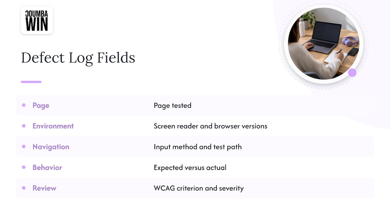
Record the page, the screen reader and browser with versions, the input method, the path you took, and expected versus actual behavior. Attach the WCAG criterion and a severity. A spreadsheet is fine. Skipping this step is how a pile of vague “it felt weird” notes becomes a sprint nobody can plan.
A note on testing in Chrome
People search for how to test a screen reader on Chrome as if it were a feature. It isn’t: Chrome is the browser, and you need a screen reader on top. On Windows that’s NVDA or JAWS. On Chromebooks, ChromeVox is built in. On Android, TalkBack runs with Chrome. Chrome’s own tools help with automated checks, but they don’t replace listening.
What to listen for: a checklist that maps to WCAG
The Illinois guide ties each content check to a WCAG success criterion, which is handy when someone asks “is this actually a failure?”
| What you’re checking | What you should hear | WCAG |
|---|---|---|
| Visible text | All of it gets read | 1.1.1 |
| Headings | Correct level announced | 1.3.1 |
| Lists | “List of x items” | 1.3.1 |
| Meaningful images | “Graphic” plus what it communicates | 1.1.1 |
| Decorative images | Silence | 1.1.1 |
| Data tables | “Table of x rows and y columns” | 1.3.1 |
| Reading order | Logical, matches the visual layout | 1.3.2 |
Syracuse University’s JAWS guide for testers adds handy shortcuts: Insert+F6 opens a headings list, Insert+F7 a links list, and Insert+F5 a form fields list. Skim those lists and you’ll spot vague links (“click here” x 14) and heading chaos in seconds.
Failure patterns worth hunting
UIC lists the usual suspects:
- Elements that aren’t announced properly (everything but decorative content should be).
- Interactive elements you can’t activate.
- State changes that go unannounced. An accordion button should say it’s expanded after you open it.
- Redundant labels or headings.
- Focus indicator problems.
Johns Hopkins adds keyboard checks to do with and without a screen reader: a clear, consistent focus indicator, logical tab order, a working skip-to-content link, reachable menus and sub-menus, and forms you can submit by keyboard alone.
Pick your critical paths
You don’t need to listen to every page on day one. MDN suggests testing the primary workflows, like buying or booking, with screen reader users and other disability groups. For a startup that usually means: homepage, sign-up or login, pricing, checkout or demo booking, and the core product screen. Our post on interactive website features is a good prompt for spotting the fancy components (carousels, modals, custom dropdowns) most likely to trip a screen reader.
Media and page structure also affect search, which is why accessible alt text and headings tend to pay off twice. This piece on accessibility and SEO overlap connects the dots between media content, site structure and WCAG requirements.
The beginner trap (and how to dodge it)
Here’s the honest bit. If you don’t know a screen reader’s commands, your first sessions will feel like trying to drive a bus blindfolded. Untrained testers often conclude that nearly everything is broken, when the real problem is unfamiliarity with the tool. That’s the caution from WebAIM’s guidance, and it’s right.
So learn a small command set first: read all, next heading, next link, next form field, tab through controls. Practice on a page you know is well built. Then test your own.
The flip side is the fun part. Listening makes mistakes jump out that your eyes skate over. A misspelled word that looks like a typo you’d never notice becomes painfully obvious when it’s mispronounced.
Automated tools and manual testing: you need both
A scanner is a great smoke detector. It isn’t a fire inspector. ASU notes that automated tools identify only 20 to 30% of accessibility issues and shouldn’t be relied on alone. Another overview of U.S. practice puts the range at 30 to 50% and recommends automated checks (axe, WAVE, Pa11y, Lighthouse) on every deploy plus quarterly manual audits on critical paths.
Scanners can tell you an image has alt text. They can’t tell you the alt text says something useful. That takes ears and judgment.
How often should you test?
ASU’s guidance: test websites and apps once a year, and retest affected pages after redesigns or changes to content or functionality. For a startup shipping weekly, that translates to:
- Automated scan on every deploy.
- A quick manual screen reader pass on any new or changed critical flow.
- A fuller review each quarter or before a big launch or fundraising push.
- A recheck after major browser, OS or screen reader updates.
If you’re planning a redesign, put screen reader checks in the design phase, not after launch. Fixing a heading structure in Figma is a lot cheaper than in production. Our guide to accessibility in UX shows how.
Which standard are you testing against?
Use WCAG 2.2 Level A and AA as your target. WCAG 2.2 was published October 5, 2023 and added nine success criteria, including Focus Not Obscured, Target Size (Minimum), Consistent Help, Accessible Authentication and Redundant Entry. The same overview notes that the 2017 Section 508 refresh incorporated WCAG 2.0 AA by reference, and that many agencies now voluntarily aim for 2.1 AA or 2.2 AA.
WCAG 3.0 is a longer story. A Missouri state briefing says it was still a working draft as of a September 2025 update, so 2.2 is the practical target for now. For a quick overview, see our WCAG 2.2 checklist, and for what happens after testing, our website accessibility statement template.
Our take: test with the people who’ll use it
We love a good screen reader session. It’s the closest thing a designer gets to a plot twist: the page looked perfect, and then you hear it say “button, button, link, graphic, graphic.” 😅
Here’s how we think about it. Screen reader testing isn’t a compliance chore you bolt on the week before launch. It’s a design input. When a founder treats design as a competitive advantage, accessibility is part of the advantage: clear structure, honest labels, and flows that work however someone gets through them.
That’s why we reject generic templates and AI-generated layouts. Templates carry their markup problems with them, and custom work lets you decide what every heading, label and focus state does from the start. Our focus is bold, outcome-oriented design for startups, and an interface that people can actually operate is an outcome.
Our advice: run the quick routine above on your critical flows, then bring in a team that does accessibility audits as part of design and development, so fixes land in the build, not in a backlog.
Coumba Evelyn
Want a hand with accessibility on your site?
If you’re building or redesigning a startup site and want accessibility baked into the design, we offer accessibility audits alongside web design and development, UI and UX design, and Webflow development. That means the people who find the issues can work with the people who design the fixes.
See our web design, UI/UX and accessibility services, or look at our Webflow development work. If you’re weighing budget first, our post on accessibility audit costs for startups is a good starting point, and our website accessibility audit guide explains what an audit covers.
FAQ
What is a screen reader test?
It’s a check where you navigate a page with a screen reader, using only the keyboard, to confirm that the content is read in a logical order and that every control announces its name, role, value and state. The aim is to find code problems that interfere with use. It complements automated scans, which miss much of what a human ear catches.
Do I need to learn JAWS before I can test?
No. NVDA on Windows and VoiceOver on Apple devices are free and cover a large share of users. Start there and add JAWS later if your customers or contracts call for it. Learn a small set of commands first so unfamiliarity doesn’t get mistaken for a broken site.
How do I test a document with a screen reader?
Open it in its native app with a screen reader running and listen for headings, lists, table structure and image descriptions, the same things you’d check on a web page. Microsoft Office also includes an Accessibility Checker you can use with the keyboard and a screen reader. For pitch decks and PDFs, check reading order and alt text before you send them to investors.
How often should I run screen reader tests?
Test at least once a year, and retest pages after redesigns or changes to content and functionality. Teams that ship often add automated checks on every deploy and a manual pass on critical paths each quarter.
Can screen reader testing replace real user testing?
No. Your own testing catches rule-based code problems. Understanding how it feels to use your product takes people who use assistive technology every day, so include them in testing for your main workflows.
Sources
- web.dev: Test with assistive technology
- ASU Digital Accessibility: Website accessibility testing
- University of Illinois: Screen Reader Testing
- Harvard Digital Accessibility: Getting Started Testing with NVDA
- UIC a11y4developers: Manual Accessibility Testing
- University of Arizona: Accessibility Testing Toolkit
- SitePoint: How to Conduct Accessibility Testing with Screen Readers
- Syracuse University: JAWS Basics for Web Accessibility Testers
- Johns Hopkins: Manual Accessibility Testing Guide
- MDN: Accessibility tooling and assistive technology
- Nat Tarnoff: A11y 101, How to test manually
- WebAIM: Testing with Screen Readers
- US Web Accessibility Laws 2026: ADA, Section 508, DOJ Rule
- Missouri: What’s New in WCAG 2.2
- Web Accessibility: Boosting Inclusion and SEO Impact