Email Preheader Best Practices for Startups (With Examples)
Email Preheader Best Practices for Startups (With Examples)
The best email preheader is a short line of preview text, roughly 40 to 130 characters, that finishes the subject line’s thought instead of repeating it. Put the payoff in the first 40 characters, because phones cut off the rest. Write it on purpose for every send, because if you don’t, the inbox grabs whatever stray text comes first in your email (hello, “View this email in your browser” 🙃).
This guide is for founders and early marketing teams who send launch emails, onboarding sequences, investor updates and newsletters, and who want the small line under the subject to do real work. If you want the design side of the same inbox experience, our team at Coumba Win builds email design for startups as part of our broader brand and web work.
TL;DR
- A preheader is the preview line that sits after your subject line in the inbox. Treat it as your second subject line.
- Aim for 40 to 130 characters, and front-load the important part, since phones show far less than desktops.
- Complement the subject line. Never repeat it, and never leave it blank.
- Add one new thing: the offer, the deadline, the proof, the next step or the end of the thought.
- Test on real devices, and A/B test the preheader on its own, because a vague one can actually cost you clicks.
Table of Contents
- What is an email preheader?
- Why the preheader is worth your time
- Preheader best practices that actually move the needle
- How long should a preheader be?
- Email preheader examples you can adapt
- Common preheader mistakes
- How to add and check a preheader
- Our take: the preheader is a design decision
- Want emails that look and sound like your startup?
- FAQ
- Sources
What is an email preheader?
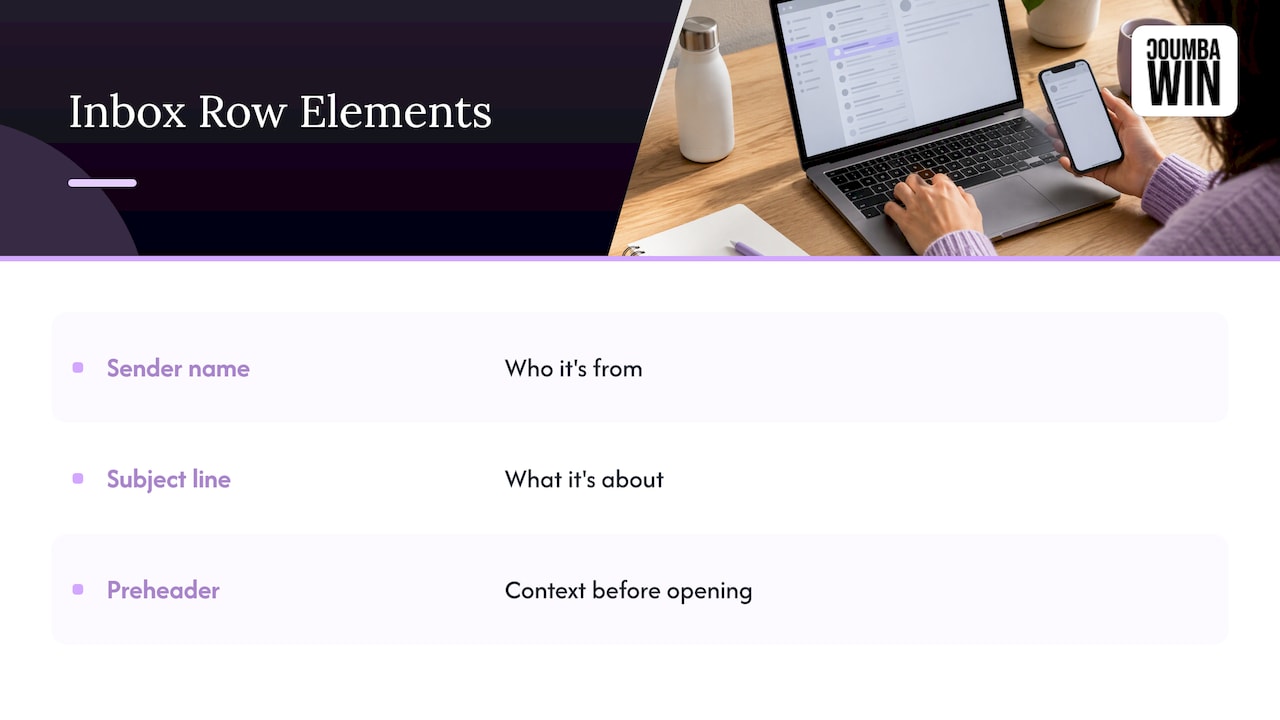
An email preheader is the snippet of text that shows up right after the sender name and subject line in someone’s inbox. Think of the inbox row as three tiny billboards: who it’s from, what it’s about, and one more line to seal the deal. The preheader is that third line.
You’ll also hear it called preview text. Strictly speaking, some people use “preview text” for what the inbox displays and “preheader” for the text placed at the top of the email’s code or body, but in everyday marketing the two are used interchangeably. Either way, the job is identical: give the reader context before they decide whether to open.
Preheader vs. subject line
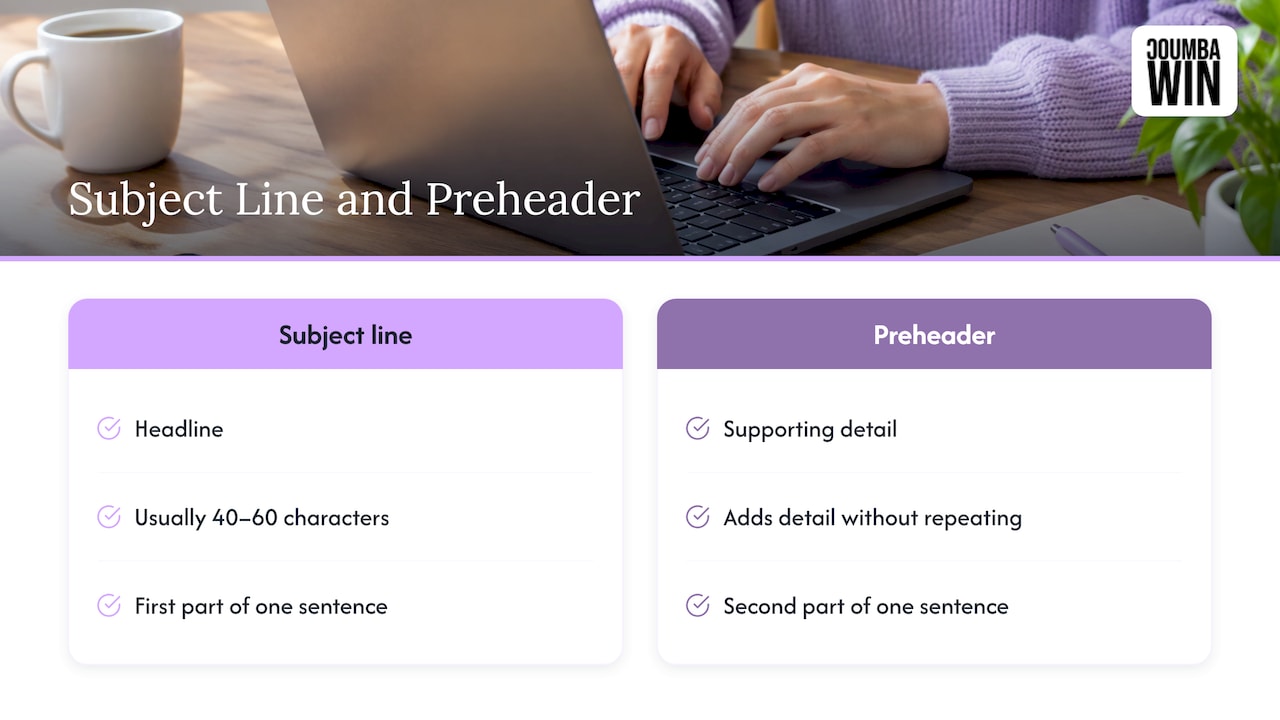
The subject line is the headline. The preheader is the supporting line that adds detail. Subject lines usually do best short; Zoho’s campaign documentation suggests 40 to 60 characters and pairing them with a meaningful preheader rather than leaving it empty or repeating it. Together they should read like one sentence in two parts.
What shows when you don’t write one
If you skip the field, most inboxes pull the first readable text from your email body. Sometimes that’s fine. Often it’s a navigation link, an unsubscribe notice or an alt-text fragment. Indiana University’s email guidance says to always write the preheader intentionally rather than letting body text fill in, and to make it different from the subject line.
Why the preheader is worth your time
Founders tend to obsess over subject lines and treat the preheader as an afterthought. That’s a missed opportunity, because it’s valuable real estate that is already on screen before anyone opens anything.
The evidence is encouraging, but also a little humbling:
- In a MarketingExperiments A/B test, a crafted preheader produced a statistically significant 104% relative increase in clicks, with no significant difference in opens.
- In the same research, a poorly focused preheader caused a 12% relative decrease in clicks. So having text isn’t the win. Clear value is.
- In another MarketingExperiments test on a UK newsletter, adding a preheader snippet lifted the open rate by 4.9 points, a 30% relative increase, with 72% of that increase coming from smartphone users. Clickthrough rose from 3.20% to 3.77%.
Two lessons. First, your preheader matters more on phones, which is where a lot of your readers are. Second, it’s worth testing, not guessing. Your list, your audience, your result.
Preheader best practices that actually move the needle
1. Complement the subject line, don’t echo it
Repeating the subject wastes the space and can make a brand look sloppy. Instead, treat the pair as a two-part sentence. The subject sets up the idea; the preheader lands it.
Weak: Subject: “Your trial ends in 3 days.” Preheader: “Your trial ends in 3 days.”
Better: Subject: “Your trial ends in 3 days.” Preheader: “Here’s what you’ll lose access to, and how to keep it.”
2. Lead with the payoff in the first 40 characters
Devices cut preheaders at different points, so a chunk of your line will be hidden for somebody. Indiana University’s guide advises front-loading the most compelling information for exactly that reason. Write for the phone first. Anything past the first 40 characters or so is a bonus for desktop readers.
3. Add one new thing
The strongest preheaders add a single piece of information the subject left out. Pick one:
- The offer (“20% off annual plans”)
- The deadline (“Ends tonight at midnight”)
- The proof (“Used by 2,000 founders”)
- The next step (“Takes two minutes to set up”)
- The end of the subject’s thought
One is plenty. Two or three crammed together read like a ransom note.
4. Give it a reason to click
A preheader can carry a soft call to action, such as “See the new dashboard” or “Grab your spot.” Keep it matched to what’s actually in the email. If your preheader promises a demo and the email opens with a paragraph of company history, you’ve set an expectation you didn’t meet.
5. Personalize with restraint
A first name or a product the person actually uses can make an email feel written for one human. But merge fields break. If the field is empty you get “Hi ,” in the most visible spot in the inbox. Always set a fallback, and test with a record that has missing data.
6. Match your brand voice
A newsletter can be playful and editorial. A sales email should feel personal and low-pressure. An investor update should be clear and confident. If you’ve written down how your brand sounds, apply it right here. Our guide to tone of voice templates for startups is a good place to pin it down so every preheader sounds like the same company. Brand voice also shapes how audience relationship changes the line you write, which is a theme in this look at newsletter monetization options, where the way you speak to subscribers affects what they’ll support.
7. Skip the spam-bait
Shouty words and a pile of punctuation hurt you in both the subject line and the preheader. Zoho’s guidance lists spam trigger words such as “FREE” and excessive punctuation as things to avoid, and suggests using emojis sparingly, one or two at most and only where they fit. Same goes for the dreaded “Click here to unsubscribe” showing up as your preview.
8. Test it like any other element
Send the same email with two different preheaders and watch clicks as well as opens. The MarketingExperiments results above show preheaders can move clicks even when opens barely change. If you want a framework for running and reading these tests, this write-up on testing newsletter email tools and results is a helpful companion for thinking about measurement.
How long should a preheader be?
The commonly cited range is 40 to 130 characters. Indiana University’s guide gives that same range, and also suggests subject lines of 40 to 50 characters, about 5 to 7 words, or fewer.
Why such a wide range? Because the space your preheader gets depends on the device, the email app and the reader’s own settings. Desktop apps show more. Phones show noticeably less. So the practical rule is:
- Put the whole message in the first 40 to 50 characters.
- Use the remaining space to add flavor, such as urgency, specificity or curiosity.
- Read the line out loud. If it still makes sense when cut at 40 characters, you’re good.
Try it on yourself. Send a test to a phone and a laptop, then check that nothing ends mid-word in an embarrassing place. (We’ve all seen a preheader that ends on “Your account has been…” and lets the imagination run wild.)
Email preheader examples you can adapt
Here are subject and preheader pairings written for the kinds of emails startups actually send. They’re our own illustrations to show the pattern, so swap in your details.
| Email type | Subject line | Preheader | Why it works |
|---|---|---|---|
| Product launch | Meet the new analytics dashboard | See your growth numbers in one place, live today | Names the benefit and the timing |
| Free trial ending | Your trial ends in 3 days | Here’s what you’ll lose access to, and how to keep it | Finishes the thought and gives a next step |
| Onboarding | Welcome! Let’s get you set up | Step one takes about two minutes | Shrinks the effort |
| Investor update | October update: revenue up, runway clear | The three numbers that matter, and one ask | Promises a quick read |
| Newsletter | The founder’s guide to boring, profitable email | Five fixes you can ship before lunch | Specific and low commitment |
| Cart or signup nudge | You left something behind | Your saved plan is waiting, no card needed | Removes a worry |
| Event follow-up | Great meeting you at Demo Day | Here’s the one-pager we promised | Delivers on a promise |
A few patterns to notice. None of the preheaders repeat the subject. Each one adds a single new element. And each one sounds like a person wrote it.
If you’re sending to editorial audiences or media lists, the pairing can lean more curious and story-driven. There are good ideas for that style in this piece on email marketing for musicians, which shows how an audience-first tone carries through from signup to sale.
Examples by goal
Urgency: Subject “Early pricing closes soon.” Preheader “Lock in the founder rate before it’s gone.”
Curiosity: Subject “We changed our onboarding.” Preheader “Activation went up. Here’s the one tweak that did it.”
Clear reward: Subject “Got two minutes?” Preheader “Tell us what you think and get a thank-you gift.”
Value first: Subject “A cleaner way to track your pipeline.” Preheader “Three ways to see where deals are stuck this week.”
For launches specifically, the preheader should work with the whole sequence, not just one send. We lay out how to plan that in our post on product launch emails, and for the post-signup journey, see our take on onboarding email sequences.
Common preheader mistakes
- Leaving it blank. The inbox fills the gap with whatever it finds first, which is rarely persuasive.
- Repeating the subject. You paid for two lines and used one.
- Writing a long sentence that only makes sense in full. Phones will chop it.
- Vague teasing. The MarketingExperiments test showed a preheader can lower clicks when it doesn’t communicate value clearly.
- Mismatching the email. If the preview promises one thing and the email delivers another, you lose trust.
- Forgetting dark mode and different apps. Preview a few before you hit send.
- Stuffing in emojis and exclamation points. One or two, only if they add meaning.
How to add and check a preheader
Most email platforms give you a dedicated preheader or preview text field right under the subject line. Fill it in, and you’re done. If you work with custom-coded email templates, a developer can place the preheader text at the very top of the email’s HTML and hide it from view in the body so it only shows in the inbox preview. Hidden preheaders are now common and widely used.
Before every send:
- Read the subject and preheader together as one sentence.
- Send a test to at least one phone and one desktop app.
- Check that the cutoff doesn’t land somewhere awkward.
- Confirm any merge fields have fallbacks.
- Make sure the first line of the email body doesn’t undo the promise.
If your templates are still being built, our curated playbook for three brand email templates shows how to set up a preheader slot once so every send starts with a good line, and our email design examples for startups help you choose which campaign to design first. Once the top is sorted, don’t forget the bottom: our email footer design patterns keep that end of the email tidy too.
Our take: the preheader is a design decision
We think of the inbox row as the very first screen of your brand. Before anyone sees your logo, your layout or your carefully chosen colors, they see a name, a subject and a line of text. That line is design in its most compressed form: every character has to earn its place.
Founders sometimes tell us they’ll “fix the email later” and ship whatever the template spits out. We get it, there’s a fundraising deck due and a launch on Thursday. But a generic preheader is a generic first impression, and we’re allergic to generic. We reject off-the-shelf templates and AI-generated design because a startup that treats design as an advantage should sound and look like itself from the first line.
Our approach is collaborative: we work with founders so the voice in the email matches the voice on the site, the pitch deck and the product. When the preheader, the layout and the landing page all feel like the same company, readers notice, even if they can’t say why.
Write the line. Test the line. Then let the design carry it the rest of the way.
Coumba Evelyn
Want emails that look and sound like your startup?
If your emails are still running on default templates and mystery preheaders, we can help. Coumba Win offers email marketing alongside branding, web design and development, UI and UX design, pitch deck design and SEO optimization, so your campaigns, your site and your brand all speak the same language. Tell us what you’re launching and we’ll take it from there at coumbawin.com.
If your site is part of the picture, our Webflow development work lives on our work page, and the landing pages your emails link to deserve the same care as the emails themselves.
FAQ
What is an email preheader?
It’s the short line of preview text that appears after the subject line in the inbox. It gives readers context about what’s inside before they open. If you don’t set one, the inbox usually pulls in the first text from the body of your email.
How long should an email preheader be?
Aim for 40 to 130 characters, which is the range Indiana University’s guide recommends. Because phones show less than desktops, put your key message in the first 40 to 50 characters and treat the rest as a bonus.
Should the preheader repeat the subject line?
No. Repeating it wastes the space. Use the preheader to add something the subject left out, like the offer, the deadline, the proof or the next step, so the two lines read as one complete thought.
Do preheaders really change open and click rates?
They can. A MarketingExperiments newsletter test saw a 30% relative lift in open rate after adding a preheader snippet. Results depend on how clear the value is, so test your own audience.
Can I use emojis in a preheader?
Yes, thoughtfully. One or two that fit the message are fine, and Zoho’s guidance suggests using them sparingly. Preview how they render across devices first.
So, what’s the worst preheader you’ve ever received? Tell us, we collect them. 😄
#EmailMarketing #Preheader #StartupMarketing #EmailDesign
Sources
- Indiana University: Subject Lines & Preheaders best practices
- Zoho Campaigns: Email subject lines and preheaders
- MarketingExperiments: Email Preheaders Tested
- MarketingExperiments: Preheader testing generates 30% higher newsletter opens
- Newsletter monetization: 6 ways to earn
- Email marketing platforms comparison
- Musician email marketing