Case Study Page Design: A Layout Founders Can Use
Case Study Page Design: A Layout Founders Can Use
A good case study page does one job: it lets a skeptical visitor see someone like them get a result, fast. Lead with the outcome, show who the customer is, tell the story as problem, solution and impact, back it with numbers that have a baseline, and end with one clear next step. Everything below is how to build that, section by section, so your page works for a busy founder skimming on a phone and for the investor-minded buyer who reads every line. 🙂
We design websites for startups all day, and the case study page is the one most teams treat as an afterthought. They paste in a PDF, add a logo wall, and wonder why nobody clicks. Let’s fix that.
TL;DR
- Open with the result, not the backstory: an outcome headline, the customer’s name and one number with its baseline.
- Tell the story in the order a buyer thinks: do they have my problem, what did they do, what changed.
- Put a quick-scan summary box near the top and a call to action both mid-page and at the end.
- Design the listing page as carefully as the individual pages: one card per story, no filters until you have enough stories to filter.
- Plan mobile and accessibility from the first wireframe, and get written permission for every name and logo.
Table of Contents
- Why a case study page deserves real design time
- The layout of one case study page, top to bottom
- Designing the listing page so people find the right story
- Visual hierarchy: make it skimmable, then make it believable
- Mobile and accessibility, from wireframe one
- Permissions: the unglamorous part that saves you later
- Common mistakes we’d fix first
- When you’d rather not build this alone
- Our take: your case study page is a sales conversation, not a gallery
- FAQ
- Sources
Why a case study page deserves real design time
Prospects arrive with one question: will this work for me? Case studies answer it with evidence instead of adjectives. HubSpot frames case studies as a way to answer buyers’ questions, demonstrate success, build credibility and increase conversions, and notes that a library of them keeps leads from wandering off to a competitor’s site.
For a startup this matters even more. You probably don’t have a decade of brand recognition or a wall of Fortune 500 logos. What you have is a handful of real stories. How those stories are laid out decides whether a visitor reads them or bounces.
Two separate pages need design here:
- The individual case study page, where one story persuades one reader.
- The listing page (the hub), where a visitor finds the story that looks most like their own situation.
Most inspiration galleries show only the pretty top half of the first. We’ll cover both.
The layout of one case study page, top to bottom
Several frameworks agree on the skeleton, even if they name the parts differently. Proofmap describes a seven-part template: a headline with a named outcome, a snapshot box, short context, challenge, solution, results with measurement context, and a closing next step with a single call to action. Mutiny’s blueprint follows the same logic: lead with the outcome, establish who the customer is, frame the challenge, show the approach, prove the result, point to what comes next.
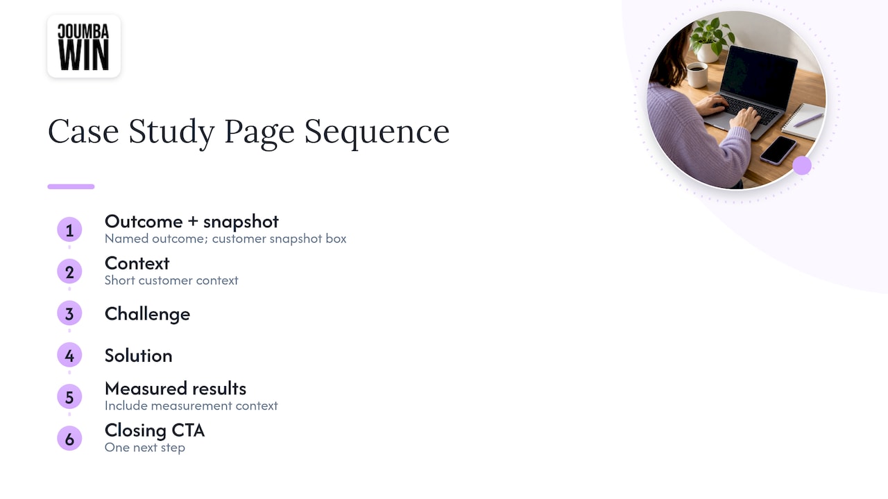
Here’s how we’d translate that into a page you can actually design.
1. The hero: result first, vendor second
The headline should name the customer and the outcome. “How a tutoring platform doubled course completions” beats “Project Spotlight: Redesign.” Pair it with the customer’s logo and a single hero image or short loop of the product in use.
The visitor is the hero here, not you. If the first screen is about your process or your team, you’ve buried the lede. One sentence under the headline can name the service (say, a website redesign or UX overhaul) so the reader instantly knows what category of work this was.
2. The snapshot box: the page for people who won’t read the page
This is a compact block of facts, sometimes called a baseball card. Think of it as the case study for the investor who gives you eleven seconds. Good fields:
- Customer name and what they do
- Industry and company size
- Region
- Service delivered
- Timeline
- The headline result
On desktop it can sit in a sidebar or a horizontal band under the hero. On mobile it should collapse into a clean stack right after the headline. It also helps visitors run the “is this like me?” check that Mutiny calls out: naming the customer’s industry and situation early.
3. Context and challenge: say the problem in their words
Keep the context short. Proofmap’s template gives it roughly 50 to 80 words and the challenge roughly 150 to 250. That’s a useful guardrail, because the common failure is a five-paragraph company history before anything interesting happens.
For the challenge, quote the customer if you can. “Our signup flow lost people at step two and we didn’t know why” is more convincing than your paraphrase. MarketingProfs argues that empathy is the foundation of a good B2B case study: if you can put yourself in the customer’s position, the page answers questions the reader hasn’t asked yet and defuses objections they haven’t voiced.
4. The solution: show the work, not the whole diary
Proofmap suggests about 200 to 300 words for the solution. In design terms, this is where visuals earn their keep: before-and-after screenshots, a key wireframe, a short annotated flow, a snippet of the new brand system. Use captions that say what changed and why, not “Homepage v2.”
If you want the story to feel like a story, pick the two or three decisions that mattered and give each its own visual block. Skip the rest. Readers who want more can click through to a deeper write-up.
5. Results: numbers with a baseline
This is the section that makes or breaks credibility. A bare “158% more signups” invites doubt. A checkable version says where things started, where they ended and over what period: “from 400 to 1,030 monthly signups over four months.” (That’s an illustrative example, not a client result.)
A few rules we like:
- Report the actual result for this client, not an “up to” range.
- Name the measurement source (analytics tool, CRM, survey) in a small footnote.
- If something else changed in the same period, like a pricing update or a campaign, say so. It makes the rest more believable.
- If there’s no clean number, use an honest non-numeric result: a launch date hit, a process that took three people and now takes one, an audit passed.
Proofmap suggests keeping the results block to about 100 to 200 words. Let charts and big-number callouts do most of the work.
6. The quote: a named person, a real title
A testimonial from “J.D.” does very little. A quote with a full name, role, company and a small photo does a lot. Pull it out as a large-type block and place it right after the results, so the numbers and the human voice land together. Feedback Robot’s teardown of testimonial pages lists outcomes before quotes, specificity over positivity, and real people with context among the patterns that convert.
7. The next step: one call to action, shown twice
End with a single, obvious action that matches how you sell: book a call, see the service, start a project. Don’t offer five choices. Proofmap also recommends a visible call to action near the middle of the page, so someone convinced by the snapshot box doesn’t have to scroll through everything to act. A slim sticky button or an inline block after the solution section does the job. Link the closing action to the relevant service page so the story flows into the offer.
How long should it be?
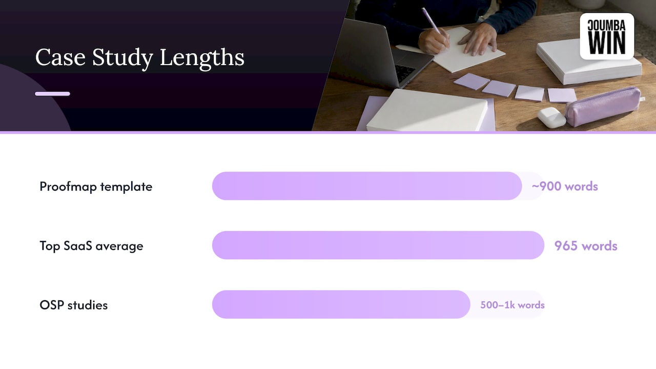
There’s no single right answer. Proofmap’s seven-part template adds up to roughly 900 words, and it cites a 965-word average across top SaaS customer stories. Open Strategy Partners notes that its own one- to two-page studies of 500 to 1,000 words work well for clients. The practical target: long enough to show the work, short enough that someone finishes it. Put the summary and result up top, and the method follows for readers who want it.
If you want a second look at how to organize the information hierarchy of a landing-style page, these landing page optimization strategies cover the same logic of ordering sections by what the visitor needs next.
Designing the listing page so people find the right story
Your hub is a navigation problem. A visitor wants the story that looks like them: same industry, similar stage, same problem.
Testimonial.to’s teardown of eight case study landing pages offers a refreshingly practical rule: skip filters until you have about ten stories. With four or five, filters just create empty states. Instead, use one card per story with four lines:
- Customer name and role
- One number with its baseline or time window
- One sentence of context
- A “Read the story” link
Once the library grows, add filters that match how buyers think: industry, service, company size or goal. Add consistent card sizes, a clear page title and breadcrumbs so people always know where they are.
Two more things founders forget. Link your best stories from the homepage proof section and from each service page they support, because most visitors never browse a hub on their own. Our guide to homepage layout that converts shows where proof fits on that first page, and our rundown of website content sections covers where else it earns a spot.
Visual hierarchy: make it skimmable, then make it believable
People scan before they read. Design for the scan.
- One focal point per screen. A big number, a bold headline, or a hero image. Not all three fighting.
- Big-number callouts. Pull two or three results into oversized type with a one-line label under each.
- Short captions. Every image gets a caption that says what the reader should notice.
- Consistent rhythm. Alternate text blocks with visual blocks so the page never becomes a wall of words.
- Video, used lightly. Feedback Robot’s examples point to short, informal video testimonials of around 60 to 90 seconds as feeling more honest than heavily produced ones. A phone-quality clip from the founder beats a glossy reel nobody believes.
- Third-party proof. Review-site ratings next to a story give it outside backing.
Technical and UX-heavy projects can go deeper. LogRocket’s roundup of UX case study examples highlights patterns like a documented research process, iterations shown in action and step-by-step breakdowns from scope to final solution. That depth fits a portfolio aimed at design peers. For a buyer-facing B2B page, keep research to a short beat and spend the space on outcomes.
Mobile and accessibility, from wireframe one
Your case study will be opened from a link in an email, a LinkedIn post or a pitch deck, very often on a phone. Design that version first, not last.
- Stack the snapshot box right under the headline.
- Make charts readable at phone width, or swap them for big-number callouts.
- Give buttons generous tap targets and spacing.
- Keep line length comfortable and body text large enough to read without zooming.
- Never put key text inside an image, since screen readers can’t read it.
For accessibility, aim for strong color contrast, clear headings in a logical order, visible focus states for keyboard users, alt text on meaningful images and captions or transcripts on video. These help everyone, not only people with disabilities. If you want a refresher on responsive layout thinking, this overview of responsive web design is a good place to start, and our mobile UX best practices for startups goes deeper on thumb zones, navigation and speed.
Permissions: the unglamorous part that saves you later
Before a story goes live, get written sign-off. Testimonial.to points out that a customer approving the story doesn’t automatically cover their logo on your hub, so request both in writing. Ideally, build naming permission into the project agreement from day one. Anonymized stories lose most of their punch, because the whole point is a real company with a real result.
Common mistakes we’d fix first
- A headline that describes the project, not the result. Swap “Brand refresh” for the outcome.
- A logo wall with no stories behind it. Logos say you have clients. Stories say what you did for them.
- Numbers floating without context. Add the baseline and the period.
- Everything on one giant scroll with no anchors. Add a summary box and a mid-page call to action.
- Stale stories. Add project dates, and refresh or retire studies about work you no longer do.
- Generic template look. If your case study looks like every other one, the reader assumes your work does too.
When you’d rather not build this alone
A case study page sits at the crossroads of brand, UX and conversion, which is exactly where startups tend to run out of hours. We build custom case study pages and full websites for startups, including Webflow builds, UI and UX design and accessibility audits, and we don’t rely on generic templates or AI-generated design. Our collaborative approach means founders are in the room as the story and layout take shape.
If you’re planning a site redesign, a new hub for your proof, or a pitch-ready presence, take a look at our web design and development services, or see our Webflow development work. Related read: the About page design guide pairs nicely with a strong case study hub, since both are trust pages.
Our take: your case study page is a sales conversation, not a gallery
We see a lot of startups treat case studies like trophies: pretty screenshots, a logo, a vague paragraph. But a buyer isn’t browsing for inspiration. They’re asking, quietly, “will this person solve my problem?”
That’s why we design these pages around the buyer’s questions. Open with the result. Show someone like them. Prove it with numbers that have a baseline. Then make the next step obvious. Design is the thing that makes all of that scannable, believable and, honestly, fun to read.
It’s also why we push back on generic templates. A template can hold your content, but it can’t decide which result deserves the biggest type, or which decision deserves a full screen. That takes a founder and a designer looking at the same story together. Treat design as a competitive advantage, and your case studies become the best salesperson you never have to onboard. 🚀
Coumba Evelyn
FAQ
What should a B2B case study page include?
At minimum: an outcome-focused headline, a summary box, the customer’s situation, what you did, results with a baseline and period, a named quote and one next step. MarketingProfs also stresses plain, readable writing and exact numbers. Add logos and project dates if you have them.
How many case studies do I need before I build a hub page?
You can start with one to three strong ones, linked from your homepage and service pages. A dedicated hub with filters makes sense once you have around ten stories. Until then, a simple grid of cards is cleaner and easier to scan.
What if I don’t have impressive numbers yet?
Use honest results you do have: a launch date met, a task that now takes one person instead of three, a clearer onboarding flow, a strong customer quote. A modest number with a baseline and period is more convincing than a big one with no context.
Do I need permission to show a client’s name and logo?
Yes. Get written approval for the story and, separately, for the name and logo. Build this into your project agreement so you aren’t chasing sign-off months later.
Where should the call to action go?
Place one near the middle of the page and one at the end, both pointing to the same action. That way a reader convinced by the snapshot box and results doesn’t need to scroll through the whole story to take the next step.
Sources
- Creating Impactful Marketing Case Studies, HubSpot
- 6 Elements of Effective B2B Case Studies, MarketingProfs
- How to Write a Case Study: Framework, Steps, and Templates, Proofmap
- Mutiny case study blueprint
- B2B Case Studies That Win Business, Open Strategy Partners
- Case Study Website Teardown: 8 Landing Pages, Testimonial.to
- 12 Testimonial Page Examples That Convert, Feedback Robot
- 25 UX case study examples, LogRocket
- Optimizing landing pages: proven strategies
- Responsive web design overview