Copyable 3–4 Tier Pricing Page Design for Startups
Copyable 3–4 Tier Pricing Page Design for Startups
Okay, real talk: the single fastest fix for most pricing pages is this. Show clear prices, cap your tiers at three or four, and make the main button impossible to scroll past without noticing. That’s it, that’s the headline. Everything below is the how: patterns to steal, rules that hold up, table tricks, mobile fixes, and the tests worth running before you touch anything else.
TL;DR:
- Limiting pricing tiers to three or four helps prevent decision paralysis and aids self-selection based on buyer roles.
- Displaying clear, whole-number prices with billing cadence and a recommended plan badge significantly boosts conversions.
- Using well-known patterns like tier cards, comparison tables focused on differentiating features, and sticky CTAs enhances user experience across devices.
- Mobile optimization requires stacking tiers vertically, large tap-friendly buttons, and thorough testing on real phones to avoid missed conversions.
- Tracking conversion rate, CTA clicks, funnel drop-off, and session recordings guides effective testing before implementing major design changes.
Table of Contents
- 1. Pricing patterns you can steal right now
- 2. The core rules high-converting pages follow
- 3. Building comparison tables that help, not overwhelm
- 4. Getting pricing right on phones and for every visitor
- 5. What to measure and which tests to run first
- 6. What a real pricing-page fix looks like in practice
- 7. Deciding between a quick DIY fix and bringing in help
- 8. Getting your pricing page built right the first time
- FAQ
- Sources
1. Pricing patterns you can steal right now
Here’s the thing about pricing pages: almost nobody is inventing a brand-new layout. They’re remixing a handful of patterns that already work, and once you can name them, you can borrow them on purpose instead of by accident. Curated collections like Pricingpages make the recurring shapes pretty obvious once you start scrolling through enough of them.
- Tier cards: three or four vertical cards, side by side, each with a price, a short feature list, and a CTA. Use when your plans map cleanly to buyer size (solo, team, business).
- Comparison table: rows of features under each plan column. Use when buyers need to cross-check specifics, not just vibes.
- Usage-based meter: a slider or calculator showing cost scale with usage. Use for metered products like storage or API calls, but keep a flat starter price visible too.
- Enterprise contact card: a fourth “card” with no price, just “Contact us.” Use whenever custom contracts or seat minimums make a single price dishonest.
- Monthly and annual toggle: a switch that recalculates price and shows the annual discount. Put the toggle above the fold, not buried in a footer.
- Sticky CTA bar: a thin bar that follows scroll with the primary button. Use on longer pages where the buy button would otherwise disappear.
One implementation note that trips people up: badge placement. A “Most Popular” badge works best on the card itself, top corner, not floating above it, because floating badges get lost on mobile. And if your pricing is genuinely complicated, a configurator can feel like homework. Sample prices for typical use cases usually convert better, a point NN/g’s research on showing prices for common scenarios backs up directly.
2. The core rules high-converting pages follow
There’s a reason the best pricing pages all kind of look similar. They’re following the same handful of rules, and the rules are boring in the best way, because boring means tested.
- Cap it at three or four tiers. More than that and people freeze up instead of choosing; fewer than three and you lose the “which one fits me” framing that helps buyers self-select.
- Write plan names around the job, not the feature count. “Starter,” “Team,” “Scale” beats “Tier 1, Tier 2, Tier 3” because it tells people who the plan is for.
- Show the price as a clean number. Whole dollars, clear billing cadence (per month, per seat, per year), and the annual discount spelled out, not hidden in a tooltip.
- Mark one plan as recommended. A badge and a slightly different card background nudge the eye without being pushy.
- Hide pricing and you lose B2B buyers, full stop. NN/g’s research on showing prices found that prospective business customers rank price as the top thing they need to see online, and sites that hide it just lose those visitors to a competitor who didn’t.
- Put social proof near the CTA, not at the bottom of the page where nobody scrolls. A logo strip or a short quote next to the recommended plan does more work there than anywhere else, a point this guide to social proof covers in more depth.
- Use tooltips to declutter, not to hide anything important. Tooltips are for “what counts as a seat,” not for the price itself.
Pro Tip: If your pricing genuinely varies by customer, show a representative sample price (“most teams pay around X”) instead of forcing everyone through a quote form before they’ve decided they’re interested.
3. Building comparison tables that help, not overwhelm
A comparison table should answer one question fast: what’s actually different between these plans. Most tables fail because they list every feature, including the ones that are identical across every column, which just buries the two or three rows that matter.
- Start with the rows that drive the purchase decision: price, usage limits, billing unit, number of seats. Everything else comes after.
- Merge identical cells across columns and reserve highlighting for rows that actually differ between tiers. NN/g’s guidance on explicit differences found that calling out what’s different, instead of listing everything, speeds up decisions and makes people more confident they picked right.
- Use checkmarks for yes or no features and tooltips for anything that needs a sentence of explanation, so the table stays scannable.
- Skip the table entirely for simple three-tier offers. A quick line under each card (“includes everything in Starter, plus…”) often does the job with less visual weight.
- Build the table with a logical DOM order and proper ARIA labels so keyboard and screen-reader users can move through rows and columns without getting lost. If your team is prototyping in Figma, tools like its AI pricing table generator can scaffold the structure from real components, which saves the usual handoff rework.
4. Getting pricing right on phones and for every visitor
Most of your pricing page traffic is arriving on a phone, and a big chunk of global web traffic overall is mobile too, per Figma’s pricing page resource, so a desktop-first table that shrinks awkwardly is a real conversion leak, not a minor detail.
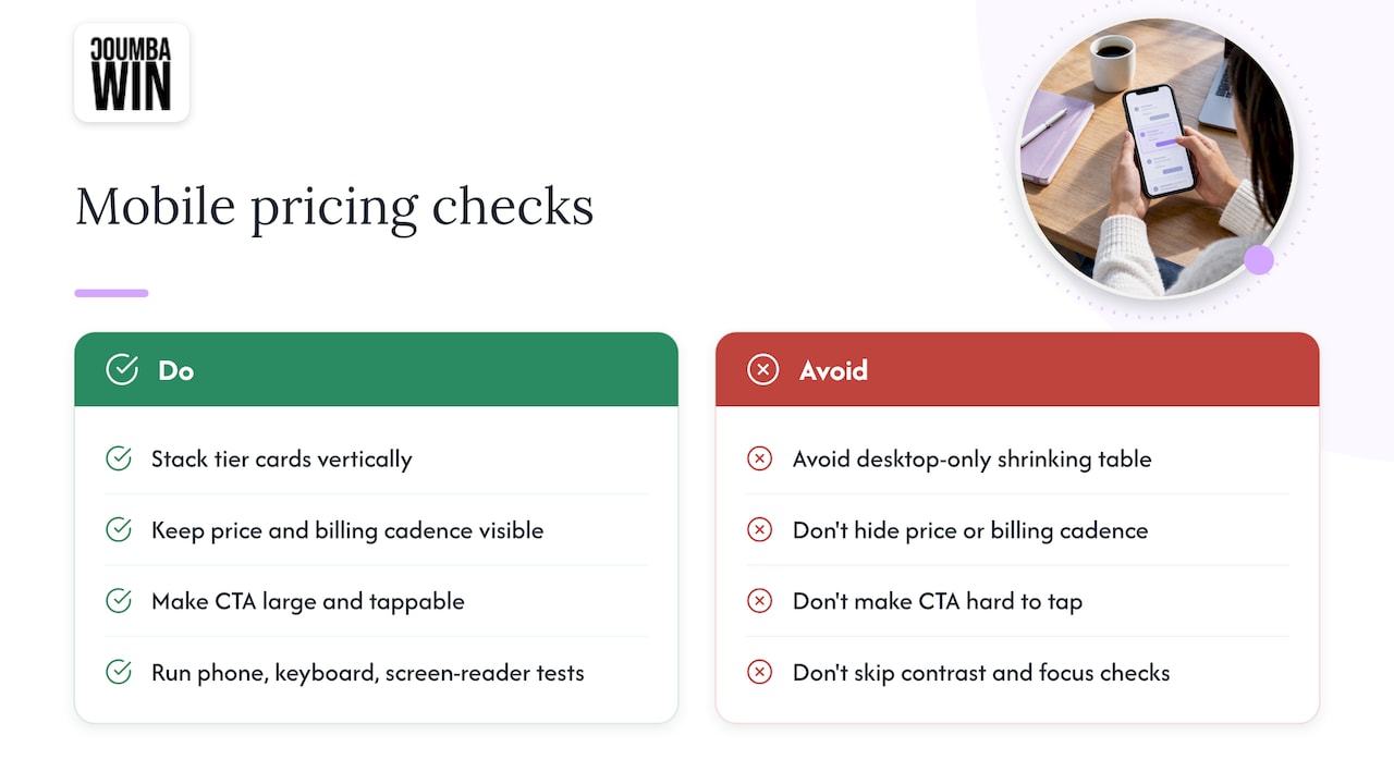
Stack tier cards vertically instead of cramming them into tiny side-by-side columns. Keep the price and billing cadence visible near the top of each card, and make the CTA button big enough to tap without a second attempt, ideally pinned as a sticky bar so it never scrolls out of reach. Check color contrast on your price text and badges, not just your body copy, and make sure every button and toggle has a visible focus state for keyboard users. Then actually test it: load the page on a real phone, tab through it with a keyboard, and run the main purchase flow with a screen reader before calling it done. For CTA specifics, Coumba Win’s guide to designing calls to action digs into button placement and copy choices that hold up on small screens.
5. What to measure and which tests to run first
You don’t need a dozen dashboards here, you need a handful of numbers that actually tell you whether the page is working.
- Conversion rate: sign-ups or trial starts from pricing page visits, your north star metric.
- CTA click-through rate: how many people who scroll the page actually hit the button.
- Funnel drop-off: where people bail between pricing and checkout.
- Time on the pricing section: too short can mean confusion, too long can mean the same thing.
- Micro-conversions: contact form requests or “talk to sales” clicks, especially for enterprise cards.
Before you launch a single A/B test, watch some session recordings or heatmaps to see where people hesitate. That’s usually a faster way to find friction than guessing. Once you’ve got a hypothesis, test one variable at a time: headline wording, tier labels, badge color or placement, whole-number versus precise pricing, or CTA copy. For a deeper playbook on prioritizing which test to run first, this conversion rate optimization guide and this resource on prioritizing CRO fixes both walk through sequencing tests by expected impact. Coumba Win’s piece on interactive web design also covers how small interaction changes move engagement numbers.
6. What a real pricing-page fix looks like in practice
A startup we worked with had a pricing page that listed seven plans with nearly identical feature lists, and visitors kept bouncing before reaching checkout. We cut it down to three tiers, rewrote each plan name around the buyer’s role instead of a feature count, added a recommended badge, and moved the sticky CTA higher on the page. Sign-up starts picked up noticeably within the first few weeks.
A simple six-step template covers most of what a pricing page needs:
- Write a one-line headline that states the core value, not just “Pricing.”
- Add a subhead clarifying who each plan is for.
- Build three to four tier cards with clear prices and billing cadence.
- Mark one plan with a recommended badge.
- Include a short comparison section for the handful of rows that actually differ.
- Pin a sticky CTA so the buy button is always one tap away.
Teams prepping for a launch event often need this fast; Coumba Win’s Demo Day Kit covers pitch decks, booths, and swag on a similar turnaround.
7. Deciding between a quick DIY fix and bringing in help
Quick copy tweaks and a badge color test? Do it yourself, today. A full brand overhaul, a genuinely complex pricing model, or a launch with a hard deadline is a different animal, and that’s when an outside design partner earns its fee, usually with a defined timeline and a short list of deliverables agreed up front.
8. Getting your pricing page built right the first time
If your pricing page needs more than a copy tweak, that’s the kind of project design partners take on. Such projects often include UI and UX design, Webflow development, and conversion-focused copy for startups that treat design as a growth lever, building pricing pages with effective patterns baked in from the start rather than bolted on later.

If you want a second pair of eyes on your current pricing page, or you’re building one from scratch for a launch, you can see the full range of what we do at Coumba Win’s services page and request a quick audit or project quote directly from there.
FAQ
What is the best design for a pricing page?
The strongest pricing pages show clear prices, limit choices to three or four tiers, mark one plan as recommended, and keep the CTA visible throughout the page. Patterns like tier cards, a focused comparison table, and a sticky CTA bar consistently outperform cluttered, feature-heavy layouts, as outlined in Figma’s pricing page best practices.
How do I create a pricing page from scratch?
Start with a headline that states your core value, write short plan descriptions tied to buyer type, then build three to four pricing cards with clear costs and billing cadence. Add a short comparison section for the rows that genuinely differ between plans, include social proof near the CTA, and pin that CTA so it stays visible as visitors scroll.
How much should I charge for a website design?
Pricing for web design work varies widely by scope, from a simple landing page to a full platform build, and most agencies quote based on the specific project rather than a flat rate. Coumba Win’s services, including web design and development, are quoted per project, available on request through its services page.
What are the four main types of pricing methods?
Pricing methods generally fall into cost-based, value-based, competition-based, and usage-based approaches, though definitions and groupings vary by source. For pricing page design specifically, the method you choose shapes which layout pattern fits best, a flat-tier page for value-based pricing, a usage meter for consumption-based models.
Should a pricing page show exact numbers or sample prices?
Show exact prices whenever your offering is simple enough to support them, since hiding price tends to drive prospects away according to NN/g’s research. When pricing genuinely depends on scale or custom terms, show representative sample prices for common scenarios instead of forcing visitors into a configurator, a method NN/g’s guidance on sample pricing recommends for complex B2B offers.