Keyboard Accessibility Testing: A 15-Minute Guide for Founders
Keyboard Accessibility Testing: A 15-Minute Guide for Founders
Keyboard accessibility testing means putting your mouse in a drawer and trying to use your own site with Tab, Shift+Tab, Enter, Space, Escape and the arrow keys. If you can reach every link, button and form field, see where you are at all times, and never get stuck, you pass the basics. If not, you have found the exact spots where real customers, investors and partners give up. You can run the whole test in about fifteen minutes, and the fixes are mostly design decisions, which is why founders should care before a developer ever touches the code.
We are a design team, so we are biased: we think most keyboard failures are born in the design file, not in the code. A designer forgets to draw a focus state, a developer ships what was drawn, and nobody notices until someone tabs through the page and watches the cursor vanish into the void. (It is a bit like a networking event where nobody wears a name tag. You know people are there, you just cannot tell who is who.)
TL;DR
- Unplug the mouse, start at the top of the page, and press Tab through everything. Every interactive thing should be reachable, operable and visible when focused.
- Focus states are the “you are here” marker. If you cannot see where focus is at any moment, the page fails.
- Tab order should follow the visual reading order, and you should never get trapped in a menu, modal or widget.
- Manual keyboard testing catches a lot, but it does not replace automated checks or assistive technology testing.
- Public-sector customers are working under a new federal web rule, so startups selling to schools, cities and agencies should get this right early.
Table of Contents
- Why a keyboard test comes first
- The keys you need
- A fifteen-minute keyboard test, step by step
- Focus states: the “you are here” marker
- Tab order: does the page make sense without a mouse?
- Keyboard traps and controls you cannot operate
- Common failures and how teams fix them
- Which standards this maps to
- What keyboard testing will not catch
- Making it a habit
- How we approach it
- Want a second pair of hands?
- FAQ
- Sources
Why a keyboard test comes first
Many people navigate without a mouse: people with motor disabilities, people who use screen readers, people with a temporary injury, and plenty of power users who simply like their keyboards. Switch devices and voice control tools also rely on the same keyboard behaviors. When your site works with a keyboard, it tends to work for all of them.
The test itself is simple. web.dev’s manual testing guide describes keyboard-only testing as checking whether a feature requires a mouse, whether tab order is logical, whether focus stays visible, whether traps occur, and whether focus returns sensibly after you close something. That is the whole checklist in one sentence, and the rest of this guide unpacks it.
For a startup there is a business angle too. Your signup form, your pricing toggle, your demo booking widget and your checkout all need to be operable by keyboard, or you are quietly losing conversions you will never see in analytics. If you want the bigger picture on how accessibility connects to product experience, our piece on the role of accessibility in UX goes deeper.
The keys you need
You only need a handful. These come straight from the web.dev guide:
| Key | What it should do |
|---|---|
| Tab | Move focus forward to the next interactive element |
| Shift+Tab | Move focus backward |
| Enter | Activate links and buttons |
| Space | Toggle checkboxes and press buttons |
| Arrow keys | Move within related controls such as radio groups, tabs and menus |
| Escape | Dismiss dynamic objects such as modals, popovers and dropdowns |
That is it. No special software, no plugin, no developer tools needed for the first pass.
A fifteen-minute keyboard test, step by step
Grab a coffee, open your site in a normal browser window, and work through these steps. We have blended the approaches from the University of Illinois keyboard testing checklist, the Berkeley developer checklist and the Johns Hopkins manual testing guide.
1. Refresh the page and start at the top
Reload so the focus starts clean, then put your hands on the keyboard and leave the mouse alone. Berkeley’s checklist suggests refreshing first so you are not testing from some leftover focus position. Press Tab once.
Where it goes wrong: the first Tab lands somewhere random, like a footer link, because of a script that steals focus on load.
2. Look for a skip link
Johns Hopkins recommends checking that the first Tab reaches a skip-to-content link and that activating it moves you to the main content. This little link lets keyboard users jump past your navigation instead of tabbing through 20 menu items on every page.
Where it goes wrong: the link exists but never appears on focus, or it appears and activating it does nothing.
3. Tab through the whole page
Keep pressing Tab. Illinois suggests watching for missing focus, invisible focus, illogical order, unexpected changes, inoperable controls and traps. Say out loud what you expect to be focused next. If the next stop surprises you, note it.
Check headers, footers, search, dropdowns, navigation panes, popups and forms, as Berkeley lists. Do not skip the cookie banner and the chat bubble, which are the usual suspects.
4. Operate everything
Reaching a control is half the job. Press Enter on links and buttons, Space on checkboxes, arrows inside radio groups and tab widgets. Open a menu, a modal and an accordion. Then close them with Escape.
Where it goes wrong: a “button” that is really a styled div. It looks great, you can click it, and the keyboard walks right past it.
5. Fill in and submit a form
Use your signup or contact form from start to finish without the mouse. Error messages should be reachable, and submitting should not cause a surprise jump somewhere else on the page.
6. Check the smaller screens
The WP Accessibility Knowledge Base recommends testing responsive layouts too, because keyboard support has to survive when your desktop nav collapses into a hamburger menu. Narrow your browser window and run steps 3 to 5 again.
7. Write it down
Keep a simple list: page, element, what happened, what you expected. Screenshots help. This list becomes the brief for your designer and developer.
Focus states: the “you are here” marker
A focus state is the visual change that shows which element currently has keyboard focus, usually an outline or highlight around a link, button or field. Without it, tabbing is like walking through a dark room.
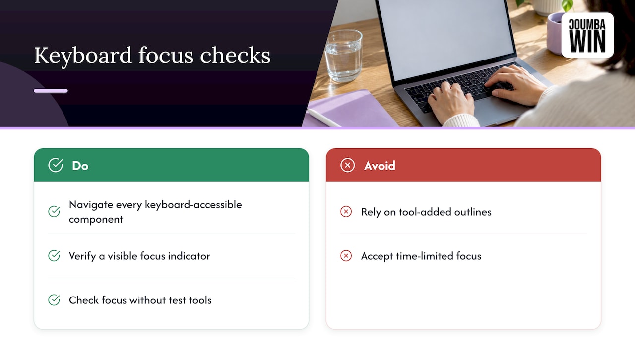
The U.S. Access Board’s ICT Baseline focus procedure has testers navigate every keyboard-accessible component and verify that a visible focus indicator appears and is not time-limited. It also notes that you should judge focus without test tools that add an outline, because an outline injected by a tool does not count as the page’s own indicator. In plain terms: if you only see focus after installing a browser extension that paints it on, your site does not have a focus state.
What a good focus state looks like
- You can spot it instantly, even on a quick glance.
- It appears on every interactive element: links, buttons, inputs, custom dropdowns, cards that act as links.
- It stays put until you move on, rather than fading after a second.
- It works on every background, including your colorful hero section and dark footer.
That last point is where brand and accessibility meet. A thin gray outline that looks elegant on white vanishes on a photo. Picking a focus color that holds up everywhere is a design task, and our color contrast workflow walks through how designers and engineers can check it together.
The classic mistake
The UMass Office of the President checklist lists removed focus outlines among the most common keyboard barriers. Someone strips the default outline because it looks “ugly” and never replaces it. The fix is not to bring back the browser default and call it a day, it is to design a focus style that fits your brand and is easy to see.
Tab order: does the page make sense without a mouse?
Tab order is the sequence in which focus moves. The W3C’s ARIA Authoring Practices Guide explains that the default tab sequence follows the order of elements in the page’s underlying code (the DOM), and it recommends keeping that sequence aligned with the reading order a screen reader user hears, so both stay predictable.
What that means for you: if a designer moves a sidebar to the left visually using layout tricks while the code still has it at the end, keyboard users will jump around in ways that feel random. A good tab order follows the visual flow: logo, navigation, main content, related content, footer, usually left to right and top to bottom.
Quick tab order checks
- Does focus move in the same order your eyes would?
- After you open a modal, does focus move into it?
- After you close it, does focus return to the button that opened it? The Access Board procedure tests exactly this: open the control, move through the revealed items, close it, and confirm focus lands back on the trigger.
- Do hidden or off-screen elements steal focus? They should not.
Keyboard traps and controls you cannot operate
A keyboard trap is when focus enters something and cannot leave using the keyboard. Think video players, embedded maps, rich text editors and modals that never let go. You tab in, you tab and tab, and nothing gets you out. For a visitor, that usually means closing the tab and leaving.
To hunt for them, open every interactive widget and try to get out using only Tab, Shift+Tab and Escape. If you need the mouse to escape, that is a failure.
For controls that look usable but are not, remember the APG’s point that standard controls come with browser-provided keyboard behavior, while custom widgets carry interaction expectations the builder must implement. A native button works for free. A custom-built dropdown needs deliberate work. That is one reason we like to keep native elements wherever the design allows.
Mega-menus and tab stop overload
UMass warns that mega-menus which expand automatically can create an excessive number of tab stops, and recommends expanding menus on user action. If your main navigation has 60 links and all of them are tabbable on every page, keyboard users pay a toll on every single visit. Make the menu open on Enter or Space, and let people skip it.
Common failures and how teams fix them
| What you see | Likely cause | Typical fix |
|---|---|---|
| Cannot see where focus is | Outline removed in CSS | Design a high-contrast focus style for every state and background |
| Skip link missing or invisible | Never built, or hidden permanently | Add a skip link that appears on focus and lands on main content |
| Tab order jumps around | Visual layout differs from code order | Reorder the code to match the visual flow |
| Button ignores Enter or Space | Clickable div instead of a real button | Use native button and link elements |
| Stuck in a modal or widget | No exit handling | Support Escape and return focus to the trigger |
| Dozens of tab stops in the nav | Auto-expanding mega-menu | Open menus on user activation |
These failures overlap with what shows up in broader audits. If you are wondering how this fits into a full review, our website accessibility audit guide and WCAG 2.2 checklist show where keyboard checks sit among the other tests.
Which standards this maps to
You do not need to memorize WCAG (the Web Content Accessibility Guidelines, the international benchmark that U.S. rules point to). But it helps to know what your test covers. The Illinois checklist maps keyboard testing to these success criteria: 2.1.1 Keyboard, 2.1.2 No Keyboard Trap, 2.4.3 Focus Order, 2.4.7 Focus Visible, 3.2.1 On Focus and 3.2.2 On Input. Your seven-step test hits all of them in plain language.
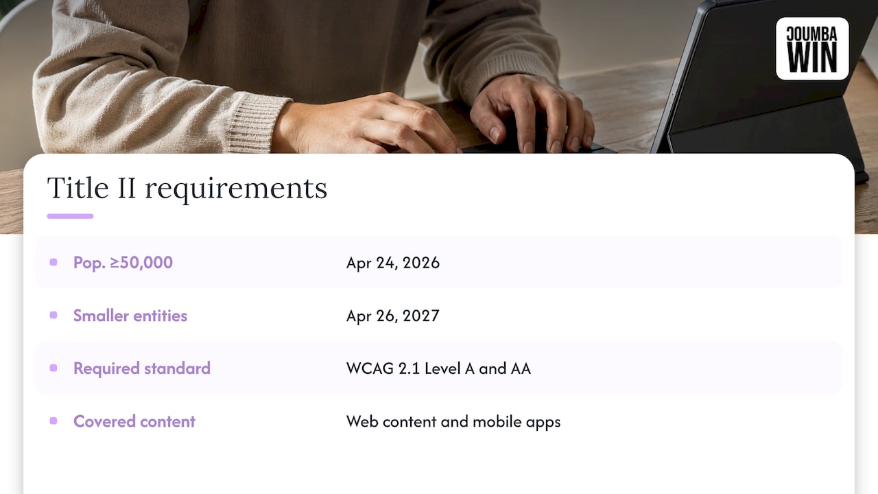
On the legal side, the U.S. Department of Justice’s Title II regulation requires covered state and local government entities to meet WCAG 2.1 Level A and AA starting April 24, 2026 for entities serving populations of 50,000 or more, and April 26, 2027 for smaller entities and special districts, subject to stated exceptions. The rule covers web content and mobile apps provided or made available by those entities, including through contractual or licensing arrangements. If your startup sells software to schools, cities or other public bodies, your product may be part of what they have to get right. That makes keyboard support a sales question, not just a design nicety.
There is also a growth angle: accessible sites tend to be easier for search engines and people to use, and this overview of web accessibility and SEO impact covers how the two connect.
What keyboard testing will not catch
The keyboard test is the best first fifteen minutes you can spend, but it is a starting point. Johns Hopkins recommends running keyboard-only testing both with and without a screen reader, checking for clear focus indication and logical order each time. And web.dev points out that manual keyboard testing should be supplemented with assistive technology checks, since automated tools do not cover all WCAG criteria.
So the healthy routine is layered: automated scan for the easy stuff, keyboard pass for operability, screen reader pass for meaning, and a contrast check for visibility. Run the keyboard pass whenever you ship a new page template, a new modal, or a redesigned navigation.
Making it a habit
A few small habits keep keyboard problems from piling up:
- Add “tab through it” to your definition of done for every new feature.
- Put focus states in the design system, with a defined style for each component state, so developers never have to guess.
- Test before launch, and again after any big redesign or new interactive feature. Our look at interactive website features for startups is a good prompt for which widgets deserve the extra scrutiny.
- Record your findings. A running list of fixes beats a one-off panic.
How we approach it
Here is our honest take: keyboard accessibility is a design problem wearing a code costume. We start with the founders’ goals, then sketch the focus states, tab order and component behavior right alongside the visuals, so nothing gets “fixed later” in a panicked sprint.
We do not do generic templates or AI-generated design, because a template does not know that your pricing toggle is the most important control on the page. Custom work means we can design the focus ring to look like part of your brand, not an afterthought, and we can plan the interaction patterns with your developers from day one.
For startups heading into a funding round, a Demo Day or a big customer pilot, we also know the clock is ticking. We built our process around fast turnarounds and close collaboration with founders who see design as a competitive advantage. Accessibility audits are one of the things we offer, and keyboard behavior is exactly the kind of detail that rewards doing it thoughtfully.
Coumba Evelyn
Want a second pair of hands?
If you would rather spend your time on product and fundraising than on tab order, we can help. Coumba Win offers accessibility audits, UI and UX design and web design and development for startups, plus Webflow development if your site lives there. We work directly with founders on custom solutions, from a fresh site to ongoing design support as you scale.
Bring us the list from your fifteen-minute test and we will take it from there.
FAQ
How long does keyboard accessibility testing take?
A basic pass on a handful of key pages takes about fifteen minutes: homepage, pricing, signup and one content page. A large product with many templates and states takes longer, because each modal, menu and form needs its own run.
What is the difference between tab order and focus order?
They describe the same idea from two angles. Tab order is the sequence in which the Tab key moves through elements, and focus order is the WCAG term (criterion 2.4.3) for requiring that sequence to be logical and preserve meaning. In practice, you test both by tabbing through the page and asking whether the path makes sense.
Do I need special tools to test keyboard navigation?
No. A keyboard and a browser are enough for the first pass. Tools can help later, but the Access Board notes that outlines painted on by a test tool do not count as your page’s own focus indicator, so always judge what the page itself shows.
Can an automated scanner replace a manual keyboard test?
No. web.dev notes that automated tools do not cover all WCAG criteria, and keyboard operability depends on how things actually behave when you press keys. Use a scanner for the quick wins and the keyboard pass for everything that requires judgment.
Is keyboard accessibility a legal requirement in the U.S.?
For state and local government entities, the DOJ’s Title II rule sets WCAG 2.1 AA compliance deadlines of April 24, 2026 and April 26, 2027, depending on population size, and it reaches content provided through contractual arrangements. If you sell to those buyers, expect them to ask about keyboard support.
Sources
- web.dev: Manual accessibility testing
- University of Illinois: Keyboard Testing
- Johns Hopkins: Manual Accessibility Testing Guide
- UC Berkeley: Manual Testing for Website Developers
- WP Accessibility Knowledge Base: Keyboard navigation support
- U.S. Access Board: ICT Baseline, Focus (Web)
- W3C: Developing a Keyboard Interface
- UMass Office of the President: Keyboard-Only Navigation Testing
- U.S. Department of Justice: Title II Regulation Supplement
- Web Accessibility: Boosting Inclusion and SEO Impact