Drive Activation in SaaS with Design Led Onboarding Email Sequences
Drive Activation in SaaS with Design Led Onboarding Email Sequences
A value-first onboarding email sequence is a short, goal-driven series of emails that pushes new users toward one measurable first-value moment instead of scattering their attention across many features. Get that single goal right and you’ll see faster time-to-value and a real lift in activation rate. Everything else (open rates, click rates, unsubscribe rates) is just a signal telling you whether you’re on track.
TL;DR:
- Choose three emails for one action, five to seven over seven to ten days for multistep setup, and eight or more across weeks for complex platforms.
- Trigger emails from user activity when possible; stop the setup sequence at first value, and use fixed delays when behavior cannot be tracked.
- Give each email one action and one button; keep subject lines under 40 characters and use preview text to set clear expectations.
- Measure activation rate and time to activation first, then track email clicks, requested actions, and unsubscribes; test only one variable at a time.
- Treat upgrade or feature pitches as commercial email, include an opt out link and physical address, and check consent rules for subscribers outside the United States.
Table of Contents
- Ready-to-use onboarding sequence examples and templates
- The exact parts of a high-converting onboarding email
- A step-by-step blueprint to design your sequence
- How many emails to send and when
- When to split flows: segments and triggers that matter
- Activation-centered metrics and a practical A/B testing checklist
- Deliverability and CAN-SPAM compliance, the short version
- Design-led checklist and quick wins for startups
- Legal compliance beyond CAN-SPAM
- When to stop tweaking emails and fix the product instead
- How we help with design-led onboarding email systems
- FAQ
- Sources
Ready-to-use onboarding sequence examples and templates
Here’s the thing about onboarding emails: most teams write too many of them, about too many things, hoping something sticks. Don’t do that. Pick one goal per sequence and build around it like your activation metric depends on it (because it does).
The three-email quick-activation sequence works when your product has one obvious first step, like connecting an account or uploading a file.
- Email 1, sent immediately: Subject: “Welcome. Let’s get your first [result].” Opener: “You’re in. Here’s the one thing to do before anything else.” CTA: “Finish setup.”
- Email 2, sent at +1 day if setup isn’t complete: Subject: “Quick nudge: you’re one step from [outcome].” Opener: “A lot of people stall right here, so here’s the fastest path through it.” CTA: “Pick up where you left off.”
- Email 3, sent at +3 days if still incomplete: Subject: “Need a hand?” Opener: “No judgment, onboarding can be a lot. Want a 2-minute walkthrough instead?” CTA: “Watch the walkthrough.”
The five-email progressive sequence suits products with a few meaningful setup steps spread over a week.
- Day 0: Welcome plus the single most important first action, framed as “this unlocks everything else.”
- Day 1: A setup checklist email that shows progress visually (checked boxes feel great, we’re not above using that).
- Day 3: A quick how-to focused on the feature tied most directly to your first-value moment.
- Day 5: Social proof, a short example of how another customer used the product to get a result.
- Day 7: A trial or upgrade nudge, only if the user has already hit the first-value moment.
Behavior-triggered branching is where things get interesting. If a user completes setup, they exit the base sequence entirely and drop into an adoption track (tips for going deeper). If they don’t complete setup by day 3, they get the “need a hand” variant above instead of the adoption email. According to onboarding sequence guidance from Hostinger, sequences should be built to exit automatically once a user reaches the goal, which keeps people from getting irrelevant emails after they’ve already done the thing.
Template snippets worth stealing: a welcome line like “You just joined [X number] of people solving [problem]” (swap in your own real number), a setup checklist with three boxes max, a how-to email that links to one video or doc (never three), and an upgrade nudge that references the specific action the user already completed.
The exact parts of a high-converting onboarding email
Every part of an onboarding email has one job. Here’s how to write each piece so it actually pulls its weight.
- Subject lines by intent: welcome (“You’re in, here’s what’s next”), setup (“One step left”), value nudge (“You haven’t tried this yet”), upgrade (“Ready for the next tier?”).
- Preview text: treat it as a second subject line, not filler. “Takes about 90 seconds” tells people exactly what they’re signing up for when they click.
- Opener: lead with the value, not your company history. “Here’s how to get your first report” beats “We’re thrilled to have you” every time.
- Body: one action, one explanation of why it matters, done. Resist the urge to mention five features.
- CTA: a single button, verb-first (“Finish setup”, “See your results”), never a wall of links competing for attention.
- Footer: your opt-out link and physical address, every time, no exceptions.
Pro Tip: Write the CTA button copy before you write the rest of the email. If you can’t name the one action in four words, the email is trying to do too much.
Given how much email gets read on a phone, keep subject lines under 40 characters and buttons thumb-sized. Mobile accounts for the majority of website traffic according to Statista, which is reason enough to write short and design for small screens first.
A step-by-step blueprint to design your sequence
Building a sequence from nothing feels overwhelming until you break it into five moves.
- Define one measurable first-value moment. Not “user feels successful,” something you can log, like “created first project” or “sent first message.”
- Map the micro-steps between signup and that moment. Write down every click a user needs to make, then flag where people tend to get stuck.
- Decide the length based on complexity. A single-step product gets 3 emails. A multi-step setup gets 5 to 7. A genuinely complex platform (think enterprise software with admin configuration) might need 8 or more, spread over several weeks.
- Write one-action emails and set exit rules. Each email asks for exactly one thing, and the sequence stops the moment a user hits the first-value moment, event-triggered rather than just time-based. 8ac3f025 Automate it with a fallback. Set the sequence to fire on product events where your tool supports it, and fall back to fixed delays (like +1 day, +3 days) for users whose behavior you can’t track yet. Then instrument the first-value event so you can actually measure activation.
A common version of this process, laid out in Hostinger’s walkthrough on building onboarding sequences, follows roughly this order: define the goal, map the journey, choose the number of emails, write them, set timing, segment where needed, automate, then measure. Teams that build product-first, aligning the email sequence to actual in-app milestones rather than guessing, tend to get the mapping step right faster. We’ve written more about this kind of alignment in our piece on freemium onboarding UX, which is worth a look if your product has a trial-to-paid transition baked into the journey.
How many emails to send and when
There’s no universal right number, but there are reasonable defaults depending on how much setup your product demands.
- Simple, single-action products: 3 emails over about 3 days.
- Multi-step setups: 5 to 7 emails spread across 7 to 10 days.
- Complex, admin-heavy platforms: 8 or more emails over several weeks, often segmented by role.
- Sample fixed-delay cadence: immediate welcome, +1 day nudge, +3 day how-to, +7 day social proof or upgrade prompt.
- Behavior-triggered timing beats fixed delays whenever you can track the relevant event, because it matches the message to where the user actually is, not where you assume they are.
- Throttle if you see unsubscribe spikes. If a nudge email consistently drives people to opt out, that’s a signal to space things out or cut a step, not to write a punchier subject line.
Research on behavioral interventions backs up the throttling instinct: more touches aren’t automatically better, and piling on frequency can create fatigue that undercuts the very outcome you’re chasing.
When to split flows: segments and triggers that matter
Not every difference between users deserves its own email flow. Build separate tracks only where the content genuinely needs to change.
- Plan type (trial vs. paid) changes what you ask people to do and what you offer next, so split here.
- Role matters when an admin and an end user need different first actions (admin sets up the workspace, teammate just needs to log in).
- Signup source can shift the opener (someone who signed up after a demo already knows your pitch).
- Use case matters when your product serves genuinely different jobs (a freelancer and an agency using the same tool rarely need the same first email).
For triggers, exit a user into their next track the moment they fire the relevant event (completed setup, invited a teammate), and keep a fallback fixed-delay path running for anyone who hasn’t. Favor two or three high-impact segments over ten tiny ones. More branches mean more maintenance and more ways for someone to fall through a gap.
Activation-centered metrics and a practical A/B testing checklist
Vanity metrics feel good and tell you almost nothing. Anchor your reporting on two numbers first.
- Activation rate: the share of new users who reach your defined first-value moment.
- Time-to-activation: how long that typically takes, which tells you where to compress the journey.
- Secondary metrics: open rate, click rate, conversion to the specific micro-action each email asks for, and unsubscribe rate as a fatigue check.
- A/B test one variable at a time: subject line, CTA copy, send timing, email length, or where you place social proof, run long enough to reach a meaningful sample, and judge results at the sequence level, not just per email.
Behavioral research on intervention frequency suggests that adding more touches doesn’t automatically improve outcomes and can backfire if it creates fatigue, which is exactly why activation rate, not email volume, should be the number your team rallies around.
Deliverability and CAN-SPAM compliance, the short version
Most onboarding emails that mention upgrades, features, or anything resembling a pitch count as commercial, not transactional, which means they’re on the hook for full compliance.
- Accurate headers. No disguising the “from” line or the subject.
- A clear, working opt-out mechanism, honored within the window the law requires.
- A valid physical postal address in the footer, every single email.
- SPF and DKIM configured, a warmed-up sending domain, and subject lines that describe the actual content.
The FTC’s CAN-SPAM compliance guide spells out that mixed-content emails (a setup reminder with an upgrade nudge tacked on) often get classified as commercial unless the transactional content clearly leads. The operational mechanics, like how opt-outs must be processed and what counts as a valid postal address, are detailed in 16 CFR Part 316, the regulation that implements the Act.
Design-led checklist and quick wins for startups
Good onboarding emails are a design problem as much as a copywriting one. A few quick wins make a disproportionate difference.
- Define your first-value moment in one sentence everyone on the team agrees on.
- Map the first three steps a new user takes after signup, and flag the one most likely to cause drop-off.
- Draft a three-email starter sequence before you touch a five-or-more-email version.
- Style your CTA buttons to match your brand system, not your email tool’s default blue button.
- Automate the exit rule so nobody gets a “finish setup” email after they’ve already finished it.
On the design side, test button color against your brand palette (not just against white space), keep microcopy under one line wherever possible, and make sure visual hierarchy points at exactly one action per screen. We cover more of this pairing between email sequencing and product UX in our write-up on cutting time to value with onboarding flow design.
Pro Tip: If your CTA button looks like it belongs to a different brand than your app, fix that before you fix your subject lines. Visual trust compounds just like copy does.
Legal compliance beyond CAN-SPAM
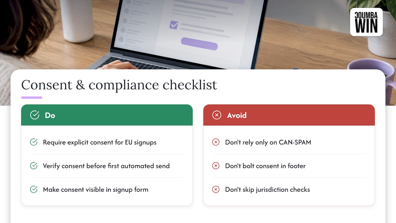
CAN-SPAM covers US senders, but it’s not the only rule that applies if your users sign up from outside the country. The General Data Protection Regulation (GDPR) governs how companies handle personal data for people in the European Union, and it generally requires a clearer legal basis for sending marketing email than US law does, often explicit consent rather than an opt-out model. If your onboarding sequence collects email addresses from EU-based signups, check whether your consent flow and data handling practices meet that bar before your first automated send goes out.
Other markets layer on their own rules (Canada’s anti-spam law, for instance, has its own consent requirements), and the details shift often enough that we won’t pretend to summarize them all here. The practical move is to treat consent as a first-class part of your signup form, not an afterthought bolted onto the footer, and to check with someone who tracks the relevant jurisdiction’s current requirements if you’re onboarding users from outside the US. A product-led software partner, like the one behind this onboarding checklist for product and UX teams, can be a useful second opinion when you’re coordinating consent capture with the rest of the signup flow.
When to stop tweaking emails and fix the product instead
Email amplifies what’s already true about your product. It can’t manufacture a first-value moment that doesn’t exist. Before you write a sixth email, ask one question: can a user reach that moment without any email at all, just by using the product? If the answer is no, the fix is in the product, not the inbox. Get your product and marketing teams looking at the same activation funnel, and let whichever side owns the biggest drop-off move first.
— Coumba Evelyn
How we help with design-led onboarding email systems
Writing the sequence is one thing. Making it look like it belongs to your brand, with CTAs that match your product’s visual language and templates your team can actually maintain, is where a lot of startups get stuck. That’s the gap we work in.

We build onboarding email systems the same way we build everything else: starting from what makes your product distinct, not from a generic template library.
- Email marketing setup, including template design and the automation handoff so your sequence actually fires on the right triggers.
- Onboarding UX design that keeps your email CTAs and in-product first steps visually and functionally aligned.
- A starter sequence plus a reusable template system, built once and handed off so your team can adapt it without a designer every time.
A typical small engagement looks like a three-email starter sequence, a brand-matched template set, and a short automation handoff session. If that sounds like what your onboarding flow is missing, take a look at our work and case examples or head to Coumbawin to talk through what a project would involve.
FAQ
What are the 5 stages of the onboarding process?
Onboarding generally moves through signup, first login, initial setup, the first-value moment, and ongoing adoption. An onboarding email sequence typically targets the gap between first login and that first-value moment, since that’s where most drop-off happens.
How do I write an onboarding email?
Start with one goal per email: open with the value, state one clear action, and give a single CTA button that names that action directly. Keep the footer compliant with an opt-out link and your physical address, and avoid mixing multiple asks into one message.
Which is the correct sequence for email tracking?
Track opens and clicks as early signals, then conversion to the specific micro-action each email requests, then your real target: activation rate and time-to-activation. According to guidance on onboarding sequence design, judging sequences by activation outcomes rather than email-level vanity metrics gives a clearer read on what’s working.
What is the 3-email rule?
There’s no official “3-email rule,” but a three-email sequence (welcome, nudge, final reminder or help offer) is a common minimum structure for simple products with one clear first action. It works well when the product’s first-value moment requires just one or two steps to reach.