5 Steps: Cut Time to Value with Onboarding Flow Design for Startups

5 Steps: Cut Time to Value with Onboarding Flow Design for Startups
Onboarding flow design succeeds when a new user reaches their first real “aha” moment as fast as possible, not when they’ve clicked through every screen you built. The single metric to obsess over is time-to-value: how many minutes (or seconds) pass between signup and the moment the product actually delivers on its promise. Get that number under five minutes and your activation rate follows.
TL;DR:
- Most effective onboarding reduces time-to-value to under five minutes, focusing on enabling users to reach their activation event quickly.
- Designing for the three onboarding phases—orient, activate, reinforce—ensures users understand the product, take action, and build habits efficiently.
- Tracking key metrics like completion rate, time-to-value, activation rate, and weekly retention helps identify drop-off points and optimize the flow.
- Streamlining onboarding by shortening steps, adding contextual tooltips, and employing value-first approaches improves user activation and reduces friction.
- Real onboarding improvements often involve targeted small changes, such as reducing questions or adding priming screens, rather than full redesigns.
Table of Contents
- What Is Onboarding Flow Design, and What Are Its Three Phases?
- How Do You Design an Onboarding Flow Step by Step?
- Which Onboarding UI Patterns Actually Work?
- How Do You Measure Whether Onboarding Is Working?
- What Do Ship-Ready Onboarding Templates Look Like?
- What Do Real Onboarding Flow Improvements Look Like?
- How Coumba Win Design Approaches Onboarding for Startups
- The Honest Take on Onboarding Flow Design
- Get Onboarding Design Help From Coumba Win Design
- Sources
- FAQ
What Is Onboarding Flow Design, and What Are Its Three Phases?
Onboarding flow design is the deliberate sequence of screens, prompts, and micro-interactions that take a brand new user from “I just signed up” to “I get why this matters.” It’s different from a passive product tour, which just points at buttons and hopes for the best. A real onboarding flow has a job: shrink the gap between curiosity and competence.
The most useful framework here breaks onboarding into three phases, each with its own clock and its own goal, according to research from DesignRevision:
- Orient (0 to 60 seconds). The user figures out what this thing is and whether they’re in the right place. This is where a welcome screen or a single value statement does the heavy lifting.
- Activate (1 to 5 minutes). The user takes the action that proves the product works for them. This is your activation event, and it should be the shortest path possible.
- Reinforce (minutes to days). The user comes back, builds a habit, and starts treating the product as part of their routine, often through email nudges, checklists, or in-app prompts.
Not every product needs a formal flow for all three phases. If your interface is intuitive enough that a first-time user can find value without hand-holding, skip the tutorial. Nielsen Norman Group’s research on mobile onboarding is blunt about this: instructional onboarding should never substitute for a product that’s confusing on its own, and it works best when reserved for genuinely novel or complex workflows, kept brief, and made skippable.
How Do You Design an Onboarding Flow Step by Step?
Most onboarding flows fail because someone designed the screens before anyone agreed on what “success” actually looks like. Fix that order problem first, then everything downstream gets easier.
-
Pick one measurable activation event. This is the single action that proves a user has experienced real value, not just poked around. For a project management app, it might be “created a task and assigned it to someone.” For a fintech app, it might be “linked a bank account and saw a balance.” Test your candidate event against retention data. If users who hit that event stick around at meaningfully higher rates a week later, you’ve found your event. If not, keep testing.
-
Map the shortest path to that event, including the steps you’d rather ignore. This is where teams get sloppy. The path isn’t just your designed screens. It includes OS-level permission dialogs, email verification links, CAPTCHA checks, and app store redirects. Kompassify’s guidance on mobile onboarding recommends working backwards from the activation event and counting every single step, hidden or not, because users abandon during the steps you forgot to design for just as often as the ones you did.
-
Decide what you actually need to ask, and when. Every form field and every permission request is a toll booth. Progressive profiling, asking for information gradually as it becomes relevant, beats front-loading a ten-field signup form. Permission priming, explaining why you need camera access before the native OS dialog appears, dramatically improves grant rates compared to firing the system prompt cold.
-
Make the flow resumable. Users close apps mid-onboarding constantly, whether they got a phone call or just got distracted. A flow that forces someone to start over from screen one is a flow that loses them for good. Persist state across sessions so a returning user picks up exactly where they left off.
-
Instrument every screen, then delete the worst one. Log entry, exit, and skip events for each step in the flow. Once you have a few weeks of data, find the screen with the highest drop-off relative to its value, and either fix it or cut it entirely. Repeat this quarterly. Kompassify’s five-step method treats this as an ongoing loop, not a one-time launch task.
Pro Tip: Run the “would we lose anything?” test on every screen before you ship a new onboarding flow: remove the screen from a prototype and ask whether a first-time user could still reach the activation event without it. If the answer is yes, you’ve found a screen to cut.
Which Onboarding UI Patterns Actually Work?
The right pattern depends on how much explaining your product genuinely needs, not on what looks impressive in a portfolio deck.
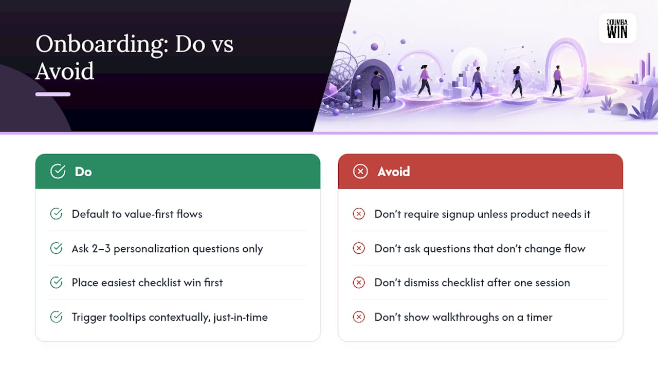
Value-first versus signup-first is the first fork in the road. Value-first flows let people try the core experience before asking for an account (think of a calculator app that works instantly, then asks you to sign up to save results). Signup-first makes sense only when the product literally cannot function without an account, like anything involving stored personal data or payments. When in doubt, default to value-first. It converts better because people commit after they’ve already felt the benefit.
Personalization questions are tempting to overload with because “more data means better personalization,” but that logic backfires fast. Keep it to two or three questions, and only ask something if the answer actually changes the next screen the user sees. A question that doesn’t alter anything downstream is just friction wearing a personalization costume, as Kompassify’s mobile pattern research points out.
Checklists work because they’re persistent, visible, and satisfying to complete. Best practice puts the easiest, fastest win first (so users feel momentum immediately), caps the list at five to seven items, and keeps it visible across logins rather than dismissing it after one session. A checklist that survives multiple sessions doubles as a measurable completion signal your team can track over time.
Tooltips and interactive walkthroughs should trigger on behavior, not on a timer or a fixed step count. Show a tooltip when a user hovers near a feature they haven’t used yet, not on page load regardless of context. Keep every walkthrough optional and short. Microsoft’s Fluent design guidance recommends contextual, just-in-time teaching over front-loaded feature dumps, because people retain guidance better when it arrives right as they need it.
Permission priming deserves its own rule: always explain the value before the native OS dialog fires, and never bundle multiple permission requests into one screen. Ask for camera access when the user is about to take a photo, not during onboarding screen three because it was convenient to batch.
How Do You Measure Whether Onboarding Is Working?
Four numbers tell you almost everything you need to know about onboarding health, and you don’t need a data science team to track them.
| Metric | What it measures | Target range |
|---|---|---|
| Completion rate | Share of users who finish the full flow | Varies by product; watch for sharp drops between steps |
| Time-to-value | Minutes from signup to activation event | Under 5 minutes |
| Activation rate | Share of new users who hit the activation event | Above roughly one-third |
| Weekly retention | Share of activated users still active a week later | Higher among users who activated fast |
These targets come from DesignRevision’s SaaS onboarding benchmarks, and they hold up as a useful baseline across product categories, though your own historical data should always override a generic number once you have enough of it.
To act on these metrics, you need a minimal event schema: log entry and exit timestamps for every screen, log success or failure for each required action, and log skip events with a reason field whenever one is available (even a rough category like “skipped, no answer” beats nothing). Once that’s in place, run a funnel analysis to see exactly where users drop off, then cross it with cohort analysis segmented by acquisition source or plan tier. The screen with the worst drop-off relative to how essential it is becomes your next fix. This is also where UX quality connects directly to retention: the products that treat onboarding as a measurement problem, not just a design problem, tend to hold onto users longer.
What Do Ship-Ready Onboarding Templates Look Like?
You don’t need to reinvent these from scratch. Steal the structure, swap in your product’s specifics.
- Welcome screen template: one headline stating the core value in under ten words, one supporting line explaining who it’s for, and a single primary button. Skip the feature list. Example: “Track every invoice in one place.” followed by “Built for freelancers who hate spreadsheets,” then a “Get Started” button.
- Checklist template: three to five required items (the ones that lead to activation) plus one or two optional items marked clearly as such. First item should take under thirty seconds. Example first item: “Add your first client (30 sec).”
- Permission priming microcopy: “We’ll ask to use your camera so you can scan receipts instantly.” shown on its own screen, followed by the native permission dialog, never combined into one prompt.
- Progress indicator copy: “Step 2 of 4” beats a vague progress bar with no numbers. Users tolerate more steps when they can see the finish line.
- Error recovery microcopy: “That didn’t save. Try again?” beats a generic “Something went wrong” because it tells the user exactly what to do next.
These templates line up with the contextual, in-the-moment guidance principle from Microsoft’s Fluent design system, and they translate well whether you’re building the flow yourself or handing specs to a development team.
What Do Real Onboarding Flow Improvements Look Like?
Small, targeted changes usually beat full redesigns, especially when supported by tools like the Social Media Post Generator that help craft clear onboarding announcements. A few patterns show up repeatedly across real products.
- Mobile fitness app: Before, users answered eight profile questions before seeing any content. After cutting it to two questions (goal and experience level) and moving the rest into progressive profiling later, activation improved because users reached a workout recommendation almost immediately instead of filling out a form first.
- Mobile finance app: Before, camera and notification permissions fired back to back during onboarding, and grant rates were low. After adding a one-line priming screen before each native dialog, more users granted permissions because they understood the value before being asked.
- Web SaaS dashboard tool: Before, a fifteen-screen product tour ran on every first login regardless of what the user clicked. After replacing it with a five-item persistent checklist and contextual tooltips triggered by behavior, users reached their first dashboard faster because the tour no longer blocked the interface.
The failure mode to watch across all three: adding a pattern without removing the friction it was meant to replace, which just adds screens instead of shortening the path.
How Coumba Win Design Approaches Onboarding for Startups
At Coumba Win Design, we treat onboarding as a business metric problem before it’s a screen-design problem. That starts with defining the activation event alongside a founder’s growth goals, not after the interface is already built.
Our process typically runs through discovery (mapping the current flow and drop-off points), prototyping (testing a shortened path), structured testing, and measurement against completion rate and time-to-value. That sequence shapes the UI design and UX design work we do for startups building or rebuilding their first-run experience, particularly for platforms where a confusing first session directly threatens retention.
The Honest Take on Onboarding Flow Design
Most onboarding advice treats screen count as the enemy, and that’s only half right. The real enemy is any screen, however few, that doesn’t shorten the path to activation. A three-screen flow can be worse than a seven-screen flow if those three screens ask for information nobody needs yet.
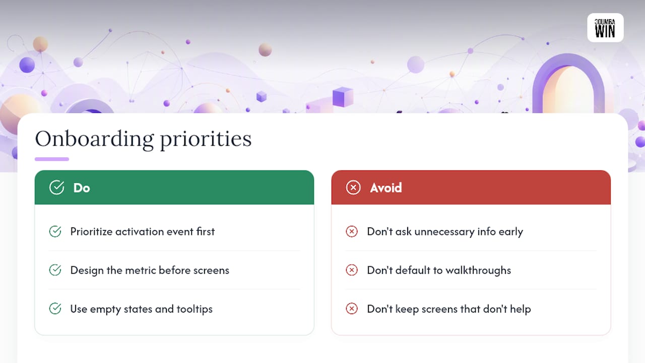
The conventional wisdom oversells interactive walkthroughs as a universal fix. They’re genuinely strong for teaching a novel interaction, weak for anything a user could figure out by simply trying it. Teams reach for a walkthrough because it feels like “doing onboarding properly,” when the better move is often just better empty states and contextual tooltips.
If you take one thing from this, prioritize the activation event before touching a single screen. Everything else, the checklists, the permission priming, the personalization questions, only earns its place if it measurably shortens or reinforces the path to that one moment. Design the metric first. Design the screens second.
— Coumba Evelyn
Get Onboarding Design Help From Coumba Win Design
Coumba Win Design is the alternative to a generic template or an AI-generated onboarding kit: real designers who map your activation event, test the flow against your users, and build screens that actually earn their place in the sequence. That matters most for startups where every dropped user during onboarding is a lead you paid to acquire and lost before they saw the product work.

Our team handles the full stack a startup actually needs for a first-run experience that converts: UI design and UX design for the flow itself, Webflow development for web-based products, and accessibility audits to make sure the flow works for everyone who lands on it, not just the users who tested well in a demo. We also build the surrounding pieces, like pitch deck design and branded materials, so your onboarding tone matches everything else a founder shows to users and investors. Engagements typically start with a walk-through of your current flow and a shortlist of the screens costing you the most drop-off. If you’re ready to see what a shorter path to activation looks like for your product, start a project with Coumba Win Design and bring your current flow to the first conversation.
Sources
- Mobile App Onboarding
- SaaS Onboarding Flow: 10 Best Practices That Reduce Churn (2026)
- Microsoft Fluent: onboarding guidance
- Mobile App Onboarding: Patterns, Examples & Best Practices (2026)
FAQ
What Are the Three Phases of the Onboarding Process?
Most onboarding flows break down into orient (the first 60 seconds, where a user figures out what the product is), activate (roughly one to five minutes, where they hit the activation event), and reinforce (the days after, where habits form through checklists and prompts).
What Is an Onboarding Flow?
An onboarding flow is the designed sequence of screens and prompts that guides a new user from signup to their first meaningful experience of a product’s value, distinct from a passive tour that just labels buttons.
How Long Should Onboarding Take?
The activation phase should take one to five minutes for most digital products; anything longer usually signals too many required steps before the user reaches real value.
Does Coumba Win Design Build Onboarding Flows for Startups?
Yes. Coumba Win Design designs and builds onboarding experiences as part of its UI and UX design services, starting with defining a measurable activation event before any screens get designed.


