Investor One Pager: Copy a Designed Template and Track Opens
Investor One Pager: Copy a Designed Template and Track Opens
An investor one-pager is a single-page, shareable summary whose job is to get a meeting, not to close a round on its own. Lead with your ask, your fastest facts, and your sharpest traction metric, then send it as a tracked link instead of a PDF attachment. That way you know the moment it gets opened, and you can follow up while you’re still warm in someone’s inbox.
TL;DR:
- Put company stage, raise amount, and mission in a top band, then organize problem, solution, market, traction, team, and a direct meeting ask.
- Keep the page to one strong visual, readable text with at least 4.5:1 contrast, and brief metrics; move detailed figures into a linked deck.
- Seed founders should emphasize founder credibility, early traction, and customer references; angels need vision, while VC meetings call for fast facts and measurable KPIs.
- For cold outreach, cut extra context; send a tracked link, follow up within 48 hours of an open, and match its wording to the deck.
Table of Contents
- The core sections every investor one-pager needs
- Layout and design rules that make investors actually read it
- Tailor the one-pager to your stage and your audience
- A sample one-pager walkthrough you can copy
- Why layout choices change how investors respond
- What actually works once you hit send
- Let us turn your rough draft into investor-ready design
- FAQ
- Sources
The core sections every investor one-pager needs
Okay, so you’ve got one page. That’s it. No pressure, right? Here’s the thing: investors spend seconds, not minutes, deciding whether to keep reading, so every line needs to earn its spot. Think of this as your “fat stack of business cards” moment, except it’s a single sheet doing the work of a whole pitch.
Here’s the checklist we’d hand a founder before any outreach:
- Headline and fast facts: company name, one-line mission, stage, and raise amount, all in 1 to 2 lines up top.
- Problem and solution: 1 to 2 bullets each, written the way you’d explain it to a smart friend who isn’t in your industry.
- Market opportunity: one sentence on the opportunity size, plus a clear definition of your target customer.
- Traction: absolute numbers paired with growth rate, like “several thousand users with strong month-over-month growth.”
- Team: one line per founder, each with a single credibility signal (prior exit, relevant domain expertise, a notable school or employer).
- The ask: raise amount, primary use of funds, and a direct CTA to meet.
- Contact and links: email, and a link to your deck or data room for anyone who wants more.
Order matters here. Put this in roughly this sequence:
- Fast facts band at the top.
- Problem, solution, and market in the body.
- Traction and team as your proof points.
- Ask and contact as the close.
Layout and design rules that make investors actually read it
Design is where most one-pagers quietly fail. You can have killer traction numbers, but if they’re buried in gray text on a busy background, nobody’s finding them. The Web Content Accessibility Guidelines recommend a contrast ratio of at least 4.5:1 for normal-sized text, and that’s not just an accessibility nicety. It’s the difference between an investor skimming your metrics in five seconds or squinting and giving up.
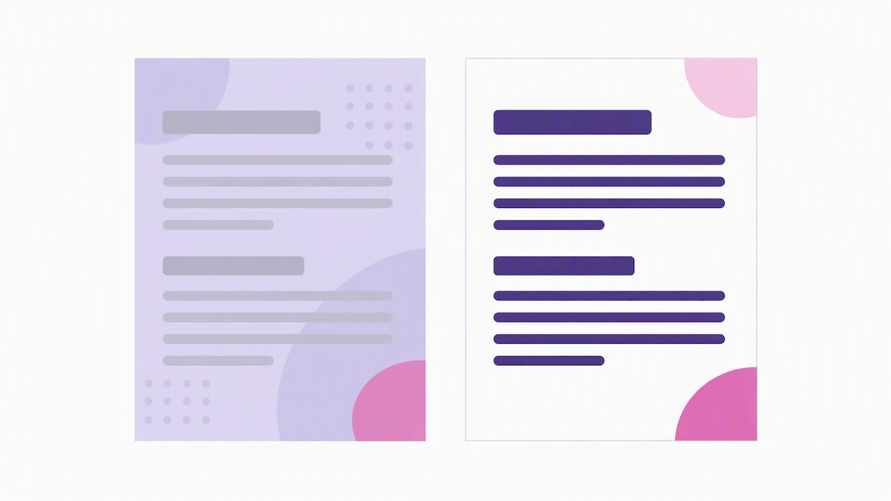
Statistic: A contrast ratio of at least 4.5:1 for normal text is the accessibility benchmark that also happens to make your numbers readable on a phone screen at 11pm, which is when half of investor inbox triage actually happens.
A few rules we stick to:
- Pick one strong visual (a product screenshot, a simple chart, a logo wall) and let it anchor the page instead of competing with five smaller graphics.
- Use short headers and bullets with generous line spacing so the page reads in a skim, not a study session.
- Skip the dense data dump. Link out to a deck or data room for anything that needs a second look.
Pro Tip: Send your one-pager as a tracked link rather than a PDF attachment. You’ll see when it’s opened, which tells you exactly when to follow up instead of guessing.
Tailor the one-pager to your stage and your audience
Not every investor wants the same story, and treating a seed angel like a Series B partner is a quick way to lose the room. Here’s how we’d split it:
- Seed or pre-seed: lean on founder track record, early traction (even if it’s just 50 beta users who love you), and any customer references you can name.
- Angels: show the vision and a short, believable path to your next milestone. They’re betting on you and the story more than the spreadsheet.
- VC partner meetings: front-load fast facts and measurable KPIs, because partner meetings move quickly and investors expect a consistent story from one-pager to deck. Be ready to hand off the full deck the second someone asks.
- Cold outreach: keep it lean and action-oriented, almost ruthless about cutting anything that isn’t essential. Warm intros can carry a touch more context since there’s already some trust in the room.
The through-line: match the depth of detail to how much the reader already believes in you.
A sample one-pager walkthrough you can copy
Let’s build one from scratch, section by section, so you’re not staring at a blank page wondering where to start.
- Top band: Headline, one-line mission, and fast facts (founded year, team size, stage, raise amount). Example microcopy: “Acme Health, founded 2024, 6 employees, raising a $1.5M seed round.”
- Left column: Problem, solution, and market, each in 1 to 2 bullets. Example: “Problem: small clinics lose 15 hours a week to manual scheduling. Solution: Acme automates intake and reduces admin time to under 2 hours.”
- Right column: Traction and logos, one-line team bios, and 2 to 3 key metrics with percent growth. Example: “over four thousand active clinics with rapid quarterly growth.”
- Footer: Funding ask, one-line use of funds, CTA, and contact. Example: “Raising $1.5M to expand sales and finish our EHR integration. Let’s talk: book a 20-minute call.”
A few microcopy habits worth stealing: lead every traction bullet with a number, keep team bios under 12 words, and make your CTA a specific action (“book a call”) instead of a vague one (“reach out anytime”). If you want a deeper model to link from your one-pager footer, our post on Series A pitch deck design walks through where traction evidence belongs in a longer deck.
Why layout choices change how investors respond
Visual hierarchy does real work here. When traction numbers sit in a dedicated band with clear contrast and breathing room around them, investors pull out the decision-relevant facts fast instead of hunting for them in paragraph text. We’ve seen this play out directly in our own design work:
- Clarifying metric placement (pulling growth percentages out of paragraph text and into a labeled band) shortened the time it took one founder to get a follow-up reply.
- Consistent type hierarchy between the one-pager and the deck meant investors recognized the story instantly instead of re-reading context.
- A single strong visual, rather than three competing ones, kept attention on the traction story instead of splitting it.
If you want to see this approach applied end to end, our visual storytelling work for startup traction shows how narrative and layout choices work together.
What actually works once you hit send
A few habits we keep coming back to: send tracked links, not attachments, and follow up within 48 hours of an open. Show your one-pager to two founder peers before it goes out. They’ll catch the confusing line you’ve read so many times you can’t see it anymore. And keep your deck’s language matched to your one-pager, word for word where you can, so nobody feels like they’re reading two different pitches from two different companies.
— Coumba Evelyn
Let us turn your rough draft into investor-ready design
If your one-pager is still living in a half-finished Google Doc, we build the version that actually gets opened, read, and forwarded. We design pitch decks, investor one-pagers, Demo Day kits, and full Webflow sites for founders who treat design as part of the pitch, not an afterthought.

- Pitch deck and one-pager design, built to match your fundraising stage.
- Demo Day kits with branded swag and booth materials for founders heading into a cohort pitch event.
- Webflow development for founders who need the website to match the deck.
Every one-pager we design comes as an editable file with guidance on sharing it as a tracked link. Take a look at our design services or browse work samples to see what a finished one looks like.
FAQ
What is an investor one-pager?
An investor one-pager is a single-page summary of your company covering the problem, solution, market, traction, team, and funding ask. Its job is to get a meeting or a warm follow-up, not to replace your full pitch deck.
How long should an investor one-pager be?
It should fit on exactly one page, with no exceptions. Anything that needs more room, like detailed financials or a full product walkthrough, belongs in a linked deck or data room instead.
Should I send my one-pager as a PDF or a link?
A tracked link is the better choice because it lets you see when the document is opened, which signals when to follow up. Tracking opens and sending share links is a common tactic for timing outreach well.
What’s the biggest mistake founders make on a one-pager?
Cramming too much data onto the page instead of linking to a deck for deeper figures. Investors scan fast, so a one-pager stuffed with charts usually gets skimmed and set aside rather than read.
How do I tailor a one-pager for a VC partner meeting versus an angel?
For a VC partner meeting, lead with fast facts and measurable KPIs since partner meetings expect a quick, consistent story before the deck. For angels, lean more on vision and a believable near-term path, since they’re often betting earlier on the story than the spreadsheet.