Ship a 30/60/90 Day Freemium Onboarding UX for PMs and UX Designers
Ship a 30/60/90 Day Freemium Onboarding UX for PMs and UX Designers
The single highest-leverage move in freemium onboarding is getting a new user to a real “aha” moment fast, then prompting upgrades only when their behavior says they’re ready, not on a fixed schedule. Three levers make this work: progressive disclosure, value-first quick wins, and contextual upgrade triggers tied to product-qualified lead (PQL) signals.
TL;DR:
- Most users are unlikely to upgrade until they hit specific usage limits or complete key setup actions, so targeting these triggers increases conversion efficiency.
- In-app prompts should be tied to real, immediate tasks and presented next to the blocked feature, using dismissible, contextually relevant messages for better results.
- Soft gating and feature previews allow users to experience value before hitting actual limits, reducing frustration and encouraging upgrades through passive desire rather than interruption.
- Mobile onboarding must be leaner with fewer steps and simplified upgrade prompts, using tap-to-reveal help and native payment options to minimize friction.
- Tracking behavioral signals like limit hits, feature use frequency, and profile completion predicts upgrade potential more reliably than demographics, guiding targeted messaging and experiments.
Table of Contents
- What makes freemium onboarding different from other onboarding flows
- Core onboarding principles for freemium: progressive disclosure, quick wins, and contextual help
- Upgrade signals and PQLs: when to prompt, message, and route users toward paid
- Feature gating, previews, trials, and pricing UX patterns that reduce friction
- In-app onboarding patterns and short examples
- Metrics and experiments: what to measure, test, and iterate on
- Coumba Win perspective: a 30/60/90-day playbook
- Handling and reducing user churn during onboarding
- Psychological principles and behavioral nudges to encourage upgrade
- Mobile vs desktop onboarding differences and optimizations
- Where freemium onboarding advice usually goes wrong
- Turning this playbook into a shipped onboarding flow
- Sources
- FAQ
What makes freemium onboarding different from other onboarding flows
Regular onboarding has one job: get the user competent. Freemium onboarding has two jobs running at the same time, and they can pull in opposite directions. You need free users to succeed enough to stick around, and you need to spot which of them are ready to pay, without turning the free experience into a 20-minute infomercial for the paid plan.
Here’s the part that should shape every design decision you make: typical freemium conversion rates land around 2 to 5 percent. That’s a small slice of your free base doing the heavy lifting on revenue, which means the product’s real job isn’t converting everyone, it’s not losing the free majority while it finds and nudges that smaller, upgrade-ready group.
Where teams get this wrong:
- Gating so much of the product that free users never reach a real value moment.
- Using vague or deceptive copy about what’s “free” versus locked.
- Interrupting active work with upgrade modals that have nothing to do with what the user is trying to do.
Each of these erodes trust faster than it builds revenue, and trust is the thing your paid conversion actually depends on later.
Core onboarding principles for freemium: progressive disclosure, quick wins, and contextual help
Start with what NN/g calls progressive disclosure: show only the primary options a new user needs, and hold the advanced stuff until they ask for it. This isn’t about hiding features to seem simple, it’s about respecting working memory. Cognitive load research backs this directly: dumping every feature on a new user at once hurts both learning and task performance, while staged, contextual exposure reduces the mental load and helps the task actually land.
The initial split between “show now” and “reveal later” isn’t a guess. NN/g’s own guidance says it should come from analytics and task analysis, not intuition. Look at what your most successful long-term users did in their first session, and build your default flow around that path.
Three steps to design the first meaningful action:
- Identify the one task that proves your product’s core value, not a tour of settings, one real result the user can see or use.
- Strip the inputs required to reach that task down to the minimum: pre-fill, default, or skip anything you can infer later.
- Design the moment of payoff (a chart, a generated draft, a completed setup) to be visually obvious, not buried in a confirmation toast.
On tutorials: NN/g’s research on onboarding tutorials versus contextual help found that push-style, interruptive tutorials often don’t reliably improve task performance and tend to just annoy people mid-task. Pull-style contextual help, the kind a user can summon when they actually need it, performs better in a lot of cases, largely because it’s reusable. Someone can come back to it in week three, not just skim past it in minute one. Guided, hands-on practice still earns its place for genuinely novel interactions, where a walkthrough that makes the user actually perform the action beats a passive tour every time.
Pro Tip: Put contextual help triggers next to the control they explain, not in a sidebar the user has to hunt for, and make every tooltip dismissible with one click.
Upgrade signals and PQLs: when to prompt, message, and route users toward paid
Not every free user deserves the same upgrade pitch, and treating them like they do is how you burn trust for nothing. The free-to-paid conversion playbook points to a specific set of behaviors that predict upgrade readiness far better than demographics or firmographics ever do.
High-signal behaviors worth tracking:
- Hitting a usage limit (storage cap, seat cap, export cap) more than once.
- Repeated use of a core feature across multiple sessions, not a one-time try.
- A completed profile or workspace setup, which signals real investment.
- Rising frequency of use week over week.
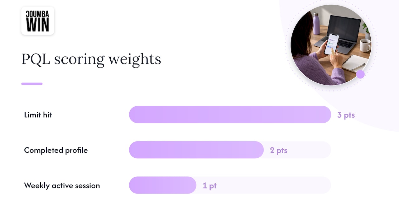
A simple weighted PQL rule might score a limit hit at 3 points, a completed profile at 2, and each weekly active session at 1, then route anyone crossing a threshold to a targeted in-app prompt, and anyone further above it to a sales or success outreach queue. That routing choice matters: in-app prompts work for self-serve moments, human outreach works for higher-value accounts where a conversation moves things faster than a modal ever could.
Message timing should match the task, not a calendar; this is a key principle in lead nurturing explained: Boost conversions with effective strategies. If someone hits their storage limit mid-upload, the prompt should say something like “upgrade to finish this upload,” not a generic “unlock premium features” banner shown to everyone on day three. Cadence matters too: one in-app nudge per blocked action, with any follow-up email cadence built around actual usage gaps rather than a fixed drip schedule.
The through-line here: copy that solves the immediate task beats copy that pressures. A prompt that helps someone finish what they’re already doing converts better than one that guilts them into it.
Feature gating, previews, trials, and pricing UX patterns that reduce friction
Soft gating limits usage (a cap on exports, a cap on seats) while still letting users see and try the feature. Hard gating blocks access outright. Soft gating tends to fit freemium products better because it lets users experience real value before hitting a wall, which is exactly the moment a PQL signal fires.
Previews and teasers do similar work without interrupting flow: a grayed-out advanced chart type with a “preview” label, or a locked template visible in a gallery, builds desire passively instead of via a pop-up.
A small, sourced fact worth designing around: one-click upgrades and seamless billing measurably reduce drop-off at checkout, and immediate activation of paid features after purchase helps prevent buyer’s remorse.
A short checklist for trial and billing mechanics:
- Offer a time-limited full-access trial for users showing strong PQL signals, not everyone.
- Prefill billing forms with account data already on file.
- Activate paid features the instant payment clears, with a visible confirmation.
- Send a short “here’s what changed” summary right after upgrade so the value is obvious immediately.
In-app onboarding patterns and short examples
A few patterns show up again and again in products that handle this well, and they’re worth mapping directly to your own flow.
- Value-first task flow: show one input field, one button, one result. A project management tool might ask only for a project name, then immediately render a usable board, with everything else added later through contextual prompts.
- Progressive reveal tied to behavior: unlock an “automation” tab only after a user completes three manual runs of the same task, so the advanced feature appears exactly when it’s relevant instead of cluttering day one.
- Graceful upgrade modal tied to a blocked action: when someone hits a limit, show a modal that names the specific benefit tied to what they were just doing (“add two more teammates to keep this project moving”), with a visible, easy dismiss option.
Placement matters as much as content. Put the prompt next to the blocked control, not as a full-screen takeover, and always give it a clear exit. Follow-up nudges should reference the same blocked action rather than starting a new pitch from scratch, since consistency here reads as helpful, not naggy. These interactive patterns pair well with the kind of interactive features that improve activation on the marketing side of a product too.
Pro Tip: Log the exact feature and limit that triggered each upgrade prompt. That data becomes your best evidence for which gates are actually driving revenue versus which ones are just annoying people.
Metrics and experiments: what to measure, test, and iterate on
Five numbers matter more than the rest: activation rate (percentage reaching your defined first-value moment), time-to-first-value, PQL rate, free-to-paid conversion, and cohort retention at 30 and 90 days. Track them by cohort, not in aggregate, since a single blended number hides which onboarding change actually helped.
Worth testing directly:
- Gating timing: does a limit hit at action 5 convert better than one at action 15?
- Prompt phrasing: task-specific copy against generic “go premium” copy.
- Trial length: a 7-day full-access trial against a 14-day one for the same PQL segment.
- Checkout friction: a one-click upgrade against a multi-step billing form.
Freemium conversion events are rare by nature, given that typical rates sit around 2 to 5 percent, so small sample tests will mislead you. Size cohorts before you launch a test, run multi-armed tests when you’re short on traffic, and set a success bar based on lift in PQL rate or activation, not just raw upgrade count, since those move faster and give you signal sooner. The retention impact of onboarding choices is worth tracking alongside conversion, since a change that boosts upgrades but tanks 90-day retention isn’t actually a win.
Coumba Win perspective: a 30/60/90-day playbook
Here’s a sequence that gets results without a full rebuild.
- Days 1 to 30: audit every feature-limit moment in your product, instrument the core activation and PQL events, and add contextual help next to your three most-clicked controls.
- Days 30 to 60: build a simple weighted PQL score from the behaviors you’re now tracking, and prototype two or three upgrade message variants tied to actual blocked actions.
- Days 60 to 90: A/B test those messages, then streamline checkout with prefilled forms and instant feature activation.
Pro Tip: Run the audit with actual founders or product leads in the room, not just designers guessing at usage patterns. The fastest fixes usually surface in that first collaborative session.
You can see this kind of rapid prototyping approach in practice through Coumba Win’s project work.
Handling and reducing user churn during onboarding
Most onboarding churn happens in the first session, and it’s rarely about the product being bad. It’s usually about the user not reaching value fast enough to justify coming back. The fix starts with cutting time-to-first-value: if your setup takes ten steps, find the three that actually matter and default or defer the rest.
Watch for silent churn signals: a user who completes signup but never triggers your core action within the first day is at serious risk, and that dropout point deserves its own instrumentation, not just an aggregate activation number. When you spot a common exit point, whether it’s a confusing form field or a feature that requires setup before it pays off, that’s your next fix, not a redesign of the whole flow.
Re-engagement matters too. A short, behavior-triggered email (“finish setting up your first project”) outperforms a generic “we miss you” message, because it points back to the specific unfinished task rather than making the user reconstruct where they left off. Pair that with in-app reminders that pick up exactly where the user stopped, and you turn a chunk of first-session dropouts into second attempts instead of permanent churn.
Psychological principles and behavioral nudges to encourage upgrade
A few behavioral patterns show up consistently in products that convert well, and they work because they respect how people actually decide, not because they trick anyone.
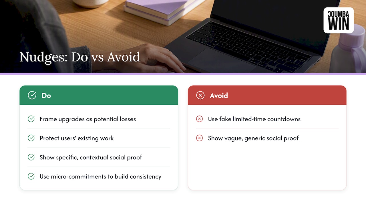
Loss aversion is the strongest one: framing an upgrade prompt around what a user is about to lose access to (their in-progress export, their fifth teammate) tends to land harder than framing it around a hypothetical future benefit. The endowment effect plays a similar role: once someone has built something inside your product, a workspace, a set of templates, they feel ownership over it, and a prompt that protects that investment resonates more than a generic feature pitch.
Social proof works best when it’s specific and contextual, showing what similar accounts or teams have done, rather than a vague “join thousands of users” banner that could belong to any product. And commitment and consistency matters at the micro level: each small action a free user completes (inviting a teammate, connecting an integration) makes the next step, including upgrading, feel like a natural continuation rather than a new decision.
The line between a nudge and a manipulation is whether the prompt is honest about what happens next. A countdown timer on a fake “limited time” discount erodes trust the moment a user notices it resets. A prompt that accurately reflects a real limit or a real deadline does the opposite.
Mobile vs desktop onboarding differences and optimizations
Mobile onboarding has less room for everything, literally. Screen real estate forces harder choices about what counts as the “first meaningful action,” so the value-first task flow needs to be even leaner on mobile than on desktop, often down to a single tap or a single field.
Progressive disclosure matters more on mobile too, since a desktop user can tolerate a slightly busier screen that a phone user can’t. Contextual help patterns need to adapt as well: a hover tooltip doesn’t exist on a touchscreen, so mobile needs tap-to-reveal patterns or a persistent, thumb-reachable help icon instead.
Upgrade prompts also behave differently across platforms. A full-screen modal that feels like a mild interruption on desktop can feel like a hard wall on mobile, where there’s no peripheral vision of the rest of the interface. Favor smaller, dismissible banners tied to the specific blocked action, and keep any billing flow mobile-optimized with native payment options where your platform supports them, since a desktop-style multi-field checkout form is a strong drop-off point on a phone. These distinctions matter enough that they deserve their own mobile-specific UX planning rather than a scaled-down copy of the desktop flow.
Where freemium onboarding advice usually goes wrong
Most freemium onboarding advice treats “reduce friction everywhere” as the whole strategy, and that’s incomplete. Some friction is useful: a limit hit that stops a user mid-task is often the exact moment that produces a PQL signal worth acting on. The real skill isn’t eliminating friction, it’s placing it deliberately at the moments that both protect the free experience and surface upgrade intent.
The other place conventional wisdom overreaches is tutorials. Teams still default to building elaborate product tours because they feel thorough, even though the evidence on interruptive tutorials versus contextual, pull-based help doesn’t support that instinct in a lot of cases. If I had to pick one priority for a team with limited time, it wouldn’t be a prettier onboarding checklist. It would be instrumenting the handful of behavioral signals that predict upgrade readiness, since that data makes every other decision in this article sharper, from gating timing to message copy to which users deserve a human follow-up instead of another in-app banner.
— Coumba Evelyn
Turning this playbook into a shipped onboarding flow
Reading a checklist and shipping it are two different projects, and most product teams are stretched too thin to do the second one on top of a full roadmap. Some agencies work directly with founders to turn exactly this kind of playbook into an audited, redesigned onboarding flow, from progressive disclosure decisions to upgrade prompt copy to check out UX.

If you want a second set of eyes on where your free users are dropping off, start with a look at our services and we’ll scope an audit or a full onboarding redesign from there.
Sources
- Free to Paid Conversion: A B2B SaaS Growth Playbook
- Progressive disclosure
- Cognitive load theory (academic DOI reference)
FAQ
What is a good freemium conversion rate to aim for?
Typical freemium conversion rates run about 2 to 5 percent, which means most of your onboarding effort should focus on identifying and converting that smaller, high-intent segment rather than pushing every free user toward upgrade. Behavioral signals like limit hits and feature adoption predict that segment better than demographics.
Should I use a tutorial or contextual help for onboarding?
Contextual, pull-based help generally performs better than interruptive, push-style tutorials, since NN/g’s research found tutorials don’t reliably improve task performance and often just interrupt the user. Guided, hands-on practice still helps for genuinely new or complex interactions.
What triggers should prompt an upgrade message?
The strongest triggers are behavioral: repeated limit hits, frequent use of a core feature, and a completed account setup, all of which predict upgrade readiness more reliably than broad user attributes. Match the message to the exact task the user was doing when they hit the limit.
How much of the product should be visible before someone signs up or upgrades?
Progressive disclosure principles suggest showing only the primary, most-used options first and revealing advanced features as the user needs them, based on NN/g’s guidance on splitting initial versus secondary features using analytics and testing. This keeps early cognitive load low without hiding the product’s real value.
Does billing UX actually affect whether people finish upgrading?
Yes, one-click upgrades and prefilled billing forms reduce drop-off at the exact moment a user has decided to pay, and immediate activation of paid features afterward helps prevent buyer’s remorse. Friction at checkout undoes a lot of the work a good onboarding flow just did.