Align Website Design with Brand Values That Convert

Align Website Design with Brand Values That Convert
Aligning your website design with brand values means translating every core belief your business holds into a visual and verbal experience visitors feel the moment they land on your homepage. This is what designers call brand-consistent web design, and it goes way beyond picking a color palette you like. When your site reflects who you actually are (not just who you wish you were), visitors trust you faster, stay longer, and convert better. For startups and small businesses, this is not a nice-to-have. It is the difference between a website that works and one that just exists.
How to align website design with brand values from the start
Before you touch a single font or layout, you need to know what you actually stand for. Not in a vague “we value integrity” way. In a specific, operational, this-is-how-we-make-decisions way.
Defining 3 to 5 core brand pillars is the industry standard for maintaining consistent identity across all digital assets. Think of these pillars as the backbone of every design and messaging choice you make. If one of your pillars is “radical transparency,” that shows up in your pricing page (no hidden fees), your About page (real team photos, not stock), and your error messages (honest, human language instead of corporate-speak).
Here is what strong brand pillars look like in practice:
-
Accessibility: Drives high-contrast color choices, plain language copy, and keyboard-friendly navigation
-
Boldness: Pushes you toward larger typography, strong visual hierarchy, and confident calls to action
-
Community: Shapes your testimonials section, your forum or blog, and how you write your newsletter opt-in
-
Precision: Influences tight grid layouts, minimal decoration, and data-forward content presentation
The trap most founders fall into? Picking pillars that sound good in a pitch deck but mean nothing to a designer. Words like “quality” and “excellence” give zero design direction. “Warm and approachable” gives a designer something to work with. “Efficient and no-nonsense” gives them something completely different. Be specific.
Clarity precedes consistency. Define who you are and who you serve before you refine a single design element. Many businesses skip this step and then wonder why their website feels off even after three redesigns.
Pro Tip: Write a one-sentence brand positioning statement before your next design meeting. Format it as: “We help [audience] achieve [outcome] through [differentiator].” Every design decision should pass through that filter.
What does translating brand values into design actually look like?
This is where abstract strategy becomes concrete pixels. And honestly, this is where most small businesses drop the ball.

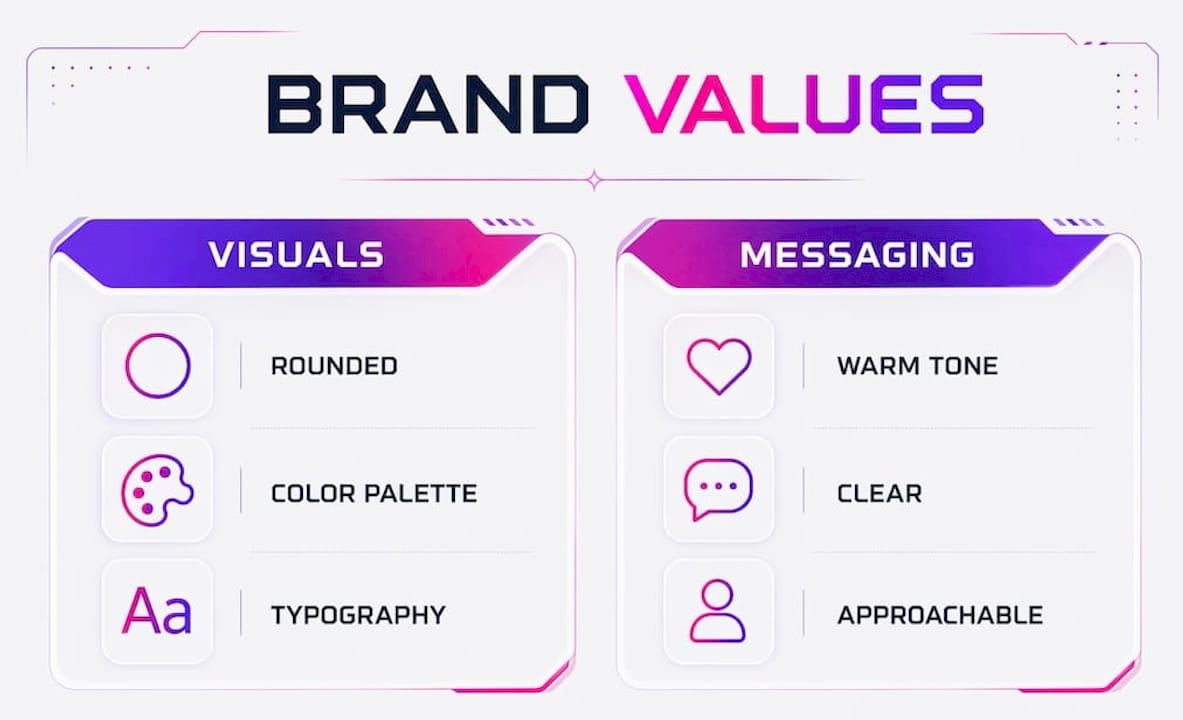
Visual consistency covers your logo, color palette, and typography. But it also covers how you use white space, what kind of photography you choose, and whether your icons feel playful or serious. All of these send signals. Visitors judge credibility within seconds of landing on your site, and if your design does not immediately communicate your brand positioning, they bounce. That bounce is not just a lost visitor. It is a lost sale.
Here is a quick comparison of how two different brand values translate into design decisions:
| Brand value | Visual expression | Messaging tone |
|---|---|---|
| Warmth and approachability | Rounded corners, warm color palette, candid photography | Conversational, uses “you,” avoids jargon |
| Authority and expertise | Sharp edges, navy or charcoal palette, professional headshots | Direct, data-forward, formal but clear |
| Sustainability | Earth tones, minimal design, nature imagery | Purposeful, values-driven, avoids hype |
| Playfulness | Bold colors, custom illustrations, asymmetric layouts | Witty, casual, uses humor intentionally |
Your homepage carries the heaviest load here. It needs to communicate your brand positioning in under five seconds. That means your headline, hero image, and primary call to action must all point in the same direction. If your brand value is “empowering independent creators” but your homepage looks like a generic SaaS template, you have a misalignment problem.
Testimonials are one of the most underused tools for reinforcing brand values on a website. 88% of consumers trust online reviews as much as personal recommendations. That means a well-placed testimonial does not just build social proof. It actively communicates what your brand delivers on. Choose testimonials that speak to your specific brand pillars, not just generic “great service” praise. You can learn more about placing testimonials strategically to maximize their impact.
Pro Tip: Run a five-second test on your homepage. Show it to someone unfamiliar with your brand and ask them to describe what you do and how you make them feel. If their answer does not match your brand pillars, your design is not doing its job.
How does user experience reflect your brand personality?
UX is not just about usability. It is about personality. The way your site moves, responds, and guides users is a direct expression of your brand values. Think of it this way: if your brand is “effortless and intuitive,” but your checkout flow requires six steps and three form fields, you have broken your brand promise.
Here is a numbered approach to mapping UX decisions to brand values:
-
Map your user journey against your brand promise. Write down the three most common paths a visitor takes on your site. For each step, ask: does this interaction feel like our brand? A brand that values speed should have fast load times, short forms, and instant feedback.
-
Audit your navigation structure. Navigation reflects how you think about your users. A brand that values simplicity should have five menu items or fewer. A brand that values depth and expertise might use a resource-rich mega menu. Neither is wrong. Both must be intentional.
-
Check every automated touchpoint. Email confirmations, thank-you pages, and error messages must carry the same tone as your main site. These are the moments users are most emotionally engaged (they just bought something, or something just went wrong), and a generic “404 Not Found” page from a brand that claims to be human-centered is a trust-breaker.
-
Use feedback to test alignment, not just preference. When a stakeholder says “I don’t like this color,” that is subjective taste. When they say “this color does not communicate the premium positioning we need,” that is strategic feedback. Framing feedback as strategic rather than personal prevents endless redesign cycles and keeps your UX decisions grounded in brand logic.
The brands that get this right treat their website like a product, not a brochure. Every interaction is designed with intention, and every design decision traces back to a brand value.
How do you maintain brand alignment over time?
Here is the uncomfortable truth: brand alignment is not a one-time project. It is an ongoing practice. And most startups treat it like a launch checklist item they can tick off and forget.
Documented brand guidelines covering logos, typography, color systems, and tone of voice make maintaining alignment dramatically easier. Without documentation, every new hire, freelancer, or agency you bring in starts from scratch (and usually gets it wrong). With documentation, you have a shared language for every design decision.
Here are the practices that actually keep brand alignment intact over time:
-
Quarterly brand audits: Regular audits prevent misalignment and catch drift before it becomes a full rebrand situation. Walk through your site every three months and ask: does this still reflect who we are?
-
Designate a brand decision-maker: Someone on your team needs to own brand alignment. Not just aesthetics. The strategic fit of every design choice against your core pillars.
-
Separate brand evolution from brand drift: Updating your messaging as your company grows is healthy. Letting your homepage, social media, and email templates slowly diverge from each other is drift. Know the difference.
-
Multi-channel consistency matters: Brands communicating values across multiple channels see 40% higher consumer recall than single-channel efforts. Your website is the hub, but it must speak the same language as your LinkedIn, your pitch deck, and your onboarding emails.
| Practice | Frequency | Why it matters |
|---|---|---|
| Full site brand audit | Quarterly | Catches visual and messaging drift early |
| Brand guidelines update | After major pivots | Keeps documentation current and usable |
| Testimonial refresh | Every 6 months | Ensures social proof reflects current brand positioning |
| UX touchpoint review | Annually | Confirms automated messages still match brand voice |
Key takeaways
Effective website design brand alignment requires defining clear brand pillars first, then translating those pillars into every visual, messaging, and UX decision your site makes.
| Point | Details |
|---|---|
| Define pillars before designing | Establish 3 to 5 specific brand values that give designers concrete direction. |
| Visual consistency signals trust | Logos, color, typography, and photography must all point toward the same brand personality. |
| UX is a brand expression | Navigation, load speed, and error pages all communicate your brand values whether you plan them to or not. |
| Testimonials reinforce values | Choose reviews that speak to your specific brand pillars, not just generic praise. |
| Audits prevent drift | Quarterly reviews catch misalignment before it requires a full redesign. |
What I’ve learned from watching startups get this wrong
I have seen founders spend serious money on a beautiful website that completely misses the mark on brand alignment. Not because the designer was bad. Because nobody had done the work of defining what the brand actually stood for before the first wireframe was drawn.
The pattern is almost always the same. A startup builds detailed visual guidelines (logo variations, hex codes, font stacks) without first clarifying their core brand personality. Then they wonder why the site feels generic even though it looks polished. Many businesses create visual guidelines without clarifying brand personality first, and the result is a site that is technically consistent but emotionally empty.
My honest take? The most expensive mistake you can make is treating your website as a design project instead of a brand strategy project. The visual stuff is the easy part. The hard part is getting clear on who you are, who you serve, and what you want people to feel when they land on your homepage. Once you have that clarity, the design almost writes itself.
I also think startups underestimate the power of their automated touchpoints. Your 404 page, your order confirmation email, your password reset message. These are moments of high user attention, and most brands waste them with generic templates. If your brand is warm and human, your error page should be warm and human too. That level of consistency is what separates brands people remember from brands people forget.
Start with clarity. Build with intention. Audit with honesty. That is the whole game.
— Coumba Evelyn
Ready to build a site that actually looks like your brand?
At Coumba Win Design, we work with founders who are done with websites that could belong to anyone. We build sites that are unmistakably you, from the homepage headline down to the 404 page copy.
If you are starting from scratch or realizing your current site has drifted from your brand, our style guide system gives you a documented foundation for every design decision going forward. We also offer reusable design components built to your brand specs, so your team can move fast without breaking consistency. And if you are gearing up for a pitch or demo, our Demo Day Kit puts your brand front and center in 14 days. Check out what we build and let’s talk about what your website should actually be doing for your business.
FAQ
What does it mean to align website design with brand values?
It means translating your core business beliefs into every visual and messaging element on your site, from color palette and typography to navigation structure and error page copy. The goal is a cohesive experience where visitors immediately understand who you are and what you stand for.
How many brand values should guide my website design?
Three to five core brand pillars is the standard. More than five becomes unmanageable and leads to inconsistent design decisions across your site.
How do testimonials help with brand alignment?
88% of consumers trust online reviews as much as personal recommendations, so testimonials that speak directly to your brand pillars do double duty. They build credibility and reinforce what your brand actually delivers.
How often should I audit my website for brand alignment?
Quarterly audits are the recommended practice. They catch visual and messaging drift before it becomes a full redesign problem, especially as your brand evolves with your business.
What is the biggest mistake startups make with brand-consistent web design?
Starting with visual guidelines before defining brand personality. A polished site with no clear brand identity feels generic no matter how good the design is. Clarity about your values, audience, and positioning must come first.
Recommended