Startup Wireframing: Test One Core Flow in 30–90 Minutes
Startup Wireframing: Test One Core Flow in 30–90 Minutes
Start wireframing by sketching the core user flow for one critical task, the thing your product absolutely has to nail. Spend 30 to 90 minutes on that first sketch and a quick test. That single move validates your biggest assumptions, saves your engineers from building the wrong thing, and gets your whole team nodding at the same picture before a line of code gets written.
TL;DR:
- Use a static wireframe to check whether a layout makes sense; choose a clickable prototype when users must navigate branching logic or multistep interactions.
- Keep early concepts low fidelity; use medium fidelity with real copy for usability tests, and reserve polished visuals for investor pitches or final handoffs.
- Sketch two or three competing directions before choosing one, then test the strongest with real content to expose assumptions before development.
- Recruit five people for a quick sketch test, ask them to explain each screen, and track task completion, pauses, and perceived ease.
- Move from paper to a shared tool only when collaboration becomes difficult; annotate interactions, map screen flows, and document errors and empty states for engineers.
Table of Contents
- What Is a Wireframe, and How Is It Different From a Prototype?
- Why Wireframing Pays Off for Startups
- Low-, Mid-, and High-Fidelity: Picking the Right Level of Polish
- A Five-Stage Wireframing Workflow You Can Run This Week
- Choosing Tools and Templates Without Overthinking It
- Testing Your Wireframes Without Spending Real Money
- What Belongs in a Wireframe Handoff Package
- How Founder-Led Teams Keep Wireframing Fast and Useful
- The Part of Wireframing Most Founders Get Wrong
- Need an Expert Hand on Your Wireframe-to-Launch Process?
- FAQ
- Sources
What Is a Wireframe, and How Is It Different From a Prototype?
Okay, let’s get the vocabulary sorted because founders mix these up constantly (we did too, once upon a time). A wireframe is a structural blueprint. It shows where things go: the header, the button, the form field, the empty state message. No colors, no fonts, no fake testimonials with stock photos. Just boxes, labels, and arrows that say “this leads to that.”
A prototype is the next step-up, where some (or all) of those boxes actually respond when you click them. Prototypes answer questions about flow and feel. Can someone complete a signup without getting stuck? Does the checkout process feel like three steps or ten? Yale’s usability resources point out that prototypes reveal navigation and task completion issues that a static wireframe simply cannot, because nothing in a wireframe actually moves.
So which do you need? Depends on the question you’re asking:
- If you’re asking “does this layout make sense,” a wireframe is enough.
- If you’re asking “can a user actually get through this flow without rage-quitting,” you need a prototype.
- If you’re asking “will investors understand our value prop in five seconds,” a wireframe of the landing page is usually plenty.
A typical founder deliverable at this stage is a 3 to 5 screen wireframe covering one core task, say, sign up, create a profile, and hit the main dashboard. That’s it. You’re not wireframing your entire app on day one. You’re wireframing the part that determines whether the rest of the app even matters.
Why Wireframing Pays Off for Startups
Here’s the thing about skipping wireframes: it feels faster in the moment and costs you later, usually right when you can least afford it. Wireframing forces decisions early, when they’re cheap to change, instead of after a developer has spent two weeks building a screen nobody actually wanted.
The practical benefits stack up fast:
- Faster decisions, because arguing over a box on a page takes ten minutes; arguing over a built feature takes a sprint.
- Fewer scope changes mid-development, since the structure was agreed on before anyone touched code.
- Clearer estimates, because engineers can scope real screens instead of a vague verbal description.
- Stakeholder alignment, so your cofounder, your designer, and your first hire are all picturing the same product.
Smashing Magazine’s wireframe guidance notes that wireframing helps teams avoid scope and development surprises by clarifying screens, elements, and interactions before anyone starts polishing pixels. That clarity is the whole point: wireframes aren’t about looking finished, they’re about catching the expensive mistakes while they’re still cheap.
Poor user friendliness is cited as a failure reason by a notable percentage of failed startups, according to CB Insights data referenced in that same piece. That’s not a small number when you consider how much of it is preventable with an afternoon of sketching and testing before you build anything.
After you wireframe, watch for a few signals that it worked: fewer “wait, what does this button do” questions from your dev team, fewer mid-sprint change requests, and testers who complete your core task without you explaining it to them first. If those show up, you’re doing it right.
Low-, Mid-, and High-Fidelity: Picking the Right Level of Polish
Fidelity is just a fancy word for “how finished does this look.” And founders consistently pick the wrong level, usually erring toward too much polish too soon.
Here’s the breakdown:
- Low-fidelity: gray boxes, stick-figure sketches, placeholder text. Great for structure and flow conversations.
- Mid-fidelity: real layout, real copy, no color or final branding. Great for usability testing.
- High-fidelity: looks like the finished product. Great for investor decks and final developer handoff, terrible for early-stage feedback because people critique the color instead of the flow.
NN/g’s research on parallel and iterative design warns against equating fidelity with progress. Premature high-fidelity work increases your emotional attachment to a design and slows down the iteration you actually need. Grayscale boxes early, detail added only where it represents something crucial (like a confusing edge case), that’s the move.
Decision rules that keep you from overbuilding too early:
- Testing a core flow with five random people? Low-fidelity, every time.
- Showing engineers what to build? Mid to high-fidelity, with annotations.
- Pitching investors on Demo Day? High-fidelity, because nobody funds a gray box.
A quick test to confirm you picked the right fidelity: if testers are commenting on your font choice instead of whether they could find the “buy” button, you went too polished too early.
Pro Tip: If a tester asks “is this the real color,” you’ve shown them too much fidelity for the question you’re actually trying to answer.
A Five-Stage Wireframing Workflow You Can Run This Week
This is the compact version, built for a founder with a product to validate and not much spare time. Each stage is time-boxed on purpose.
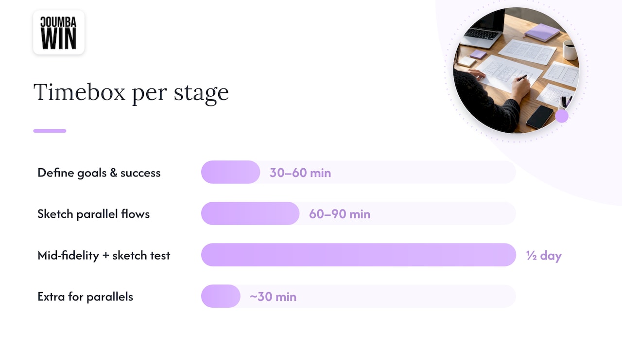
- Define goals, users, and success metrics (30 to 60 minutes). Write down the single task you’re validating, who’s doing it, and what “success” looks like (completed signup, found the pricing page, whatever matters for your product).
- Sketch parallel flows (60 to 90 minutes). Don’t commit to one layout. NN/g’s guidance on parallel design is blunt about this: multiple quick alternatives beat one polished idea, because comparing options surfaces assumptions you didn’t know you were making. Sketch two or three directions, on paper or in a quick digital tool, before you fall in love with any of them.
- Convert to mid-fidelity and run a sketch test (half a day). Pick the strongest direction, build it out with real content, and test it immediately. NN/g’s sketch test method is dead simple: hand someone your wireframe, ask them to explain what each screen does, and have them sketch what they understood. Mismatches between their sketch and your intent tell you exactly where the confusion lives.
- Iterate, then decide: prototype or build? If your core flow has interaction-heavy moments (drag and drop, multistep forms, anything with branching logic), move to a clickable prototype before development. If it’s mostly static screens and simple navigation, you may be able to skip straight to development with annotated wireframes. Yale’s usability team frames this well: prototypes exist to answer interaction questions wireframes can’t, so only build one when you actually have an interaction question.
- Package the handoff. Annotated screens, a flow diagram, and a short list of edge cases. We’ll get into exactly what belongs in this package in a later section, but the short version: nothing should require a Slack message to clarify.
Pro Tip: Timebox every stage out loud, in the room, before you start. “We have 90 minutes for sketching” keeps founders from polishing a login screen for three hours instead of testing five different flows.
What makes this workflow work for startups specifically is the parallel step. Most founders go straight from idea to a single detailed wireframe, skipping the comparison that would have caught a bad assumption. Running two or three rough directions side by side costs you maybe 30 extra minutes and regularly saves you from building the wrong thing entirely.
Choosing Tools and Templates Without Overthinking It
You don’t need expensive software to start. You need a tool that matches how your team actually works, and a template that keeps you from staring at a blank canvas.
Tool categories, roughly in order of how most startups graduate through them:
- Paper or whiteboard: zero cost, fastest for the parallel-sketch stage, terrible for remote collaboration.
- Lightweight apps (Balsamiq, Excalidraw, Whimsical): quick, low-fidelity by design, good for solo founders or very small teams.
- Collaborative platforms (Figma): best when multiple people need to edit the same file live, essential once you have a designer and a developer working together.
On the Figma question specifically: pricing is seat-based, and only editors are billed, so viewers and commenters are free. CompareTiers’ 2026 breakdown of Figma pricing notes that the Starter tier caps out at two editors and three projects, which fits a scrappy two-person founding team fine. Once you add a third editor or need more projects, the Professional tier becomes the practical choice for most small teams. Either way, you’re not committing to an expensive platform just to sketch a login screen.
Our rule of thumb: stay paper-first until collaboration friction becomes a real problem (someone’s always waiting for a file, or feedback is getting lost in screenshots). That’s your signal to move to a shared digital tool.
A starter template that works for almost any first wireframe pass:
- Name every screen clearly (Signup_01, Dashboard_02), not “Screen 1” and “Screen 2.”
- Annotate anything non-obvious directly on the wireframe, not in a separate document nobody reads.
- Reuse the same button, input field, and navigation components across screens instead of redrawing them each time.
That last point matters more than it sounds. If your signup button looks different on every screen, your engineer doesn’t know if that’s intentional or a mistake.
Testing Your Wireframes Without Spending Real Money
This is where a lot of founders either skip entirely or massively overbuild. You don’t need a usability lab. You need five people and an hour.
The sketch test is the fastest option: print your wireframe (or share the file), ask a colleague or a willing stranger to walk through it and explain each screen in their own words, then have them sketch what they think they just saw. NN/g’s write-up on the sketch test frames this as a way to catch major misunderstandings before a wider review, and it’s accurate: a 30-minute session regularly surfaces confusion that would have taken a full sprint to uncover after launch. NN/g also notes that a founder sketching alongside the tester tends to reveal assumptions that never come up in a verbal brief.
For recruitment, don’t overthink it. Friends, early signups on your waitlist, or people at a coworking space usually work fine for this early stage. You’re not running a scientific study, you’re catching obvious confusion.
What to measure:
- Task success: did they complete the core action without help?
- Time on task: how long did it take, and where did they pause?
- Perceived ease: a quick System Usability Scale style question (“how easy was that, 1 to 5”) gives you a rough signal.
A 2026 academic comparison of prototype and live-system testing found that prototype testing reliably surfaces usability issues early and provides a predictive signal of perceived usability for the live product. That’s the entire argument for testing before you build: the feedback you get from a rough version tends to hold up once the real thing ships.
Once you’ve got your notes, sort them into a short prioritized list: fix immediately, fix before launch, watch and revisit. Don’t try to fix everything someone mentions. If you want a repeatable weekly cadence for this kind of fast testing beyond the wireframe stage, Rivetline’s creative testing framework is a useful reference for keeping that habit going after launch too.
What Belongs in a Wireframe Handoff Package
Engineers build what they can see, not what you meant. A clean handoff package is the difference between a build that matches your intent and three weeks of “wait, is this supposed to do that?”
Standard artifacts to include:
- Annotated wireframes with notes on every non-obvious interaction or state.
- A full user flow diagram showing how screens connect, including dead ends and error states.
- Acceptance criteria per screen (what “done” looks like for this specific feature).
- Edge-case notes: empty states, loading states, error messages, what happens when a form field is left blank.
Shared component libraries matter here too. If your wireframes reuse the same named button and field components throughout, your engineer builds one reusable component instead of five slightly different versions of the same thing. Naming consistency (Signup_01, not “the second screen”) removes a surprising amount of back-and-forth.
Pro Tip: Attach your handoff checklist directly to the ticket or PRD, not as a separate linked document. If engineers have to go hunting for context, they’ll guess instead, and guesses are where scope creep lives.
Get this right once and it becomes a template you reuse for every future feature, which is exactly the kind of system that matters once you’re moving fast across a founder’s typical website launch timeline.
How Founder-Led Teams Keep Wireframing Fast and Useful
In our work with early-stage founders, the fastest, highest-quality wireframing sessions share a pattern: the founder sketches too, not just the designer. When a founder sits in on the rough-sketch stage, assumptions that never made it into the verbal brief show up on paper within minutes, exactly the kind of gap NN/g’s sketch test findings describe.
A typical cadence we see work well: a short kickoff to define the one task worth validating, a same-day parallel sketch session, a round of mid-fidelity wireframes within 48 hours, and a handoff package ready before the end of the week. Documenting assumptions as you go (not after) keeps the feedback loop tight instead of circular.
One pattern worth naming: teams that test a rough wireframe with five real users before touching high-fidelity design consistently catch navigation confusion that would otherwise surface as support tickets after launch. The fix at the wireframe stage takes an hour. The fix after launch takes a sprint, plus some uncomfortable user emails.
The Part of Wireframing Most Founders Get Wrong
Here’s our honest take: most founders treat wireframes as a deliverable to hand off instead of a question to answer, and that mindset is exactly backward. A wireframe that looks tidy but never got tested hasn’t taught you anything, it’s just a nicer-looking guess.
The conventional advice tells founders to wireframe “the whole app” before building. We’d push back on that. Wireframe the one flow your business depends on, test it hard, and let everything else stay rough until it matters. Polish is a trap disguised as progress: a gorgeous wireframe of the wrong flow still ships the wrong product.
What we’d prioritize first, always, is the test, not the tool. Founders obsess over which app to use when the real risk is skipping the five-person sketch test that would have caught the confusing navigation before a single engineer touched it. Fast and rough, tested early, beats slow and polished every time.
— Coumba Evelyn
Need an Expert Hand on Your Wireframe-to-Launch Process?
Wireframing is only valuable when someone turns the insights into a real, working product, and that’s the part where most founders run out of time or patience. We handle that full arc: UX design to validate your core flow, UI design and development to turn tested wireframes into a production-ready site, and the handoff documentation that keeps your build on track.

What a typical engagement looks like: we start by mapping your core user task with you (the same founder-sketch-in-the-room approach that catches assumptions early), move through tested wireframes within days, then carry that work straight into UI design and development without the usual back-and-forth of re-explaining intent to a new team. If you’re further along and need a consistent design system across future features, our style guide work keeps everything aligned as you scale.
Ready to see how this works for your product? Visit Coumba Win to start the conversation, or check out our Webflow development work to see what a finished build looks like after the wireframing is done right.
FAQ
Is wireframing part of UX or UI design?
Wireframing belongs to UX design, since it focuses on structure, flow, and function rather than visual style. UI design comes later and handles color, typography, and the finished look once the structure is validated.
What are the three main types of wireframes?
The three types are low-fidelity (gray boxes and rough sketches for flow discussions), mid-fidelity (real layout and copy for usability testing), and high-fidelity (polished, near-final visuals for investor decks or developer handoff). Most startups should work in low to mid-fidelity for as long as possible before adding visual polish.
Which software is commonly used for wireframing?
Paper and whiteboards work well for the earliest sketching, while lightweight apps like Balsamiq or Excalidraw suit solo founders, and collaborative platforms like Figma fit teams that need to edit the same file together. Figma’s seat-based pricing only charges editors, which keeps costs manageable for a small founding team.
Is Figma considered a wireframing tool?
Figma supports wireframing along with higher-fidelity UI design and prototyping, so it covers the whole process in one file rather than being limited to one stage. Many startup teams use it from the first rough sketch through final developer handoff.
When should a startup move from wireframe to prototype?
Move to a prototype once your flow includes real interaction questions, like multi-step forms, drag-and-drop, or branching navigation, that a static wireframe can’t answer. Yale’s usability resources note that prototypes reveal navigation and task-completion issues wireframes simply cannot show.