Visual Storytelling for Social Impact on Startup Traction

Visual Storytelling for Social Impact on Startup Traction
Visual storytelling, meaning a consistent identity, repeatable content formats, and investor-grade pitch visuals working together, accelerates engagement and investor traction for startups. A DOI-published study on visual rhetoric ties clean design choices to measurable persuasion effects in investor psychology. Coumba Win Design has watched this play out directly with founders who rebuilt their pitch narrative before a raise instead of after.
Here’s the one move to make this week:
- Pick exactly one visual format (short-form video, carousel, or a demo clip) and commit to a single narrative theme for 90 days before judging results.
Everything below explains why that works and how to execute it without burning your runway on guesswork.
Key Takeaways
Visual storytelling drives startup growth when a consistent identity, repeatable formats, and research-backed pitch design work together over a sustained 90-day window.
| Point | Details |
|---|---|
| Commit to one format first | Choose one primary format and one narrative theme, then hold it for 90 days before judging results. |
| Keep pitch decks to 8 to 12 slides | Decks in this range correlate with better funding outcomes than longer, denser decks. |
| Measure saves and completions, not likes | Track saves, shares, completion rates, and click-to-demo conversion as the real resonance signals. |
| Create one core asset, then repurpose | Build a high-effort core piece first and derive shorter formats from it to preserve consistency. |
| Partner with Coumba Win Design for execution | Coumba Win Design bundles branding, pitch decks, and website storytelling into short, collaborative sprints built for founders. |
Table of Contents
- Why Visual Design Changes Investor and User Behavior
- What Foundations Do You Need Before You Scale Content?
- How Do You Turn One Asset Into a Month of Content?
- What Makes a Pitch Deck Investor-Ready?
- What Should You Actually Measure?
- How Do You Roll This Out in 90 Days?
- What Do Real Coumba Win Engagements Look Like?
- Where the Conventional Advice on This Falls Short
- Ready to Build This With a Design Partner?
- Sources
- FAQ
Why Visual Design Changes Investor and User Behavior
Design isn’t decoration. Typography, color, and hierarchy function as a cognitive-load manager, deciding how fast a stranger understands what you do and whether they trust you enough to keep reading. The DOI study on visual rhetoric and investor psychology frames these choices as persuasion tools, not aesthetic preferences. That distinction changes how you should brief a designer.
Statistic Callout: Analysis of pitch decks shows sans-serif typography correlates with higher funding advantage over serif-heavy layouts, a gap wide enough that font choice belongs in the same conversation as your financials.
Clear visuals also speed up comprehension enough that an internal champion, the person on the buyer’s side pushing your product up the chain, can explain it to their boss without you in the room. That’s the quiet mechanism behind faster B2B sales cycles: polished visuals act as a trust signal before anyone reads a word of your pitch.
What Foundations Do You Need Before You Scale Content?
Four things need to exist before you start posting daily or building decks for every investor meeting. Skip this step and you’ll produce a lot of content that looks like it came from four different companies.
- Identity rules. A tight color palette (two to three core colors, not a rainbow), one typography system with clear rules for headlines versus body text, and two or three composition patterns you reuse deliberately.
- Narrative rules. Write two or three variants of your origin story, pick a monthly narrative theme, and settle on a consistent hero-to-user framing. That means your customer is the hero of the story, not your product.
- Format rules. Match format to funnel stage. Short-form video and infographics build awareness fast; carousels build understanding; demo clips convert. Brandlix’s 2026 format analysis puts these three formats ahead of static posts for engagement.
- Composition heuristics. Strong contrast, one clear subject per frame, and a golden-ratio-informed layout as a starting heuristic, not a rulebook you follow religiously.
Pro Tip: Build your core identity assets in a shared design language that mirrors your actual product UI. When your marketing visuals and product screens look related, demos feel familiar instead of jarring, and that familiarity shortens the path from “interesting” to “let’s talk.”
Our guide on website storytelling techniques for startups walks through how to carry these same rules into your product site.
How Do You Turn One Asset Into a Month of Content?
The founders who burn out on content creation almost always start by trying to produce everything from scratch, every time. The fix is a create-once, adapt-often workflow.
Start here:
- Choose two to three formats maximum for your first quarter, not five. For practical tips on short-form video formats that build impact, see Social Video: Short Form, Big Impact.
- Build the highest-effort “core” asset first, usually a demo video or a founder interview, before deriving anything from it.
- Set a two-week production cadence: one core asset every two weeks, with lighter derivative pieces filling the gaps.
Then repurpose on a schedule:
- Cut the core asset into a 30-second short-form video for quick-scroll platforms.
- Pull three to five stills into a carousel that walks through the same story slower.
- Extract a single stat or before/after into a one-frame infographic.
- Ask early users for a 15-second reaction clip or screen recording, and weave that user-generated footage between your polished pieces.
That last step matters more than founders expect. Behind-the-scenes and problem-solving visuals, your team debugging something live, a customer walking through their actual workflow, tend to outperform glossy lifestyle shots when the goal is a demo request instead of a like.
What Makes a Pitch Deck Investor-Ready?
Your deck is a visual artifact whether you treat it that way or not. A quantitative study of 10,247 venture capital pitch decks found clear patterns worth building into your checklist before your next raise.
- Aim for 8 to 12 slides. The same analysis found funding likelihood drops as slide count climbs past that range, which usually means you’re explaining instead of showing.
- Use sans-serif typography with a strong visual hierarchy, one headline size, one subhead size, generous white space between blocks.
- Keep your color palette moderate rather than saturated across every slide; the research ties balanced layout proportions to stronger outcomes than dense, cluttered slides.
- Add one short demo or motion slide near the middle of your deck. Demo videos and motion-rich visuals can re-anchor an investor’s attention right when slide fatigue usually sets in.
Treat these as heuristics pulled from a large sample, not laws of physics. But when a pattern shows up across ten thousand decks, it’s worth designing toward it on purpose.
What Should You Actually Measure?
Likes tell you almost nothing about whether your visuals are moving your business forward. Saves, shares, and completion rates say far more, because they measure whether someone found the content worth keeping or finishing, not just glancing at.
Track the full chain, not just the top of it:
| Metric | What It Tells You |
|---|---|
| Saves and shares | Whether the content earns enough trust to be passed along or bookmarked |
| Completion rate | Whether your narrative pacing holds attention to the end |
| Click-to-demo rate | Whether the visual actually converts curiosity into a booked call |
| Demo-to-pilot rate | Whether the story you told matches the product experience |
Run structured A/B tests on visual hierarchy (which element sits first) and CTA framing, then check both the micro metric (completion rate) and the macro one (pilot conversions) before declaring a winner. Our post on user engagement design covers how to structure these tests without needing a data science team.
How Do You Roll This Out in 90 Days?
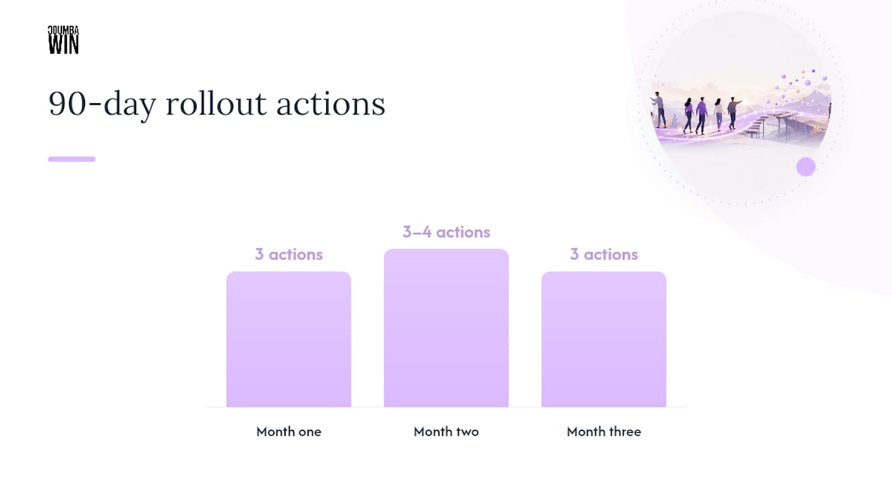
A 90-day minimum is the realistic window before you can judge whether a visual direction is working, so build your plan around three distinct phases instead of one long sprint.
- Month one: Finalize your identity system, produce your first core asset, and build a simple content calendar mapping formats to weeks.
- Month two: Publish on your two-week cadence, repurpose each core asset into three or four derivative pieces, and start logging baseline engagement numbers.
- Month three: Run your first A/B tests, fold the winning patterns into your investor deck, and schedule pitch meetings once your materials reflect what actually worked.
Pro Tip: Don’t touch your pitch deck’s visual system until month three. Let real audience data, not your own taste, tell you which layout and color choices are actually earning attention.
Our piece on motion design for brand engagement is worth a read heading into month two, right when most teams start wondering if a demo clip is worth the extra production time.
What Do Real Coumba Win Engagements Look Like?
Two projects show what this playbook produces in practice. An edtech platform came to Coumba Win Design with a confusing onboarding flow that buried its core value behind three screens of setup; a UX overhaul built around a clearer visual hierarchy and a simplified narrative arc cut that friction down to a single guided flow. A high-end apparel brand needed its story reframed entirely, moving from generic lifestyle imagery to a narrative built around craftsmanship and material sourcing, the kind of specific, verifiable story that gives a brand something to actually say.
The pattern across both engagements: founders who treat visual identity as a strategic asset, not a launch-week checkbox, get further with investors and users because the story holds up under repeated exposure.
Coumba Evelyn structures these engagements as short, collaborative sprints rather than long agency retainers, working directly with founders who see design as leverage rather than decoration.
Where the Conventional Advice on This Falls Short
Most guidance on visual storytelling treats it as a branding exercise, something you do once and revisit during a rebrand two years later. That framing misses what the pitch-deck research actually shows: design choices correlate with funding outcomes on a rolling basis, tied to specific decisions like slide count and typography, not a one-time identity refresh.
The bigger gap is patience. Founders will test a new visual direction for two weeks, see flat numbers, and abandon it. Ninety days is the honest minimum before a narrative theme has had a fair shot to build recognition. Judging it sooner isn’t rigor, it’s impatience wearing a data hat.
What I’d prioritize first, before formats, before cadence, before even the deck, is the shared design language between your marketing and your actual product UI. Every other tactic in this guide compounds faster once that alignment exists, because a demo starts feeling like a continuation of the story instead of a break from it.
Ready to Build This With a Design Partner?
Reading a 90-day plan is one thing. Executing it while also running product, sales, and everything else on a founder’s plate is another. Coumba Win Design exists specifically for that gap: a design partner that builds your identity system, pitch deck, and website narrative as one connected package instead of three disconnected vendors.

Depending on what stage you’re at, that might mean a full branding and website engagement, a focused pitch-deck sprint before your next raise, or a Components build if you need engineering-delivered design work that scales with your product. Engagements are structured as short, collaborative sprints rather than open-ended retainers, and success gets measured against the same signals covered above: saves, shares, completion rates, and demo conversions, not vanity metrics. If your pitch deck is still running fifteen slides deep or your product site tells a different story than your product actually delivers, that’s the fix to make before your next investor meeting. Start by looking at Coumba Win Design and see which engagement fits where you are right now.
Sources
- Visual rhetoric and investor psychology (DOI study, 2026-01-02)
- Quantitative Analysis of Visual and Structural Patterns in Venture Capital Pitch Decks
- Visual Storytelling for Brands: The Complete Guide 2026 - Brandlix Blog
- Visual storytelling b2b startups guide - UseVisuals
- Visual Storytelling for Startups - Framework Films
FAQ
What Is the Best Visual Format to Start With?
Short-form video, carousels, and infographics are the strongest starting formats, but pick just one to build a core asset before spreading across all three.
How Many Slides Should a Pitch Deck Have?
Aim for 8 to 12 slides; that range correlates with better funding outcomes than longer, denser decks in large-sample analysis.
How Long Should You Test a Visual Direction Before Changing It?
Give a new visual identity or narrative theme a minimum of 90 days before deciding whether it’s working.
What Metrics Actually Matter for Visual Content?
Saves, shares, and completion rates matter more than likes because they measure whether someone found the content worth keeping or finishing.
Can Coumba Win Design Help With Pitch Decks and Websites Together?
Yes. Coumba Win Design builds branding, pitch decks, and website storytelling as one connected engagement, so your investor materials and product site tell the same story.


