Why Navigation Structure Affects UX: A 2026 Guide

Why Navigation Structure Affects UX: A 2026 Guide
Navigation structure is defined as the organized system of links, labels, and hierarchies that determines how users move through a digital product. It is the single most consequential structural element in user experience design, shaping whether users complete tasks, stay engaged, or leave in frustration. Understanding why navigation structure affects UX is not optional for web designers and UX professionals. It is the foundation every other design decision rests on. Get it wrong, and no amount of beautiful UI will save your product.
Why navigation structure affects UX more than any other design decision
Navigation structure controls cognitive load. Cognitive load is the mental effort a user spends processing information instead of completing a goal. When navigation is clear and predictable, users spend their mental energy on their actual task. When it is confusing, they spend it on figuring out where to go next, and that is a losing battle.
Miller’s Law and Hick’s Law both speak directly to this. Miller’s Law tells us working memory holds roughly 7 items at once. Hick’s Law says decision time increases with the number of choices. Applied to navigation, navigation systems exceeding 7 primary items cause measurable declines in task completion due to cognitive overload. The sweet spot is 4–6 top-level items. That range keeps decisions fast and memory load low.

The payoff for getting this right is significant. Well-designed navigation improves task completion success by 50% compared to confusing hierarchies. That is not a marginal gain. It is the difference between a product that works and one that hemorrhages users.
Visibility matters just as much as item count. Hiding navigation reduces content discoverability by over 20%, increases task difficulty by 21%, and slows desktop task completion by at least 39%. Desktop users engage with visible navigation 48–50% of the time versus only 27% for hidden navigation. That gap is enormous and explains why hamburger menus on desktop consistently underperform.
- Keep top-level navigation items between 4 and 6.
- Use visible navigation on desktop whenever possible.
- Reserve hidden navigation patterns for secondary or utility links.
- Test navigation with real users before launch, not after.
Pro Tip: Run a five-second test on your navigation. Show users your site for five seconds, then ask them to name the main sections. If they can’t recall at least three, your navigation labels need work.
How does navigation hierarchy and labeling reduce user friction?
Hierarchy is the backbone of navigation design. A well-structured hierarchy tells users where they are, where they have been, and where they can go next. A weak one leaves them guessing, and guessing breeds frustration.
The core trade-off in hierarchy design is breadth versus depth. A broad, flat structure puts more options at the top level, which reduces clicks but increases cognitive load. A deep structure hides options behind multiple layers, which reduces visual clutter but increases clicks and memory demand. Effective navigation balances breadth and depth with 4–6 primary categories and no more than two levels of depth. Deviation from that pattern almost always signals a categorization problem, not a design problem.
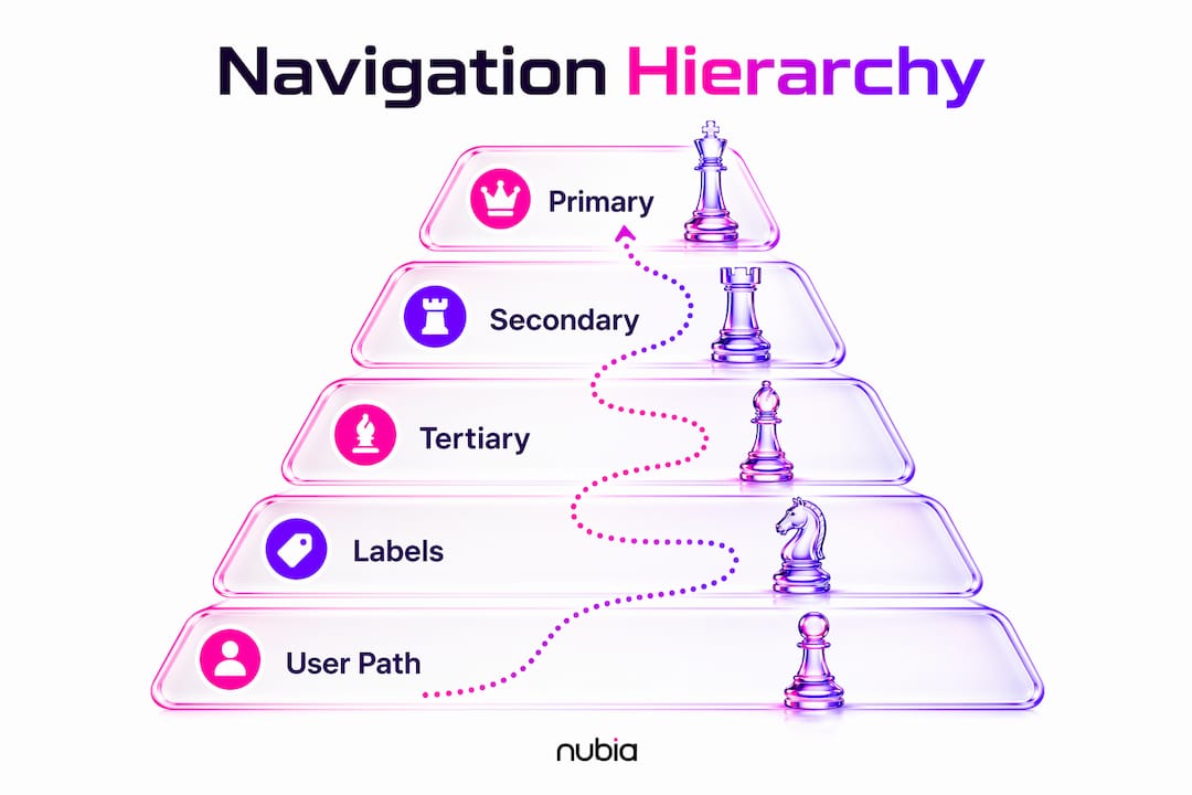
Labeling is where most teams quietly fail. Labels must match the vocabulary users already use, not the internal language of the organization. When labels reflect how the company thinks rather than how users think, navigation mismatch becomes a measurable driver of task failure. Users hit a label, expect one thing, find another, and leave.
Here is a practical process for building hierarchy and labels that actually work:
- Run a card sort. Give users index cards with your content categories and ask them to group and label them. Their groupings reveal their mental model.
- Audit your current labels. Compare your navigation vocabulary against the words users type into your search bar or support chat.
- Add breadcrumbs for depth. Any site with more than two levels of hierarchy needs breadcrumbs. They give users a map of where they are without requiring them to remember their path.
- Use local navigation for content-heavy sections. A sidebar or in-page nav keeps users oriented inside a section without forcing them back to the global menu.
- Test with tree testing. Tree testing isolates navigation structure from visual design, so you know whether the hierarchy works before you build anything.
Pro Tip: Avoid clever or branded labels in primary navigation. “The Hub,” “Our World,” and “Explore” tell users nothing. “Resources,” “About,” and “Products” convert better because users already know what to expect.
What is navigation structure’s impact on SEO and content discoverability?
Navigation structure does two jobs simultaneously. It guides human users and signals content priority to search engines. Most designers focus on the first job and forget the second entirely.
Pages linked in primary navigation receive more SEO authority than pages buried in footers or linked only from body content. Search engine crawlers treat navigation links as editorial signals. A link in your main nav says, “This page matters.” A link buried three levels deep says the opposite. The structure of your navigation directly shapes how crawlers index your site and how authority flows across pages.
Label keywords matter too. Navigation labels are crawled as anchor text. “Services” passes less keyword signal than “UX Design Services.” Neither is wrong, but the specific label gives search engines more context about what the linked page covers.
| Navigation element | UX impact | SEO impact |
|---|---|---|
| Primary nav links | Reduces cognitive load, aids wayfinding | Passes highest link authority to linked pages |
| Descriptive labels | Matches user mental models, reduces friction | Provides keyword context as anchor text |
| Consistent cross-device nav | Maintains user orientation on all screens | Supports mobile-first indexing requirements |
| Hidden or hamburger menus | Lowers discoverability by over 20% on desktop | Reduces crawl frequency of hidden links |
Mobile navigation deserves its own attention. Mobile navigation requires different structural decisions than desktop, and search engines now index the mobile version of your site first. A navigation structure that works beautifully on desktop but collapses into an inaccessible hamburger menu on mobile will hurt both users and rankings. Consistent navigation across devices is not a nice-to-have. It is a technical SEO requirement. For more on mobile-specific decisions, the mobile UX best practices guide at Coumba Win Design covers the structural considerations in detail.
What are the most common navigation design pitfalls?
Most navigation problems fall into a small number of repeating patterns. Recognizing them early saves enormous rework later.
- Too many top-level items. Anything above 7 primary items triggers decision fatigue. Users stop reading the list and start guessing. Cut ruthlessly.
- Excessive depth. Navigation structures deeper than 3 clicks harm user performance. If users need more than two layers to reach content, the content is probably miscategorized, not just buried.
- Org-chart navigation. This is the most common enterprise mistake. The navigation reflects internal departments rather than user tasks. Users do not care that your company has a “Solutions Delivery” team. They want to find pricing.
- Overusing hamburger menus. Hidden navigation is used only 27% of the time by desktop users. Hiding your navigation on desktop to save visual space costs you engagement and discoverability.
- No governance plan. Navigation grows over time as teams add pages. Without a governance process, it becomes a junk drawer. Assign someone to own navigation decisions and review the structure quarterly.
Pro Tip: Before any navigation redesign, run a first-click test. Ask users where they would click to complete a specific task. If fewer than 80% click the correct first link, your structure has a real problem, not just a visual one.
The fix for most of these pitfalls is the same: go back to user research. Card sorting, tree testing, and first-click testing are the three methods that reliably surface structural problems before they reach production. The role of information architecture in UX design explains how these methods connect to broader IA decisions.
Key Takeaways
Navigation structure is the primary driver of user task success, cognitive load, and SEO authority, making it the highest-leverage design decision on any digital product.
| Point | Details |
|---|---|
| Optimal item count | Keep top-level navigation to 4–6 items to prevent cognitive overload and decision fatigue. |
| Visible beats hidden | Visible navigation outperforms hidden menus by 21–39% on task difficulty and completion speed. |
| Labels must match users | Use vocabulary from card sorts and search queries, not internal org language, to reduce navigation mismatch. |
| Navigation drives SEO | Primary nav links pass the highest link authority; descriptive labels function as keyword-rich anchor text. |
| Depth limit matters | Limit navigation to two levels of depth; structures deeper than three clicks measurably harm user performance. |
Navigation is a product decision, not a UI detail
I have audited a lot of digital products over the years, and the pattern I keep seeing is this: teams spend months on visual polish and almost no time on navigation structure. Then they wonder why users are not converting, why support tickets keep piling up, and why onboarding costs are through the roof.
Here is the uncomfortable truth. Poor navigation structure leads teams to add costly onboarding, tooltips, and support layers rather than fixing the root cause. I have watched startups spend $30,000 on an onboarding flow that would have been unnecessary if the navigation had been structured correctly from the start. That is navigation debt, and it compounds.
What I have found is that navigation must be treated as a fundamental product model reflecting how users mentally categorize your content. When the structure matches user expectations, the navigation becomes invisible. Users just move. When it does not match, every click feels like a puzzle, and puzzles kill conversion.
My advice: audit your navigation before you touch anything else in a redesign. Run a tree test. Check your top-level item count. Look at your labels through the eyes of someone who has never seen your product. The structural fix is almost always cheaper and more effective than any UI change you could make on top of a broken hierarchy.
— Coumba Evelyn
How Coumba Win Design approaches navigation for real results
Navigation structure is where Coumba Win Design starts every website and platform project, because fixing it first makes every other design decision easier and more effective. The team works directly with founders to audit existing structures, run user research, and build navigation systems that match how real users think, not how internal teams are organized. If your site is losing users before they reach your core content, the problem is almost certainly structural. Coumba Win Design’s website design work covers navigation architecture as a core deliverable, and the UI component library includes navigation patterns built for clarity and conversion from day one.
FAQ
Why does navigation structure affect user experience so directly?
Navigation structure controls cognitive load by determining how many choices users face and how many clicks they need to reach their goal. When structure matches user mental models, task completion rates improve by up to 50%.
How many items should a primary navigation menu have?
The optimal range is 4–6 top-level items. Navigation systems exceeding 7 primary items cause cognitive overload and measurable declines in task completion rates.
Does navigation structure affect SEO rankings?
Yes. Pages linked in primary navigation receive more SEO authority than pages linked elsewhere. Navigation labels also function as anchor text, passing keyword signals to search engines about the content of linked pages.
What is the biggest mistake in navigation design?
Building navigation that reflects internal org structure rather than user tasks is the most common and costly mistake. Users navigate by goal, not by department, and misaligned labels are a primary driver of task failure and bounce.
How does mobile navigation differ from desktop navigation?
Mobile navigation requires different structural decisions because screen space is limited and touch targets behave differently than mouse clicks. Search engines also index the mobile version of a site first, making consistent, accessible mobile navigation a direct SEO factor.
Recommended