404 Page Design: What to Put on It and How to Make It Work
404 Page Design: What to Put on It and How to Make It Work
A good 404 page does four things: it says plainly that the page isn’t there, it keeps your brand and navigation intact, it hands the visitor a search box and a few useful links, and it sounds like a human wrote it. That’s the whole job. Everything else (the animation, the joke, the illustrated astronaut) is seasoning.
We’re a design studio that works with startups, so we’ve seen the full range. Some founders ship the default server error and forget about it. Others spend a week on a 404 page that’s gorgeous and has zero ways out. Let’s land in the sweet spot. 😅
TL;DR
- A 404 page should say clearly that the page doesn’t exist, then give visitors a next step: a search field, links to popular pages and a path home.
- Keep the header, footer and visual style of the rest of your site, so people know they haven’t left.
- Friendly, human copy beats technical jargon. Humor is fine if it never blocks the way forward.
- Make it accessible: real text, readable contrast, keyboard-friendly links.
- Fix the cause too. A great 404 page is a safety net, not an excuse for broken links.
Table of Contents
- What a 404 page actually is
- Why your 404 page deserves real design time
- What should be on a 404 page
- 404 page best practices, in the order we’d tackle them
- Creative 404 pages: what each style teaches
- Mistakes that turn a 404 page into a second dead end
- A 404 page is part of a bigger site picture
- Our perspective: the 404 page is a brand moment
- Want a 404 page (and a site) that sounds like you?
- FAQ
- Sources
What a 404 page actually is
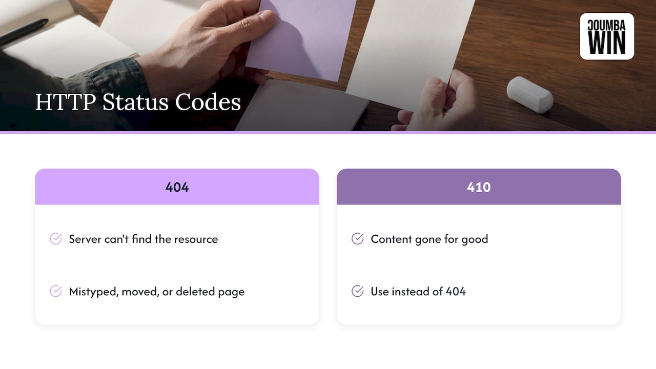
A 404 is an HTTP status code. According to MDN Web Docs, it means the server can’t find the requested resource, and the usual culprits are mistyped URLs or pages that were moved or deleted without a redirect.
So what does the visitor see? If you haven’t designed anything, they see a bare, browser-style or server-style message. Often it’s white, tiny, and says something like “Not Found.” No logo. No menu. No clue whether they’re even still on your site.
That’s the moment a custom page earns its keep. Someone arrived with a goal (a pricing page, an old blog post, a link a friend sent), and you’ve just told them no. The design question is what you say next.
A quick technical note that affects design: MDN explains that when content is gone for good, servers should use the 410 Gone status instead of a 404. For most startup sites, a well-designed 404 is plenty. But if you retire whole sections on purpose, talk to your developer about it.
Why your 404 page deserves real design time
Here’s the founder logic we hear: “Nobody should ever land there, so why bother?”
Because people do land there. Old links in newsletters, a typo in a social bio, a deck you sent to investors two years ago with a URL that no longer exists. Every one of those visitors is a person who already wanted something from you. Your 404 page is the one place where you can still save that visit.
SAP’s design system describes the 404 as more than an error: an opportunity to offer helpful navigation, maintain trust and create a friendly, branded experience. We agree with that framing. A dead end that feels designed says “we’re still paying attention.” A dead end that feels abandoned says the opposite, and visitors draw conclusions about the rest of your product from it.
What should be on a 404 page
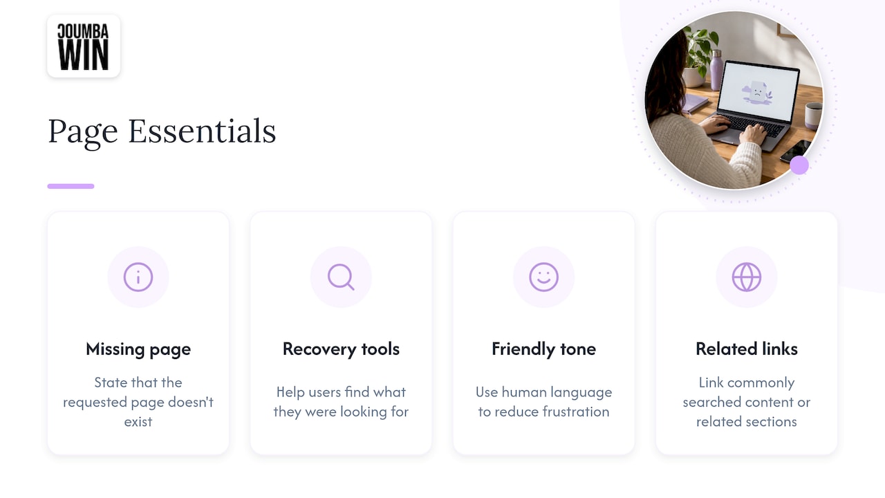
Let’s get concrete. SAP’s guidance says a 404 page should clearly communicate that the requested page doesn’t exist, offer tools to help users find what they were looking for, use friendly, human language to reduce frustration, and provide links to commonly searched content or related sections. We’d boil that down to a checklist you can build from today.
1. A clear headline that says what happened
Say it in plain words. “We can’t find that page” works. “Error 404” alone doesn’t, because plenty of visitors have no idea what the number means. You can keep the number as a small visual element if you love it, but the sentence should do the explaining.
2. One short line of reassurance
Tell them it’s not their fault, or at least that it’s fixable. Something like: “The link may be old, or the page may have moved. Let’s get you back on track.” Two sentences, tops.
3. A search field
SAP’s design system treats the search field as the main recovery tool on the page, and that matches what we see in practice. If a visitor typed or clicked toward something specific, search is the fastest way to it. Put it right under the headline, big enough to notice, with a visible label or clear placeholder text.
4. A short list of useful links
This is where most pages either shine or flop. Don’t dump your whole sitemap. Pick four to six destinations that match what lost visitors tend to want:
- Home
- Your main product or service page
- Pricing or “how it works”
- Your blog or resource hub
- Contact or support
If you’re not sure which pages matter most, check your analytics for the most-visited pages and the most common broken URLs. Those two lists tell you who is getting lost and where they were headed. For more on picking and organizing those destinations, our guide on why navigation structure affects UX walks through the thinking.
5. Your normal header and footer
Keep the main navigation. This is the single easiest win. If the 404 page looks like a dead-end island with no menu, visitors have to use the back button, and some won’t. If your site’s navigation is intact, they can recover on their own.
6. One primary action
Pick one button that does the most useful thing, usually “Back to home” or “Browse [your main category].” Everything else is secondary. Too many equal-weight options bring back the paralysis you were trying to cure.
404 page best practices, in the order we’d tackle them
Checklists are great, but order matters when you’re busy. Here’s the sequence we’d follow if a founder said, “I have one afternoon.”
- Make sure the page really returns a 404 status. The design is only half the story. The page should still tell browsers and crawlers the resource is missing. Your developer can confirm this in a minute.
- Keep the brand and the navigation. Same fonts, colors, header and footer as the rest of the site.
- Write the headline and helper text. Plain language, no blame.
- Add search and four to six links.
- Check it on a phone. Many broken-link visits come from social apps and messaging, so mobile is often the main case. Our mobile UX best practices for startups cover tap targets and spacing that apply here too.
- Run an accessibility pass. More on that below.
- Then, and only then, add the fun stuff.
Keep it consistent with the rest of the site
Can you customize a 404 page? Absolutely, and you should. Most website platforms and frameworks let you set a custom one. What the design should preserve is the feeling of being on your site: logo, navigation, typography, color palette, tone of voice. The custom part is the message and the helpful extras, not a brand-new visual identity.
A visitor who lands on a page that looks totally unlike your site may wonder if the link took them somewhere sketchy. Consistency is trust.
Write it like a person
Microcopy matters more here than almost anywhere, because the reader is mildly annoyed and has about three seconds of patience. Short, warm, specific. If you want templates and patterns to steal from, our post on microcopy examples and ready templates is a good starting point.
A few tone guidelines we use:
- Own the problem (“We couldn’t find that page”) instead of blaming the visitor (“You entered an invalid URL”).
- Skip jargon like “resource,” “request” and “server.”
- Make the next step the loudest thing on the page.
- If you joke, joke once.
Make it accessible
A 404 page is often built last and tested never, which is how it ends up with a text-as-image headline and a low-contrast gray link. Run through this short list:
- Use real text for the headline and message, not text baked into an illustration.
- Give any decorative image empty alt text, and any meaningful image a short description.
- Check color contrast on text and buttons, especially light-gray-on-white.
- Make sure every link and the search field can be reached and used with a keyboard.
- Keep motion subtle, and respect a visitor’s reduced-motion setting.
If your whole site could use that kind of review, it’s something we do: accessibility audits are part of our services.
Don’t forget to link related content
A smart extra is a small “popular reads” or “you might be looking for” block. It turns a failed visit into a browsing session. The same logic that makes a strong internal linking strategy for SEO applies here: point people toward pages that are genuinely related and useful, not just the ones you want to promote.
Creative 404 pages: what each style teaches
Creative 404 pages are the fun part, and clearly people love browsing them: galleries of them rank at the top for this topic. But a gallery shows you the outfit, not whether the wearer found the exit. Here are the common styles and the lesson inside each.
| Style | What it looks like | What it teaches | Watch out for |
|---|---|---|---|
| Illustration with a joke | A character lost in space, a broken robot, a dropped ice cream cone | Personality can lower frustration | Make sure the joke doesn’t replace the message |
| Interactive or game | A tiny playable game or hover effects | Delight can keep people on the site | Keyboard access and load speed |
| Helpful hub | Search, popular links and recent posts front and center | The best creative move is often usefulness | Too many links blur the main action |
| Minimal and calm | Lots of white space, one sentence, one button | Clarity is a design choice | Don’t strip out search |
| Brand-voice page | Copy that sounds exactly like your product | A 404 can reinforce your identity | Cleverness that confuses a first-time visitor |
The pattern we notice: the pages that work best are creative and useful. The creative layer sits on top of search, links and navigation. It never replaces them.
A few ideas that fit a startup
- Make it about your product. A fintech startup might say a page “didn’t make it through underwriting.” A learning platform might say the page “skipped class.” One line is enough.
- Use your brand illustration style. If you already have custom illustrations, one of them on the 404 page is free brand-building.
- Offer the next step you most want. A founder demo page, a signup, a pricing link. Visitors who got lost still might be warm leads.
- Rotate the message. A few headline variations keep repeat visitors from seeing the same line, if you have the dev time.
If you’re curious how interactive touches can support a site without getting in the way, take a look at interactive website features that convert.
Mistakes that turn a 404 page into a second dead end
We’ve seen all of these in the wild (and yes, a couple in our own early work, because humility builds character 🙃):
- Redirecting every broken URL to the homepage. It looks tidy, but it leaves visitors confused about why they didn’t get what they clicked. A clear message is kinder.
- A giant illustration pushing everything below the fold on a phone.
- No navigation. The visitor is stranded.
- Blame-y or technical copy. “Invalid request” is not a human sentence.
- Humor with no exit. A hilarious page that offers no search or links is a very funny cul-de-sac.
- Ignoring the cause. If a page you linked to yourself returns a 404, fix the link or add a redirect. MDN itself notes that broken links should be kept to a minimum to avoid frustrating readers.
A 404 page is part of a bigger site picture
The 404 page is a small piece of the same puzzle as your navigation, content sections and technical foundations. If you’re auditing your site, it’s worth looking at a few related things at the same time:
- Whether your site has the content sections a business actually needs, so lost visitors have somewhere good to land.
- The common startup website design pitfalls that cause broken experiences in the first place.
- How your site holds up on SEO-friendly web design fundamentals, since broken pages and site structure often show up together.
Our perspective: the 404 page is a brand moment
Here’s our honest take. Most startups treat the 404 page like the janitor’s closet of their website: necessary, ignored, and a bit of a mess. We think that’s a missed opportunity, and it’s the kind of detail that separates a site that was designed from a site that was assembled.
We work with founders who see design as a competitive advantage, and that mindset shows up in the small stuff. A 404 page is a tiny test of whether a team sweats the details. Does it sound like your brand? Does it keep your navigation? Does it help someone who is lost, or just look cute?
We’re also firm about not using generic templates or AI-generated filler for this. A canned “Oops!” with a stock illustration says nothing about you. A custom page, even a simple one, shows how you think about people who are slightly off course. That’s where trust gets built or quietly lost.
Our rule: be useful first, be memorable second. Search, clear links and your real navigation come first. Then we add the personality, whether that’s an illustration, a line of copy that sounds like you, or a small interaction.
Coumba Evelyn
Want a 404 page (and a site) that sounds like you?
If your 404 page is currently the default and your site needs more than a quick fix, that’s something we can help with. We design and build custom websites for startups, including UX and UI design, accessibility audits and Webflow development, so the small pages get the same care as the big ones. You can see everything we do at Coumba Win.
Bring us the founder-sized version of the problem (“our site feels clunky and we’re growing fast”) and we’ll work out what to design first.
FAQ
What does a 404 page mean?
It means the server couldn’t find the page the visitor asked for. MDN Web Docs notes that the usual causes are mistyped URLs or pages that were moved or deleted without a redirect. For the visitor, it just feels like a dead end, which is why the design matters.
What should be on a 404 page?
A plain-language message that the page doesn’t exist, a search field, links to popular or related pages, and your normal header and footer. SAP’s design system recommends friendly, human language and helpful links to commonly searched content. One clear primary button is a good finishing touch.
Can you customize a 404 page?
Yes. Most website builders and frameworks let you replace the default with your own design. Keep your logo, navigation, fonts, colors and tone so visitors know they’re still on your site, and customize the message and recovery links.
What does a 404 page look like?
Without customization, usually a plain white page with a short error message and no branding. A well-designed one looks like the rest of your site, with a friendly headline, a search field and a handful of useful links. Many add an illustration or a light joke on top.
Should a creative 404 page replace helpful navigation?
No. Creativity works best as a layer on top of search, links and your regular menu. If a visitor has to decode a joke or finish a game before finding a way out, the page is working against you.