Why Bold Design Differentiates Startups in 2026

Why Bold Design Differentiates Startups in 2026
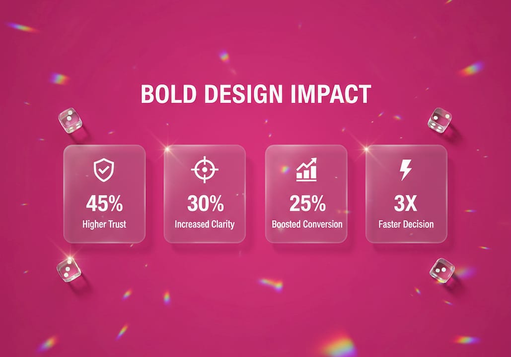
Bold design is the deliberate use of simplified, high-impact visual elements that create a strong brand presence and measurable competitive advantage for startups. And honestly? Most founders are sleeping on this. While everyone else is throwing every color in the rainbow at their homepage (been there, watched it happen), the startups that actually break through are the ones who commit to fewer choices made with more conviction. We’re talking about visual identity as a growth lever, not just a “nice to have.” A bold design shift can increase demo conversion rates by 31% and improve email click-through rates by 15%. That’s not decoration. That’s revenue.
Why bold design differentiates startups from the competition
Bold design, in the startup context, is what designers formally call disciplined visual reduction. It means stripping your brand system down to the elements that actually do the work and applying them with consistency across every touchpoint. Think of it like a capsule wardrobe for your brand. Fewer pieces, worn with total confidence, every single time.
The startups that get this right don’t look expensive. They look certain. And certainty is what converts. HubSpot’s rebranding is a textbook example: they moved toward a tighter, bolder visual system and saw measurable lifts in engagement across their marketing channels. The principle holds at every stage. Whether you’re pre-seed or Series A, the question isn’t “how much design can we afford?” It’s “how clearly does our design communicate who we are?”

The impact of bold design shows up in the numbers, but it starts with a decision. The decision to stop hedging visually and start committing.
How visual design elements signal brand personality
Your color palette is a personality test. Your typography is a handshake. Every visual choice you make tells your audience something about who you are before they read a single word of copy.
A TU Delft study of 1,561 participants found that maximalist and bold design associates with a cheerful, approachable brand identity, while geometric patterns signal modernity and forward-thinking values. That’s not a soft finding. That’s proof that your visual choices are doing active communication work, whether you intend them to or not.
Here’s a quick breakdown of how specific design elements map to brand personality signals:
| Visual element | Brand personality signal |
|---|---|
| Reduced color palette (3 or fewer) | Confidence, clarity, premium positioning |
| Geometric patterns | Modernity, precision, tech-forward identity |
| Bold typography | Authority, directness, strong point of view |
| Maximalist composition | Approachability, energy, cheerful brand character |
| Consistent white space | Calm, trust, editorial credibility |
The trap most early-stage founders fall into is treating design as decoration rather than communication. They add more colors because they want to “stand out.” They end up looking like a ransom note. Disciplined reduction means cutting your palette from 30+ colors down to 9 or fewer and applying those 9 with total conviction. That’s what creates a brand system people actually remember.
Pro Tip: Pick your three most important brand colors and stress-test them across every single touchpoint before you add a fourth. If the three aren’t working, more colors won’t fix it.
Does bold design actually improve trust and conversions?
Short answer: yes, and faster than you think. First impressions form in under 100 milliseconds, and for startups without an established reputation, visual design is the primary trust signal. You don’t get a second chance at that first 100ms.
For startups, this is especially high-stakes. You don’t have a decade of brand equity to fall back on. You don’t have a household name. What you have is your homepage, your pitch deck, and your product UI. If those don’t communicate trust immediately, you’re losing users before they’ve read your value proposition.
The practical design tactics that move the needle on trust and conversions include:
-
Clear visual hierarchy: Guide the eye from headline to CTA without friction. Users should never wonder where to look next.
-
Focused value proposition: One bold statement above the fold. Not three. Not five. One.
-
Friction-free conversion paths: Reduce the number of clicks between landing and action. Every extra step is a leak in your funnel.
-
Consistent brand application: Use the same colors, type, and spacing across every page. Inconsistency reads as untrustworthy.
-
Homepage optimization: Even small improvements to homepage design can shift monthly revenue by 1–2% without increasing ad spend.
That last point deserves a moment. A 1–2% monthly revenue shift from homepage design alone compounds fast. If you’re doing $100k a month, that’s an extra $1,000–$2,000 per month from a design decision, not a new marketing channel.
How startups turn aesthetics into operational infrastructure
Here’s the part most founders don’t see coming: bold design isn’t just a brand play. It’s an operational one. Startups that treat aesthetics as infrastructure see improvements in onboarding, retention, and internal efficiency, not just in how pretty their product looks.
Think of your design system as a governance layer. When your team knows exactly which button style to use, which color signals an error, and which type size signals a heading, they ship faster. They make fewer inconsistent decisions. They accumulate less design debt. Fintech startups like Brex and AI-native companies building on top of design systems have demonstrated this clearly: a well-built design system reduces the cost of every future product decision.
Here’s how to build design as operational infrastructure, step by step:
-
Audit your current visual chaos. Document every color, font, and component your product currently uses. The number will shock you.
-
Define your core system. Choose your palette, type scale, spacing system, and core components. Write them down in a living style guide.
-
Build reusable components. Create a component library your team can pull from instead of reinventing the wheel every sprint.
-
Establish governance rules. Decide who approves new design additions. Without governance, systems drift.
-
Tie design decisions to outcomes. Every system update should connect to a user behavior metric, whether that’s activation rate, retention, or conversion.
Bold design reduces onboarding and design debt by creating reusable systems that teams can apply without constant creative direction. That’s leverage. And for a startup running lean, leverage is everything.
Pro Tip: Your style guide is not a PDF you make once and forget. Treat it like a living product. Update it every sprint and make sure every new hire reads it on day one.
When should startups invest in bold design?
The timing question is real, and the answer is more nuanced than “as soon as possible.” Early-stage startups should prioritize usability over design polish. Pre-seed and seed-stage founders need to validate their product before they invest in a full brand system. At that stage, a clean, functional UI beats a gorgeous one that confuses users.
At Series A and beyond, the calculus flips. Polish and bold design become critical to retention and valuation. Investors look at your product and brand as signals of operational maturity. A messy visual identity at Series A says “this team doesn’t have their act together.” A tight, bold brand says “these people know exactly who they are.”
Here’s a practical breakdown of design investment priorities by stage:
-
Pre-seed: Focus on onboarding UX and messaging clarity. Can users understand your product in 30 seconds?
-
Seed: Add conversion funnel optimization. Where are users dropping off, and can design fix it?
-
Series A: Invest in a full brand system and bold visual identity. This is when a $10k UX investment can improve conversion by 20% and a 10% retention gain meaningfully impacts your valuation.
-
Growth stage: Systematize everything. Design governance, component libraries, and brand guidelines become non-negotiable.
The biggest misconception I see founders carry is that bold design means expensive design. It doesn’t. Bold design means decisive design. A startup with three colors, one typeface, and a clear visual hierarchy can out-brand a competitor spending ten times more on a chaotic visual identity.
Key takeaways
Bold design differentiates startups by creating memorable, trust-building brand systems that drive measurable conversion gains and reduce long-term operational overhead.
| Point | Details |
|---|---|
| Bold design drives conversions | Reducing color palettes and visual elements can increase demo conversions by 31% and email CTR by 15%. |
| First impressions are instant | Visual design forms trust signals in under 100 milliseconds, making homepage design a direct revenue lever. |
| Design is operational infrastructure | Reusable design systems reduce design debt and improve team speed, not just brand perception. |
| Stage determines design priority | Pre-seed startups should prioritize usability; Series A and beyond demand bold, polished brand systems. |
| Boldness means reduction, not complexity | The most effective bold design uses fewer elements applied with total consistency and conviction. |
What I’ve actually learned about bold design and startup growth
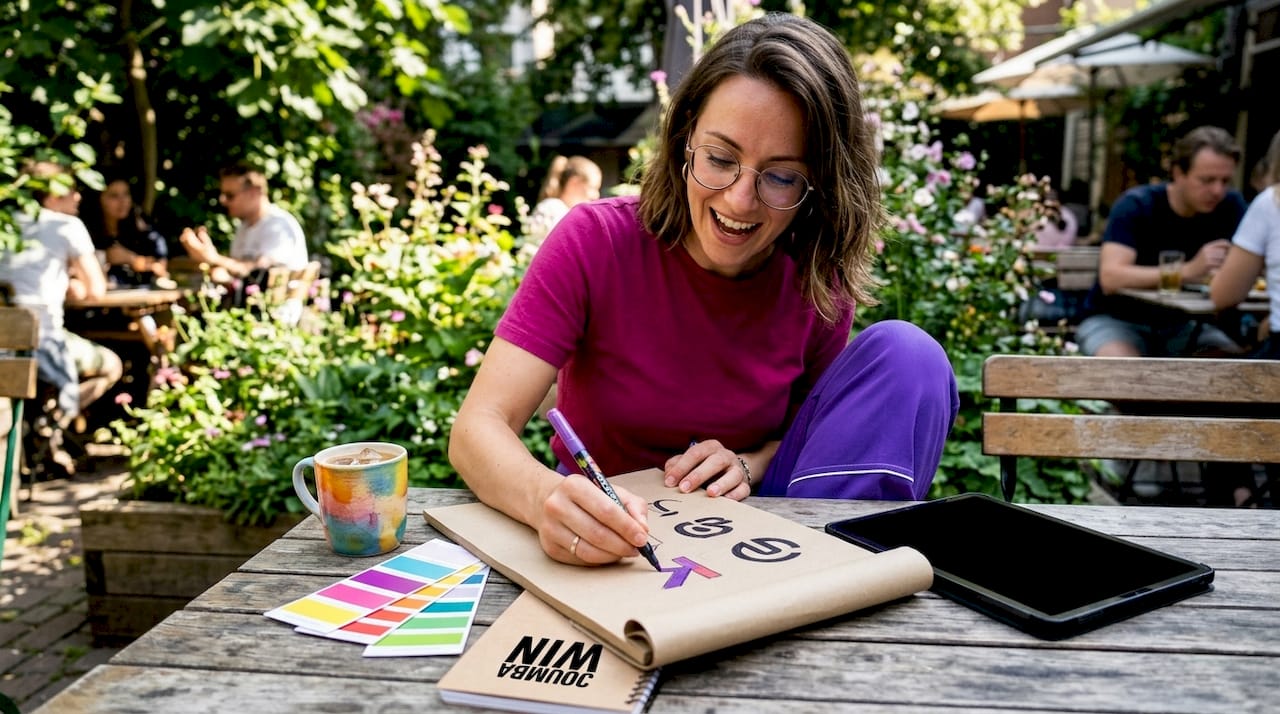
By Coumba Evelyn
I’ll be honest with you: when I started working with startup founders on design, I thought the hardest part would be the creative work. Picking the colors, building the layouts, getting the typography right. Turns out, the hardest part is convincing founders to commit.
The pattern I see over and over is what I call “visual hedging.” A founder wants to appeal to everyone, so they use five colors instead of two. They write three value propositions instead of one. They add a carousel because they can’t decide which image matters most. The result is a brand that says nothing to anyone.
Bold design is not about being loud. It’s about being clear. The startups I’ve worked with that saw the biggest jumps in engagement weren’t the ones with the flashiest visuals. They were the ones that made a decision and stuck to it, across every single touchpoint, without flinching.
There’s also something I don’t see talked about enough: bold design builds internal culture. When your team has a clear visual language, they make faster decisions. They argue less about aesthetics in sprint reviews. They ship with more confidence because the system tells them what “right” looks like. That’s not a soft benefit. That’s operational speed.
My honest advice? Stop treating design as something you’ll “figure out later.” The founders who win are the ones who treat their visual identity as seriously as their cap table. Because in the first 100 milliseconds of a user’s experience, your design is your pitch.
— Coumba Evelyn
Ready to build a bold brand that actually converts?
If you’ve been nodding along to everything above and thinking “okay, but where do I actually start,” I’ve got you. Coumba Win Design builds bold, strategic brand systems specifically for founders who are done playing it safe visually.
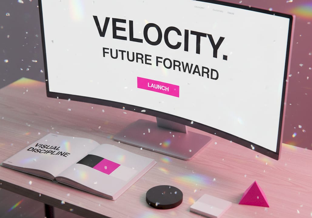
The Style Guide is where most founders begin: a living, structured brand system that gives your team the visual rules they need to ship consistently and fast. For founders heading into demo season, the Demo Day Kit covers pitch decks, booth design, and swag in 14 days flat. Both are built around the same principle this whole article is about: fewer decisions made with more conviction. Check out what Coumba Win Design has built for startups at coumbawin.com and let’s make your brand impossible to ignore.
FAQ
Why does bold design help startups stand out?
Bold design creates instant brand recognition by using fewer, more deliberate visual elements that communicate a clear identity. Startups without established reputations rely on design as their primary trust signal, and a bold system makes that signal unmistakable.
How does bold design affect conversion rates?
A bold design shift that reduces color palettes and simplifies visual elements has been shown to increase demo conversions by 31% and improve email click-through rates by 15%. Clarity in design removes friction from the user’s decision-making process.
Is bold design only for well-funded startups?
No. Bold design is about decisiveness, not budget. A startup with three colors, one typeface, and a clear visual hierarchy can outperform a competitor spending far more on a cluttered identity.
When should a startup invest in a full brand system?
Series A is the critical inflection point where bold design and brand polish shift from optional to essential. Pre-seed and seed stages should prioritize usability and messaging clarity first.
What is the difference between bold design and maximalist design?
Bold design is defined by disciplined reduction: fewer elements used with conviction. Maximalist design uses layered complexity to signal energy and approachability. Both can differentiate a startup, but bold design through reduction is more scalable as a brand system.
Recommended