What Does Intuitive Design Mean? A Clear Guide

What Does Intuitive Design Mean? A Clear Guide
Intuitive design means users can pick up a product and just go. No manual, no tutorial, no “wait, where’s the button?” moment. An interface is truly intuitive when it works exactly the way the user expects it to, because it aligns with the mental models they already carry around in their heads.
That alignment is the whole game. Not clever visuals. Not a slick color palette. The mental model match.
What does intuitive design actually mean?
At its core, intuitive design lets users understand and navigate an interface immediately, without conscious reasoning or prior training. The product’s affordances, language, and interaction patterns fit so naturally with what users already know that using it feels obvious rather than learned.
The concept that makes or breaks this? Cognitive load. Every time a user has to stop and think “what does this do?” you’ve added mental friction. Intuitive interfaces keep that friction near zero, so users can focus on their actual task rather than on figuring out the tool. Four core attributes drive this:
- Discoverability: Starting points and next steps are visible and clear.
- Affordance: Visual cues communicate how elements work (a raised button invites clicking; a text field with a cursor invites typing).
- Comprehensibility: Text and visuals are understandable at a glance, with no jargon.
- Responsive feedback: Users see the result of their actions immediately, success or failure.
Think of a restaurant. When you walk in and a host seats you, hands you a menu, and a server appears, you don’t need a script. You just know what to do. A well-designed interface works the same way, following a script the user already has memorized from life experience.
How intuitive design aligns with real user mental models

Here’s the thing people miss: intuition isn’t a feature you add to a design. It’s an outcome. The IUUI research group defines it this way: a system is intuitively usable when a specific user can interact with it effectively by applying knowledge unconsciously. That “specific user” part is doing a lot of work.
Users arrive at any new product with mental models built from two sources: their experience with the physical world (gravity, handles, buttons that push) and their experience with the cultural world (icons, language, conventions they’ve learned over time). Physical experience is nearly universal. Cultural experience varies wildly by background, age, and geography.
Real-world examples of intuitive design in action:
- Folder icons in file systems borrow directly from physical office folders. No explanation needed.
- The play button (▶) is so culturally embedded that it works across virtually every media app globally.
- Swipe gestures on touchscreens map to the physical act of flipping through pages or cards.
- Shopping cart icons in e-commerce mirror the experience of a physical store cart.
Where intuitive design differs from plain usability: usability asks “can users complete the task?” Intuitive design asks “can they complete it without thinking?” User-centered design is the broader process; intuitive design is one of its most prized outcomes. You can have a usable product that still requires a learning curve. Truly intuitive products skip the curve entirely, or at least shrink it dramatically.
Core principles that make a design feel intuitive
The Nielsen Norman Group’s usability heuristics and broader UX research converge on a handful of principles that consistently produce intuitive experiences. These aren’t suggestions. They’re the structural bones of any interface users will actually love.
- Consistency: Same icons, same colors, same interaction patterns throughout the product. When users learn one part, they can apply that knowledge everywhere else. Consistency is one of the most reliable sources of intuition.
- Simplicity: Remove everything that doesn’t serve the user’s goal. Clutter forces choices, and choices create cognitive load.
- Adherence to common standards: Don’t reinvent the wheel when a convention already exists. The hamburger menu, the back arrow, the magnifying glass for search. These work because users already know them.
- Clear affordances: Visual design should communicate use without labels. A button should look clickable. A draggable element should look movable.
- User language, not system language: Write labels and error messages the way your users talk, not the way your engineering team documents the backend. “Something went wrong” beats “Error 403: Forbidden.”
- Error tolerance: Users will make mistakes. Intuitive design anticipates this and makes recovery easy, not punishing.
Pro Tip: Run a quick “vocabulary audit” on your interface. Pull out every label, button, and error message, then ask five real users what they think each one means. The gaps between what you intended and what they understood are exactly where intuition breaks down.
Common misconceptions about intuitive design
“Intuitive” is one of the most abused words in product design. Almost every product team claims their design is intuitive. Most are wrong, and here’s why.
Myth 1: Intuitive means no learning required at all. Not quite. Even highly intuitive designs may require a brief moment of orientation. The distinction is that intuitive designs use knowledge users already have, rather than forcing them to acquire new knowledge. There’s a difference between “I figured it out in 10 seconds” and “I needed to read the docs.”
Myth 2: If it’s intuitive to the designer, it’s intuitive to the user. This is the trap that catches almost every design team. Designers are experts in their own product. They’ve lost the ability to see it as a newcomer would. What feels obvious to the person who built it is often baffling to someone encountering it fresh.
Myth 3: Intuitive design is universal. An interface can only be universally intuitive if it relies exclusively on physical world experience. The moment you introduce cultural cues (icons, language, conventions), intuitiveness becomes audience-specific. A hashtag symbol feels intuitive to a Gen Z social media user and confusing to someone who’s never used Twitter.
Myth 4: Intuitive design is a one-time achievement. User expectations shift. What felt intuitive in 2015 may feel dated and confusing now. Intuitive design requires ongoing attention.
Pro Tip: When your team says “this is intuitive,” that’s a hypothesis, not a fact. The only way to confirm it is to watch someone who has never seen the product try to use it.
How to create and test intuitive designs
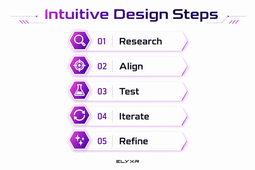
Start with research, not wireframes. You need to understand your users’ mental models before you draw a single screen. Interviews, contextual inquiry, and competitive analysis all help map what users expect before they ever touch your product.
From there, the process looks like this:
- Use known interaction patterns wherever possible. Reinventing navigation or form behavior adds learning cost with no benefit.
- Borrow from the physical world when introducing new concepts. Skeuomorphic cues (a notepad that looks like paper, a trash can for deletion) give users an immediate frame of reference.
- Write in plain language. Every label is a micro-decision about whose vocabulary you’re using.
- Build in feedback loops. Users need to know their actions worked. Confirmation messages, loading states, and error recovery aren’t polish. They’re core to the intuitive experience.
- Test with real users early. Usability testing with people who have never seen the product is the most direct way to find where your mental model assumptions were wrong.
- Iterate based on behavior, not opinion. What users do tells you more than what they say. Watch where they hesitate, where they click the wrong thing, where they give up.
For mobile UX specifically, intuitive design demands even tighter constraints. Smaller screens, touch targets, and context-switching all raise the stakes for getting the mental model match right from the first tap.
Why intuitive design matters for users and businesses

The business case for intuitive design is straightforward. When users don’t have to think, they move faster, make fewer errors, and feel better about the product. That translates directly to outcomes companies care about.
For users, the benefits are immediate: reduced learning curve, lower frustration, and faster task completion. For businesses, intuitive design cuts onboarding time, reduces customer support volume, and increases adoption rates. Products that feel hard to use get abandoned. Products that feel obvious get recommended.
There’s also a brand perception angle that often gets overlooked. When a product feels intuitive, users attribute that ease to quality. They trust the company more. A clunky interface, even if technically functional, signals carelessness. A well-designed website that users navigate without friction builds credibility in a way that no marketing copy can replicate.
The interaction design research is clear: intuitive interactions rely on feedforward, a neurological mechanism where users predict the next state based on prior experience and move toward it with minimal conscious effort. Designs that support feedforward feel effortless. Designs that block it feel frustrating, even when users can’t articulate why.
Expert insights and how Coumba Win Design applies them
“Intuition is not a feature of design. It is a characteristic of the interaction between a specific user and the design. To evaluate whether a design is intuitive, you must also think about who will use it.” — Intuitive Use of User Interfaces (IUUI) research group
That quote reframes the whole challenge. You’re not designing an intuitive product in the abstract. You’re designing an intuitive experience for a specific person with a specific background and specific expectations.
At Coumba Win Design, this philosophy drives every project. When working with an educational platform client, the team identified that the existing navigation used internal product terminology that meant nothing to new students. Renaming sections to match how students actually described their learning goals, and restructuring the flow to mirror how they naturally progressed through content, cut the “where do I go next?” confusion dramatically. No new features. Just better alignment with the users’ mental model.
The practical approach Coumba Win Design uses across projects:
- Map users’ existing mental models through interviews and observation before any design work begins.
- Audit every label, icon, and interaction pattern against what users already know from comparable products.
- Run first-use testing with people outside the project team to surface assumption gaps.
- Treat every point of hesitation in testing as a design problem, not a user problem.
- Revisit intuitiveness after launch, because user expectations evolve.
Pro Tip: The best intuitive designs feel invisible. If users are complimenting your interface, that’s nice. If they’re just getting their work done without noticing the interface at all, that’s the real win.
For teams building interactive digital products, the principles of interface design that support intuitive use are well-documented. The gap between knowing them and applying them consistently is where most products fall short.
Ready to build something users just get? Coumba Win Design works with startups to create digital products that align with how real users think, not how product teams assume they do.

Key Takeaways
Intuitive design is not a visual style or a feature. It is the outcome of aligning an interface with the mental models users already hold, reducing cognitive load to near zero.
| Point | Details |
|---|---|
| Mental model alignment | Intuitive design works when the interface matches what users already expect from prior experience. |
| Cognitive load reduction | Interfaces that lower mental effort let users focus on their task, not on figuring out the tool. |
| Core attributes | Discoverability, affordance, comprehensibility, and responsive feedback are the building blocks of intuitive use. |
| Consistency drives intuition | Uniform icons, colors, and interaction patterns let users transfer learning across the entire product. |
| Testing is non-optional | Watching real first-time users interact with a product is the only reliable way to confirm intuitiveness. |
FAQ
What does “intuitive” mean in simple terms?
Something is intuitive when you can use it without stopping to figure it out. In design, it means the product works the way you already expected it to, based on your prior experience.
What is a real example of intuitive design?
The folder icon in any file system is a classic case. It borrows directly from physical office folders, so users understand it immediately without any explanation.
How do you make a design more intuitive?
Start by researching your users’ mental models, then use familiar interaction patterns, plain language, and clear visual affordances. Test with real first-time users and iterate based on where they hesitate or make mistakes.
Is intuitive design the same as usability?
Not exactly. Usability asks whether users can complete a task. Intuitive design asks whether they can complete it without conscious thought. A usable product may still require a learning curve; a truly intuitive one does not.
Does intuitive design work the same for every user?
No. Intuitiveness depends on the specific user’s background, culture, and prior experience. An interface that feels obvious to one audience may confuse another, which is why user research and testing with your actual target users is so important.
Recommended


