4 Reusable Transactional Email Templates for Startups

4 Reusable Transactional Email Templates for Startups
Transactional email design is the practice of building automated, trigger-based messages (receipts, order confirmations, password resets, shipping alerts) so the recipient can find what they need and act within seconds of opening it. The single rule that matters more than any other: put one clear action above the fold, backed by real transaction details, and don’t let branding get in the way. Follow accessibility basics, stay inside FTC CAN-SPAM rules, and you’ve covered 90% of what makes these emails work.
TL;DR:
- Transactional emails must immediately display essential details such as order number, delivery status, and clear calls to action within the first two seconds of opening.
- Building and maintaining four reusable templates—receipt, full e-receipt, password reset, and notification—streamlines future integrations and preserves consistency across message types.
- Design should prioritize simplicity and functionality, ensuring emails work reliably across all clients, dark mode, and with accessibility standards intact.
- Before sending, test every template thoroughly for broken links, visual glitches, and fallback text, and verify the correct rendering across email clients and dark mode.
- A focus on utility design, with minimal branding and clear, straightforward information, reduces support tickets and builds trust by delivering value fast.
Table of Contents
- What Are the Core Elements Every Transactional Email Needs?
- Design Patterns and Templates You Can Reuse
- How Should Design Change by Message Type?
- Accessibility, Dark Mode, and Cross-Client Testing Checklist
- Preflight Checklist Before You Send
- How Strategic Design Cuts Support Friction
- What the Templates-First Approach Gets Right (and Where It Falls Short)
- Get Your Transactional Emails Audited by Coumba Win Design
- Sources
- FAQ
What Are the Core Elements Every Transactional Email Needs?
Every transactional email is doing a job: confirm, notify, or unlock. It fails that job the moment the reader has to hunt for information. Litmus found that transactional messages need to surface their essential information within roughly two seconds of opening, which means the subject line, preheader, and first screen have to do more work than in any marketing email you’ll ever send.
Here’s what has to show up, every time, no exceptions:
- Subject and preheader that name the specific event (“Your order #48213 has shipped,” not “Update on your order”). Vague subjects get skimmed or ignored.
- A one-line summary of what happened, followed immediately by one clear CTA button or code. Don’t bury the reason for the email under three paragraphs of pleasantries.
- Transaction specifics: order number, itemized list, total, delivery or tracking status, and payment method used. These are the details that actually stop a support ticket before it starts.
- A support and legal footer: a real contact method, your company’s postal address, and an unsubscribe mechanism where required. This is where CAN-SPAM compliance actually lives for transactional mail, and the FTC’s guidance spells out how those rules bend for messages that are triggered by a transaction rather than sent as pure marketing.
- A genuine plain-text alternative, sent as part of a multipart/alternative message. This isn’t decorative. It’s what displays when a client blocks images or an inbox strips HTML, and skipping it is one of the fastest ways to look broken to a chunk of your list.
Get these five right and the rest of your design decisions are just polish.
Design Patterns and Templates You Can Reuse
Most transactional emails don’t need a new layout. They need the same skeleton, applied consistently, with the copy swapped out. Here’s the pattern that holds up across message types:
- Build on a single-column skeleton, capped around 600 pixels wide, with body text at 16 pixels or larger and generous line spacing. Anything narrower cramps on mobile; anything wider forces horizontal scrolling on the phones most recipients are using.
- Size buttons for thumbs, not cursors. Keep tap targets at 44 by 44 pixels or larger, use full-width buttons on mobile breakpoints, and always include a plain-text link version directly beneath the button in case rendering fails.
- Write copy in repeatable patterns: subject lines that name the event, preheaders that add one useful detail the subject skipped, CTA microcopy that’s a verb phrase (“Track Your Order,” not “Click Here”), and expiration text stated in absolute terms (“expires in 15 minutes,” not “expires soon”).
- Keep four template variants on hand: a short receipt for low-stakes purchases, a full e-receipt for anything with shipping or tax detail, a password reset with minimal copy and a prominent code, and a shipping update built around a single tracking CTA.
Once these four templates exist as reusable components, new integrations become a copy-and-swap exercise, not a design project.
How Should Design Change by Message Type?
Order confirmations, receipts, password resets, and notifications all share the same skeleton, but the details inside that skeleton shift based on what the message is actually for.
Order confirmations and e-receipts carry the most information density. Omnisend’s research shows the standard set includes order number, an itemized product list, pricing, shipping and billing addresses, an estimated delivery date, and a primary CTA like “Track Order” or “View Order.” Keep marketing content minimal here. A well-built e-receipt, according to Litmus, balances those essential details against a mobile-first layout and includes fraud and security cues that reassure the buyer the charge is legitimate.
Receipts need legal and financial specifics placed where a reader would look for them, plus a visible return policy, not one buried in a footer link nobody clicks.
- Password resets and OTPs should carry almost no copy beyond the code or button, a visible expiration window, and a one-line security note (“If you didn’t request this, ignore this email”).
- Notifications work best as a short event summary that states plainly whether action is required, and low-priority alerts should batch rather than fire one email per event.
- A subtle, contextual cross-sell only belongs after every essential detail has landed, never above it.
Accessibility, Dark Mode, and Cross-Client Testing Checklist
A transactional email that looks perfect in your test inbox and breaks in someone else’s isn’t done. Run this list before every send:
- Add alt text to every image, use semantic HTML for structure, and write link text that describes the destination instead of “click here.”
- Hit a contrast ratio of at least 4.5:1 and set body text no smaller than 16 pixels, matching the accessible sizing Bento’s design guide recommends.
- Fix dark mode issues before they surface: use transparent image backgrounds, choose logo files that hold up against both light and dark backgrounds, and manually check inverted color schemes rather than assuming they’ll render fine.
- Test the full client matrix: Gmail, Outlook desktop and web, Apple Mail, and the major mobile clients. Blazalek’s testing guidance specifically calls out verifying how each renders in dark mode and confirming that fallback text displays correctly when images are blocked.
- Check deliverability basics: stay under size limits, always include the plain-text part, send from a consistent subdomain, and monitor the Reply-To address instead of routing it to a dead inbox.
Pro Tip: Automate your rendering checks with a preview service instead of manually opening a dozen clients every time you edit a template. It turns a 45-minute QA pass into a five-minute one, which means you’ll actually do it before every send instead of skipping it under deadline pressure.
Preflight Checklist Before You Send
Run through these steps in order, every time a transactional template changes:
- Populate every merge tag and dynamic field with real test data, not placeholder text, so you catch broken variables before a customer does.
- Click every CTA, confirm the redirect lands where it should, and verify that token or code expiry flows actually expire on schedule.
- Test across your full client matrix and dark mode, then turn images off entirely to confirm your fallback text still makes sense on its own.
- Check total message size and load time, and confirm heavy assets are hosted on a CDN instead of embedded raw.
- Document a rollback or safe resend plan for what happens if a send goes out with an error. You will need it eventually.
How Strategic Design Cuts Support Friction
Coumba Evelyn, whose work anchors Coumba Win Design’s approach to interface and communication design, treats transactional email as utility design first. That’s the same lens applied to mobile UX work for startups: the interface should get out of the user’s way, not perform for them.
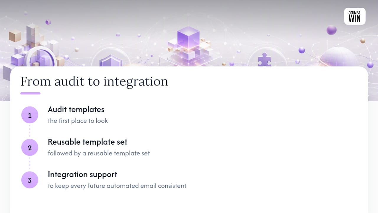
The pattern holds for email. A receipt that clearly states the total, the delivery window, and the support contact answers the question before the customer emails to ask it. Startups that tighten this loop tend to see fewer “where’s my order” tickets and a calmer support inbox. If your transactional templates haven’t been audited in a while, that’s the first place to look, followed by a reusable template set and integration support to keep every future automated email consistent.
What the Templates-First Approach Gets Right (and Where It Falls Short)
Most advice on this topic treats transactional email as an afterthought bolted onto the “real” marketing strategy. That’s backwards. Transactional messages get opened at far higher rates than promotional ones because the recipient asked for them, directly or indirectly, by completing a transaction. Treating them as a checkbox instead of a designed experience wastes the highest-trust inbox real estate a company has.
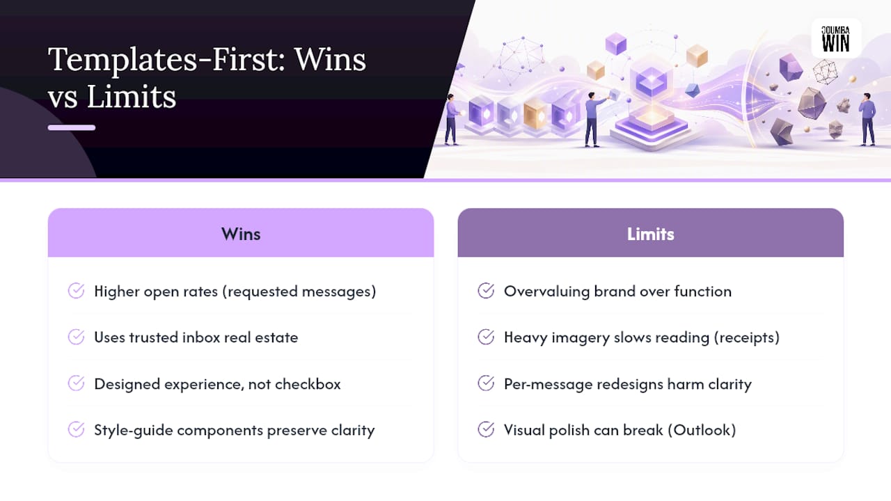
Where conventional advice falls short is in overvaluing brand expression at the expense of function. A receipt covered in hero imagery and marketing copy is not “on brand.” It’s a receipt that takes longer to read, which is the opposite of what earns trust. The style guide approach, consistent components applied lightly rather than a fresh design exercise per email, wins because it protects clarity while still looking intentional.
If you take one thing from this guide, prioritize the preflight checklist over the visual polish. A gorgeous template that breaks in Outlook or fails dark mode does more damage than a plain one that works everywhere.
— Coumba Evelyn
Get Your Transactional Emails Audited by Coumba Win Design
Some design agencies offer founder-collaborative audits of automated emails to ensure templates hold up across clients and dark mode from the start. That covers template design, accessibility audits, and integration support so your engineering team isn’t reverse-engineering merge tags alone.

This fits startup teams shipping fast, where nobody has bandwidth to own email QA full-time but everyone feels it when support tickets spike after a launch. Certain design firms work directly with founders who see design, including the transactional layer, as part of the product experience, not an afterthought. Browse past project work to see the kind of platform and interface design this extends to, then reach out through Coumbawin to scope an audit or a template set for your product.
Sources
For deeper reference, consult the FTC’s CAN-SPAM compliance guide, Litmus’s e-receipt examples, Omnisend’s order confirmation guide, and general trust-signal strategies for online communication.
- A guide to bulletproof buttons in email design — Litmus
- CAN-SPAM Act: A Compliance Guide for Business — FTC
- Order confirmation email guide — Omnisend
FAQ
What Makes a Transactional Email Different From a Marketing Email?
A transactional email is triggered by a specific user action, like a purchase or password request, and its primary job is delivering information the user needs, not persuading them to buy something new.
What Should Appear Above the Fold in a Receipt Email?
The transaction summary and one clear CTA, such as “Track Order” or “View Receipt,” should appear before any branding elements or secondary content.
Does CAN-SPAM Apply to Transactional Emails?
Yes, but with different rules than marketing email; the FTC’s compliance guide outlines the specific obligations that apply to transaction-triggered messages.
How Often Should Transactional Templates Be Tested?
Test every time a template changes and periodically even without changes, since email client rendering engines update independently of your code.
Can Coumba Win Design Audit Existing Transactional Templates?
Yes, Coumba Win Design offers accessibility audits and template design services for startups looking to fix or rebuild their transactional email set; current pricing details are available directly on Coumbawin.


