
The Role of Information Architecture in UX Design

The Role of Information Architecture in UX Design
Information architecture (IA) is the structural discipline that organizes, labels, and connects digital content so users can find what they need and navigate without friction. In UX practice, IA sits upstream of every interaction and visual design decision, making it the blueprint that product teams build everything else on top of. The industry term is information architecture, and while UX designers often treat it as one task among many, it deserves its own dedicated process. This article breaks down the role of information architecture in UX, covering core components, accessibility impact, measurement methods, and why smart product managers treat IA as a business asset, not a design detail.
What is the role of information architecture in UX?
IA is the backbone of any digital product. Before a single wireframe gets drawn or a component library gets opened, IA determines how content is grouped, what it is called, and how users move through it. The outputs are concrete: taxonomies, controlled vocabularies, sitemaps, navigation systems, and metadata schemas. These are not abstract deliverables. They are the decisions that determine whether a user finds your pricing page in two clicks or rage-quits after five.
The IA blueprint gives product teams a bird’s-eye view of hierarchy, navigation, features, content, and flows. That single document accelerates development and cuts rework when features evolve. For UX designers, IA defines the problem space before solutions get designed. For product managers, it is the map that connects user goals to business goals. Without it, you are building on sand.

IA also differs fundamentally from UX and UI design. UX handles interaction quality and user satisfaction. UI handles visual presentation. IA handles structural decisions about what content exists, where it lives, and what it is called. Conflating the three is one of the most common and costly mistakes teams make.
What are the core components of effective information architecture?
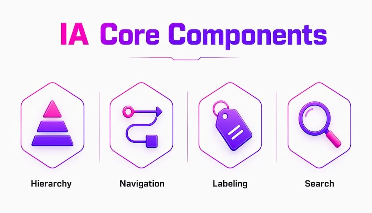
Effective IA rests on four interconnected elements: hierarchy, navigation, labeling, and search. Each one shapes how users experience your product, and weakness in any single area creates friction across the whole system.
Hierarchy organizes content from broad categories down to specific items. The depth and breadth of that hierarchy directly affect cognitive load. Each additional navigation level a user must traverse increases the mental effort required to complete a task. Flat hierarchies with clear categories outperform deep, branching trees for most digital products.
Navigation models include three types that work together:
-
Global navigation appears consistently across all pages and anchors users to the product’s main sections
-
Local navigation helps users move within a specific section or category
-
Contextual navigation surfaces related content inline, reducing the need to backtrack
Labeling is where most IA breaks down in practice. Internal teams name things using organizational jargon. Users search using their own vocabulary. That gap causes navigation abandonment and forces users onto search as a fallback. Vocabulary and taxonomy management, including synonyms and controlled vocabularies, are core IA tasks, not content strategy afterthoughts.
Search complements navigation but should not replace it. If users rely on search to find basic content, your navigation structure has already failed them.
Pro Tip: Run a vocabulary audit before finalizing any navigation labels. Pull actual search queries from your site analytics and compare them against your current menu labels. The gaps you find are your IA’s biggest usability liabilities.
Card sorting and tree testing are the two methods that validate IA before you build. Card sorting reveals how users mentally group content. Tree testing checks whether users can find specific items within a proposed hierarchy. Both methods should happen before any visual design work begins.
How does IA impact accessibility and cognitive load?
IA is not just a usability concern. It is an accessibility requirement. The W3C/WAI guidelines recommend clear, logical site structures with visible submenu indicators specifically to support users with cognitive disabilities. When hierarchy is unclear or menus hide their structure, users with cognitive challenges become disoriented and cannot complete tasks.
The cognitive accessibility implications of IA decisions include several concrete practices:
-
Use visible indicators (arrows, indentation, breadcrumbs) to show where submenu items live
-
Avoid hiding navigation elements behind hover states or ambiguous icons
-
Limit navigation depth so users can predict where content lives after one or two clicks
-
Use consistent labeling across all navigation instances so users do not re-learn the structure on every page
Clear IA reduces cognitive overhead by limiting navigation depth and breadth, which directly improves task completion time and reduces errors. This is not a soft benefit. Fewer errors mean fewer support tickets, lower bounce rates, and higher conversion rates. The business case for accessible IA writes itself.
Users should be able to correctly guess on the first try where a submenu item lives. When they cannot, the problem is almost always a labeling or hierarchy failure, not a visual design failure. That distinction matters enormously for where you invest your redesign effort.
What methods measure the effectiveness of information architecture?
Measuring IA effectiveness requires separating structural correctness from visual preferences. This is a critical distinction. If you test IA using a fully designed prototype, users’ reactions to colors, typography, and imagery will contaminate your structural findings. Text-only tests like tree testing and first-click testing isolate the IA structure so you get clean data.
The ISO 9241-11 usability standard defines three dimensions for measurement: effectiveness (can users complete tasks?), efficiency (how long does it take?), and satisfaction (how do users feel about the experience?). IA directly influences all three.
Here are the four primary measurement methods ranked by when to use them:
-
Tree testing validates your proposed hierarchy before any design work. A task success rate of 80% or higher is the accepted benchmark for a well-structured IA.
-
First-click testing measures whether users click the right element first. Research benchmarks first-click success at approximately 87% for well-designed navigation.
-
Behavioral analytics (click paths, search reformulation rates, exit pages) reveal where users get lost post-launch.
-
Task-based usability testing combines IA and UI evaluation but should be run after structural tests confirm the hierarchy is sound.
| Method | When to use | Key metric |
|---|---|---|
| Tree testing | Pre-design, hierarchy validation | Task success rate ≥ 80% |
| First-click testing | Pre-design, label validation | First-click accuracy ~87% |
| Behavioral analytics | Post-launch, ongoing monitoring | Search reformulation rate, exit rate |
| Task-based usability testing | Post-design, combined evaluation | Task completion time, error rate |
Pro Tip: Set up a monthly IA health check post-launch. Track search reformulation rates (users who search, get results, then search again with different terms) as your early warning system for taxonomy drift.
Post-launch monitoring prevents structural drift, which happens when new content gets added without updating the taxonomy or navigation. Left unchecked, drift turns a clean IA into a confusing maze within 12 to 18 months.
How does IA function as a strategic business asset?
Here is the framing most product teams miss: IA decisions are business decisions. Menu structure, category labels, and search success rates directly accelerate or slow customer conversions. When stakeholders delegate IA entirely to designers without business input, they risk undermining their own revenue strategy.
Think about an e-commerce product where “Accessories” is a top-level category. If users mentally categorize those items under specific product types instead, they will never find them through browsing. That is not a visual design problem. It is a taxonomy problem with a direct line to lost revenue.
The comparison below shows where IA and UI/UX investment produce different types of ROI:
| Focus area | Primary output | Business impact |
|---|---|---|
| Information architecture | Taxonomy, sitemaps, navigation structure | Conversion rate, findability, support cost reduction |
| UX design | Interaction patterns, user flows, prototypes | Task completion, satisfaction, retention |
| UI design | Visual components, style systems, branding | Brand perception, engagement, accessibility compliance |
IA governance post-launch, including annotated sitemaps, labeling guidelines, and metadata schemas, is what separates products that scale cleanly from products that accumulate technical and structural debt. Regular audits prevent taxonomy and navigation drift as content evolves. This is not optional maintenance. It is the difference between a product that grows with your users and one that grows against them.
For product managers specifically, the IA blueprint is the document that aligns engineering, design, and content teams around a shared structural model. When everyone works from the same map, feature additions slot into existing structures instead of creating new ones that fragment the user experience.
Key takeaways
Strong information architecture is the structural foundation that determines whether users succeed or fail at every task in a digital product, and no amount of visual polish fixes a broken hierarchy.
| Point | Details |
|---|---|
| IA precedes UI and UX | Structural decisions about hierarchy, labels, and navigation must be made before visual or interaction design begins. |
| Labeling is a business decision | Category names and navigation labels directly affect conversion rates and should involve product and business stakeholders. |
| Measure structure in isolation | Use tree testing and first-click testing before design to get clean IA data uncontaminated by visual preferences. |
| Accessibility requires clear hierarchy | W3C/WAI guidelines mandate logical site structures with visible submenu indicators to support users with cognitive disabilities. |
| Governance prevents drift | Post-launch IA audits and annotated sitemaps are required to maintain structural quality as content scales. |
Why I think most teams invest in IA too late
I have worked with enough startups to see the pattern repeat itself. The team ships a product, users complain they cannot find things, and the response is a visual redesign. New colors, new fonts, new hero images. The findability problem does not move. Because the problem was never visual.
The honest truth is that IA investment feels abstract before launch. You cannot show a taxonomy to a stakeholder and get the same reaction as a polished mockup. So teams skip it, or they treat it as a one-time deliverable that gets filed away after the site goes live. That is where the real cost accumulates.
What I have found actually works is treating the IA blueprint the same way engineering teams treat a data model. You document it, you version it, you update it when the product changes. You do not let it drift. The teams I have seen do this well spend less time on redesigns and more time on features that actually grow the product.
The other thing worth saying: IA and UX are not the same role, and pretending they are creates gaps. A UX designer who is also responsible for IA governance will deprioritize one or the other under deadline pressure. The products that get this right either have a dedicated IA practice or a product manager who owns the structural decisions with the same rigor they apply to the roadmap.
— Coumba Evelyn
Ready to build a product users can actually navigate?
At Coumba Win Design, we work with startup founders who are tired of watching users bounce because they cannot find what they came for. Our UX and product design work starts with structure, not aesthetics. We map your content, validate your hierarchy with real users, and build navigation systems that convert browsers into customers.
If you are heading into a product demo or investor pitch and need to show your UX thinking clearly, our Demo Day Kit gives you the tools to present your product architecture in 14 days. Pitch decks, booth materials, and swag that make your structural thinking look as sharp as it actually is. Check out what Coumba Win Design can do for your next product launch at coumbawin.com.
FAQ
What is information architecture in UX design?
Information architecture in UX is the practice of organizing, labeling, and connecting digital content so users can find information and complete tasks efficiently. Its outputs include taxonomies, sitemaps, navigation systems, and metadata schemas that sit upstream of all interaction and visual design decisions.
How does information architecture improve user experience?
IA improves UX by reducing cognitive load, improving task completion rates, and ensuring users can predict where content lives within a product. Clear hierarchy and consistent labeling directly reduce errors and navigation abandonment.
What are the key elements of information architecture?
The four key elements are hierarchy (content organization from broad to specific), navigation (global, local, and contextual systems), labeling (user-centered terminology), and search (complementing navigation for complex content sets).
How do you measure information architecture effectiveness?
IA effectiveness is measured using tree testing (targeting an 80% or higher task success rate), first-click testing (benchmarked at approximately 87% accuracy), and post-launch behavioral metrics like search reformulation rates and exit page analysis.
Why does information architecture matter for product managers?
IA is the structural blueprint that aligns engineering, design, and content teams around a shared model. Menu structure and category labels directly affect conversion rates, making IA a strategic business decision, not just a design concern.
Recommended