
The Role of Gradient Design in Modern Websites

The Role of Gradient Design in Modern Websites
Gradient design is the deliberate use of smooth color transitions to create depth, focus, and brand personality on modern websites. The role of gradient design in modern websites goes far beyond decoration. Gradients communicate emotional tone, guide user attention, and reinforce brand identity in ways that flat color simply cannot. Tools like CSS3, TailwindCSS, and Figma have made gradient implementation faster and more precise than ever. When used well, gradients also improve performance and support stronger Core Web Vitals scores, making them a practical choice for designers who care about both aesthetics and speed.
How do gradients enhance website aesthetics compared to flat design?
Gradients add depth and emotional resonance that flat design cannot match. A flat blue button sits on a page. A gradient button with a shift from cobalt to electric violet feels like it has weight, energy, and personality. That difference is not subtle to users. It shapes how they feel about a brand before they read a single word.
The emotional range gradients cover is genuinely impressive. Vibrant multi-color gradients signal creativity, while soft monochromatic gradients convey calm and trust. A fintech startup using a deep navy-to-teal gradient reads as stable and forward-thinking. A creative agency using a coral-to-magenta sweep reads as bold and expressive. The gradient does the brand storytelling before the copy kicks in.

Gradients also direct attention more naturally than flat color. The eye follows the lightest point of a gradient, which means you can literally point users toward a CTA, a headline, or a product image just by controlling where the gradient fades. Flat design relies on contrast alone. Gradient design adds movement and flow to that contrast.
Here is a quick comparison of how gradients and flat design perform across key design goals:
| Design goal | Flat color | Gradient |
|---|---|---|
| Visual depth | None | High |
| Emotional tone | Neutral | Expressive |
| Attention guidance | Contrast only | Flow and contrast |
| Brand differentiation | Low | High |
| Perceived modernity | Dated in 2026 | Current and dynamic |
Key benefits of gradients over flat design at a glance:
-
Gradients create a sense of dimension without adding extra UI elements
-
They allow a single background to carry multiple brand colors simultaneously
-
They make hero sections feel alive without requiring video or animation
-
They reduce visual monotony across long-scroll pages
Pro Tip: Use a two-stop gradient with a 120-degree angle on hero sections to create a natural reading flow from headline to CTA. The eye follows the lighter stop first, so place your headline there.
What are the technical performance advantages of CSS gradients?
CSS gradients are natively rendered by the browser at infinite resolution, eliminating the need for raster image files entirely. Replacing raster background images with CSS gradients can reduce page weight by 80–150 KB per page. That reduction directly improves Largest Contentful Paint (LCP) scores, which Google uses as a Core Web Vitals ranking signal.
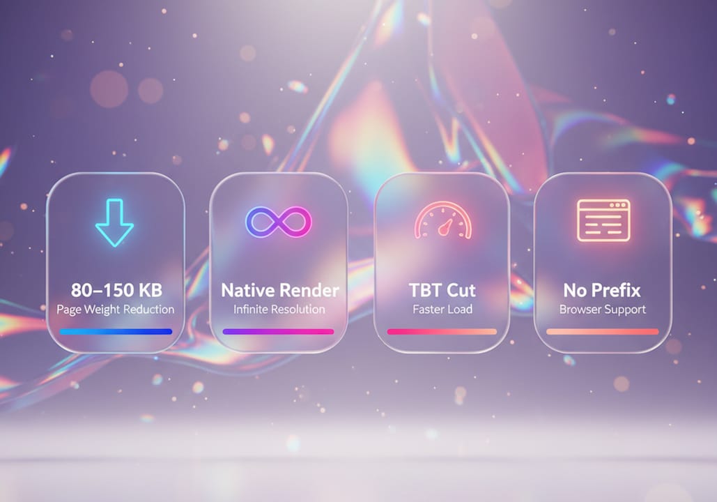
The performance gains go deeper than file size. CSS gradients reduce Total Blocking Time (TBT) by cutting the number of image decode operations during page load. Fewer decodes mean the main thread stays free longer, which makes the whole page feel more responsive. For mobile users on slower connections, this difference is noticeable.
Modern browsers support linear, radial, and conic gradients with no vendor prefixes required. That means you write one clean CSS rule and it works everywhere. No fallback images, no polyfills, no extra build steps.
There is one real pitfall to watch. Improper CSS gradient implementation without explicit container dimensions causes Cumulative Layout Shift (CLS) when containers collapse before rendering. CLS is another Core Web Vitals metric, and a bad score hurts both rankings and user experience. The fix is straightforward: always set an explicit height or aspect-ratio on any container using a CSS gradient background.
Best practices for CSS gradient performance:
-
Replace all decorative background images with CSS gradients first. These are the easiest wins.
-
Set explicit height or aspect-ratio on every gradient container to prevent CLS.
-
Use rgba() values instead of hex for gradient stops to enable smooth transparency control.
-
Test LCP before and after replacing images with gradients using Google PageSpeed Insights.
-
Avoid animating gradients on low-powered devices. Use the prefers-reduced-motion media query to disable animation for users who request it.
Pro Tip: When fading a gradient to transparent, use rgba(R,G,B,0) instead of the transparent keyword. The transparent keyword can cause gray-banding artifacts in some browsers. rgba() keeps the color channel intact and produces a cleaner fade.
For more guidance on applying gradients across devices without breaking layouts, responsive design practices are worth reviewing alongside your CSS gradient workflow.
Which gradient types work best for different UI elements?
Linear, radial, conic, and mesh gradients each solve different visual problems. Choosing the wrong type for a UI element is one of the most common mistakes designers make when working with color gradients in UX.
Linear gradients are the workhorse. They work on buttons, hero backgrounds, dividers, and text fills. A left-to-right or diagonal linear gradient on a CTA button adds energy without visual noise. They are predictable, easy to control, and universally supported.
Radial gradients radiate from a center point outward. They work well for spotlight effects, card backgrounds, and icon glows. A radial gradient centered on a product image creates a natural focal point that draws the eye inward. They feel warmer and more organic than linear gradients.
Conic gradients rotate color stops around a central point, like a color wheel. They are best for data visualizations, loading indicators, and decorative geometric elements. They are not ideal for backgrounds because they can feel visually aggressive at large sizes.
Mesh gradients are the most advanced type. Mesh gradients layer multiple radial gradients with varied positions and opacities to produce organic, painted effects. They are popular in SaaS dashboards, landing pages, and portfolios right now. The effect looks hand-crafted and expensive, which is exactly why startups use them to signal premium quality.
Gradient type by UI element:
-
Buttons: linear gradient, 45-degree angle, two stops
-
Hero backgrounds: linear or mesh gradient, low contrast for readability
-
Cards: radial gradient for spotlight, subtle opacity
-
Text fills: linear gradient with background-clip in CSS
-
Data visualizations: conic gradient for pie-style charts
-
Borders: linear gradient via border-image or pseudo-elements
Accessibility matters here. Always check contrast ratios between text and gradient backgrounds using tools like the WebAIM Contrast Checker. A gradient that looks great at one end of the spectrum may fail contrast requirements at the other end.
What are gradient design best practices for design systems?
Integrating gradients as design tokens inside a design system is the single most effective way to keep gradient use consistent and professional. A design token stores a gradient as a named variable, like --gradient-hero or --gradient-cta. Every component that uses that gradient references the token. When the brand evolves, you update one token and every instance updates automatically.
Gradients aligned with defined design tokens maintain color harmony and prevent the “neon highlights” or muddy darks that plague ad-hoc gradient use. Adjusting saturation at the extremes of your color palette before building gradients produces a cleaner, more polished result. This is the difference between a gradient that looks intentional and one that looks like a 2003 PowerPoint slide.
Practical steps for gradient design system integration:
-
Define your gradient palette in design tokens before writing any CSS. Name tokens by purpose, not by color value.
-
Build a gradient scale with at least three variants per brand color: light, mid, and dark.
-
Test every gradient at all breakpoints. A gradient that looks balanced on desktop can feel overwhelming on mobile.
-
Document accessibility fallbacks. Define a solid color fallback for each gradient token for high-contrast mode users.
-
Use the prefers-reduced-motion media query to disable animated gradients for users who have motion sensitivity.
The smart use of gradients within a design system eliminates randomness and builds a refined, scalable visual language. That is not just an aesthetic win. It is a time-saving operational win for any team managing a growing product. For a deeper look at how website speed and gradient choices intersect, performance-focused teams should audit their gradient implementation alongside their broader speed strategy.
Key Takeaways
Gradient design is a technical and visual tool that improves aesthetics, performance, and brand consistency when implemented through a structured design system with proper CSS practices.
| Point | Details |
|---|---|
| Gradients outperform flat design | They add depth, emotional tone, and attention guidance that flat color cannot replicate. |
| CSS gradients improve performance | Replacing raster images with CSS gradients reduces page weight by 80–150 KB and improves LCP scores. |
| Gradient type matters | Linear, radial, conic, and mesh gradients each serve different UI elements and contexts. |
| Design tokens prevent chaos | Storing gradients as design tokens ensures consistency and prevents ad-hoc, off-brand color mixes. |
| CLS is a real risk | Always set explicit container dimensions to prevent layout shift when using CSS gradient backgrounds. |
Gradients in 2026: what I’ve actually learned on the job
Okay, real talk. When gradients came back hard a few years ago, I was skeptical. (I had flashbacks to every MySpace page I ever cringed at.) But working on real startup projects changed my mind fast.
The thing most designers get wrong is treating gradients like decoration. They slap a purple-to-pink sweep on a hero section and call it a day. That is not gradient design. That is gradient wallpaper. The actual power of gradients is in how they move the eye, carry brand emotion, and signal quality before a user reads anything.
What I have seen work consistently is restraint. One strong gradient per page, used with intention, beats five competing gradients every time. The brands that do this well (think Stripe, Linear, or Vercel) use gradients to create a single, memorable visual moment. Everything else is clean.
The animated gradient trend is genuinely exciting right now. CSS-only animated gradients using @keyframes and hue-rotate are lightweight and beautiful. But I have watched teams ship animated gradients without testing on low-end Android devices, and the results are rough. Always test on real hardware, not just your MacBook Pro.
The AI-generated color scheme tools are also worth watching. They are getting good at producing gradient palettes that feel cohesive rather than random. But they still need a human eye to check accessibility and brand fit. The tool generates the palette. You decide if it actually fits the product.
— Coumba Evelyn
Gradient tools and systems from Coumba Win Design
Getting gradients right across a whole product is harder than it looks on a single screen. Coumba Win Design builds the systems that make it repeatable.

The Style Guide at Coumba Win Design gives you a structured framework for defining and managing gradient tokens across your entire project. No more one-off color decisions that break brand consistency three sprints later. The Components library takes it further by showing exactly how gradients behave inside real UI elements, from buttons to hero sections to cards. If you are building a startup product and want gradients that look intentional rather than accidental, these resources are where to start.
FAQ
What is the role of gradient design in modern websites?
Gradient design creates visual depth, guides user attention, and communicates brand personality through smooth color transitions. It replaces flat color with a more expressive and emotionally resonant visual tool.
Do CSS gradients improve website performance?
Yes. Replacing raster background images with CSS gradients reduces page weight by 80–150 KB per page and improves Core Web Vitals metrics like LCP and TBT.
What causes layout shift with CSS gradients?
Cumulative Layout Shift (CLS) occurs when gradient containers lack explicit height or aspect-ratio values. Setting these dimensions prevents containers from collapsing before the gradient renders.
Which gradient type is best for website backgrounds?
Linear and mesh gradients work best for large backgrounds. Mesh gradients, created by layering multiple radial gradients, produce organic effects popular in SaaS and portfolio sites.
How do I keep gradients consistent across a design system?
Store gradients as named design tokens and reference those tokens in every component. This approach ensures brand consistency and makes global updates fast and reliable.
Recommended