The Role of Whitespace in Branding: Clarity and Impact

The Role of Whitespace in Branding: Clarity and Impact
Whitespace makes your brand look clearer, more premium, and easier to remember — and that’s not just a design opinion, it’s measurable. Perceived clarity scores increase from 5.08 to 5.73 when Active White Space is present in a logo (p < .05), making the breathing room you give a mark a real persuasive force. The core benefits? Better readability, stronger visual hierarchy, elevated perceived value, and a brand personality that actually lands. The one thing you can do right now: audit your current layouts for crowding and add at least one deliberate spacing decision before your next review.
Table of Contents
- What is whitespace (and what it’s not) in branding
- What are the different kinds of whitespace designers use?
- Why does whitespace matter for brand identity and perception?
- How do you apply whitespace across brand assets?
- What design principles should guide your whitespace decisions?
- Real examples of whitespace doing the heavy lifting
- Common whitespace mistakes and how to fix them fast
- How do you measure the impact of whitespace on brand outcomes?
- What does the research actually say about Active White Space?
- Key Takeaways
- The thing most designers get wrong about whitespace
- Coumba Win Design builds spacing systems that actually hold up
- Useful sources
- FAQ
What is whitespace (and what it’s not) in branding
Whitespace is any empty area in a design — the space between letters, around a logo, inside a layout grid, or across a packaging panel. It doesn’t have to be white. It can be black, textured, or the color of your background. The name is a holdover from print, but the concept applies everywhere: logos, web layouts, packaging, environmental signage, even app UI.

Here’s where designers sometimes get tangled: whitespace and negative space are related but not the same thing. Whitespace is the breathing room in a layout — the margins, gutters, and padding that keep content from feeling claustrophobic. Negative space is structural; it’s the shaped emptiness inside or around a mark that carries meaning. Think of the arrow hidden in a delivery company’s wordmark, or the face formed between two profiles. One supports legibility, the other creates it.
For branding work, whitespace shows up in: logo clearance zones, typographic kerning and line-height, grid gutters between columns, packaging panels with open fields, and digital margins around CTAs. Each context has its own rules, but the underlying logic is the same — empty space is never wasted space.
What are the different kinds of whitespace designers use?
Not all whitespace is doing the same job. Here’s how practitioners break it down:
- Macro whitespace: Large-scale separation between major layout elements — the space between a hero image and the first content block, or the generous padding around a luxury brand’s logo. Signals premium positioning and gives the eye room to rest.
- Micro whitespace: The small-scale spacing decisions — letter-spacing (tracking), line-height (leading), padding inside buttons, margins between list items. Gets ignored constantly, but it’s what makes body copy actually readable.
- Active White Space (AWS): Intentionally placed empty space that directs the viewer’s eye toward something specific. It’s a design choice, not an accident. Use it to create emphasis, isolate a key element, or build tension in a composition.
- Passive White Space (PWS): The natural breathing room that supports legibility and comfort without calling attention to itself. Think of the margins on a well-set page — you don’t notice them, but you’d notice if they were gone.
Active whitespace is the tool you reach for when you want to emphasize; passive whitespace is the baseline that keeps everything readable. Luxury brands lean heavily on macro AWS to signal exclusivity. News and utility sites deliberately compress macro spacing to communicate information density and credibility — that tightness is a feature, not a bug.
Why does whitespace matter for brand identity and perception?
Readability and legibility
Micro spacing is where most readability problems live. Tight leading makes paragraphs feel like walls. Poor kerning makes headlines look amateurish. Whitespace in web design improves scannability by giving the eye clear entry points and natural resting places. For brand identity, this translates directly to how quickly someone absorbs your message — and whether they bother trying.

Hierarchy and emphasis
Macro spacing creates focal points. When you give one element significantly more room than its neighbors, you’re telling the viewer: this matters most. That’s hierarchy without color, weight, or size changes. It’s one of the quietest and most powerful tools in a brand system.
Perceived value and tone
More breathing room almost always reads as more premium. Macro whitespace signals minimalism and a kind of confidence — the brand isn’t scrambling to fill every inch. Tight, information-dense layouts signal utility and credibility, which is exactly right for a news platform or a data-heavy dashboard. Neither is wrong; they’re calibrated to different brand promises.
Personality calibration
This one’s backed by research, and it’s worth paying attention to. Active White Space disproportionately benefits brands aiming for a sophisticated personality — the effect is measurable and consistent. It also supports sincere, exciting, and competent archetypes. The one personality where AWS shows little effect? Rugged. If your brand is built on grit, durability, and no-nonsense utility, generous whitespace can actually feel off-brand. Knowing this helps you make spacing decisions that are strategic, not just aesthetic. For more on how layout choices map to brand personality traits, it’s worth thinking through your archetype before you open Figma.
How do you apply whitespace across brand assets?
Start with an audit, build a system, then test. That’s the process in three words. Here’s what it looks like in practice:
- Audit visual density. Print or screenshot your key brand assets at actual use size. Mark every area that feels crowded or where the eye doesn’t know where to go first.
- Define spacing tokens. Pick a base unit (4px or 8px works for most digital systems) and build a scale: 4–8–16–24–32–48. Name them semantically:
space-xs,space-sm,space-md,space-lg. - Apply the spacing scale. Replace arbitrary spacing decisions with tokens. Padding inside components, margins between sections, clearance around logos — all of it maps to the scale.
- Test at key sizes. Check your logo at 16px favicon size, at 32px app icon size, and at full lockup size. Micro whitespace that looks elegant at large scale can collapse into mud at small scale.
- Document in your style guide. Spacing decisions that aren’t written down get overridden in the first dev handoff. Your spacing tokens and style rules belong in the design system, not just in your head.
Dos and don’ts:
- Do increase macro spacing when a brand needs to feel more premium or when content is competing for attention.
- Do tighten micro spacing when you’re working with dense information that needs to feel organized, not airy.
- Don’t force negative-space tricks into a logo just because they look clever — if the secondary image doesn’t connect to the brand concept, it’s a gimmick.
- Don’t ignore responsive scaling. A layout with generous macro spacing on desktop can feel broken on mobile if spacing tokens aren’t responsive.
For developer handoff, include spacing tokens in your component library. A typographic spacing system that lives only in a design file is a system that will drift the moment a developer eyeballs a margin.
What design principles should guide your whitespace decisions?
Good spacing isn’t intuitive — it’s principled. Here’s the short list of what to keep in mind:
- Balance: Distribute whitespace so no single area of a layout feels heavier or lighter than the content warrants. Asymmetric balance is fine; accidental imbalance is not.
- Visual rhythm: Consistent spacing intervals create a beat the eye follows. Break the rhythm intentionally (a wider gap, a tighter cluster) to create emphasis.
- Alignment: Whitespace and alignment work together. Elements that share a spatial relationship should share a spacing logic.
- Figure-ground clarity: The empty space around a mark defines its shape as much as the mark itself. If the background competes with the foreground, the mark loses.
- Accessibility: Minimum touch targets on mobile are 44×44px (per Apple’s Human Interface Guidelines) and 48×48dp (per Google’s Material Design). Line lengths of 50–75 characters per line support comfortable reading. Sufficient padding around interactive elements prevents mis-taps. And critically: never rely on whitespace alone to convey meaning — screen readers don’t see spacing.
Pro Tip: Test your negative-space logo at 32px and 16px. If the hidden image or the figure-ground relationship collapses at small scale, the technique is working against you. Either simplify the mark or reserve the negative-space version for large-format use only.
Visual storytelling through layout depends on these principles working together — spacing, alignment, and figure-ground clarity are what let a composition tell a story without words.
Real examples of whitespace doing the heavy lifting
| Example type | Whitespace choice | Why it worked | Designer takeaway |
|---|---|---|---|
| Minimal wordmark logo | AWS between letterforms and icon | Isolated the mark, raised perceived clarity | Clearance zones aren’t optional — they’re part of the logo |
| Luxury e-commerce layout | Generous macro spacing between product and copy | Communicated premium positioning without a single word | Let the product breathe; the space IS the message |
| News/media homepage | Tight macro spacing, dense grid | Signaled information credibility and utility | Density is a brand choice, not a failure of restraint |
| Packaging with structured panels | Open field on front panel, detail on reverse | Created hierarchy across surfaces | Front panel = brand statement; back panel = information |
| Negative-space logo mark | Figure-ground reversal with two brand concepts | Triggered cognitive reward, improved recall | Only works when both concepts are genuinely brand-relevant |
The cognitive reward from resolving hidden imagery in a negative-space mark is real — viewers experience a small satisfaction hit when they “find” the secondary image, and that moment strengthens memory encoding. It’s one of the reasons negative-space logo techniques keep showing up in identity work: when the concept is earned, the payoff is genuine.
Environmental and spatial branding adds another layer — interior brand spaces use physical whitespace (open wall areas, spacing between signage elements) to control how a visitor moves through and reads a space.
Common whitespace mistakes and how to fix them fast
- Overuse (too sparse): The layout feels cold, disconnected, or unfinished. Fix: add one anchor element — a rule, a subtle texture, a secondary typographic element — to give the space a reason to exist.
- Underuse (crowding): Everything is competing for attention and nothing wins. Fix: identify the single most important element per section and give it 1.5× the surrounding space.
- Forced negative-space gimmicks: A hidden image that doesn’t connect to the brand concept confuses more than it delights. Fix: if you can’t explain the conceptual link in one sentence, cut it.
- Ignoring responsive scaling: Desktop spacing that looks elegant collapses on mobile. Fix: use relative spacing tokens (rem, %, viewport units) rather than fixed pixel values wherever possible.
- Inconsistent micro spacing: Random padding values across components make a brand system feel unpolished. Fix: run a spacing audit in your design file and replace every arbitrary value with a token from your scale.
The trade-off between luxury spacing and information density is intentional when it’s a brand decision — and a mistake when it’s just habit. Aligning visual choices with brand values means making that call consciously, not by default.
How do you measure the impact of whitespace on brand outcomes?
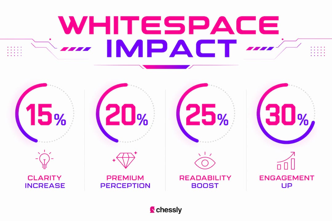
Whitespace impact is measurable — you just need to know what to track. The primary outcome metrics are perceived clarity, CTA click-through rate, brand favorability, and recall.
| Test type | What you’re measuring | Recommended sample size | Primary metric |
|---|---|---|---|
| A/B layout test (macro spacing) | CTA click-through rate | — | CTR lift |
| Logo variant test (AWS vs. no AWS) | Perceived clarity, brand personality fit | 50 respondents | Survey clarity score |
| 5-second recall test | Brand memorability | 30–50 respondents | Unaided recall rate |
| Preference survey | Perceived premium / favorability | 50 respondents | Favorability score |
For survey questions, keep them simple: “How clear is this brand’s message?” (1–7 scale), “How premium does this brand feel?” (1–7 scale), “How likely are you to remember this logo?” (1–7 scale). Run the same questions on your baseline and your revised version.
For analytics, track: scroll depth on pages with increased macro spacing, CTA click rate before and after spacing changes, and time-on-page as a proxy for readability. None of these are perfect signals in isolation, but together they build a case. Strong branding that drives growth is always backed by evidence, not just instinct.
What does the research actually say about Active White Space?
The clearest evidence on whitespace in branding comes from a peer-reviewed study on Active White Space in logo design. The finding is direct: adding AWS between logo elements raises perceived clarity scores from 5.08 to 5.73 — a statistically significant increase (p < .05). That’s not a subtle effect. It means viewers consistently read a logo with deliberate spacing as more communicatively clear than the same logo without it.
The personality fit finding is the part most designers miss. AWS works hardest for sophisticated, sincere, exciting, and competent brand personalities. For rugged brands — think workwear, heavy equipment, outdoor survival gear — the effect is minimal. Generous whitespace can actually undercut the brand’s intended toughness.
Want to replicate the study’s approach on your own marks? Show two versions of your logo (one with AWS, one without) to 30–50 people who match your target audience. Ask them to rate clarity, premium feel, and personality fit on a 1–7 scale. Run a paired t-test on the results. You don’t need a research lab — you need a survey tool and a clear hypothesis.
Key Takeaways
Whitespace is a measurable brand asset: logos with Active White Space score significantly higher on perceived clarity, and spacing decisions directly shape how premium, readable, and memorable a brand feels.
| Point | Details |
|---|---|
| AWS raises perceived clarity | Clarity scores increase from 5.08 to 5.73 when Active White Space is present in a logo (p < .05). |
| Macro vs. micro spacing | Macro spacing signals premium positioning; micro spacing (kerning, leading, padding) drives readability. |
| Personality fit matters | AWS benefits sophisticated, sincere, exciting, and competent brands most; it has little effect for rugged archetypes. |
| Measure before and after | Use A/B layout tests and 1–7 scale surveys to quantify clarity, favorability, and recall changes. |
| Coumba Win Design approach | Coumba Win Design builds spacing tokens and style guides into brand systems so spacing decisions survive dev handoff. |
The thing most designers get wrong about whitespace
Here’s an opinion that might ruffle some feathers: whitespace is not a style choice. It’s a communication strategy. And the biggest mistake I see in brand work — across logos, web layouts, and packaging — is treating it as decoration rather than function.
Designers spend hours on color palettes and typeface pairings, then hand off a layout with arbitrary padding values and no spacing documentation. Six months later, the brand looks inconsistent across platforms, the logo is getting cropped wrong, and nobody can figure out why the site feels “off.” The whitespace wasn’t documented. The tokens weren’t defined. The system wasn’t built.
The research backs this up: Active White Space produces a measurable clarity lift, but only when it’s intentional. Accidental whitespace — the kind that happens because nobody thought about it — doesn’t carry the same signal. It just looks like something is missing.
The contrarian take? Sometimes the right answer is less whitespace. A brand that’s trying to signal information authority, urgency, or gritty authenticity can actually be undermined by too much breathing room. Knowing when to pull back is as important as knowing when to add space. The goal isn’t minimalism for its own sake — it’s spacing that serves the brand’s actual personality.
Coumba Win Design builds spacing systems that actually hold up
Most brand guides look great on launch day and fall apart by month three — because spacing decisions were made in Figma but never translated into a real system. Coumba Win Design works differently. The team builds brand identity systems that include documented spacing tokens, component libraries, and style guides designed to survive developer handoff and platform changes. Whether you’re launching a startup identity from scratch or cleaning up a brand that’s grown inconsistent, the work is grounded in the kind of research-backed spacing strategy this guide covers.
If you want a brand system where whitespace is doing real work — not just looking pretty — get in touch with Coumba Win Design and let’s talk about what your brand actually needs.
Useful sources
- Active White Space (AWS) in Logo Designs: Effects on Logo Evaluations and Brand Communication — The primary peer-reviewed study on AWS effects; provides the clarity score data and personality fit findings cited throughout this article.
- The Importance of White Space in Graphic Design (UF/IFAS) — Accessible practitioner overview of whitespace principles in graphic design contexts.
- What Is Negative Space in Logo Design? A Guide (Design Your Way) — Covers the structural distinction between whitespace and negative space, plus the cognitive reward mechanism behind figure-ground reversal.
- The Power of White Space (IxDF) — Explains how macro whitespace signals premium positioning and how information-dense layouts serve different brand needs.
- What Is White Space? Why It’s Important in Web Design (Mailchimp) — Practical web design framing; clarifies that whitespace is not necessarily white and covers its role in UX and scannability.
- The Power of White Space in Design (Think Design) — Practitioner guidance on active vs. passive whitespace and when to use each for emphasis vs. legibility.
- Negative Space in Logo Design (Tailor Brands) — Tips and examples for using negative space techniques thoughtfully in logo marks.
FAQ
What is whitespace in branding?
Whitespace in branding is any empty area in a design — margins, padding, spacing between elements — that gives a layout room to breathe and guides the viewer’s eye. It doesn’t have to be literally white; it’s defined by the absence of content, not by color.
What is the purpose of whitespace in design?
Whitespace improves readability, creates visual hierarchy, and signals brand personality. Active White Space in logos has been shown to raise perceived clarity scores from 5.08 to 5.73, making a brand’s message feel cleaner and more intentional.
What is the difference between whitespace and negative space?
Whitespace refers to the breathing room in a layout that supports legibility and comfort. Negative space is the shaped emptiness inside or around a logo mark that carries structural meaning — like a hidden image formed between two elements. Both are empty space; only negative space is designed to communicate a specific visual concept.
What is whitespace vs. greenfield in a business context?
In business strategy, “whitespace” refers to an untapped market opportunity — a gap where no competitor currently operates. In design, whitespace is purely a visual concept about empty space in a layout. The two uses of the term are unrelated.
How do you measure whitespace impact on a brand?
Run A/B tests comparing layouts with and without increased macro spacing, and use 1–7 scale surveys measuring perceived clarity, premium feel, and memorability. Track CTA click-through rates and scroll depth as supporting analytics signals.
Recommended