Pull Up Banner Design for Founders: Print Ready Templates & Specs

Pull Up Banner Design for Founders: Print Ready Templates & Specs
Your headline and logo go in the top third, because that’s the eye-level zone people actually look at first. Keep the whole thing to one clear message and one call to action at the bottom. Use the standard 33.5" × 78.7" size unless you genuinely need more real estate. Everything else, templates, file specs, the pre-print checklist, exists to protect that one decision.
TL;DR:
- Place the logo and headline in the top third of the banner, as this area captures initial attention and is most visible from a distance.
- Use a standard size of roughly 33.5 inches by 78.7 inches unless wider formats are needed for dual branding or open spaces, and keep critical content above the bottom 70 millimeters to avoid being obscured.
- Design with bold, high-contrast typography and limit text to eight words for headlines, with supporting points kept short and skimmable to maximize readability from a distance.
- Export files at 150 to 300 DPI in CMYK with at least 3 millimeters of bleed, and test QR codes from standing distance to ensure scannability.
- Employ a consistent visual system across all booth and branding materials to create a cohesive, polished appearance that enhances brand perception at events.
Table of Contents
- Pull Up Banner Design Rules That Get You Read at 10 Feet
- What Size Should a Pull Up Banner Be?
- Where Do I Find Editable Pull Up Banner Templates?
- What File Specs Do Pull Up Banners Need for Printing?
- Final Checklist Before You Order Your Pull Up Banner
- How Coumba Win Design Approaches Banner and Booth Strategy
- Templates Get You There Fast, but Not Every Booth Needs More
- Get Your Banner and Booth Materials Designed Right the First Time
- Sources
- FAQ
Pull Up Banner Design Rules That Get You Read at 10 Feet
Here’s the thing nobody tells you at the print shop: your banner has about three seconds to work before someone’s eyes slide past it toward the coffee table. That’s not a design problem you fix with a fancier font. It’s a layout problem.
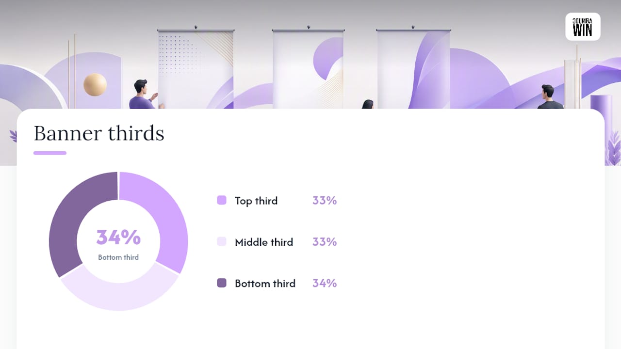
Think of your banner in three horizontal zones. The top third is prime real estate, your logo and headline live here because that’s where eyes land first when someone’s walking toward your booth. The middle third carries supporting proof: a short benefit list, a product shot, maybe a stat. The bottom third is your CTA and QR code, positioned where someone standing close enough to act can actually reach it.
A few non-negotiables for getting the copy and visuals right:
- Cap your headline at 8 words or fewer, paired with three short supporting points, a structure that performs reliably precisely because it’s skimmable.
- Go bold and oversized with type. Design professionals recommend large, high-contrast typography specifically because banners get read from a distance, not from six inches away.
- Use color contrast that survives bad lighting. Dark text on light backgrounds (or the reverse) beats anything midtone under fluorescent convention-hall lighting.
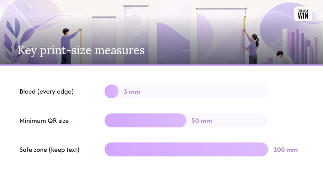
- Size your QR code at a minimum of 5cm × 5cm, and test it from standing distance before you commit to print, ideally on two or three different phones.
- Skip paragraphs entirely. If a sentence needs more than eight words to land, cut it down or turn it into a bullet.
Pro Tip: Print a reduced scale proof on regular paper and tape it to a wall, then walk backward until you’re roughly 10 feet away. Anything you can’t read from there won’t work at full size either.
What Size Should a Pull Up Banner Be?
Most retractable banner stands ship in a handful of standard widths, and picking outside that range usually means custom hardware and a longer lead time.
The industry default sits around 850mm × 2000mm, roughly 33.5 inches by 78.7 inches, and that’s the size to default to unless you have a specific reason not to. Wider formats (39" or 47") make sense for double-branding two products or when your booth sits in a wide-open hallway where extra width helps you get noticed from the side, not just head-on.
| Consideration | Detail |
|---|---|
| Standard size | 33.5" × 78.7" (850mm × 2000mm) |
| Wider option | 39"–47" width for dual branding or open aisles |
| Safe zone from bottom | Keep critical content above the lower 70–100mm |
| Sided printing | Single-sided (standard, cheaper) vs. double-sided (better for open-floor visibility) |
| Budget tier | Entry-level vinyl banners run cheap; premium fabric with a sturdier base costs more |
The base and cassette mechanism at the bottom of every retractable stand hides more than you’d expect. Production guides consistently flag that lower 70 to 100mm as a dead zone, so keep your logo, headline, and QR code clear of it or you’ll unroll a banner with your CTA half swallowed by plastic.
Single-sided vinyl is the standard choice and it’s fine for most booths pressed against a wall. Double-sided fabric costs more but earns it back at events where people approach from both directions, like a center-aisle booth at a trade show.
Where Do I Find Editable Pull Up Banner Templates?
You don’t need a designer on retainer to get a decent first draft. Canva hosts a library of retractable banner templates sized to standard dimensions, and it’s the fastest on ramp for a founder who needs something presentable by Friday.
The workflow that actually works:
- Write your headline and three supporting points first, before you touch a template. Copy drives layout, not the other way around.
- Pick a template that already respects the three zone structure, don’t fight a template built for a different message hierarchy.
- Swap in your brand colors, font, and logo immediately so you’re designing with real assets, not placeholders.
- Replace stock imagery with your own photography or a simple, uncluttered brand graphic.
- Export at full print resolution, not the web-preview default most online editors ship with.
The catch with free online editors: many cap export resolution or default to RGB color, which looks fine on screen and prints muddy. If your template tool doesn’t offer a high-res PDF export in CMYK, treat it as a layout draft and hand the final file to a designer or print shop for proper setup.
What File Specs Do Pull Up Banners Need for Printing?
Print shops reject or silently downgrade more files over resolution and color mode than anything else, so get these right before you hit export.
- Resolution: Aim for 150 to 300 DPI at final print size, 150 DPI is acceptable for most banner content since viewers stand several feet away, but bump close-up photography to 300 DPI so skin tones and product detail don’t turn soft.
- Color mode: Set your file to CMYK before you start designing, not after. RGB files shift color unpredictably when converted for print, and a logo that looked vibrant magenta on screen can print flat and gray.
- Bleed and safe zones: Build in at least 3mm of bleed on every edge and keep text and logos comfortably inside the safe zone, roughly 100mm from any trimmed edge.
- File format: Export vector logos as AI, EPS, or SVG, and submit your final artwork as a high-resolution PDF, ideally PDF/X, with crop marks included.
- Request a proof: Ask your printer for a digital or physical sample proof before running the full print, especially on your first order with a new supplier.
One number worth remembering: a minimum QR code size of 5cm × 5cm isn’t a suggestion, it’s the difference between a scannable code and a dead corner of your banner nobody bothers tapping.
If you’re repurposing digital ad creative for print, note that Google Ads accepts different file types and size limits than print production does, so don’t assume a display-ready asset is print-ready without conversion.
Final Checklist Before You Order Your Pull Up Banner
Run through this before you click “order,” not after the box arrives:
- Logo saved as a vector file (AI, EPS, or SVG), not a screenshot
- Headline at 8 words or fewer, checked out loud for length
- Resolution confirmed at 150 to 300 DPI at final size
- 3mm bleed built into the file, with crop marks visible
- Safe zone respected, nothing critical inside 100mm of any edge or the bottom cassette area
- QR code tested at standing distance on at least two phones
- File color mode set to CMYK, not RGB
The most common mistake isn’t a technical one, it’s overloading the banner with three headlines’ worth of information because everyone in the room wanted their message included. Fix it by ruthlessly cutting to one headline and three points, full stop.
Pro Tip: Hold your phone camera up, zoom out until the frame roughly matches a 10 foot viewing distance, and snap a photo of your proof. If you squint at the photo and still can’t read the headline, your type is too small.
How Coumba Win Design Approaches Banner and Booth Strategy
Placing the brand name and headline in the top third isn’t a decoration choice, it’s where attention lands first at eye level, and Coumba Win Design treats that zone as the most contested real estate on the entire banner. Every project starts by asking what a founder needs a stranger to remember in three seconds, not what looks good in a mockup.
That thinking shows up across Coumba Win Design’s case studies, where refining a brand narrative for a high-end apparel client meant stripping a cluttered pitch down to one visual hierarchy that carried across web, deck, and physical event materials.
A banner is rarely the problem by itself. It’s usually the symptom of a brand system that hasn’t been decided yet, so the banner ends up trying to make five decisions at once.
If you need something functional by Thursday, a template gets you there. If you’re heading into a Demo Day or a fundraising push where brand consistency across your pitch deck, website, and booth actually moves investor perception, that’s when hiring a designer earns its cost back.
Templates Get You There Fast, but Not Every Booth Needs More
Most of the advice floating around treats pull-up banner design like it’s purely an aesthetic exercise, pick a nice font, add a photo, done. That misses the real lesson buried in the technical requirements: a banner is a communication problem disguised as a print job.
The conventional wisdom oversells creativity and undersells restraint. The banners that actually work aren’t the most beautifully designed ones in the booth, they’re the ones that survive a busy hallway, bad lighting, and a viewer who’s already scanning three other booths at once. That means the headline word count and the QR code test matter more than font pairing ever will.
For most small business owners, a solid template plus a careful pass through the checklist above will get a professional result. Where template routes fall short is brand cohesion, a banner that doesn’t visually match your pitch deck or website undercuts the polish you worked to build everywhere else. That gap, not the print quality, is usually what separates a booth that looks assembled from one that looks intentional.
— Coumba Evelyn
Get Your Banner and Booth Materials Designed Right the First Time
Coumba Win Design is the alternative to piecing together a booth from three different template sites: one team builds your banner, Demo Day kit, and branded swag so they actually match your website and pitch deck, instead of looking like they came from different companies.

For startups heading into a Demo Day or a launch event, that consistency matters more than any single asset. Coumba Win Design’s Demo Day kits bundle banner design with branded swag and booth materials built from the same visual system used across your site and deck, so nothing looks like an afterthought. If your brand already has defined components and visual patterns, the component library shows how those elements extend cleanly onto physical materials like banners and signage.
If you’d rather skip the template guesswork entirely, reach out to see examples and get pricing for a banner and event kit built around your actual brand system.
Sources
FAQ
How Do I Design a Pull-Up Banner?
Start with a single headline of 8 words or fewer, place your logo and headline in the top third, add three short supporting points in the middle, and put one clear CTA with a QR code at the bottom, then export the file at 150 to 300 DPI in CMYK with 3mm bleed.
What Are the Standard Measurements for a Pull-Up Banner?
The most common size is roughly 33.5" × 78.7" (850mm × 2000mm), though wider stands up to 47" are available for dual branding or open aisle placements.
What Are Pull-Up Banners Also Called?
They’re commonly called retractable banners or roller banners, all three terms describe the same spring-loaded stand with a cassette base that retracts the printed graphic for storage and transport.
How Much Does a Pull-Up Banner Cost?
Entry-level vinyl banners with a basic stand sit at the lower end of the price range, while premium fabric graphics with a sturdier double-sided stand cost more, with the gap driven mainly by material quality and stand durability rather than print complexity. For startups who want banner design bundled with matching Demo Day materials, Coumba Win Design offers kits that combine banner production with branded swag and booth assets.
Can I Use a Free Template for My Pull-Up Banner?
Yes, tools like Canva offer retractable banner templates sized to standard dimensions, but check the export resolution and color mode before printing, since many free editors default to web-quality RGB files that print poorly.


