
Marketplace UX Design: The Priorities That Move Metrics

Marketplace UX Design: The Priorities That Move Metrics
Prioritize three things: discovery, trust at the moment of choice, and seller onboarding. Everything else in marketplace UX design is downstream of those three, and if you’re staring at a roadmap with forty items on it, that’s your filter. Two-sided products live or die on whether buyers find what they want fast and whether sellers keep showing up with good listings. Miss either side and the flywheel stalls.
Here’s the thing about marketplaces that nobody tells founders early enough: you’re building two products wearing one interface, and most teams design for the buyer while treating the seller experience like an afterthought glued on in sprint six.
So, what do you actually do this week?
- Audit your default search ranking. If it’s sorted by “newest” instead of relevance and buyer intent, fix that first.
- Count the clicks from your product listing page to checkout. More than 3-4 and you’re bleeding conversion.
- Time how long it takes a new seller to publish their first listing. Anything over 10 minutes is a churn risk.
- Check whether your trust signals (reviews, verification badges, payment protection) appear near the buy button, not buried in a footer.
- Look at your empty-state screens for new categories. Nothing says “abandon this app” faster than a search that returns zero results.
Watch these numbers weekly: PLP-to-cart conversion, checkout abandonment rate, and time-to-first-listing for sellers. If time-to-first-listing creeps past 15 minutes, your onboarding flow needs surgery, not a tooltip.
Key Takeaways
Marketplace UX design succeeds when discovery, trust at the moment of choice, and seller onboarding are treated as the three highest-priority, measurable levers on the roadmap.
| Point | Details |
|---|---|
| Fix search ranking first | Default to relevance and buyer intent, not seller recency, before touching visual design. |
| Layer trust, don’t dump it | Launch with identity verification and on-platform payments, then add reputation scoring as volume grows. |
| Split PDP strategy by involvement | Lead with price and photos for low-involvement goods; lead with seller history and reviews for high-involvement ones. |
| Guest checkout is the biggest single lever | It often produces the largest standalone conversion lift of any checkout pattern change. |
| Sequence trade-offs deliberately | Build the minimum trust stack and onboarding flow first; defer advanced personalization until scale justifies it, and consider Coumba Win Design for the dual-journey audit work. |
Table of Contents
- What Problems Does Marketplace UX Design Actually Solve?
- Core Principles That Should Govern Every Marketplace Screen
- How Should Search and Category Pages Rank Listings?
- What Belongs on a Marketplace Listing or Product Page?
- How Do You Build a Trust Architecture That Scales?
- What Checkout Patterns Reduce Marketplace Abandonment?
- How Do You Design a Seller Onboarding Flow That Sticks?
- What Performance Targets Actually Move Marketplace Conversion?
- What Accessibility Standards Do Marketplaces Need?
- How Do You Test and Validate Marketplace UX Changes?
- What Research Should Guide Marketplace UX Decisions?
- The Trade-Offs Product Teams Consistently Get Wrong
- Need a Design Partner That Understands Marketplaces?
- Sources
- FAQ
What Problems Does Marketplace UX Design Actually Solve?
Every marketplace fights the same five fires, whether it’s selling sneakers or freelance welders. Discovery friction happens when buyers can’t find relevant inventory fast enough, and they bounce. Decision friction shows up on high-involvement purchases (real estate, used cars, freelance hires) where buyers hesitate because the stakes feel too high for a five-second scroll decision.
Trust and safety concerns kill transactions before they start, particularly in peer-to-peer categories where buyers are handing money to a stranger. Thin supply, meaning empty categories or too few listings to build confidence, tells new visitors the platform isn’t ready yet. And off-platform leakage, where buyers and sellers connect on your platform then finish the deal over text or PayPal, quietly drains your take rate.
These problems compound. A category with thin supply also suffers worse decision friction, because buyers have nothing to compare against. You’ll see it in your metrics before you see it anywhere else:
- Search abandonment spikes when result sets are too broad or too sparse
- PDP bounce rate climbs on listings missing key specs or trust cues
- Listing drop-off during creation signals a broken seller flow
- Seller churn within 30 days often traces back to zero views on their first listing
Map each metric to its root problem before you touch a single pixel.
Core Principles That Should Govern Every Marketplace Screen
Good marketplace UX design comes down to a handful of rules that apply whether you’re designing a checkout button or a seller dashboard. Miss these and no amount of visual polish saves you.
- Design for the moment of choice. The instant before a buyer clicks “book” or “buy” is where trust signals, price clarity, and urgency cues matter most. Put your strongest signal (verified seller badge, instant refund policy) right next to that button, not three scrolls above it.
- Surface trust signals sparingly, not everywhere. A listing covered in eight badges reads as desperate, not credible. Pick the two or three that matter for that category and let the rest live one click deeper.
- Optimize search first. Most marketplace traffic funnels through search or category browse, so a slow or dumb search algorithm caps your entire conversion ceiling before checkout even enters the picture.
- Build mobile-first, not mobile-adapted. More than half of marketplace sessions now start on a phone, and a desktop-first layout squeezed into a mobile frame always shows the seams.
- Use progressive verification. Don’t demand ID scans and bank details before someone has even browsed. Verify identity in layers, escalating only when the transaction size or risk warrants it.
A quick example: on a rideshare-style listing, the moment of choice is the driver’s photo, rating, and ETA sitting together. On a freelance marketplace, it’s the seller’s response time and portfolio thumbnail next to the “message” button. Same principle, completely different execution because the goods are different.
Baymard Institute’s research on ecommerce quantitative UX patterns backs principle three hard: breaking conventional patterns, like moving search to an unexpected spot or hiding filters behind an extra tap, correlates with measurable conversion drops. Marketplace buyers already carry expectations from Amazon and Airbnb into your product. Fighting those expectations for the sake of originality is a losing bet.
Pro Tip: When buyer speed conflicts with seller control (a seller wants to approve every booking, but instant booking converts better for buyers), don’t pick one globally. Let sellers with strong track records unlock instant booking as a reward, and keep manual approval as the default for new or lower-rated sellers. You get buyer speed where it’s earned and safety where it’s needed.
How Should Search and Category Pages Rank Listings?
Default ranking should reflect what the buyer is trying to accomplish, never what’s easiest for you to compute. Sorting by “newest first” rewards sellers for posting frequently instead of rewarding buyers with relevant results, and it’s one of the most common mistakes in early-stage marketplaces. A sensible default blends relevance, price competitiveness, and seller quality signals, then lets buyers override with explicit sort options.
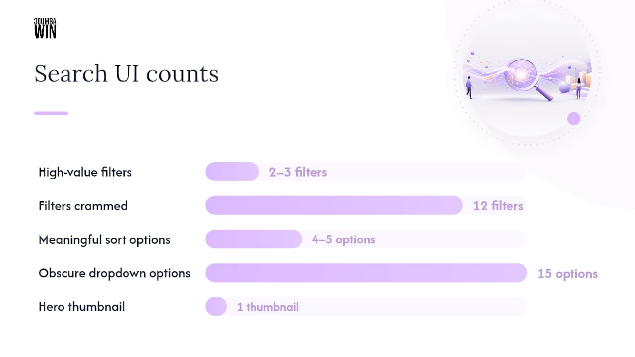
Faceted filtering needs discipline. Cramming twelve filters above the fold overwhelms new users; two or three high-value filters (price range, location, category-specific specs) belong front and center, with the rest tucked into an expandable panel. Filters should persist through back-button navigation. Nothing frustrates a buyer faster than reapplying five filters because they hit “back” to compare two listings.
On the listing page itself, surface the signals buyers actually weigh before opening a detail page:
- Price, always visible, never requiring a click to reveal
- Verified seller or verified listing status, shown as a small badge, not a banner
- Delivery window or availability date for time-sensitive categories
- A single hero thumbnail that represents the actual item, not a stock photo
Avoid signal overload on the card itself. Every additional badge or icon competes for attention, and NN/g’s ecommerce research consistently finds that cluttered product cards slow scanning speed without improving conversion. Keep sort options limited to four or five meaningful choices (relevance, price, rating, distance) rather than a dropdown with fifteen obscure options nobody uses.
What Belongs on a Marketplace Listing or Product Page?
The listing page is where browsing turns into a decision, and what you put above the fold depends heavily on whether you’re selling a $12 phone case or a $12,000 vintage watch. A mixed-methods study on how buyers process market signals in online marketplaces found that price and photographs act as fast, low-effort signals for low-involvement purchases, while buyers evaluating high-involvement goods lean on costlier signals: seller history, third-party verification, and detailed reviews.
That distinction should shape your entire PDP layout. For low-involvement goods, lead with a clean hero image, price, and a one-tap add-to-cart button. Buyers aren’t reading paragraphs of specs for a $15 item.
For high-involvement goods, the calculus flips. Buyers want:
- Multiple images, ideally from different angles or contexts, not one glamour shot
- Seller credentials (years active, transaction count, response rate)
- Long-form reviews, not just a star average
- Third-party verification or platform-backed guarantees, stated explicitly
Mandatory elements regardless of category: hero images, price, key specs, real-time availability, and a visible line about platform protections (buyer guarantee, refund window, payment security). Put the “add to cart” or “contact seller” action above the fold every time. Push extended specs, full review text, and shipping policy details below the fold, where interested buyers will scroll for them but casual browsers won’t be forced past them.
How Do You Build a Trust Architecture That Scales?
Trust in a marketplace works in layers, and trying to build the advanced layer before the basic one is why so many early platforms feel sketchy even when the product idea is sound. The base layer covers identity verification for sellers, on-platform payments (never “message me for Venmo details”), and confirmed, verified transactions before a review can be posted. MarketplaceBeat’s playbook on building marketplace trust recommends shipping exactly this minimum viable trust stack at launch, then adding complexity as transaction volume grows.

The advanced layer comes later: recency-weighted reputation scores (a seller’s last ten transactions matter more than their first ten), deposit or escrow requirements for high-value categories, and dual reputation models where public star ratings coexist with a private, platform-only risk score that never surfaces to buyers directly. Academic research on marketplace reputation systems documents exactly this tension: too much disclosure invites discrimination, too little invites fraud, and the right balance depends on category risk.
Every trust decision involves a trade-off. More visibility into a seller’s history builds buyer confidence but can expose sellers to bias. More friction (extra verification steps) improves safety but slows conversion. Escalate verification only when the transaction size or category risk justifies it, not as a blanket policy.
A practical moderation checklist: verify identity before a first listing goes live, require on-platform messaging before release of contact details, flag review clusters that arrive in suspicious bursts, and place a platform guarantee message directly next to the payment button. Coumba Win Design’s take on building trust through website design covers how these visual cues translate into actual layout decisions.
Pro Tip: *Never show a raw fraud or dispute count publicly, as it reads as alarming even when the rate is low.
What Checkout Patterns Reduce Marketplace Abandonment?
Checkout is where marketplaces lose deals they already won on the listing page, and most of the leakage is self-inflicted. The recommended flow runs in a predictable sequence:
- Offer guest checkout as the default path, not an obscure link under the login form
- Show a persistent progress indicator (step 1 of 3, not a mystery scroll)
- Display a full order summary with itemized costs before the final payment step
- Keep platform protection messaging visible at the exact point of payment, not just on a policy page
- Confirm the transaction immediately with a receipt and a clear next-step message
Fee and shipping transparency has to happen early. Hiding delivery costs until the last screen is a dark pattern buyers now recognize instantly, and it’s one of the fastest ways to spike cart abandonment. Metricuno’s analysis of ecommerce UX patterns found guest checkout alone often produces the single largest conversion lift of any individual pattern change, larger than redesigning the entire cart page.
Post-transaction UX matters just as much as the payment step itself. Buyers want an immediate confirmation, a receipt they can find later without digging through email, an in-platform messaging thread with the seller, and a clearly labeled path to file a dispute if something goes wrong. A dispute flow buried three menus deep tells buyers you don’t expect problems to get resolved, which erodes the exact trust you built on the listing page.
How Do You Design a Seller Onboarding Flow That Sticks?
Seller onboarding is the most underinvested screen in most marketplaces, and it’s usually the reason supply dries up before demand ever gets a chance to build. A guided first-listing flow with a visible progress bar and a preview mode (showing the seller exactly what buyers will see) reduces drop-off compared to a blank form with twelve required fields.
- Guide the first listing step by step, with example images and pricing hints, not a generic upload form
- Autosave every field so a seller who gets interrupted doesn’t lose thirty minutes of work
- Offer a pricing comparator showing what similar listings charge, so sellers don’t guess blind
- Build in an anti-drop checkpoint: if a seller abandons mid-listing, follow up with a targeted nudge, not a generic email blast
Once a seller is live, the dashboard needs to answer one question fast: is this working? Surface views, buyer inquiries, conversion rate from view to sale, and the next payout date front and center. A seller who checks their dashboard and sees zero views for a week is a seller who churns within 30 days, and that early-view signal is one of the strongest predictors of seller retention that product teams can act on immediately.
What Performance Targets Actually Move Marketplace Conversion?
Speed is a trust signal whether buyers consciously register it or not. A slow-loading listing feels shady before a buyer even reads the description. Aim for a Largest Contentful Paint under roughly 2.5 seconds on product pages, especially since marketplace PDPs tend to be image-heavy by nature.
On mobile, a handful of patterns consistently outperform their alternatives:
- Sticky “buy” or “contact seller” CTAs that stay visible through the scroll
- Buttons and filters placed within natural thumb-reach zones, not stretched to the top corners
- Progressive image loading so the hero photo appears instantly while gallery thumbnails load behind it
- A slide-out cart drawer for quick add-to-cart flows, reserving the full cart page for final review
Layered verification systems can create latency if every trust badge requires a live database check. Verifies.cloud’s research on layered verification at scale recommends caching trust fragments (verification badges, rating summaries) at the edge so they render instantly without blocking the critical page load.
What Accessibility Standards Do Marketplaces Need?
Accessibility isn’t a separate checklist bolted onto marketplace UX design. It’s the same clarity that helps every buyer, just enforced rigorously. Cover keyboard navigation through every filter and modal, descriptive form labels on checkout fields, sufficient color contrast on price and CTA text, and real alt text on listing images, not a filename dump.
- Test every critical flow (search, listing view, checkout) using keyboard-only navigation
- Write alt text that describes the actual item, not “image1.jpg”
- Confirm contrast ratios meet WCAG AA on all price and button text
- Add captions or transcripts to any seller-uploaded video content
Inclusive design goes further than compliance. Progressive identity disclosure, where sensitive profile details stay hidden until a transaction is confirmed, protects both buyers and sellers. Instant booking without manual approval, applied evenly rather than at a seller’s discretion, reduces the risk of discriminatory rejection patterns. Coumba Win Design’s guide on accessibility in UX breaks down how these patterns show up in real interfaces. Clearer information genuinely benefits everyone, not just buyers who need accommodations.
How Do You Test and Validate Marketplace UX Changes?
Every UX change needs a metric it’s supposed to move, and pairing changes to the wrong metric is how teams end up “improving” something nobody asked about.
| UX Change | Primary Metric Moved |
|---|---|
| Sticky mobile CTA | PDP-to-cart conversion |
| Guest checkout option | Cart-to-checkout completion |
| Guided seller onboarding | Time-to-first-listing |
| Simplified filter set | Search-to-PDP click-through |
| Trust badge near payment | Checkout abandonment rate |
Run experiments with a clear hypothesis. For a sticky CTA test, split traffic 50/50, run until you hit a meaningful sample size for your traffic volume, and track PDP-to-cart conversion as the primary metric with checkout completion as a guardrail. For onboarding, pair a quantitative A/B test with qualitative usability sessions:
- Recruit five to eight real or prospective sellers
- Watch them complete a first listing unassisted, no coaching
- Note every point of hesitation or confusion, not just where they quit
- Repeat after shipping the fix to confirm the friction actually disappeared
Before rolling any change to 100% of users, check guardrail metrics like fraud rate delta and support ticket volume, not just the primary conversion number. A change that lifts conversion 3% while doubling disputes isn’t a win. Coumba Win Design’s perspective on UX research driving product decisions covers how to structure this qual-quant pairing without slowing your release cycle to a crawl.
What Research Should Guide Marketplace UX Decisions?
A handful of research findings should directly override “gut feel” design debates. Baymard’s quantitative UX research confirms that hiding shipping costs until the final checkout step measurably hurts conversion, so show total cost early, no exceptions. The signal-processing study on marketplace buyers shows costly credibility signals matter far more for expensive, high-involvement categories, which should directly inform how much PDP real estate you give to seller history versus price.
NN/g’s broader ecommerce usability findings reinforce that navigation clarity and checkout simplicity consistently outperform novel interaction patterns, no matter how compelling those patterns look in a design review. Baymard’s marketplace-specific benchmark also gives a structured way to rate your own PLP and PDP against dozens of comparable platforms, rather than relying on internal opinion.
Use these findings to prioritize your A/B testing backlog. When two ideas compete for the same sprint, the one backed by a documented conversion lift, not the one your loudest stakeholder prefers, should usually go first.
The Trade-Offs Product Teams Consistently Get Wrong
Most teams over-invest in the buyer side and treat seller experience as plumbing, then wonder why supply dries up eighteen months in. The fix isn’t complicated: it’s sequencing. In sprint one, build the minimum viable trust stack and a workable seller onboarding flow. Defer advanced reputation scoring, dynamic pricing tools, and elaborate personalization until you have transaction volume that justifies them.
The teams that launch cleanly are the ones who get product, operations, and trust functions agreeing on the same three launch metrics before writing a line of code, not after the first fraud incident forces the conversation.
Pro Tip: Hold a single kickoff meeting where product, ops, and trust/safety each name the one metric they’ll be judged on. If those three metrics conflict, you’ll find out in that meeting instead of in a postmortem.
Need a Design Partner That Understands Marketplaces?
Coumba Win Design is the alternative to hiring a generalist agency and hoping they figure out two-sided UX along the way. We map buyer and seller journeys separately from day one, run trust-architecture audits before writing a line of interface copy, and build mobile-first from the wireframe stage rather than retrofitting a desktop layout after launch.

Startups come to us mid-scramble, usually right after realizing their PLP, onboarding flow, and checkout were each designed by a different contractor with no shared logic between them — a problem many platforms in the creator economy face, as explained on Influenna — Where the creator economy connects. Our work spanning educational platforms and high-end apparel brands has centered on exactly this kind of cohesion: making every screen feel like it belongs to the same product. If your marketplace needs a discovery-to-checkout audit or a full seller onboarding rebuild, start with a look at our component-based development approach or reach out through Coumba Win Design to scope a project.
Sources
- How users process market signals in online marketplaces (2024)
- Ecommerce user experience | Nielsen Norman Group
- How to build trust in your marketplace | MarketplaceBeat
FAQ
What Is the Fastest Way to Improve Marketplace UX?
Start with your search ranking default and your checkout flow. Fixing relevance-based sorting and adding guest checkout typically produces faster, more measurable lifts than a full visual redesign.
How Important Is Mobile Design for Marketplaces?
It’s foundational, not optional. Sticky CTAs, thumb-reach button placement, and progressive image loading directly affect conversion on the phone-first traffic most marketplaces now see.
What Trust Signals Should Appear on a Product Listing?
For low-involvement goods, price and clear photos suffice. For high-involvement purchases, add seller history, verified transaction counts, and detailed reviews near the decision point.
How Do You Know If Seller Onboarding Is Working?
Track time-to-first-listing and views on that first listing within a week. A seller with zero early views is a strong signal they’ll churn within 30 days.
Should a Startup Hire an Agency for Marketplace UX?
It depends on internal design capacity, but a partner that specializes in dual-sided journey mapping, like Coumba Win Design, can shortcut months of trial and error on trust architecture and onboarding flow design.


