Loading States UX: Skeletons, Spinners and Progress Bars
Loading States UX: Skeletons, Spinners and Progress Bars
A loading state is what your product shows between “user did something” and “here’s the result.” Pick it by wait time and by what is loading: nothing for very short waits, a spinner or skeleton for brief ones, and a real progress bar or step list for long ones. Get it wrong and people think your app is broken. Get it right and a slow moment feels like a working product. 🙂
We design a lot of startup dashboards, onboarding flows and marketing sites, and the loading screen is always the thing everyone forgets until demo day. (Yes, the demo where the Wi-Fi is bad and your investor is watching a blank white rectangle. We’ve all been there, or we’ve nearly been there, which is somehow worse.) Here’s how we think about it.
TL;DR
- Under about one second, show nothing. Flashing an animation for a blink-long wait is more confusing than helpful.
- From one to three seconds, use a spinner or a skeleton. Past three seconds, move to a determinate progress bar or steps.
- Choose by what is loading: a familiar layout suits a skeleton, an unpredictable result suits a spinner, and a measurable task suits a progress bar.
- Delay the indicator slightly, never fake progress that races to 95%, and label it for screen readers.
- A loading state is not an empty state or an error state. Design all three on purpose.
Table of Contents
- What a loading state actually does
- The wait-time rule of thumb
- Skeleton vs spinner: how to choose
- Progress indicators: determinate vs indeterminate
- Let people keep working
- Loading vs empty vs error states
- Accessibility details people forget
- Microcopy and motion: the small stuff
- A quick decision flow
- Perspective
- Want us to design yours?
- FAQ
- Sources
What a loading state actually does
A loading state tells people the system received their request and is working on it. Without it, users can’t tell whether the command landed or the app crashed. Nielsen Norman Group describes that uncertainty as a cause of anxiety, and it’s easy to see the behavior it produces: extra clicks, double submissions, a refresh at the worst moment.
The design-system teams that publish guidance on this agree on the core point. Primer, GitHub’s design system, says indicators reassure users that a request is being executed, and that without one, people may assume the process silently failed. It also makes a point we like: performance comes first, and loading states help people feel stable and in control when delays are unavoidable.
So a loading state is a tool for trust, not a bandage for a slow backend. If you want to shrink the wait itself, start with how to improve website loading speed through design, then come back here for the moments you can’t remove.
The wait-time rule of thumb
The simplest way to choose a pattern is to ask how long the wait will be. The Octopus design system suggests no indicator under one second, a spinner or skeleton for one to three seconds, and a determinate progress bar for three to ten seconds. For longer tasks, it recommends moving the work to the background so people aren’t stuck staring.
Here’s that in a table, with the nuances we add on projects:
| Expected wait | What to show | Our note |
|---|---|---|
| Under 1 second | Nothing | Let the content just appear |
| 1 to 3 seconds | Spinner or skeleton | Skeleton if the layout is familiar, spinner if not |
| 3 to 10 seconds | Determinate progress bar or step indicator | Show true progress, or steps if you can’t |
| Over 10 seconds | Progress with steps, plus background processing | Let people leave and come back |
The over-10-seconds row is our own working rule, informed by the same logic: when the wait is long, people need to see movement toward an end, and ideally they shouldn’t have to wait at all.
Why “nothing” is often the right answer
Fluent 2, Microsoft’s design system, is blunt: for waits under a second, don’t show any animation, because flashing may confuse users. A spinner that appears and vanishes in 200 milliseconds reads as a glitch.
The practical fix is a short delay. Spark’s guidance recommends delaying the indicator by 200 to 500 milliseconds, then holding it for a few hundred milliseconds once it shows. Fast responses show nothing, and anything that does appear stays long enough to be read as intentional.
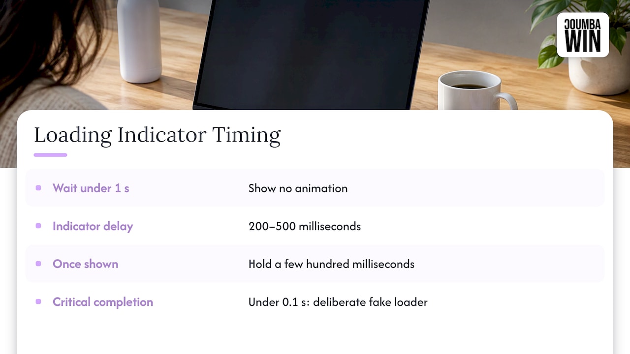
One odd exception: Octopus notes that when a critical task or the last step of a tedious flow finishes in under 0.1 seconds, a deliberate “fake” loader can reassure people that it actually worked. Think payment confirmation, not a page of search results. Use it sparingly and only where the reassurance is genuinely needed.
Skeleton vs spinner: how to choose
This is the question we get most. Skeleton loading vs spinner is less of a taste battle than it sounds (no battle royale here, sorry).
A skeleton screen is a gray wireframe of the layout to come, with blocks where the images and text will land. A spinner is a looping animation that says “something is happening” and nothing else.
Spark’s documentation offers the cleanest rule we’ve seen: choose by what is loading rather than how long it takes. That means predictability of layout decides it.
Use a skeleton when
- The layout is known in advance: a feed, a card grid, a profile page, a table.
- The wait is short, in the one-to-three-second range.
- The whole page or a large region is loading, so a lone spinner would leave a big empty hole.
A skeleton gives the eye something to anchor to, and when the real content arrives, nothing jumps around. That last bit matters more than people think. A skeleton that doesn’t match the final layout just trades one annoyance for another.
Use a spinner when
- You don’t know what the result will look like, like a search that might return ten items or zero.
- The loading area is small: a button, a single field, a toggle.
- The action is a quick background save or refresh.
Fluent 2 puts spinners in the one-to-three-second band, which fits our experience. A spinner inside a button after a click is a perfect small use: it confirms the click and prevents the double tap.
Use neither when
The task is long and measurable. That’s progress-bar territory.
Progress indicators: determinate vs indeterminate
Progress indicators (the other thing people search for alongside this topic) come in two flavors.
- Indeterminate: a spinner or looping bar. It says “working” with no idea how much is left.
- Determinate: a bar or percentage that moves toward 100%. It says how far along you are.
The rule is simple. If you can show true progress, do. Octopus’s thresholds put determinate bars at three to ten seconds, and Nielsen Norman Group’s classic piece on progress indicators for slow systems makes the same case: when people know the system is making progress, a long wait is easier to live with.
When you can’t measure, use steps
A percentage you made up is worse than none. Octopus suggests that when granular visibility isn’t possible, a step indicator with general messaging can explain what’s happening now. Something like “Uploading, Processing, Finishing up” works nicely.
And please, avoid the classic: a bar that sprints to 95% and then hangs. Spark specifically calls out using steps where a percentage would be invented. Nothing makes a product feel less honest than a bar that lies.
A time or percentage estimate is fine, but Octopus says to include one only when you have a reasonable basis for it.
Progress during media-heavy tasks
Uploads, exports and image processing are where determinate progress earns its keep. If your product handles lots of media, the wait often starts with file weight, so it’s worth knowing how to optimize images for website performance before you design the progress bar. Lighter files mean shorter waits, and shorter waits mean fewer loading states to design in the first place.
Let people keep working
A loading state shouldn’t always freeze the screen. Siemens’ Element documentation notes that inline loading indicators should let users interact with other parts of the interface when that makes sense.
Some ways we apply it:
- Load by region. In a dashboard, give each widget its own skeleton so people can read the cards that are ready. (We go deeper in our guide to dashboard UI patterns.)
- Keep the page interactive. Don’t block navigation while a table refreshes.
- Move long jobs to the background. Let the user start an export, leave, and get notified when it’s done.
Loading vs empty vs error states
These three get mixed up constantly, and it matters because each one answers a different question from the user.
| State | What happened | What the user needs |
|---|---|---|
| Loading | The request is in progress | Reassurance that work is happening |
| Empty | The request succeeded, but there’s nothing to show | A clear next step |
| Error | The request failed | What went wrong and how to retry |
The classic mistake is showing an empty state while data is still loading. For half a second, your user sees “No projects yet,” then a list pops in. Now they don’t trust your app. The fix is to resolve loading first, then decide between empty, error and success.
When the answer really is “nothing here,” that’s a chance to guide people. We wrote about empty state design for startups, including how to give one clear next step. And error states deserve the same care: say what happened in plain words, and offer a retry.
Accessibility details people forget
A loading state that only works for sighted users isn’t finished. Fluent 2’s guidance includes ARIA labels such as role="status" so assistive technology announces what’s happening, and a nonbreaking space before ellipses so “Loading” and its dots never split across lines.
Our short checklist:
- Give every indicator an accessible name that says what is loading, not just “loading.”
- Announce completion, not only the start.
- Don’t rely on color alone to show progress.
- Keep motion gentle. Respect reduced-motion settings where you can.
- Test with a screen reader on at least the main flows.
If you’d like a second pair of eyes, accessibility audits are one of the things we do.
Microcopy and motion: the small stuff
A spinner with no words is fine for a button. For anything larger, add a short line that says what’s going on: “Fetching your invoices” beats “Loading.” It sets expectations and shows you know what the system is doing.
Motion should be calm. A subtle shimmer on a skeleton is plenty. If the animation is the most exciting thing on the screen, it’s too much. (Done well, motion can support your brand, which we cover in our piece on motion design and brand engagement.) On phones, remember that connections are patchier, so check our mobile UX best practices when you plan these states.
A quick decision flow
When we sit down with a founder and a Figma file, we ask these in order:
- Will it take under a second? Show nothing.
- Is it a small area, like a button or a field? Use a spinner.
- Do we know the layout that’s coming? Use a skeleton.
- Will it take more than three seconds and can we measure it? Use a determinate bar.
- Can’t measure it? Use steps with honest messaging.
- Will it take very long? Move it to the background and notify.
- After all that, what happens if it fails or returns nothing? Design those states too.
Perspective
We treat loading states as a brand moment, not a technical footnote. Founders hand us a beautiful homepage and a blank screen for everything else, and then wonder why the product feels unfinished when a customer or an investor clicks around.
Our view: the loading state is where your product proves it’s looking after the user. A thoughtful skeleton, a progress bar that tells the truth and a clear message when something goes wrong say more about your care than a hero image ever will. That’s why we design these states custom, in step with the rest of your brand, rather than dropping in a generic template.
It’s also why we like working closely with founders. You know which action matters most in your product. We help make sure the wait around it feels fast, calm and trustworthy.
Coumba Evelyn
Want us to design yours?
If your product still ships with a default spinner and a blank white screen, we can help. Coumba Win is a design partner for startups, covering UI and UX design, web design and development, accessibility audits and more, all custom and built around how your users actually move through your product.
See what we offer on our services page, or look at our Webflow development work if your site is the thing that needs polish. Pricing is scoped per project, so tell us what you’re building and we’ll take it from there.
FAQ
What is a loading state in UX?
It’s the interface’s response while the system works on a request. It shows that the action was received and the result is coming. Without it, people can’t tell whether the app is working or has failed, which is why Primer’s guidance treats it as a basic reassurance.
Is a skeleton screen better than a spinner?
Neither wins everywhere. Skeletons suit familiar layouts and large regions that load in a second or three, while spinners suit small areas and unpredictable results. Spark’s advice is to choose by what is loading, not just how long it takes.
When should I show a progress bar?
Show a determinate bar when the wait runs past roughly three seconds and you can measure real progress. Octopus puts bars in the three-to-ten-second range. If you can’t measure it, use a step indicator rather than an invented percentage.
Should I show a loader for very fast actions?
Generally no. For waits under a second, Fluent 2 advises skipping animation because flashes confuse people. Adding a short delay before the indicator appears keeps quick responses clean.
How is a loading state different from an empty state?
A loading state means the data is on its way. An empty state means the request finished and there’s genuinely nothing to show, so it should point to a next step. Always resolve loading before you decide which one to display.
So, what’s the loading screen in your product that you’re quietly hoping nobody notices? Tell us. We won’t judge (much). 😅