Improve Website Conversion Rate Design for Startups

Improve Website Conversion Rate Design for Startups
Website conversion rate optimization (CRO) is defined as the practice of redesigning your site so more visitors take a specific action, whether that’s signing up, buying, or booking a call. For startups and small businesses, this is not a nice-to-have. It’s the difference between a site that looks good and one that actually grows your business. High-converting websites prioritize clarity over aesthetics, communicating value in the first three seconds. When you improve website conversion rate design, you’re not decorating. You’re building a system that turns curious visitors into paying customers.
How do you optimize headlines and CTAs for higher conversions?
Your headline is doing more work than you think. About 80% of visitors read only the headline and first subhead before deciding to stay or leave. That means your headline has roughly three seconds to answer two questions: what is this, and is it for me?
A strong headline formula follows a simple structure: “We help [specific audience] achieve [specific outcome] without [common frustration].” That’s it. No clever wordplay. No vague mission statements. Specificity converts.
Your CTA text matters just as much. Generic phrases like “Submit” or “Learn More” kill momentum. First-person, benefit-focused phrasing like “Get My Free Audit” or “Start Building Today” outperforms passive alternatives. For deeper guidance on designing CTAs that convert, the principles are consistent: make the benefit obvious and the action feel low-risk.
Here’s what a high-converting headline and CTA setup looks like in practice:
- Headline: Answers “what” and “who” in one sentence
- Subhead: Expands on the benefit or removes the biggest objection
- CTA button: First-person, action-oriented, benefit-forward
- Microcopy below the CTA: Removes doubt (“No credit card required,” “Cancel anytime”)
- Visual placement: CTA sits above the fold, with enough contrast to stand out
Pro Tip: Never use your CTA as a headline. “Get Started” is not a value proposition. If your headline could appear on any website in your industry, rewrite it.

What design changes reduce friction and boost user engagement?
Friction is anything that slows a visitor down or makes them think harder than necessary. Every extra click, form field, or competing link is friction. And friction kills conversions.
Landing pages with a single CTA convert 266% better than those with three or more competing options. That number comes from an analysis of 64,000 landing pages. The implication is clear: when you give visitors too many choices, they make none.
Form design is where most startups leave money on the table. Reducing form fields from seven to three can increase conversions by over 80% without losing lead quality. A/B testing confirmed an 11.3% conversion rate with three fields versus 6.1% with seven. Ask only for what you absolutely need at that stage of the relationship.
The subtractive design mindset is the most underused tool in a startup’s arsenal. Removing every non-essential element yields bigger conversion gains than tweaking button colors or font sizes. Before adding anything new to a page, ask: does this element move a visitor closer to the CTA, or does it distract them?
- Remove: Secondary navigation links on landing pages
- Remove: Autoplay videos that slow load time and hijack attention
- Simplify: Forms to the minimum fields needed for that conversion step
- Add: Progress indicators if a multi-step form is unavoidable
- Focus: One primary CTA per page, always
Pro Tip: If you need more information from a user, use a multi-step form with a progress bar. Visitors are far more likely to complete a form when they can see they’re already 50% done.
Visual hierarchy and layout principles for clearer user flow
Visual hierarchy accounts for over 60% of conversion differences between pages. That’s not a small variable. It means the order and weight you assign to page elements directly determines whether visitors convert.
Two layout patterns match how people naturally scan a page. The F-pattern applies to text-heavy pages: visitors read across the top, then scan down the left side. The Z-pattern applies to simpler pages: eyes move across the top, diagonally to the bottom left, then across again. Knowing which pattern fits your page helps you place your CTA exactly where eyes land.
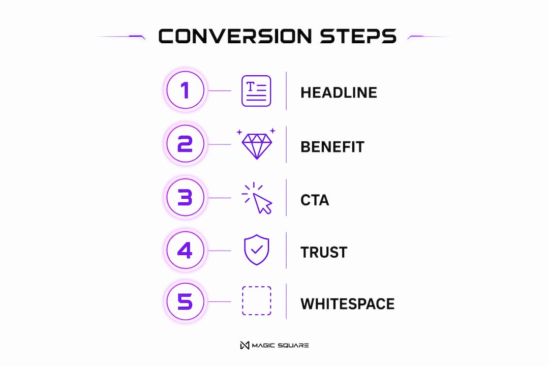
The correct content sequence for a converting page is: headline, benefit statement, CTA, trust signals. That order is not arbitrary. It mirrors the mental checklist a visitor runs through before taking action. For a deeper look at homepage layout that converts, the same sequence applies at a larger scale.
| Hierarchy element | Role in conversion | Common mistake |
|---|---|---|
| Headline | Captures attention and states value | Too vague or clever |
| Benefit statement | Explains the outcome for the visitor | Lists features instead of benefits |
| CTA button | Directs action with clear next step | Buried below the fold |
| Trust signals | Reduces risk perception | Placed too far from the CTA |
| Imagery | Supports the message visually | Decorative stock photos with no context |
Whitespace is not wasted space. It directs attention by removing visual competition around your most important elements. A CTA surrounded by breathing room gets more clicks than one buried in a cluttered layout.
How does social proof build trust and increase conversions?
Social proof is the fastest way to reduce a visitor’s perceived risk. Trust signals placed within 200 pixels of your CTA button increase click-through rates by 12–34%. Proximity matters because trust needs to be present at the exact moment of decision.
The most effective types of social proof for startups are not the most expensive to produce:
- Verified reviews with star ratings: Specific, named reviews outperform anonymous quotes every time
- Client logos: Recognizable brand names create instant credibility, even for early-stage companies
- Testimonials with photos: Real faces increase trust; stock photos decrease it
- Case study snippets: A one-line result (“Increased signups by 40% in 30 days”) beats a paragraph of praise
- Security badges: SSL certificates and payment security icons reduce checkout abandonment
Generic stock photos and decorative “proof” elements actually hurt conversions. Visitors recognize staged imagery immediately, and it signals inauthenticity. Use real photos of real clients or real team members. If you don’t have them yet, a well-written specific testimonial with a name and company title does more work than a polished but fake headshot.
Why does mobile design directly affect your conversion rate?
Mobile is where most of your visitors are, and most startup sites are still designed for desktop first. That’s a conversion problem hiding in plain sight.
A 1-second delay in page load time reduces conversions by 7%, and a 3-second delay causes over 50% of mobile visitors to abandon the page entirely. Speed is not a technical detail. It’s a conversion lever. For a full breakdown of how page speed affects conversions, the relationship between load time and revenue is direct and measurable.
Pages loading under 2 seconds convert twice as well as those taking over 5 seconds. Every additional second beyond 2 seconds costs approximately 12% in conversion rate. That’s not a rounding error.
Here’s what mobile-first conversion design looks like in practice:
- Thumb zone placement: Position CTAs in the bottom 40% of the screen. Mobile CTAs in the thumb zone increase tap rates by 23%
- Hero image compression: Simplify above-the-fold visuals to load fast without sacrificing clarity
- Responsive form fields: Use number keyboards for phone fields, email keyboards for email fields
- Full-width input fields: Easier to tap and fill on small screens
- Minimal scripts: Every third-party script adds load time; audit and remove what you don’t need
For startups building their first mobile experience, the mobile UX best practices guide covers the most common errors and how to fix them without a full rebuild.
Key Takeaways
Improving your website conversion rate requires a design system built around clarity, speed, and trust, not aesthetics alone.
| Point | Details |
|---|---|
| Headlines decide in 3 seconds | Write headlines that answer “what” and “who” immediately, or visitors leave. |
| Single CTA wins every time | Pages with one CTA convert 266% better than those with multiple competing options. |
| Fewer form fields, more conversions | Cutting from seven to three fields can more than double your form conversion rate. |
| Trust signals belong near the CTA | Place reviews, logos, and badges within 200 pixels of your conversion button. |
| Mobile speed is a conversion factor | Pages loading under 2 seconds convert twice as well as those taking over 5 seconds. |
The uncomfortable truth about “beautiful” startup websites
I’ve worked with a lot of founders who come in with a mood board, a color palette they’re genuinely in love with, and a vision for a site that looks like it belongs in a design award catalog. And honestly? I get it. Your brand feels personal. You want it to look incredible.
But here’s what I’ve seen over and over: the prettiest sites in the room are often the worst converters. Not because beauty is bad, but because beauty without clarity is just expensive decoration. A site that wins a design award and loses customers is not a win.
The misconception I push back on most is that conversion optimization means making your site look “salesy” or cheap. It doesn’t. It means making your value obvious, your path frictionless, and your trust signals visible. You can do all of that and still have a site that looks stunning. The two are not in conflict. They just require a different starting question. Instead of “what looks good here?” ask “what does my visitor need to understand, feel, and do next?”
For startups especially, I’d argue that iterative testing beats a full redesign almost every time. Change one element, measure it, then move to the next. You’ll learn more from three months of testing than from one big launch. And your budget will thank you.
— Coumba Evelyn
Coumba Win Design helps startups convert more visitors
Coumba Win Design works with founders who are done guessing why their site isn’t converting. The work goes beyond making things look good. It’s about building pages that communicate value fast, reduce friction at every step, and move visitors toward action.

From conversion-focused components to full landing page builds, Coumba Win Design brings the same data-informed approach to every project. If your site is getting traffic but not conversions, that’s a design problem with a design solution. See what a site built to convert looks like, and let’s talk about what yours could do.
FAQ
What is website conversion rate optimization in design?
Website conversion rate optimization (CRO) in design is the practice of structuring visual elements, copy, and user flow to increase the percentage of visitors who complete a desired action. It combines layout, hierarchy, and trust signals to reduce friction and guide decisions.
How many CTAs should a landing page have?
A landing page should have one primary CTA. Pages with a single CTA convert 266% better than those with three or more competing options.
How much do form fields affect conversion rates?
Form field count has a major impact. Reducing fields from seven to three can increase conversions by over 80%, with A/B testing showing 11.3% conversion at three fields versus 6.1% at seven.
Why does page speed matter for conversions?
A 1-second delay in load time reduces conversions by 7%. Pages loading under 2 seconds convert twice as well as those taking over 5 seconds, making speed one of the highest-leverage conversion factors.
Where should trust signals appear on a page?
Trust signals should appear within 200 pixels of your CTA button. Proximity to the conversion action increases click-through rates by 12–34%, because trust needs to be present at the exact moment a visitor decides to act.
Recommended


