Designing for Underrepresented Community Needs: A Practical Guide

Designing for Underrepresented Community Needs: A Practical Guide
Start by centering the most impacted people — then design, test, and steward solutions with them, not for them. That single shift is what separates genuinely equitable design from well-intentioned guesswork that still leaves people behind.
Here’s your immediate action checklist before you open a single design file:
- Identify who is decentered. Name the specific groups your current process excludes or underserves (by race, disability, language, income, geography, or overlapping identities).
- Recruit community partners first. Find organizations already trusted by those communities before you recruit individual participants.
- Set consent and compensation terms upfront. Decide how you’ll pay participants, who owns the data, and what participants can opt out of — before the first conversation.
- Define early success metrics. Agree on what “working” looks like for the most impacted users, not just average engagement numbers.
- Follow the process: discovery → co-design → prototype → pilot → steward. Each phase has a community checkpoint built in.
The rest of this guide unpacks every step with the methods, standards, and ethical guardrails you need to do it right.
Key Takeaways
Centering the most impacted users from day one, and sharing real decision power with community partners, is the single most effective lever for producing equitable, durable design outcomes.
| Point | Details |
|---|---|
| Center the most impacted first | Name excluded groups explicitly before design begins; their friction reveals systemic gaps that improve the product for everyone. |
| Share power, not just access | Write MOUs that define data ownership, IP rights, and decision authority with community partners before research starts. |
| Measure equity, not just averages | Track outcomes for the bottom quartile of users, safety incidents, and trust indicators alongside standard engagement metrics. |
| Follow the five-phase process | Discovery, co-design, pilot, launch, and stewardship each require a community checkpoint — stewardship is ongoing, not optional. |
| Coumba Win Design supports the full process | From accessibility audits and co-design facilitation to stewardship retainers, Coumba Win Design offers hands-on help at every phase. |
Table of Contents
- How inclusive design, design justice, and “designing from the margins” actually differ
- How to engage communities ethically without extractive dynamics
- A phase-by-phase process your team can actually follow
- Technical and safety standards your team needs to apply
- How to measure success and stay accountable to the communities you serve
- What this looks like in practice: cases and lessons
- Common mistakes, ethical red flags, and how to fix them mid-project
- What I’ve learned about trust in long-term community partnerships
- Coumba Win Design helps teams build with underrepresented communities
- Sources
- FAQ
How inclusive design, design justice, and “designing from the margins” actually differ
These three frames get used interchangeably all the time, and that’s a problem — because they make different demands on your team and produce different outcomes.
Inclusive design is a methodology for creating mainstream products usable by as many people as possible without specialized adaptations. The EDC/University of Cambridge inclusive design toolkit defines it as a process that accounts for diversity across accessibility, age, culture, economic situation, education, gender, geographic location, language, and race. The key word is mainstream — the goal is one product that works broadly, not a separate “accessible version” bolted on afterward.
Universal design is related but older and more focused on physical environments and products. It aims for a single design solution that works for everyone without adaptation or specialized design. Inclusive design is more iterative and accepts that some adaptations may still be needed; universal design holds a stricter “one solution fits all” standard.
Accessibility is the technical floor — the minimum standard that ensures people with disabilities can use a product at all. It’s necessary but not sufficient. You can pass every WCAG checkpoint and still build something that systematically excludes communities by language, cultural context, or economic assumption.
Design justice goes further than any of these. It reframes who leads the design process entirely. Rather than designers centering marginalized users as subjects, design justice positions communities as decision-makers. The Design Justice Network principles explicitly challenge structural inequalities and prioritize community knowledge, non-exploitative outcomes, and honoring traditional and indigenous ways of knowing.
Designing from the margins (DFM) is the most practically useful frame for most teams. The Bellwether Education Partners toolkit argues that centering the most impacted users produces solutions that generalize to broader populations — and reduces the likelihood of large-scale harms when technologies scale beyond their original context. Fix the experience for the person with the most friction, and you almost always fix it for everyone else too.
The Nielsen Norman Group calls out the “bias of the average” — teams that claim to design for everyone while actually targeting a narrow user profile. The corrective step is explicit: name the excluded groups before you start, not after you ship.
In practice, the difference between these frames shows up in three decisions: who is centered, what success looks like, and who breaks the tie when trade-offs occur. Design justice says the community breaks the tie. DFM says the most impacted user’s experience is the primary success measure. Inclusive design says the product should work without special adaptations. You can hold all three simultaneously — and the strongest teams do.
How to engage communities ethically without extractive dynamics
Ethical community engagement is not a nice-to-have. Health-equity research consistently shows that authentic, ongoing partnership and trust-building are the most critical precursors to successful inclusive design outcomes. Rushed research sprints that treat community members as data sources — and then disappear — don’t just fail ethically. They fail practically, because communities stop participating.
Recruitment
Who you recruit shapes everything downstream. Prioritize people with the most friction in the current system, not the most articulate or most available. Practical outreach channels include:
- Community-based organizations (CBOs) and nonprofits already serving the target population
- Faith communities, mutual aid networks, and cultural centers
- Public libraries, community health workers, and school liaisons
- Social media groups moderated by community members (ask permission before posting)
- Peer researchers — community members paid to help recruit and facilitate
Avoid recruiting exclusively through digital channels. Many underrepresented groups have lower smartphone access, limited broadband, or distrust of online platforms. Show up where people already are.
Consent and safety
Informed consent for marginalized communities needs to go beyond a standard IRB form. Write consent documents at a 6th-grade reading level. Offer them in every language your participants speak. Explain clearly what data you’re collecting, who sees it, how long you keep it, and what happens if someone withdraws. For communities with documented experiences of surveillance (undocumented immigrants, formerly incarcerated people, LGBTQ+ youth in hostile environments), a privacy-by-default approach is non-negotiable: collect only what you strictly need, anonymize early, and never share raw data with third parties.
Compensation
Pay participants. Full stop. Stipends signal respect and reduce the participation gap that skews research toward people with flexible schedules and financial cushion. Budget a reasonable stipend per session for individual participants, adjusting for your market and session length. Non-monetary reciprocity also matters: co-authorship credit, skill-building workshops, and sharing research findings back with the community before publication all build goodwill that sustains long-term partnerships.
Participatory methods
Co-design workshops, community advisory boards, and peer researcher models each distribute power differently. Co-design workshops work best when participants help generate and evaluate solutions, not just validate pre-built prototypes. Community liaisons — trusted insiders who bridge your team and the community — reduce translation friction and catch cultural missteps before they become trust-breakers. Peer researchers bring lived experience into the research design itself, which changes what questions get asked.

Pro Tip: Write a simple MOU (memorandum of understanding) with your community partners before research begins. Define data ownership, IP sharing, decision rights, and what happens to findings after the project ends. This one document prevents most of the disputes that derail long-term partnerships — and it signals that you’re serious about building trust through design.
A phase-by-phase process your team can actually follow
High-level principles are great. A repeatable process is better. Here’s how the work actually flows, with realistic timing and outputs for small-to-medium initiatives.
Phase 1: Discovery (initial weeks)
The goal here is understanding — not building. Core outputs include empathy interviews with 8–15 community members, an ecosystem map showing who else is trying to solve this problem (and who’s been harmed by previous attempts), and a clear articulation of the most impacted user group. Budget extra time here. Trust-building is slow, and rushing discovery is the single most common reason projects fail downstream.
Phase 2: Co-design (subsequent weeks)
Run 2–4 co-design workshops with community members as active participants, not passive reviewers. Outputs: rough prototypes, prioritized feature lists, and a shared definition of success. Bring community liaisons into facilitation roles. Keep prototypes low-fidelity — paper, sticky notes, and simple wireframes invite more honest feedback than polished mockups, which signal that decisions are already made.
Phase 3: Pilot (following weeks)
Small-scale testing with a defined cohort from the target community. Monitor not just usability metrics but safety incidents, trust indicators, and dropout rates. Run a security threat model with community representatives before launch — especially if the product handles sensitive data. The Belfer Center’s Design From the Margins report specifically warns that technologies built without this step often get weaponized against the communities they were meant to serve once they scale.
Phase 4: Launch and documentation (later weeks)
Ship with support infrastructure in place: multilingual help content, accessible onboarding, and a clear escalation path for community-reported issues. Document design decisions and their rationale so future teams understand why choices were made, not just what was built. Good design asset management at this stage saves enormous rework later.
Phase 5: Stewardship (ongoing)
This is where most teams drop the ball. Stewardship means maintaining feedback loops, updating the product as community needs evolve, and honoring the governance agreements you made in your MOU. Budget for it explicitly — at minimum, a quarterly community check-in and an annual equity audit. Stewardship is not optional if you want long-term trust.
These aren’t overhead — they’re the work.
Technical and safety standards your team needs to apply
Standards aren’t bureaucratic box-checking. They’re the floor below which you’re actively causing harm.
Digital accessibility: WCAG priorities
W3C’s Web Content Accessibility Guidelines organize requirements into three levels (A, AA, AAA). For most products, target WCAG 2.1 AA as your baseline. In early sprints, prioritize these criteria:
- 1.1.1 Non-text content: All images, icons, and charts have meaningful alt text.
- 1.4.3 Contrast ratio: Text meets a 4.5:1 contrast ratio against its background (3:1 for large text).
- 2.1.1 Keyboard accessible: Every function is operable without a mouse.
- 2.4.6 Headings and labels: Headings describe content; form labels are descriptive and persistent.
- 3.1.1 Language of page: The page language is programmatically set so screen readers pronounce correctly.
- 4.1.2 Name, role, value: All UI components have accessible names and states.
In the United States, the Americans with Disabilities Act (ADA) applies to digital products for covered entities. Federal agencies and their contractors must meet Section 508 standards, which reference WCAG 2.0 AA. For motion and animation, WCAG 2.1 adds criteria for vestibular disorders — relevant if your product uses motion design heavily. The practical guide on accessibility in UX covers how these standards integrate into a real product workflow.
For web accessibility’s intersection with discoverability, the accessibility and SEO guidance from Babylove Growth is worth a read — accessible content tends to rank better too.
Physical access
For in-person events and built environments: confirm wheelchair-accessible entrances and restrooms, provide large-print and high-contrast signage, plan for sensory considerations (noise levels, lighting, scent-free policies), and communicate transport access clearly in advance. These aren’t afterthoughts — they determine who can actually show up.
Privacy and safety for vulnerable communities
Data minimization is the starting point: collect only what you need, store it only as long as necessary, and anonymize it as early as possible in the pipeline. Run a security threat model before you build any data collection flow — ideally with community representatives in the room. Avoid collecting identifiers (names, addresses, device IDs) that aren’t strictly necessary for the product to function. For communities with documented surveillance risks, consider whether the product itself could be weaponized by a hostile actor and design against that scenario explicitly.
Bring legal counsel in early when you’re working with minors, undocumented populations, health data, or any group with documented government surveillance exposure. A human-rights or privacy specialist is worth the cost — far cheaper than a breach or a community trust collapse.
How to measure success and stay accountable to the communities you serve
Average engagement metrics will lie to you. A product can have strong overall retention while systematically failing its most vulnerable users — and you won’t see it unless you measure for it.
Here’s a practical measurement schema:
| Category | Example measures |
|---|---|
| Participation | Demographic representation of testers vs. target community; dropout rate by group |
| Usability | Task completion rate for the bottom quartile of users; error rate by language/device |
| Equity impact | Improvement in outcomes for most impacted group; reduction in support escalations from marginalized users |
| Safety incidents | Number of reported harms; time to remediation; near-miss reports from community reps |
| Trust indicators | Community advisory board satisfaction scores; participant willingness to return; qualitative trust interviews |
Combine quantitative tracking with longitudinal qualitative methods. A quarterly interview with 5–8 community members will surface issues that no dashboard catches. Community advisory boards — standing groups of community representatives with real decision power — are the most reliable accountability mechanism. Publish your results back to the community before you publish them anywhere else. Open feedback loops and explicit remediation commitments (what you’ll fix, by when, and who’s responsible) are what turn a one-time project into a long-term partnership.
Redefine what “success” means in your product metrics. Improvement for the bottom quartile of users, reductions in support escalations from marginalized groups, and increases in reported trust are stronger equity indicators than overall DAU or NPS.
What this looks like in practice: cases and lessons
Case 1: Accessible civic tech for non-English speakers
A U.S. municipal government redesigned its benefits application portal after discovering that completion rates for Spanish-speaking residents were less than half those of English speakers. The team recruited bilingual community health workers as peer researchers, ran co-design sessions in community centers (not city hall), and rewrote all content at a 6th-grade reading level in both languages. They also added SMS-based status updates for residents without reliable internet. Completion rates for Spanish-speaking residents increased substantially, and the simplified interface improved completion for English speakers too — a textbook DFM outcome.
Case 2: Safety-first design for a domestic violence resource platform
A nonprofit built a resource-finder for survivors of domestic violence. Early prototypes stored search history in the browser — a feature that could expose users to abusers with access to their devices. Community advocates flagged this in a co-design session. The team added a one-tap “quick exit” button that cleared history and redirected to a neutral page, and they removed all persistent cookies from the product. The fix came directly from centering the most at-risk users. It cost two additional sprints. It prevented real harm.
Coumba Win Design in practice
Coumba Win Design worked with an educational platform startup to redesign their onboarding flow after early data showed significantly lower completion rates among users accessing the product on low-end Android devices with slower connections. The team ran accessibility audits, rebuilt the onboarding as a lightweight, mobile-first experience, and tested with users in lower-bandwidth environments. The result: a faster, more accessible product that also improved conversion for the platform’s primary user base. The lesson? Designing for the constrained case made the product better for everyone.
Lessons you can take directly into your next project
- Run your first co-design session in a space the community controls, not one you control.
- Treat every “edge case” as a signal, not a nuisance — it usually points to a systemic gap.
- Budget for a second round of community testing after you think you’re done. The first round tells you what’s broken; the second tells you whether you fixed it.
- Document trade-offs explicitly. When you can’t do everything, write down what you chose not to do and why — communities deserve that transparency.
Common mistakes, ethical red flags, and how to fix them mid-project
Red flags and immediate remediation steps
-
Tokenism: One community member on an advisory board, consulted once, with no decision power. Fix: Expand the board to at least 3–5 members, give them a formal vote on key product decisions, and compensate them for their time.
-
Extractive research: You collect rich qualitative data, publish findings, and the community never sees the results or benefits from them. Fix: Share findings with community partners before any external publication. Offer co-authorship or acknowledgment. Return a plain-language summary to participants.
-
Ignoring intersectionality: Designing for “women” or “people with disabilities” as monolithic groups, missing the compounded barriers faced by, say, a Black woman with a mobility disability and limited English proficiency. Fix: Segment your participant recruitment and your metrics by overlapping identity dimensions. Ask participants directly about the intersections that shape their experience.
-
Design decisions that worsen harm: A feature that increases efficiency for most users but creates a new risk for a vulnerable subgroup (e.g., a location-sharing feature that exposes domestic violence survivors). Fix: Run a structured harm assessment before shipping any new feature. Include community representatives in that assessment.
-
Surveillance and security exposures: Collecting more data than necessary, storing it insecurely, or building features that could be weaponized by hostile actors. Fix: Apply data minimization from day one. Run a security threat model with community reps. Anonymize sensitive flows before they touch production systems.
Handling dissent within community input
Community members won’t always agree — and that’s healthy. When you get conflicting input, don’t average it out or default to the majority view. Instead:
- Document the dissent explicitly and share it with the full advisory group.
- Identify whose safety or access is most at stake in the disputed decision.
- Apply a “most impacted first” decision rule: the option that reduces harm for the most vulnerable participant wins, unless there’s a compelling, documented reason otherwise.
- Communicate the decision and its rationale back to all participants, including those who disagreed.
Transparent trade-offs build more trust than false consensus. Communities that see you take their dissent seriously will stay in the partnership longer.
What I’ve learned about trust in long-term community partnerships
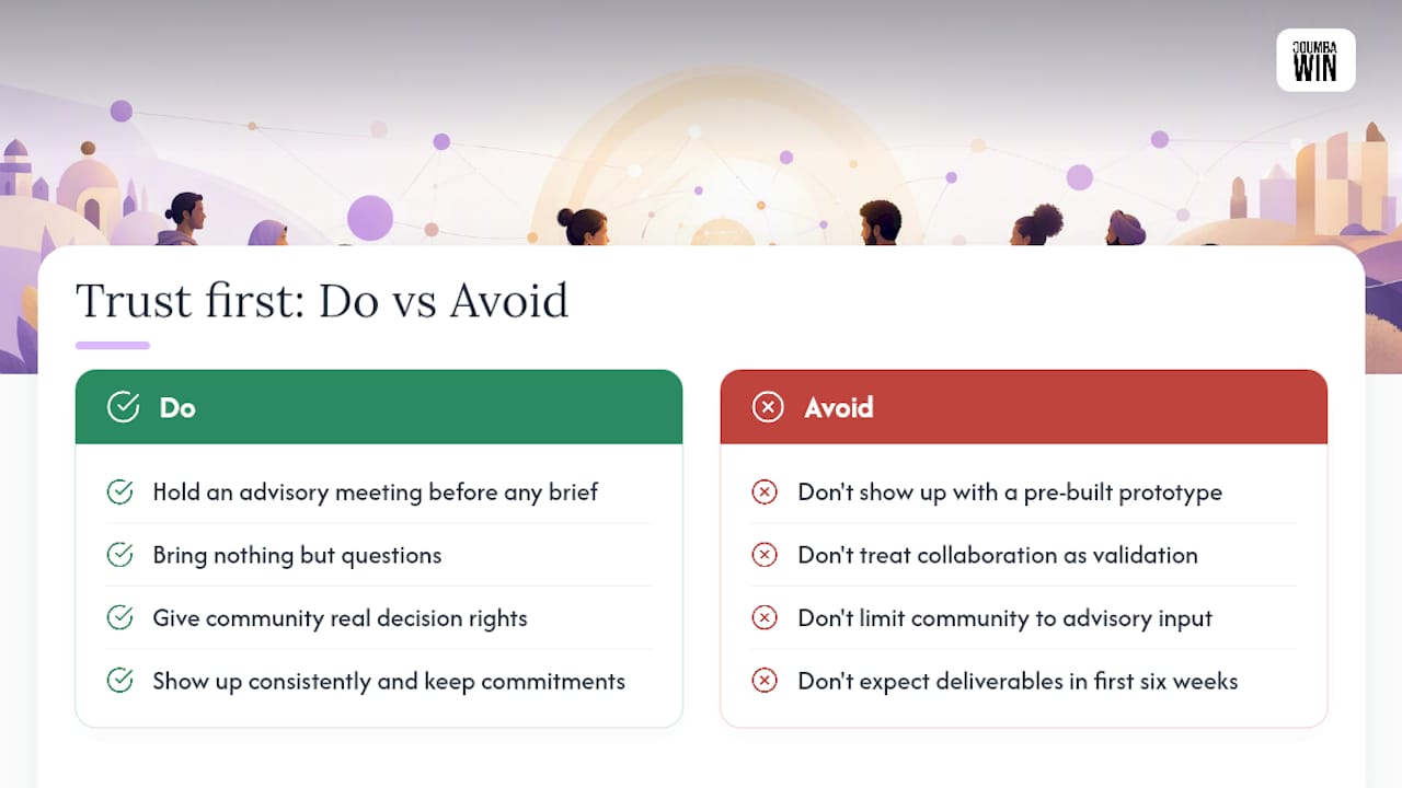
The hardest thing to explain to a client who’s excited about inclusive design is that the first six weeks of a project might produce zero deliverables — and that’s exactly right.
Trust is not a phase you complete. It’s the medium the whole project runs in. I’ve seen technically excellent co-design processes collapse because the team showed up with a pre-built prototype in week two, signaling that the “collaboration” was really just validation. And I’ve seen scrappy, under-resourced projects succeed because the team spent the first month just listening, showing up consistently, and doing what they said they would do.
The MIT Press Design Justice work puts it plainly: give real decision power to community leaders from day one. Not advisory input. Not a feedback form. Actual decision rights over things that matter. That’s uncomfortable for most design teams, and it should be — it means giving up some control. But it’s also the only thing that produces outcomes communities actually want to sustain.
If you’re just starting out: set your first community advisory meeting before you write a single design brief. Bring nothing but questions. That meeting will tell you more than any competitive analysis or persona deck.
Teams that want hands-on support with this process can reach Coumba Win Design directly through Coumbawin.
Coumba Win Design helps teams build with underrepresented communities
Designing for underrepresented community needs is one of the most technically and ethically demanding things a product team can take on. Coumba Win Design brings the full stack of support to make it work:

- Accessibility audits against WCAG 2.1 AA and ADA baselines, with prioritized remediation roadmaps
- Co-design facilitation — structured workshops that center community voices and produce testable prototypes
- Community engagement planning — recruitment strategy, consent frameworks, compensation budgeting, and MOU templates
- Measurement and stewardship retainers — equity metrics setup, community advisory board support, and quarterly impact reviews
A typical discovery engagement runs several weeks and delivers a community research summary, an ecosystem map, and a prioritized design brief your engineering team can act on immediately. Ready to get started? Visit Coumbawin to book a discovery conversation — and bring your hardest community design challenge with you.
Sources
- Inclusive design toolkit (EDC, University of Cambridge)
- Lost by Design — Designing From the Margins toolkit (Bellwether Education Partners)
- Community engagement and trust-building in health equity research (PMC article)
- Web accessibility standards (W3C)
FAQ
How do you design for inclusivity?
Start by explicitly naming who your current design excludes, then recruit those people as active co-designers rather than passive research subjects. Apply WCAG 2.1 AA as your technical baseline and measure outcomes for the most impacted users, not just overall averages.
What is neurodiversity in design?
Neurodiversity in design means accounting for the full range of cognitive differences — including ADHD, autism, dyslexia, and anxiety — when making decisions about layout, language, motion, and interaction patterns. WCAG 2.1 includes criteria for cognitive accessibility and vestibular disorders that provide a practical starting checklist.
What are some examples of inclusivity in design?
A civic benefits portal redesigned with bilingual peer researchers that doubled completion rates for non-English speakers, a domestic violence resource platform with a one-tap “quick exit” button designed with survivor advocates, and a mobile-first onboarding flow rebuilt for low-bandwidth devices are all real examples of inclusive design producing measurable equity outcomes.
What is design for special needs?
“Design for special needs” is an older framing that treats disability or difference as an exception to be accommodated separately. The more current and effective approach is inclusive design from the margins: building one product that works for the widest range of people by centering the users with the most friction, rather than creating parallel “accessible versions” after the fact.
How do you handle conflicting community input during a design process?
Document the dissent, identify whose safety or access is most at stake, and apply a “most impacted first” decision rule — the option that reduces harm for the most vulnerable participant wins unless there’s a compelling documented reason otherwise. Share the decision and its rationale with all participants, including those who disagreed.


