Design Community Engagement Digital Tools for Urban Planners

Design Community Engagement Digital Tools for Urban Planners
Choose a stage-matched toolkit of map-based surveys, structured consultation platforms, and lightweight collaboration spaces to increase participation and keep decisions traceable. The fastest path to better engagement: (1) run broad, accessible concept tests early using collaborative whiteboards and quick polls; (2) move to geolocated map surveys during design iteration; (3) shift to structured platforms for formal consultation and exportable reporting. GOV.UK planning guidance recommends matching tool complexity to the consultation stage and publishing how feedback will be used. Projects that follow this approach have reported a 50% higher response rate compared to traditional methods. Coumba Win Design works with teams to build the design layer that ties these tools together.
Your quick-start checklist:
- Pick one lightweight tool for concept testing (Miro, MURAL, or Google Forms)
- Add a map-based survey layer for spatial feedback (Maptionnaire or ArcGIS Hub)
- Choose a structured platform for formal consultation and reporting
- Pair every digital channel with at least one offline touchpoint
- Publish a plain-language summary of how input will shape decisions
Table of Contents
- Which digital tools should you use for community engagement?
- How do you match tool complexity to your project stage?
- What design principles actually increase participation and trust?
- Your implementation checklist: roles, timeline, and costs
- How do you measure success and report results?
- Real projects that show this approach working
- Data privacy and consent best practices
- How do you keep participants engaged over time?
- How to moderate and facilitate online community interactions
- Why hybrid approaches outperform digital-only programs
- Key Takeaways
- The part most engagement guides won’t tell you
- Coumba Win Design can help you build this
- Useful sources and further reading
- FAQ
Which digital tools should you use for community engagement?
Think of your toolkit as a stack of jobs, not a single platform. Each tool category solves a different problem, and mixing them intentionally is what separates a real engagement program from a survey link nobody clicks.
Discovery and ideation (collaborative whiteboards) Tools like Miro and MURAL let distributed teams and community members co-create on a shared canvas. The core capability: real-time sticky notes, voting, and concept mapping without needing a physical room. Pick this category when you need broad input fast and your audience is reasonably tech-comfortable.

Spatial feedback (map-based surveys) Maptionnaire is a GIS-backed platform that exports geolocated data directly into ArcGIS or QGIS. Participants drop pins, draw routes, and rank locations. Pick this when the outcome depends on where something happens, not just whether people like it.
Structured consultation and response analysis Go Vocal offers interactive maps, document annotation, surveys, and built-in AI for organizing input. ArcGIS Hub (Esri) adds GIS integration for government-grade data management. Pick these when you need auditable, exportable records for formal planning decisions.
Document review and annotation Hypothesis (open annotation) lets stakeholders comment directly on draft plans or policy documents in a browser. Low barrier to entry, no account required for basic use.
Quick polling and forms SurveyMonkey (Momentive), Typeform, and Google Forms cover the full range from simple pulse checks to branching logic surveys. Google Forms is free and accessible; Typeform adds a conversational UX that tends to lift completion rates; SurveyMonkey offers stronger analytics and reporting exports.
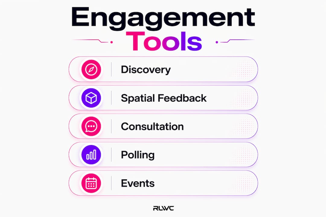
Synchronous events Zoom remains the default for public meetings, webinars, and hybrid workshops. Pair it with a live polling tool (Mentimeter or Slido) to capture structured input during the session.
Ongoing neighborhood networks Nextdoor reaches residents already organized by geography. It works best for awareness and light feedback, not for formal consultation where you need structured, exportable responses.
Integration priorities to check before you commit to any platform: CSV and GIS data export, moderation and consent controls, multilingual support, and mobile-first accessibility.
How do you match tool complexity to your project stage?
Here’s the honest truth: most engagement programs fail not because of bad tools, but because they deploy enterprise-grade platforms at the concept stage and scare everyone off. Complexity should increase with formality.
- Concept and early testing (weeks 1–2): Use Miro, MURAL, or Google Forms. The goal is broad reach and low friction. No login walls, no long surveys.
- Design iteration (weeks 3–5): Introduce map-based surveys (Maptionnaire or ArcGIS Hub) to surface spatial priorities. Run a small pilot with a defined audience before opening to the public.
- Formal consultation (weeks 6–8): Switch to a structured platform (Go Vocal, ArcGIS Hub) that captures responses in an auditable format. This is where consent flows, moderation, and data export matter most.
- Implementation and monitoring (weeks 9–12): Use dashboards and reporting templates to track how input influenced decisions. Publish a plain-language summary to close the loop.
GOV.UK guidance specifically flags that councils see better accessibility and delivery when communications, digital, and IT teams collaborate before launch, not after the first complaint arrives.
Pro Tip: Run a 48-hour internal pilot with your own team before going live. You’ll catch broken links, accessibility gaps, and confusing question logic before real participants do.
What design principles actually increase participation and trust?
Transparency and accessibility are the two strongest levers. Everything else is secondary.
When participants know how their input will be used before they submit it, they’re more likely to engage and more likely to trust the outcome. GOV.UK guidance highlights this directly: transparent feedback mechanisms significantly increase participation and public trust. Projects using interactive, 24/7-accessible platforms have reported a 50% higher response rate than traditional methods.
Your practical checklist:
- Feedback loop: State explicitly how input will influence the decision, and publish a response summary after the consultation closes
- Plain language: Write at a 6th-grade reading level for public-facing content; avoid planning jargon
- Multilingual options: Offer at minimum Spanish translation for US communities; check your demographic data first
- ADA/accessibility: Test with a screen reader, check color contrast ratios (WCAG 2.1 AA minimum), and provide captions on any video content
- Mobile-first flows: Over half of US internet users access the web primarily on mobile; a desktop-only survey loses a significant portion of your audience
- Low-bandwidth options: Offer a PDF or phone alternative for participants with limited connectivity
Understanding user engagement design at the interaction level helps you build forms and flows that feel intuitive rather than bureaucratic.
Your implementation checklist: roles, timeline, and costs
Getting this right is a team sport. Here’s who you need and when.
- Stakeholder mapping (week 1): Identify your audiences, their digital access levels, and any equity gaps. Assign a communications lead, digital/IT lead, engagement facilitator, and data analyst.
- Comms plan and accessibility testing (week 2): Draft participant-facing copy, test the platform with assistive technology, and confirm multilingual content is ready.
- Pilot launch (weeks 3–4): Open to a small, representative group. Collect feedback on usability, not just content.
- Iteration (week 5): Fix what the pilot broke. This is the step most teams skip and then regret.
- Formal consultation launch (week 6): Go live with the full platform, moderation plan active.
- Moderation and response analysis (weeks 7–9): Review incoming responses weekly. Flag outliers and emerging themes.
- Reporting and close-the-loop summary (weeks 10–12): Produce an internal executive report and a public-facing plain-language summary.
Typical budget buckets: platform subscription (often $0–$500/month for entry-level tools, scaling up for enterprise GIS platforms), staff hours for facilitation and analysis, translation and accessibility support, and paid outreach or advertising to reach underrepresented groups. None of these are optional if equity is a stated goal.
How do you measure success and report results?
Measure two things: participation (who showed up and how many) and influence (how input actually changed the outcome). Most programs track the first and ignore the second, which is why communities stop trusting the process.
Core KPIs:
- Response rate and demographic reach (are you hearing from the full community, or just the usual suspects?)
- Geolocated contribution density (where are the spatial hotspots of concern?)
- Time-to-analysis (how quickly can you turn raw responses into a usable report?)
- Proportion of structured vs. unstructured responses (structured data is faster to analyze and easier to defend)
- Policy changes or design decisions traced directly to community input
Structured online responses reduce manual processing time and make feedback easier to analyze. Platforms like Maptionnaire offer GIS exports that feed directly into planning dashboards.
| KPI | What to track | Reporting cadence |
|---|---|---|
| Response rate | Total submissions vs. target | Weekly |
| Demographic reach | Age, zip code, language | Mid-point and final |
| Spatial density | Pin/comment map heatmap | Weekly |
| Time-to-analysis | Days from close to report | End of phase |
| Input-to-decision ratio | Decisions citing community input | Final report |
Publish a public-facing summary within 30 days of closing a consultation. That deadline is what separates programs that build trust from ones that erode it.
Real projects that show this approach working
Case 1: Platform-assisted consultation that widened reach PlaceChangers has refined its workflow across 120+ projects, connecting engagement, analysis, and reporting in a single pipeline. A typical win: a local authority that previously received dozens of paper responses shifted to an interactive platform and saw participation climb by 50%, with structured data ready for analysis the same week the consultation closed. The lesson: structured inputs cut reporting time more than any post-processing tool.
Case 2: Map-based survey pilot for spatial priorities A neighborhood planning team used Maptionnaire to run a two-week map survey before a formal consultation. Participants pinned concerns directly onto a street map, and the GIS export surfaced three spatial clusters the planning team hadn’t anticipated. The pilot ran with a communications lead and one digital coordinator, no specialist GIS staff required at the input stage.
Case 3: Hybrid workshop with Streetmix-style tools Streetmix is an open collaborative tool originally built at a civic hackathon. A community design team used it alongside an in-person pop-up event: participants designed their ideal street cross-section on tablets, then discussed trade-offs with facilitators face-to-face. The digital tool handled the “what do you want?” question; the in-person conversation handled the “why?” The combination produced richer qualitative data than either channel alone. Interactive web features like this consistently outperform static surveys for capturing nuanced preferences.
Data privacy and consent best practices
Consent isn’t a checkbox. It’s the foundation of a trustworthy engagement program.
Before you launch any digital tool, confirm: what data are you collecting, where is it stored, who has access, and how long will you keep it? For US-based projects, this means reviewing applicable state privacy laws (California’s CPRA is the most stringent benchmark), your organization’s data retention policy, and the platform vendor’s data processing agreement.
Practical steps: display a plain-language privacy notice on every entry point, collect only the data you actually need (avoid asking for name and email if anonymous responses serve the purpose), and give participants a clear opt-out path. If you’re working with a vendor platform, confirm they offer data deletion on request and that data is not sold to third parties.
How do you keep participants engaged over time?
The hardest part of any engagement program isn’t the launch. It’s month three, when the novelty has worn off and response rates start sliding.
The fix is a structured cadence with visible progress. Send a mid-consultation update that shows what you’ve heard so far and what questions are still open. This signals that participation is actually being read, which is the single biggest driver of continued engagement. Gamification elements (progress bars, contribution counts) help on digital platforms, but they’re no substitute for genuine responsiveness.
Segment your outreach. Residents who already engaged once respond well to a “here’s what we heard” follow-up. Residents who haven’t engaged yet need a different message, often delivered through a different channel (door hangers, community liaisons, or a local partner organization). Local digital outreach strategies can help you reach specific neighborhood segments who aren’t showing up in your digital data.
How to moderate and facilitate online community interactions
Moderation is not censorship. It’s the work that keeps a public forum useful.
Set community guidelines before launch and display them prominently. Define what gets removed (personal attacks, off-topic submissions, spam) and what stays even if it’s critical. Assign a named moderator with a response-time commitment, typically 24–48 hours for public platforms.
For synchronous events on Zoom, designate a separate facilitator and a chat moderator. The facilitator manages the agenda and discussion; the moderator watches the chat for questions, flags, and tone issues. Trying to do both at once is how public meetings go sideways. After each session, publish a summary of what was discussed and what happens next.
Why hybrid approaches outperform digital-only programs
Digital tools widen reach. In-person events build trust. You need both.
GOV.UK guidance is explicit: digital tools do not replace statutory requirements or offline engagement. Printed materials, pop-up events, and community liaison visits reach residents with limited internet access and are often the only way to engage older adults, non-English speakers, and lower-income households at meaningful scale.
The practical model: use digital tools to collect structured input at scale, then use in-person events to go deeper on contested or complex issues. Feed the digital data into the in-person agenda so participants feel the conversation is continuous, not duplicated. A well-designed engagement portal can serve as the connective tissue between online and offline touchpoints, displaying real-time results from the digital survey during a live event.
Key Takeaways
A stage-matched toolkit combining map-based surveys, structured consultation platforms, and hybrid offline methods consistently produces higher participation rates and more defensible, traceable outcomes than any single-channel approach.
| Point | Details |
|---|---|
| Match tools to stage | Use lightweight tools (Miro, Google Forms) early; add structured platforms (Go Vocal, ArcGIS Hub) for formal consultation. |
| Run a map-based pilot first | A short Maptionnaire or ArcGIS Hub pilot surfaces spatial priorities before formal consultation opens. |
| Define KPIs upfront | Track response rate, demographic reach, spatial density, and input-to-decision ratio from day one. |
| Publish how input will be used | Transparent feedback loops are the single strongest driver of participation and trust, per GOV.UK guidance. |
| Coumba Win Design as design partner | Coumba Win Design helps teams build the accessible, stage-matched engagement portals and reporting templates that tie these tools together. |
The part most engagement guides won’t tell you
Here’s my honest take: the tool selection conversation is often a distraction from the harder work of designing a process people actually trust.
I’ve seen well-funded engagement programs with beautiful platforms and near-zero participation, because nobody told residents what would happen to their input. And I’ve seen scrappy programs run on Google Forms and a neighborhood Facebook group that produced genuinely representative data, because the facilitators were transparent, responsive, and showed up in person.
The three trade-offs worth naming: speed vs. rigor (a fast digital survey gives you volume; a slower deliberative process gives you depth, and you usually need both), breadth vs. depth of representation (reaching 500 people online is not the same as hearing from the full demographic range of a community), and DIY vs. external design support for accessibility testing (most in-house teams underestimate how much work WCAG compliance and multilingual content actually require).
Bringing in a design partner like Coumba Win Design makes the most sense at the point where your engagement portal needs to be both beautiful and functional, where accessibility isn’t optional, and where the reporting template has to hold up in a public meeting. That’s not a sales pitch. That’s just where the complexity exceeds what a spreadsheet and a Zoom link can handle.
Coumba Win Design can help you build this
Most engagement programs have the strategy figured out. What they’re missing is the design layer that makes the whole thing work: a portal that’s actually accessible, forms that people want to complete, and reporting templates that tell a clear story to decision-makers.

Coumba Win Design works with community teams, nonprofits, and local government partners to build engagement-ready digital platforms that are ADA-compliant, mobile-first, and designed to close the feedback loop visually. Whether you need a full portal build, an accessibility audit of an existing platform, or a reporting template your team can reuse across projects, the work starts with a discovery conversation. Ready to talk through your next engagement project? Request a discovery call and let’s figure out what you actually need.
Useful sources and further reading
- GOV.UK: Using community engagement platforms in planning consultations — The most practical government-level guidance on matching tool complexity to stage, hybrid approaches, and team collaboration for digital engagement.
- PlaceChangers — An integrated engagement, analysis, and reporting platform refined across 120+ planning projects; useful for understanding what a connected workflow looks like.
- Maptionnaire — GIS-backed map survey platform with multilingual support and ArcGIS/QGIS export; the go-to for spatial priority mapping.
- Go Vocal for planners — End-to-end consultation toolbox with interactive maps, document annotation, and built-in AI for organizing large volumes of input.
- Streetmix (GitHub) — Open-source collaborative streetscape design tool; excellent for participatory placemaking workshops.
- Coumba Win Design: User engagement design guide — Practical interaction design patterns for increasing participation across project stages.
- Coumba Win Design: Interaction design fundamentals — Foundational concepts for designing digital engagement touchpoints that feel intuitive.
When choosing any platform, prioritize accessibility compliance (WCAG 2.1 AA minimum), data protection practices, and a clear, public-facing transparency statement about how participant data will be used and stored.
FAQ
Which tools work best for early-stage community engagement?
Miro, MURAL, and Google Forms are the lowest-friction options for concept testing. They require minimal setup, no specialist training, and work on mobile, which keeps the barrier to participation low.
How do map-based surveys differ from standard online surveys?
Map-based surveys like Maptionnaire let participants attach feedback to specific locations, producing geolocated data exportable as GIS layers. Standard surveys capture opinions; map surveys capture where those opinions apply.
What does “closing the feedback loop” mean in practice?
It means publishing a plain-language summary that shows how community input influenced specific decisions, typically within 30 days of a consultation closing. GOV.UK guidance identifies this as one of the strongest drivers of participation and trust.
How does Coumba Win Design support community engagement projects?
Coumba Win Design builds accessible, mobile-first engagement portals, runs accessibility audits, and creates reporting templates that help teams present community input clearly to decision-makers.
What’s the minimum budget for a digital engagement program?
Entry-level tools (Google Forms, Zoom, Nextdoor) are free or near-free. The real costs are staff hours for facilitation and analysis, translation and accessibility support, and paid outreach to reach underrepresented groups. Budget for all three from the start.
Recommended


