Design a Bold Startup Website That Stands Out

Design a Bold Startup Website That Stands Out
A bold startup website is defined as a site that communicates product value within seconds, uses a coherent brand identity, and guides visitors toward a clear action. Most startup founders treat their website like a digital brochure. The ones winning deals treat it like a sales rep who never sleeps. The difference? Successful startup websites highlight product value immediately and align design consistently with brand identity while guiding conversions with clear user paths. That’s the playbook. This article breaks it down into steps you can actually use.
How do you design a bold startup website that stands out?
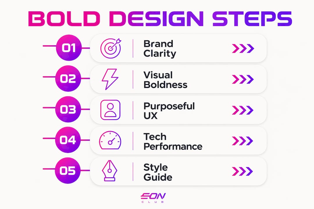
The short answer: you combine brand clarity, visual boldness, purposeful UX, and technical performance into one coherent system. Think of it less like decorating a room and more like directing a film. Every frame has a job. Every scene moves the story forward. The industry term for this approach is conversion-centered design, and it’s the framework behind every impressive startup website you’ve bookmarked and thought, “I want something like that.”
The goal isn’t to be loud. The goal is to be memorable and clear at the same time. That’s a harder target than most founders realize, and it’s exactly where great creative startup web design separates itself from the noise.

What design principles make a startup site cohesive and bold?
Brand alignment is the foundation of every standout website. Before you pick a color or write a headline, you need a design system: a shared set of rules covering typography, color, spacing, and component behavior. Design systems reduce fragmentation and reinforce recognition through repeated visual language. That repetition is what makes a brand feel premium instead of patched together.
Here’s what a solid design system covers for a startup site:
- Color palette: Pick two to three brand colors with clear roles (primary, accent, background). Iridescent accents and dark-first palettes are showing up everywhere in 2026 for a reason. They signal sophistication without screaming for attention.
- Typography: Mono-spaced large typography and bold display fonts create strong visual identity. Pair one expressive display font with one clean body font. That’s it.
- Component library: Buttons, cards, nav bars, and form fields should all come from the same visual family. A shared component library keeps your site from looking like it was built by three different people on three different days.
- Style guide: Document your rules. A living style guide means every new page you add stays on-brand without a design review meeting.
Two aesthetics dominate bold startup design right now. Bold Brutalism uses raw grids, heavy type, and high-contrast color blocks to feel unapologetically direct. Cinematic design uses dark backgrounds, editorial typography, and motion to feel like a movie trailer for your product. Neither is better. Both work when they match your brand’s actual personality.
Pro Tip: Before you design a single page, create a one-page style guide with your fonts, colors, and three core UI components. It takes two hours and saves you twenty.
How do you highlight product value immediately on your homepage?
Your homepage has one job in the first viewport: make the visitor understand what you do and why it matters. Not in three paragraphs. In one headline and one subheadline. High-impact sites simplify complex narratives to make them understandable within seconds to non-technical buyers. That’s your benchmark.
Here’s a step-by-step approach to nailing your above-the-fold section:
- Lead with the outcome, not the feature. “Close deals faster” beats “AI-powered CRM with pipeline automation.” Buyers care about results first.
- Use motion as a navigational cue, not decoration. Parallax and kinetic typography guide users through a problem-to-solution journey rather than just visual flair. A subtle scroll-triggered animation that reveals your value prop beats a looping background video every time.
- Place your primary CTA above the fold. One button. One action. “Start free trial,” “Book a demo,” or “See it in action.” Pick one and commit.
- Support with a hero visual. A product screenshot, a short demo clip, or a bold illustration. The visual should reinforce the headline, not compete with it.
- Optimize for speed. A beautiful homepage that loads in four seconds is a homepage nobody sees. Use Webflow’s built-in optimization or implement lazy loading in React to keep your initial load fast.
| Element | Purpose | Common Mistake |
|---|---|---|
| Headline | Communicate the core outcome | Too vague or feature-focused |
| Subheadline | Add context and credibility | Repeating the headline in different words |
| Hero visual | Reinforce the value prop visually | Decorative image with no product connection |
| Primary CTA | Drive one clear action | Multiple competing buttons |
| Motion/animation | Guide attention and narrative flow | Autoplay video that slows load time |
Pro Tip: Test your homepage headline with five people outside your industry. If they can’t explain what you do in one sentence after reading it, rewrite it.
What UX tactics guide visitors toward conversion?
Clear conversion paths are the difference between a site that looks great in a portfolio and one that actually fills your pipeline. UX design should balance expressiveness with clarity, avoiding overwhelming users while maintaining brand presence. That balance is harder to strike than it sounds, especially when you’re excited about your brand and want to show everything at once.
Here’s what actually works:
- Limit choices per page. Every additional option you give a visitor reduces the chance they take any action. One primary CTA per section. Secondary actions (like “Learn more”) should be visually quieter.
- Use whitespace as a guide. Whitespace isn’t empty space. It’s direction. It tells the eye where to go next. Dense pages feel like a wall. Spaced pages feel like a conversation.
- Make navigation invisible. The best nav bars are the ones visitors don’t notice because they always find what they need. Sticky headers with three to five clear labels work better than mega-menus for most startups.
- Respect accessibility. Animated kinetic typography can serve as navigation cues, but only when it doesn’t exclude users with motion sensitivity. Always include a reduced-motion fallback.
- Test your conversion path end-to-end. Click through your site as if you’re a skeptical first-time visitor. Where do you get confused? Where do you lose momentum? Fix those spots before you launch.
The sites that convert best aren’t the flashiest ones. They’re the ones where every design decision serves the visitor’s next logical step. Boldness and clarity aren’t opposites. They’re partners.
How do you add bold features without killing site speed?
Advanced interactive elements like 3D scenes, distortion effects, blur transitions, and scroll-triggered animations are the signature moves of a standout website. The catch is that they can wreck your load time if you implement them carelessly. Optimized routes can keep critical load under 75 kB gzipped, even with complex visuals. That’s the technical target to aim for.
| Approach | Performance Impact | Best Use Case |
|---|---|---|
| Lazy loading routes | Low load, fast initial render | Multi-page React apps |
| Code splitting | Reduces bundle size significantly | Feature-heavy startup sites |
| Optimized assets (WebP, SVG) | Faster image delivery | Hero visuals and icons |
| Reduced motion media query | No performance cost | Accessibility compliance |
| Inline critical CSS | Faster perceived load | Above-the-fold content |
Performance optimization techniques like lazy loading routes and vendor chunking keep complex React-based startup sites responsive and fast. The initial main entry load can be kept around 13 kB gzipped with this approach. That’s fast enough to keep Google happy and visitors engaged.
Practitioners implement high-impact motion effects with accessibility in mind by honoring user preferences for reduced motion and using optimized loading strategies. The prefers-reduced-motion CSS media query is a two-line fix that makes your site usable for everyone. There’s no excuse to skip it.
Pro Tip: Run your site through Google PageSpeed Insights before launch. A score below 80 on mobile means your bold design is costing you conversions, not earning them.
Key takeaways
A bold startup website works when design cohesion, clear messaging, and technical performance operate as a single system, not three separate projects.
| Point | Details |
|---|---|
| Start with a design system | Build a style guide and component library before designing any page. |
| Lead with the outcome | Your homepage headline should state the result your product delivers, not its features. |
| Use motion with purpose | Parallax and kinetic typography guide users through your story when used intentionally. |
| Optimize for speed | Keep initial load under 75 kB gzipped using lazy loading and code splitting. |
| Balance boldness with clarity | One primary CTA per section and clear whitespace keep conversion paths visible. |
What i’ve learned about bold design after working with startups
I’ll be honest with you: the first version of almost every bold startup site I’ve worked on was too much. Too many animations, too many colors, too many “look at this cool thing” moments stacked on top of each other. It felt exciting in Figma. It felt exhausting in the browser.
The lesson I keep relearning is that presence beats volume. High-end bold websites work by emphasizing design cohesion and clear storytelling rather than piling on disconnected effects. One well-executed scroll animation that reveals your product value is worth ten decorative transitions that make visitors wait.
The founders I’ve seen get this right are the ones who treat their website like a pitch, not a portfolio. They ask, “Does this design help my visitor say yes?” before they ask, “Does this look cool?” Those two questions aren’t always in conflict. But when they are, the first one wins every time. Experiment boldly. Just experiment within a clear strategic boundary, and you’ll build something that actually converts.
— Coumba Evelyn
Ready to build a site that actually stands out?
Coumba Win Design works with startup founders who know design is a competitive advantage, not an afterthought. If you’ve read this far, you’re probably one of them (and we love that for you ).

The Coumba Win Design approach starts with the systems that make bold design sustainable: a brand style guide that keeps every page on-brand, a reusable component library that speeds up every future build, and conversion-focused design that connects your visual identity to real business outcomes. Whether you’re prepping for a launch, a fundraise, or a Demo Day, the Demo Day Kit gets your brand pitch-ready in 14 days. Explore what’s possible at Coumba Win Design.
FAQ
What makes a startup website “bold” in design terms?
A bold startup website combines a strong visual identity, clear product messaging, and purposeful motion or interaction that guides visitors toward conversion. It’s defined by coherence and clarity, not just visual intensity.
How quickly should my homepage communicate my product value?
Visitors should understand what your product does and why it matters within the first few seconds of landing on your page. High-impact startup sites simplify complex narratives to be understandable within seconds, even to non-technical buyers.
Can bold design hurt my site’s performance?
Only if it’s implemented carelessly. Using techniques like lazy loading, code splitting, and optimized assets, you can keep initial load times fast even with 3D effects and scroll animations.
What’s the most common mistake founders make with startup web design?
Overloading the homepage with too many calls-to-action, animations, and messages. One clear CTA per section and a single visual focus per page consistently outperform busy, feature-heavy layouts.
Do i need a design system before building my startup site?
Yes. A shared style guide and component library prevent visual fragmentation, speed up future updates, and make your brand feel consistent across every page from day one.
Recommended