Create Consistent Visual Brand Language: A Practical Guide

Create Consistent Visual Brand Language: A Practical Guide
A consistent visual brand language is the complete set of documented visual rules and executable artifacts that make your brand instantly recognizable across every touchpoint — and building one is a five-step process: audit what you have, define your visual personality, encode it into tokens and templates, distribute it to your team, and govern it with a clear owner.
Here’s your quick-start checklist before we dig in:
- Screenshot every current branded asset (social, web, print) in one folder.
- Identify your three most-used colors and check if they match across channels.
- Confirm you have one locked logo file with clear-space rules.
- Write one sentence describing how your brand should feel visually.
- Name one person responsible for brand approvals going forward.
That’s your five-minute win. Now, let’s build the full system.
Table of Contents
- What is a visual brand language and why does it matter?
- Which visual elements do you actually need to standardize?
- How do you build a visual identity system step by step?
- Which tools keep your visual brand language consistent across teams?
- How do you apply the visual language across web, mobile, social, print, and motion?
- How do you keep the visual language consistent over time?
- How Coumba Win Design applies these principles in practice
- How do you adapt the visual language for different cultural contexts?
- Key Takeaways
- The artifact gap is where most brand systems fail
- Coumba Win Design builds visual brand systems for startups that need to scale fast
- Useful sources and further reading
- FAQ
What is a visual brand language and why does it matter?
A visual brand language is not your logo. It’s not your color palette sitting in a PDF nobody opens. It’s the operating system behind every visual decision your team makes — the rules that determine how color, type, imagery, layout, and motion work together to create a feeling that’s unmistakably yours.
Your logo is one asset. Your visual identity is the collection of assets. Your visual brand language is the logic that governs how all of them behave together, across every format, at every scale.
Why does this distinction matter? Because maintaining a uniform look across online and offline materials builds trust and recognition in ways that a single polished logo never can. Brands that show up consistently feel more credible — full stop. And from a purely operational angle, a documented visual language cuts the time your team spends second-guessing design decisions, which means faster content production and fewer “does this look on-brand?” Slack messages at 11 PM.
The business case is real. According to research on visual identity systems, consistent brand presentation can increase revenue, and color alone can significantly boost brand recognition. Those figures come from brand-system practitioners, not marketing fluff — and they track with what happens when teams actually enforce visual rules versus winging it.
The quick comparison:
- Visual identity: — the full set of assets (logo, colors, type, imagery).
- Visual brand language: — the rules, tokens, and artifacts that govern how those assets are used — and what they’re not allowed to do.
Which visual elements do you actually need to standardize?
Short answer: more than you think, but less than you fear. Here’s the canonical list, with the exact artifact each one requires so your team can execute without guessing.
| Element | Why it matters | Artifact to produce |
|---|---|---|
| Color | Drives recognition faster than any other element | HEX, RGB, PANTONE, dark/light mode tokens |
| Typography | Sets tone and readability across every format | Type scale (H1–body–caption), web font stack, UI variants |
| Logo/signature | Anchors brand recognition | Locked SVG/PNG files, clear-space rules, approved variations |
| Imagery/photography | Often the biggest consistency blind spot | Style guide with do’s/don’ts, curated image bank, prompt templates |
| Iconography | Signals visual personality in UI and print | Icon set with weight/style spec, approved library |
| Layout/grids | Creates visual rhythm and predictability | Grid spec per format (web, social, print) |
| Motion/interaction | Extends brand personality into time-based media | Timing curves, transition rules, motion brand principles |
| Texture/patterns | Adds depth and distinctiveness | Approved pattern files, usage rules |
| Visual hierarchy | Guides the eye and reinforces messaging priority | Hierarchy spec with examples per format |
| AI image-generation rules | Prevents off-brand AI outputs at scale | Named prompt patterns, exclusion list, reference images |
That last row is the one most brand guides skip entirely — and it’s the one that will bite you hardest in 2026. A modern brand visual system pairs documented rules with executable artifacts and treats AI image-generation rules as a first-class pillar, not an afterthought.
Pro Tip: For imagery, document a written visual style specification that fixes background treatment, lighting, object style, color palette, and composition. A master prompt template built from that spec creates consistent AI outputs at scale — and consistency across a series of images builds recognition faster than any single high-quality image.
On accessibility: every color token should pass WCAG 2.1 AA contrast ratios (4.5:1 for body text, 3:1 for large text). Document this in your spec so it’s a constraint, not a checkbox someone remembers on launch day.
How do you build a visual identity system step by step?
This is the part where most teams stall — not because it’s hard, but because there’s no clear starting order. Here’s the sequence that actually works.
Step 1: Audit. Gather every branded asset your team currently uses: website screenshots, social posts, email headers, pitch decks, print materials. Look for color drift, inconsistent type usage, and off-brand photography. Your audit checklist: logo files (how many versions exist?), color values in use (are they consistent?), font files (licensed and available to everyone?), imagery style (does it feel cohesive?).
Step 2: Define. Translate your brand strategy into visual rules. What’s the emotional “weather” of your brand? Warm and approachable? Sharp and technical? Write it down in one paragraph, then map each visual element to that feeling. This is where building a startup brand identity from scratch gets real — the visual rules have to mean something, not just look nice.
Step 3: Encode. Turn your rules into design tokens (color, spacing, type as named variables), a component library, locked templates, and named AI prompt patterns. A brand world bible goes beyond style rules — it includes mood references, prompt patterns, and a “rejected directions” section that keeps AI outputs from drifting somewhere weird. Start with color tokens and typography first; they have the highest leverage.
Step 4: Ship. Distribute your system through the tools your team already uses. Locked Figma/Canva templates, a shared asset library, and a one-page brand spec get you 80% of the way there without a six-month design-system project.
Step 5: Govern. Assign one owner. Set an approval workflow for new assets. Define what “off-brand” looks like so the conversation is about rules, not taste.
Minimum viable brand spec (MVB): If you’re a small team, you don’t need a 200-page brand book. You need: a one-page color and type spec, a locked logo kit, a 10-image curated photo bank, a master AI prompt template, and one locked social template per format. That’s it. Ship that first.
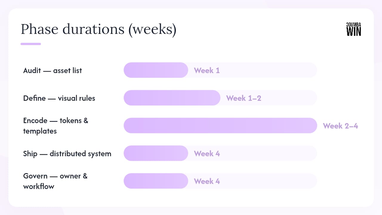
| Phase | Output | Priority |
|---|---|---|
| Audit | Asset inventory + gap list | Week 1 |
| Define | Brand personality doc + visual rules | Week 1–2 |
| Encode | Tokens, templates, prompt patterns | Week 2–4 |
| Ship | Distributed system + onboarding doc | Week 4 |
| Govern | Owner assigned + approval workflow | Week 4 |
Which tools keep your visual brand language consistent across teams?
The honest answer: the best tool is the one your team already opens every day. Encoding your brand into existing workflows beats building a beautiful system nobody uses.
Tool categories to cover:
- Design systems/DAM: Figma (design source of truth), Bynder or Brandfolder for digital asset management, organized asset libraries for growing teams.
Sample workflow: Design token → Figma component → developer handoff via Storybook → CMS template → marketing team’s locked Canva template → publish. Every step pulls from the same source of truth.
Pro Tip: Encode the brand into the tools people already open — locked templates in Canva or Figma and named AI prompt templates in the DAM make consistent execution the default, not the exception. If your team has to go hunting for brand assets, they’ll improvise instead.
Given that mobile devices account for a substantial share of global web traffic, your template library needs mobile-first crops and responsive layout specs baked in from day one — not retrofitted later.
How do you apply the visual language across web, mobile, social, print, and motion?
Same visual logic, different execution rules per channel. Here’s the channel-by-channel breakdown:
- Web: Use your design tokens directly in CSS. Responsive logo variants (full lockup → icon-only at small sizes), consistent grid, and a type scale that holds up at every breakpoint. Aligning your website design with brand values is where visual language and conversion strategy meet.
- Mobile: Prioritize touch targets, reduce visual complexity, and use your icon set consistently. Safe zones matter — keep the logo and key UI elements out of swipe-gesture areas.
- Social: Each platform has different crop ratios, but your color palette, type treatment, and photography style should be immediately recognizable across all of them. Build a template per format (1:1, 9:16, 16:9) locked to your brand spec. Visual storytelling consistency across social channels compounds over time — recognition builds through repetition.
- Email: Use web-safe fonts with your brand stack as fallback. Stick to your color tokens for backgrounds and CTAs. Imagery should match your photography style guide, not whatever stock photo looked good that day.
- Print: Convert digital tokens to PANTONE/CMYK equivalents. Document bleed, safe zones, and paper stock recommendations in your spec. What looks great on screen can look flat or muddy in print without this step.
- Packaging: Structural constraints (die lines, finishes, substrate) mean your visual language needs a packaging-specific adaptation guide — same personality, different rules.
- Motion: Brand-preserving transitions use your color palette and move at a pace that matches your brand’s emotional tone. Motion design in brand engagement is one of the most underused tools for building recognition. Document your easing curves and timing ranges so motion feels consistent, not random.
How do you keep the visual language consistent over time?
Governance is the part everyone skips and then regrets. Here are the three models:
Central brand team: One team owns all brand decisions. High consistency, slower execution. Works well for large organizations with complex brand architecture.
Decentralized owners: Each department owns its pillar (marketing owns social templates, product owns UI components). Faster, but requires clear handoff rules and regular syncs.
Hybrid with approval tiers: Most teams land here. Tier 1 (locked templates) = no approval needed. Tier 2 (new asset types) = brand owner reviews. Tier 3 (brand evolution) = leadership sign-off. This model scales without creating a bottleneck.
Audit cadence: Quarterly spot-checks (pull 10 random assets and score them against your spec) plus an annual full audit. A simple scoring model: rate each asset on color accuracy, type usage, imagery style, and logo treatment — 1 to 3 per dimension, flag anything below 8/12.
KPIs to track: Asset compliance rate (% of published assets that pass brand check), time-to-publish (does your system speed things up?), asset mismatch rate (how often does someone use an off-brand file?), and qualitative recognition signals (do customers describe your brand the way you intend?).
Pro Tip: Imagery is often the blind spot where recognizability leaks away. A curated image bank with do’s and don’ts, reviewed quarterly, prevents the slow drift toward generic stock photography that makes every brand look the same.
How Coumba Win Design applies these principles in practice
Here’s what a real engagement looks like — no invented metrics, just the phases and outputs.
A typical Coumba Win Design project starts with a brand audit (what exists, what’s inconsistent, what’s missing), moves into a brand personality workshop to define the visual rules, then encodes everything into a deliverable system. The outputs a founder actually receives: a brand world bible (mood, rules, exclusions, prompt patterns), a design token set, locked Figma/Canva templates, a curated image bank, named AI prompt patterns, a DAM folder structure, and an onboarding doc for new team members and external partners.
That last piece — the onboarding doc — is what most DIY brand projects skip. Without it, every new contractor or agency you hire starts from scratch, and your visual language drifts a little further each time.
When to DIY vs. hire a design partner:
- Hire a partner when you’re scaling fast, onboarding new team members regularly, launching across multiple channels simultaneously, or when your current visual assets are inconsistent and you don’t have the bandwidth to fix them. The SBA’s small business resources can help founders think through when outside investment in brand systems makes strategic sense.
Strong branding accelerates startup growth — and the ROI on a well-built visual system compounds every time a new team member can execute on-brand without a design review.
How do you adapt the visual language for different cultural contexts?
Your visual brand language needs to travel well — and that means building adaptation rules into the system, not bolting them on after the fact.
Color carries different cultural meanings across markets. White signals purity in Western contexts and mourning in parts of East Asia. Red reads as danger or urgency in some markets and luck or celebration in others. Your brand spec should document the intent behind each color choice, so regional teams can make informed adaptation decisions rather than guessing.
Typography adaptation matters too. If your brand expands into markets that use non-Latin scripts (Arabic, Chinese, Devanagari), your type scale and hierarchy rules need script-specific variants. The visual rhythm of your brand should hold even when the letterforms change completely.
Photography and imagery are the most culturally sensitive elements. A curated image bank for a US market may not represent the diversity of a global audience — and imagery that feels aspirational in one culture can feel alienating in another. Build regional image banks with the same style spec but locally relevant subjects.
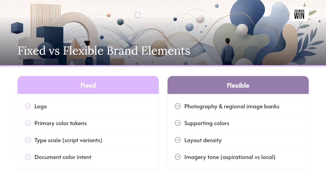
The governance rule here: regional adaptations get a Tier 2 review (brand owner approval) before publishing. Document which elements are fixed (logo, primary color tokens, type scale) and which are flexible (photography, supporting colors, layout density). That fixed/flexible framework is what lets your brand feel local without losing its identity.
Key Takeaways
A consistent visual brand language requires documented rules, executable artifacts, and a named owner — without all three visual drift is inevitable.
| Point | Details |
|---|---|
| Start with an audit | Gather every current branded asset and identify color, type, and imagery inconsistencies before building anything new. |
| Encode into tokens and templates | Design tokens and locked templates make consistent execution the default for every team member. |
| Add AI image rules as a pillar | A master prompt template and exclusion list prevent off-brand AI outputs at scale. |
| Govern with a fixed/flexible framework | Document which elements are locked and which can adapt for channels or regional markets. |
| Audit quarterly | A simple 10-asset spot-check scored against your spec catches drift before it compounds. |
| Coumba Win Design as your partner | Coumba Win Design delivers brand world bibles, design tokens, locked templates, and onboarding docs for startups scaling fast. |
The artifact gap is where most brand systems fail
Most teams I see have the strategy part figured out. They know their brand personality, they have a color palette, they’ve got a logo they love. What they’re missing is the artifact layer — the locked templates, the design tokens, the named prompt patterns, the onboarding doc that tells a new contractor exactly how to execute.
Here’s the thing: a brand guide that lives in a PDF nobody opens is not a brand system. It’s a document. The difference between a brand that stays consistent and one that drifts is whether the rules are encoded into the tools people already use — not stored somewhere they have to go looking for them.
The other pitfall I see constantly is no named owner. Brand consistency doesn’t maintain itself. Someone has to run the quarterly audit, approve new asset types, and update the prompt templates when the brand evolves. Without that person, every “just this once” exception becomes the new normal.
Small teams can absolutely build and maintain a strong visual language — the MVB approach (one-page spec, locked templates, curated image bank, master prompt template) is genuinely enough to get consistent. The question is whether you have the bandwidth to build it well and keep it current. If you don’t, that’s exactly what a design partner is for.
Coumba Win Design builds visual brand systems for startups that need to scale fast
Founders scaling quickly rarely have the bandwidth to build a complete visual brand system from scratch — and the cost of inconsistency compounds every time a new hire, contractor, or agency touches your brand without a clear spec.
Coumba Win Design delivers the full artifact stack: brand world bibles, design token sets, locked Figma and Canva templates, curated image banks, named AI prompt patterns, DAM folder structures, and onboarding docs. Not just the strategy — the executable system your team can actually use on day one.
This is built for startups scaling across multiple channels, teams onboarding new members fast, and founders who know their current visual assets are inconsistent but don’t have a design lead to fix it. The component and design system work is available as a standalone engagement or as part of a full brand sprint.
Ready to stop the visual drift? Book a brand audit with Coumba Win Design and walk away with a clear picture of what’s inconsistent, what’s missing, and exactly what to build first.
Useful sources and further reading
- How to Build a Brand Visual System Your Whole Team Can Use
- Brand World Bible: Building a Coherent Visual Universe with AI - Orias AI
- How to Create Consistent Brand Imagery Across All Social Channels — Postprism
- Visual Identity Guide (2026): Build a System, Not Just a Logo
- Brand visual language | Customer Impact
- Share of website traffic coming from mobile devices — Statista
- SBA
- Visual brand language - Wikipedia
- VISUAL BRANDING CONSISTENCY
FAQ
What is a visual brand language?
A visual brand language is the documented system of rules and artifacts — color tokens, typography scales, imagery guidelines, layout specs, and AI prompt patterns — that governs how a brand looks across every touchpoint. It goes beyond a logo or style guide by encoding how visual elements behave together.
How do you create visual consistency across channels?
Build a minimum viable brand spec (color and type tokens, locked templates, a curated image bank, and a master AI prompt template), distribute it through the tools your team already uses, and assign one person to own brand approvals. Consistency is a governance problem as much as a design problem.
What should a brand guidelines document include?
At minimum: color values (HEX, RGB, PANTONE), typography scale, logo usage rules with clear-space specs, imagery do’s and don’ts with a curated image bank, iconography style, layout/grid specs per format, and named AI prompt patterns. A “rejected directions” section that shows what the brand is not is equally useful.
When should a startup hire a design partner for brand system work?
When you’re scaling across multiple channels simultaneously, onboarding new team members or contractors regularly, or when your current visual assets are inconsistent and you lack the bandwidth to fix them. Coumba Win Design builds complete visual brand systems — tokens, templates, brand world bibles, and onboarding docs — for exactly this stage.
How do you handle cultural adaptations without losing brand consistency?
Document which elements are fixed (logo, primary color tokens, type scale) and which are flexible (photography, supporting colors, layout density). Build regional image banks that follow the same style spec but use locally relevant subjects, and require brand owner approval for any regional adaptation before publishing.
Recommended