Fix Your Hero and CTA: Conversion Focused Design Playbook for Startups

Fix Your Hero and CTA: Conversion Focused Design Playbook for Startups
Conversion-focused design means every visual and content choice on a page serves one action, not ten. The highest-leverage move you can make today is ruthless simplification: one page, one goal, with your hero and CTA doing the heavy lifting. I’ve built this playbook working with founders who needed their sites to sell, not just look good, and the seven principles below are where every audit starts.
TL;DR:
- Most visitors form their entire impression of a page based on the hero section, making headline clarity and CTA visibility crucial within the first three seconds.
- Prioritizing a single primary action, removing competing CTAs, and eliminating unnecessary navigation can increase conversion rates by 16 to 28 percent.
- Testing contrast, copy tone, and form length in order of impact helps optimize key elements like headline, CTA design, and load speed for maximum effect.
- Trust signals such as testimonials, client logos, and security badges perform best when placed near the call-to-action, not buried at the bottom of the page.
- Focus on speed, mobile-friendly design, and real user research tools like heatmaps to uncover friction points and improve iterative testing results.
Table of Contents
- What Is Conversion-Focused Design? The 7 Core Principles
- Why Does Your Hero Section Matter So Much?
- How Do You Design a CTA That Gets Clicked?
- What Trust Signals Actually Move Conversions?
- How Do You Reduce Form Friction Without Losing Data?
- What Should You Test First, and How Do You Know It Worked?
- Does Mobile-First Design Really Change Conversion Outcomes?
- How Does User-Centered Design Support Conversion Goals?
- Real Results From Applying These Principles
- A 12-Step Conversion Audit You Can Run Today
- Which Psychological Triggers Actually Increase Conversions?
- How Do Color and Typography Shape User Behavior?
- Does Your Copy Actually Support the Conversion Goal?
- Can Personalization Really Lift Conversion Rates?
- What Design Mistakes Quietly Kill Conversions?
- What Analytics Should You Track Beyond A/B Test Results?
- Balancing Brand and Conversion Priorities
- Get Hands-On Help Building Pages That Convert
- Sources
- FAQ
What Is Conversion-Focused Design? The 7 Core Principles
Conversion-focused design (sometimes called conversion-centered design, or CCD) is the practice of designing every element around a single visitor action instead of general polish. It’s a different discipline than aesthetic-focused web design, which optimizes for how a page looks in a portfolio, not how it performs in the wild. Here are the seven principles, in the order you should apply them.
- Create focus. One page, one goal, one primary CTA. If your landing page has a “Learn More,” a “Sign Up,” and a “Contact Us,” competing for attention, none of them win. Pick one action and strip the rest.
- Build structure. Content should flow in a sequence a first-time visitor can follow without thinking: problem, solution, proof, action. Pages that follow a deliberate hero-to-CTA sequence outperform pages arranged around visual balance alone, and headline optimization by itself can lift conversions 27 to 104% depending on the starting point.
- Stay consistent. Your headline promise, your ad copy, and your CTA language need to match word for word. A visitor who clicked “Get your free audit” and lands on a page that says “Request a consultation” feels the mismatch even if they can’t name it.
- Show benefits, not features. “256-bit encryption” is a feature. “Your customer data stays private” is a benefit. Write copy that answers “what does this do for me,” before you explain how it works.
- Draw attention with contrast. Your CTA should be the most visually loud element on the page. If your logo, your CTA button, and your hero image are all fighting for the same visual weight, the CTA loses by default.
- Design for trust. Every claim needs a receipt. Testimonials, client logos, security badges, and specific numbers do the convincing your copy alone can’t.
- Reduce friction. Every field, every click, every extra decision is a chance for someone to leave. Removing navigation from single-goal landing pages has produced conversion lifts of 16 to 28% in documented cases, because there’s nowhere else to go but forward.
Master these seven and the rest of this guide is really just detail on execution.
Why Does Your Hero Section Matter So Much?
Most of your visitors will never see anything past the fold. Between 57% and 80% of on-page attention happens above the fold, and 50 to 60% of visitors never scroll past the hero at all. That single stat should change how you brief every landing page: the hero isn’t an introduction, it’s the whole pitch for most of your traffic.
Statistic Callout: More than half of your visitors form their entire impression, and often their decision to leave, before they ever scroll. Your hero has roughly three seconds to earn the rest of the page.
Build your hero against this checklist:
- Headline that states the outcome, not the product. “Cut your onboarding time in half” beats “Introducing our onboarding platform” every time.
- Subheadline that adds specificity. Answer the “how” your headline raised in one sentence.
- A visible CTA, above the fold, with no scrolling required. If a visitor has to hunt for the button, you’ve already lost a chunk of them.
- One proof signal near the CTA. A client logo, a user count, or a single strong testimonial line.
- A supporting visual that clarifies, not decorates. Product screenshots and short demo clips tend to outperform generic stock photography because they show rather than tell.
On mobile, collapse this further. Stack headline, subheadline, and CTA vertically with no competing navigation, and make the CTA full width so it’s impossible to miss with a thumb. Two fast tests catch most hero failures: the squint test (blur your eyes; if the CTA isn’t the brightest thing on the page, fix contrast) and the three-second relevance test (show it to someone unfamiliar with the product and ask what it does; if they can’t answer, the copy isn’t working). Our homepage layout guide walks through hero construction in more detail if you want a deeper reference.
How Do You Design a CTA That Gets Clicked?
Visual hierarchy is the art of controlling where the eye goes first, second, and third, and your CTA should always win that race. Contrast does more work here than color choice alone. A button that’s a slightly different shade of your brand color will get ignored; a button that breaks the palette entirely (even a jarring one) tends to pull the eye immediately.
A few rules that hold up across most conversion audits:
- Make the CTA button noticeably larger than surrounding text and other buttons on the page, not just a different color.
- Give the CTA breathing room. Cramming it next to dense text or competing links kills its visual priority no matter how bright it is.
- Use action-first copy. “Start my free trial” outperforms “Submit” or “Learn more” because it names the specific outcome, and testing consistently shows first-person, outcome-specific CTA copy beating vague, second-person phrasing.
- Limit yourself to one primary CTA style per page. Secondary actions (like “See pricing”) should look visibly less important.
- Run the “first-person test” on your own copy: rewrite the button as if the visitor is saying it out loud (“Get my quote,” “Send my demo request”). If it sounds natural, it usually converts better than the generic version.
Pro Tip: Test contrast before you test copy. A high-contrast, mediocre-copy button will almost always beat a low-contrast, perfectly-worded one, because visitors have to see the CTA before your copy can do anything.
Quick experiments here don’t require a full testing platform. Swap your CTA color against a control group for two weeks, then test copy variations against the winning color. Our guide to designing CTAs that convert has more copy formulas if you’re stuck on wording. For CTA-specific testing tactics, this rundown on crafting effective CTAs covers additional patterns worth trying.
What Trust Signals Actually Move Conversions?
Not all social proof pulls equal weight, and stacking ten logos at the bottom of a page does less than one specific testimonial placed near the CTA. The data on this is fairly clear: logo bars add roughly an 8% lift, written testimonials around 14%, and authentic video testimonials as much as 34%, with combined formats performing best of all.
Placement matters as much as format. Put your strongest single trust element directly above or beside your primary CTA, where the decision is actually happening, rather than burying all your proof in a separate “testimonials” section visitors may never scroll to.
- Use specific numbers over vague claims. “Trusted by 40,000 users” beats “Trusted by thousands,” and a named client with a title beats an anonymous quote every time.
- Show three to five trust elements near the point of decision, not fifteen. More isn’t more convincing past a certain density; it starts to read as filler.
- Real names, real photos, and real context (company, role, result) make testimonials believable. A quote with no attribution reads as marketing copy, not proof.
- Security badges and payment logos matter most right before a form submission or checkout, not at the top of the page where there’s nothing to secure yet.
How Do You Reduce Form Friction Without Losing Data?
Every field you add past what’s necessary costs you completions. The goal isn’t zero fields, it’s matching field count to the value being exchanged.
- Newsletter signups: one field (email only). Anything more is friction with no payoff for a low-commitment ask.
- Demo requests: three to four fields (name, work email, company, maybe team size). This is a mid-commitment ask; a little friction filters for intent.
- Free trial signups: keep it to email and password, or offer social sign-in, and collect the rest after activation through progressive profiling.
- Purchases: offer guest checkout by default. Forcing account creation before purchase is one of the most reliable ways to inflate cart abandonment, a pattern well documented in research on cart abandonment as a browsing problem rather than a checkout problem.
On mobile specifically, minimize typing wherever possible: use dropdowns, autofill, and number pads for phone and payment fields instead of open text inputs. Inline validation (flagging an invalid email the moment someone types it, not after they hit submit) prevents the frustration of a full-form rejection. Smart defaults, like pre-selecting the most common shipping option, remove decisions rather than adding them.
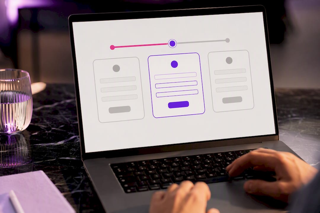
For anything longer than five fields, break it into steps with a visible progress indicator. A multistep form with a progress bar consistently feels shorter than a single long form with the same number of fields, even when it isn’t.
What Should You Test First, and How Do You Know It Worked?
Test in order of leverage, not order of ease. Headline changes affect the most visitors (everyone sees the headline) and are cheap to produce, which makes them the right starting point. From there, move to hero image, then CTA copy and placement, then form length. Testing form length before you’ve nailed the headline is backwards: you’re optimizing a smaller problem while a bigger one sits untouched.
Statistic Callout: Page speed alone can swing results by double. A page loading in 5 seconds can convert at roughly half the rate of one loading in 2 seconds, with each additional second past the 2-second mark cutting conversions by another 7 to 12%.
- Don’t run a test on traffic too thin to detect a real difference. An underpowered A/B test that ends after 200 total visitors is more likely to show you noise than a genuine winner.
- Give a test enough time to cover a full business cycle (usually at least one to two weeks) so day-of-week and traffic-source variance don’t skew the result.
- Track conversion rate per page as your headline metric, but also track form starts versus completions separately. A page that gets plenty of form starts but few completions has a form problem, not a traffic or interest problem.
- Watch load time as its own KPI, not just a technical afterthought. A redesign that adds conversions on paper but doubles load time can lose more than it gains.
The Interaction Design Foundation’s framework for iterative evaluation is a useful model here: test, measure, learn, adjust, repeat, rather than treating any single test as a final verdict.
Does Mobile-First Design Really Change Conversion Outcomes?
Yes, and the constraints aren’t optional extras, they’re the primary design brief for most traffic today. Tap targets need to be large enough for a thumb, not a cursor, generally at least 44 by 44 pixels with real spacing between clickable elements. Font sizes that look fine on a laptop often read as cramped on a phone; body text under 16 pixels forces zooming, which is friction you’re adding for free.
- Make CTAs full width on mobile. A button that only spans half the screen looks smaller and less important than it should.
- Cut secondary navigation and non-essential links on mobile landing pages. Every extra tap target is a chance to route someone away from the one action that matters.
- Compress and lazy-load images so they load only as a visitor scrolls to them, rather than all at once on page load.
- Use system fonts or a limited number of web font weights; every additional font file is another request slowing the page down.
- Prioritize speed fixes over visual polish when you’re short on development time. A visually perfect page that loads slowly loses more conversions than a slightly plainer page that loads fast, given the roughly 7 to 12% conversion drop per second past 2 seconds.
Our mobile UX guide covers layout patterns specific to startup product pages if you want more detail on responsive priorities beyond speed.
How Does User-Centered Design Support Conversion Goals?
Conversion-focused design isn’t a separate discipline from user-centered design, it’s what happens when you apply UCD specifically to the goal of getting someone to act. The core UCD cycle runs through research, design, testing, and evaluation, and each stage maps directly onto conversion work.
- Research: talk to real users or prospects about what’s confusing or slowing them down, rather than guessing at objections from a conference room.
- Design: translate what you learned into specific layout and copy decisions, tied to the actual friction points you found, not to general best practices alone.
- Test: ship the change to a portion of traffic and measure it against the original.
- Evaluate: decide whether the result justifies keeping the change, and feed what you learned into the next research cycle.
Heatmaps and session recordings are the highest-leverage research tools for conversion work specifically, because they show where visitors actually hesitate or abandon, not just what they say they’ll do in an interview. Short user interviews still matter for understanding why a drop-off happens, which heatmaps can’t tell you on their own. Running this cycle inside two-week sprints, paired with A/B tests, keeps design decisions grounded in behavior instead of internal opinion. Involving users early and often also reduces the guesswork that leads to costly redesigns later.
Real Results From Applying These Principles
Two anonymized client engagements illustrate how these principles play out in practice.
- An education platform’s enrollment funnel: the original page buried its sign-up CTA below three sections of feature descriptions. After restructuring around a single hero CTA, adding a specific student outcome to the headline, and cutting the enrollment form from seven fields to three, enrollment completions rose measurably within the first testing cycle. (Detailed metrics available on request; specific figures are proprietary to the client engagement.)
- A high-end apparel brand’s product launch page: the brand’s original design prioritized full-bleed lifestyle photography with no clear single action above the fold. Rebuilding the hero around one product benefit, one visible “Shop the Collection” CTA, and a compact trust bar with press mentions produced a clear lift in click-through to product pages. (Case study metrics available in the full write-up.)
Both cases followed the same pattern: identify the single action, remove what competes with it, and measure before and after rather than assuming the redesign worked.
Coumba Evelyn leads design strategy where the focus is building brand and product experiences that hold up under real user behavior, not just design reviews. The perspective throughout this guide draws on pattern recognition across founder-stage engagements where design had to answer directly to conversion metrics.
A 12-Step Conversion Audit You Can Run Today
Score each item pass or fail, then tally your results. Anything below 8 out of 12 signals a page worth a full redesign pass rather than a patch.
- Does the page have exactly one primary CTA, repeated consistently in style?
- Does the headline state a specific outcome rather than a product name?
- Is the CTA visible without scrolling on both desktop and mobile?
- Does the hero include at least one proof signal near the CTA?
- Is navigation removed or minimized on single-goal landing pages?
- Does the visual hierarchy make the CTA the highest-contrast element on the page?
- Is there at least one specific, attributed testimonial or trust signal above the fold?
- Does the form request only the fields necessary for that specific offer?
- Does the page load in under 2.5 seconds on mobile?
- Are tap targets sized appropriately for thumb use, not cursor use?
- Has the headline been tested against at least one alternative version?
- Is conversion rate tracked per page, with form starts measured separately from completions?
In most audits, items 1, 3, and 9 (single CTA, visible without scrolling, and page speed) deliver the largest lift relative to effort, because they affect every single visitor rather than a subset. Turn a failing score into a roadmap by fixing those three first, then working down the list in order of how many visitors each item touches.
Which Psychological Triggers Actually Increase Conversions?
Scarcity, urgency, and reciprocity work because they shift a visitor from “maybe later” to “decide now,” but they only hold up when they’re true. A countdown timer that resets every time someone revisits the page destroys trust the moment a visitor notices, and today’s visitors notice quickly.
Scarcity (“Only 12 left at this price”) works best when it reflects a real limit, tied to actual inventory or cohort size rather than an evergreen banner. Urgency (“Offer ends Friday”) performs similarly, real deadlines outperform recurring fake ones because repeat visitors eventually catch on. Reciprocity works differently: giving something useful first, a free audit, a template, a genuinely helpful guide, primes visitors to feel they owe you their attention or their email address in return.
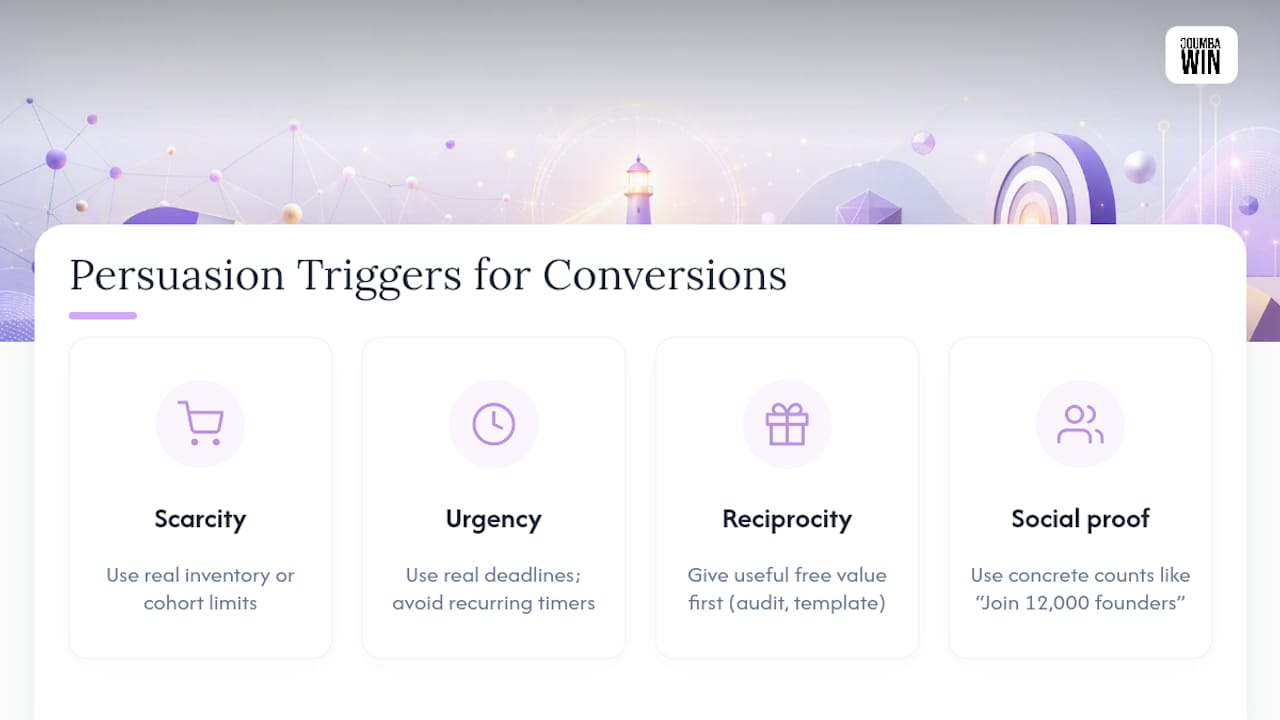
Social proof as a trigger deserves its own mention here beyond the trust-signal placement covered earlier: phrases like “Join 12,000 other founders” tap into the instinct to follow what others are already doing, which is why specific numbers outperform vague claims.
The common failure mode is stacking every trigger on one page at once. A hero with a countdown timer, a “3 people are viewing this,” a limited-stock badge, and a pop-up discount all firing simultaneously reads as manipulative rather than persuasive. Pick the one or two triggers that are genuinely true for your offer and let them do the work quietly.
How Do Color and Typography Shape User Behavior?
Color choice matters less for its supposed psychological meaning (“blue means trust”) and more for how it creates contrast against your specific palette. A button that stands out because it’s the only warm color on an otherwise cool page will outperform a button chosen because a color-theory chart says orange converts better in general.
Typography affects behavior through readability first, personality second. Body text under 16 pixels forces visitors to work harder to read your pitch, and that extra effort is friction, exactly the thing conversion-focused design tries to eliminate. Keep line length reasonable (roughly 50 to 75 characters per line) and use a clear size hierarchy: headline, subheadline, and body text should be visually distinct at a glance, without needing to read the words to tell them apart.
Two practical rules cover most cases. First, reserve your highest-contrast color exclusively for the CTA; if your logo, links, and buttons all share the same bright accent color, none of them reads as more important than the others. Second, limit yourself to two typefaces (one for headlines, one for body) and a maximum of three font sizes on any given screen. Pages that mix four or five type styles tend to feel busier and slower to read, even when the content itself is short.

Does Your Copy Actually Support the Conversion Goal?
Content strategy and conversion design fail independently of each other more often than people expect: beautiful copy that doesn’t map to the CTA, or a strong CTA sitting under vague, jargon-heavy paragraphs that never earn the click.
Every piece of copy on a conversion-focused page should answer one implicit question: does this move the visitor closer to the CTA or further from it? A features list without benefit framing does neither, it just fills space. Microcopy, the small text near form fields and buttons, carries more weight than its size suggests. “We’ll never share your email” next to a signup field removes a specific objection in five words. “Cancel anytime” next to a trial CTA does the same for a different hesitation.
Messaging tone should match the commitment level of the ask. A newsletter signup can use a light, casual tone. A B2B demo request or a high-ticket purchase page needs a more direct, confident tone, visitors making bigger decisions want clarity and reassurance, not cleverness. Mismatched tone (playful copy on a serious enterprise sale, or stiff corporate language on a low-stakes freebie) creates a subtle friction that’s hard to diagnose in analytics but shows up in your conversion rate anyway.
Can Personalization Really Lift Conversion Rates?
Personalization works when it removes a decision for the visitor, not when it just inserts their first name into a headline. The most effective version of this at the startup stage is often source-based: a visitor arriving from a paid search ad about “startup pitch decks” should land on a page that opens with pitch deck language, not a generic homepage that makes them re-explain what they came for.
Returning-visitor personalization is the second highest-leverage tactic available to most teams. Someone who already downloaded a lead magnet doesn’t need to see that same offer again; showing them a next-step CTA instead (a demo request, a consultation) respects where they actually are in the decision process. Geographic and industry-based personalization (swapping case studies or pricing display based on visitor location or detected industry) can work well too, but it requires enough traffic volume to justify the build effort, this isn’t a first move for a low-traffic page.
The mistake to avoid is over-engineering personalization before nailing the base page. A perfectly personalized experience built on top of a confusing hero and a buried CTA won’t outperform a clear, non-personalized page. Get the fundamentals right first, then layer in personalization as a secondary lift once you have the traffic and data to support it.
What Design Mistakes Quietly Kill Conversions?
The most common failure isn’t a bad idea executed well, it’s a good idea diluted by too many competing priorities on one page. A few patterns show up again and again in audits.
Multiple CTAs with equal visual weight is the single most frequent mistake: “Sign Up,” “Learn More,” and “Contact Sales” all styled as buttons of the same size and color force the visitor to make a decision the page should have made for them. Long forms asking for information before establishing value is another: asking for a phone number before a visitor even understands what they’re signing up for reliably increases abandonment.
Slow load times disguised as acceptable because “it looks fine on our office wifi” catch teams constantly; test on throttled mobile connections, not your development machine. Generic stock photography that doesn’t represent the actual product creates a subtle credibility gap visitors feel even if they can’t articulate it. And burying trust signals in a separate page or footer, rather than near the actual decision point, wastes proof that could otherwise be doing active persuasive work.
Finally, treating a redesign as a one-time project rather than an ongoing test cycle means teams often ship a better page once and then never touch it again, missing months of incremental gains a continued testing habit would have caught.
What Analytics Should You Track Beyond A/B Test Results?
A/B testing tells you which version won. It doesn’t always tell you why, and that gap is where analytics tools beyond simple split testing earn their place. Heatmap and click-tracking tools show where visitors actually click, hover, and hesitate, revealing dead zones (parts of the page nobody engages with) that a conversion-rate number alone can’t surface. Session recordings take this further, letting you watch individual visitor paths to spot the exact moment someone gives up on a form or backtracks from a pricing page.
Funnel analysis matters just as much as any single-page metric. Tracking the full path from landing page to form start to completion to actual signup or purchase shows you exactly where the biggest drop-off happens, which tells you where to focus design effort next. A page with a strong conversion rate but a weak completion rate downstream has a different problem than a page nobody clicks into in the first place, and only funnel-level tracking distinguishes the two.
Treat these tools as diagnostic instruments that tell you what to test next, not as a replacement for the test itself.
Balancing Brand and Conversion Priorities
Founders often assume brand and conversion are opposing forces, and that’s rarely true in practice. The tension shows up more in process than in outcome: a founder wants the hero to reflect their full brand story, while the metrics say a visitor needs to understand the offer in three seconds. At Coumba Win Design, that negotiation starts with a simple question: what does this specific page need to accomplish, and for which visitor?
Brand-first thinking earns its place on pages where trust needs building before an ask, an “About” page, a case study. Conversion-first thinking should win on any page where the visitor already has intent to act, a pricing page, a signup flow. The mistake is applying one philosophy uniformly across a whole site.
The talking point that resolves most disagreements: commit to a metric before the design starts, and let a real test settle the debate instead of opinion in a review meeting. Brand instincts are valuable input. They shouldn’t be the final word on a page built to sell.
— Coumba Evelyn
Get Hands-On Help Building Pages That Convert
If you’ve made it through the audit above and found more failing items than passing ones, that’s normal, most sites do, and it’s exactly the gap Coumba Win Design closes for startups that need results, not just a redesign. Whether you need a full conversion audit, a landing page built from scratch, or an ongoing UX/UI retainer to keep testing and iterating, the engagement structure stays the same: audit first, prioritized roadmap second, test plan third.

A first engagement typically starts with a walkthrough of your current pages against the same 12-step framework covered above, followed by a scoped roadmap ranking fixes by expected impact, not just ease of implementation. For teams that need to move fast, the component library gives you pre-built, conversion-tested pieces instead of starting from a blank canvas. If you’re ready to see what a conversion-focused rebuild could do for your numbers, visit Coumba Win Design and start the conversation.
Sources
- FoundryCRO — Landing Page Design That Converts (Landing page blueprint 2026)
- Interaction Design Foundation — user-centered design
FAQ
What Are the 7 Principles of Conversion-Centered Design?
The seven principles are creating focus, building structure, staying consistent, showing benefits over features, drawing attention through contrast, designing for trust, and reducing friction, each aimed at guiding a visitor toward one clear action.
What Does “Conversion Focused” Mean in Web Design?
It means every layout, copy, and visual decision on a page is made to move a visitor toward a single defined action, such as a signup or purchase, rather than optimizing for general aesthetics.
What Are the Stages of User-Centered Design?
The core cycle runs through research, design, testing, and evaluation, repeated iteratively so that real user behavior, not internal assumptions, drives each design change.
What Is an Example of a Conversion Strategy?
A common strategy is restructuring a landing page into a hero-to-CTA sequence, cutting a signup form from several fields to two or three, and testing the headline against a benefit-driven alternative, a pattern Coumba Win Design applies across founder-stage engagements.
How Long Should an A/B Test Run Before You Trust the Result?
Most tests need at least one to two full weeks to account for day-of-week traffic variation, and should only be called once you’ve collected enough visitors per variant to detect a real difference rather than random noise.


