Choose Brand Colors: A Startup Founder's Playbook

Choose Brand Colors: A Startup Founder’s Playbook
Pick your primary brand color first. One hex. That’s it. Selecting brand colors is a strategic exercise rooted in brand personality, not personal taste, and the fastest way to get unstuck is to commit to a single primary hue you can defend with three quick checks:
- Category clash: Does your candidate hex blend into your five closest competitors? If yes, it’s a liability, not an asset.
- 32x32 recognizability: Shrink it to favicon size. Can you still read it? If it turns into a muddy blob, it won’t survive your app icon.
- WCAG contrast: Does white or dark text clear a 4.5:1 contrast ratio on top of it? If not, you’ll have legal and usability problems before you even launch.
Pass all three? You have your primary color. Now build everything else around it.
Key Takeaways
Choosing brand colors for your startup comes down to one primary hex, three quick checks, and a documented system you enforce consistently for 12–24 months.
| Point | Details |
|---|---|
| Start with one primary hex | Commit to a single hex before building any other palette elements. |
| Run three checks before committing | Test for category clash, 32x32 favicon legibility, and WCAG 4.5:1 contrast. |
| Build a minimal three-color system | One primary, one accent for CTAs, and a neutral scale covers most startup needs. |
| Enforce hex values for 12–24 months | Consistency over time is what builds color recognition with your audience. |
| Coumba Win Design handles the system | Coumba Win Design converts your primary hex into tokens, CSS variables, and print specs ready for engineering and Demo Day. |
Table of Contents
- How to choose brand colors for your startup in 5 steps
- How color psychology maps to startup positioning
- How to audit your competitors and audience fit fast
- Rules for building a startup palette that actually ships
- What WCAG contrast rules mean for your startup
- How to validate your palette before full rollout
- How to hand off color specs so nothing breaks
- What a real color decision looks like in practice
- How to present your color rationale and get co-founder buy-in
- What to do after you pick your colors
- Pitfalls that trip up most startup founders
- How to evolve your palette as your startup grows
- The mistake I see founders make most often
- Coumba Win Design turns your color decision into a full brand system
- Sources
- FAQ
How to choose brand colors for your startup in 5 steps
A repeatable five-step process cuts the “vibe” decisions out of color selection entirely. Run this in a single working session.
- Define your brand promise and three adjectives. Write down what your startup does and the three emotional words you want customers to feel. “Trustworthy, approachable, modern” is a filter. “Cool” is not.
- Run a category audit. Map 5–8 direct competitors by primary hue, saturation, and lightness. Screenshot their homepages, use an eyedropper tool, and note the clusters. Where everyone is blue, going green is a differentiator. Where everyone is green, going blue is safe but forgettable.
- Select three candidate hues. Filter by semantic fit (does the hue match your adjectives?) and reproducibility (can it be printed, coded, and embroidered consistently?). Build a quick tonal scale for each using OKLCH or HSL so you’re comparing full families, not single swatches.
- Run four practical tests. Favicon at 32x32, grayscale conversion, WCAG contrast check, and a dark-mode preview. Any candidate that fails two or more is out.
- Commit and document. Pick one primary hex, write a one-page style spec, and run a two-week consistency rollout. Track CTA engagement and perceived trust in quick surveys at the end of week two.
Pro Tip: Define your emotional tone first, then pick your background color, and only then choose your accent. Founders who start with the accent color almost always end up with a palette that fights itself.
How color psychology maps to startup positioning
Hue, saturation, and lightness all carry meaning, and changing any one of them shifts perception even within the same color family. A neon green and a forest green share a hue but communicate completely different personalities. That nuance is where most founders get tripped up.
Here’s a quick reference for the hue families that show up most in startup branding, with the saturation and lightness caveats that actually matter:
- Blue (mid-saturation, mid-lightness): Trust, reliability, calm. Dominant in fintech and SaaS. The risk? You disappear into a sea of blue logos. If you go blue, go a specific, ownable shade.
- Green (high saturation): Growth, health, sustainability. Works for wellness, climate tech, and edtech. Muted green reads earthy; bright green reads energetic.
- Purple (mid-to-high saturation): Creative, premium, slightly mysterious. Strong for AI tools, creative platforms, and anything positioning as “smart but not corporate.”
- Orange (high saturation, mid-lightness): Energetic, approachable, bold. Great for consumer apps and marketplaces. Drops to “cheap” territory at low saturation.
- Black/near-black neutrals: Premium, serious, editorial. Works for high-end B2B, luxury, and fashion-adjacent startups. Requires a strong accent to avoid feeling cold.
For sector archetypes: SaaS tools often pair a mid-blue primary with a warm accent for CTAs. Fintech startups lean on navy or deep teal with white space doing the heavy lifting. Wellness brands favor muted greens or warm terracottas. Creative tools (design, video, audio) are where you can push bold, differentiated color choices most aggressively without confusing your audience.
How to audit your competitors and audience fit fast
The most expensive color mistake a startup can make is choosing a color indistinguishable from its competitors. Here’s a 30–60 minute audit that surfaces that risk before you commit.
- Screenshot the homepages of your 5–8 closest competitors.
- Use an eyedropper plugin (ColorZilla for Chrome, or the built-in eyedropper in Figma) to extract each primary color.
- Note the hue angle, approximate saturation, and lightness for each. Group them visually. Where’s the cluster? Where’s the gap?
- Ask yourself: where does my audience already encounter this color? A color that signals “hospital” to your B2C health audience is a problem even if it’s technically beautiful.
Quick audience fit checks to layer on top:
- Cultural signals: Red means luck in some markets and danger in others. If you’re targeting a multicultural U.S. audience, check for the most common associations in your primary demographic.
- Device context: Will your primary color be seen mostly on mobile screens in bright sunlight? High-contrast, high-saturation colors survive that environment better than muted pastels.
- Partner and vendor contexts: Will this color appear on promotional items and swag? Some hues are notoriously difficult to reproduce accurately in embroidery or screen printing.
Rules for building a startup palette that actually ships
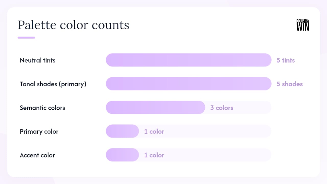
A minimal three-color system with explicit role assignments produces more coherent products than a sprawling palette with no rules. Here’s the minimum viable structure:
- Primary (action color): Your one committed hex. Used for buttons, links, and key UI elements.
- Neutral scale: Five tints from near-white to near-black. These carry most of your UI weight.
- Accent (CTA color): One color, different enough from primary to create visual hierarchy. This is your conversion workhorse.
- Semantic colors: Success (green family), warning (amber family), error (red family). These are functional, not expressive, so keep them conventional.
For your tonal scale, build five shades of your primary using OKLCH for perceptual consistency. Name them with semantic tokens (e.g., --color-primary-100 through --color-primary-900) rather than raw hex values in your codebase. That naming convention is what lets engineers swap a shade without breaking the whole system.
Print vs. screen note: your hex is sRGB. For print, you’ll need an approximate CMYK conversion and, for high-stakes materials like packaging or pitch decks, a Pantone match. Adobe Color can generate approximate Pantone equivalents from hex. Don’t skip this step if your brand will appear on physical materials.
What WCAG contrast rules mean for your startup
The WCAG minimum contrast ratio is 4.5:1 for normal text and 3:1 for large text (18pt+ or 14pt bold) and graphical objects. Many U.S. jurisdictions treat digital accessibility as a legal requirement, so this isn’t optional polish. It’s a ship-blocking issue.
Fast tools to run your checks:
- WebAIM Contrast Checker: Paste two hex values, get a pass/fail instantly.
- Stark (Figma/Sketch plugin): Checks contrast directly on your mockups without leaving your design file.
- Material Design color tools: Google’s color system tool generates accessible tonal palettes and flags contrast failures automatically.
- Adobe Color: Accessibility mode shows which color pairs pass WCAG AA and AAA.
- Coolors: Generates palettes and includes a contrast checker in the palette view.
Pro Tip: Always test your semantic colors (success green, error red) against both your primary background AND your neutral backgrounds. A green that passes on white can fail badly on your primary color, which is exactly the situation that causes confusing UI states.
How to validate your palette before full rollout
Don’t skip testing. A two-week validation sprint costs almost nothing and saves you from a rebrand six months in.
- Internal mockups (days 1–3): Apply your palette to three real screens: homepage hero, a CTA button in context, and an error state. If anything looks wrong here, fix it before anyone outside sees it.
- Prototype screens (days 4–7): Share with five to ten people outside your team. Ask one question: “What does this color make you feel about this product?” You’re listening for mismatches with your three adjectives.
- Small-sample user feedback (days 8–10): Run a five-question survey with your target users. Include a perceived-trust question and a “would you trust this with your credit card?” question if relevant.
- A/B test on landing page (days 11–14): Test your primary CTA button color against a neutral. Track click-through rate. A meaningful lift confirms your accent is doing its job.
For budget context: DIY testing with Figma prototypes and a Typeform survey is an affordable approach for early validation. A design retainer that includes structured color testing typically runs $1,500–$5,000 for an early-stage startup, depending on scope.
How to hand off color specs so nothing breaks
Enforce exact hex values consistently for 12–24 months. That consistency is what builds recognition. But it only holds if your handoff artifacts are airtight.
A one-page color spec should include:
- Primary hex, RGB, and approximate CMYK values
- Full tonal scale (five shades, named with semantic tokens)
- Neutral scale with token names
- Semantic color tokens (success, warning, error) with their hex and accessible text pairings
- Usage rules: which token goes on which surface, and what text color is approved on each
For developer handoff, CSS custom properties are the standard:
:root {
  --color-primary: #5B2EFF;
  --color-primary-light: #8A6FFF;
  --color-accent: #FF3CAC;
  --color-neutral-900: #1A1A2E;
}
Design tokens in JSON (for multi-platform teams using Style Dictionary or Theo) follow the same naming logic. Single-source truth: one style page, one component library, one QA checklist that engineers run before every release.
What a real color decision looks like in practice
A Coumba Win Design client, an early-stage edtech platform, came in with a palette of six colors, no token system, and a primary color that matched two of their three main competitors exactly. Their CTA button was the same blue as their navigation, which meant users couldn’t find the conversion point.
The process: one brand session to define three adjectives (curious, clear, encouraging), a competitor audit that revealed a gap in warm amber tones, and a new primary hex in a high-saturation amber that passed WCAG 4.5:1 with dark text. The tonal scale was built in OKLCH for screen consistency, and a Pantone match was added for their Demo Day materials.
Key takeaways from that project that you can apply directly:
- The competitor audit, not the mood board, drove the final color decision.
- The favicon test eliminated two candidates that looked great at full size but turned into orange blobs at 32x32.
- Documenting the rationale in a one-page spec prevented three separate “can we just change it to blue?” conversations with stakeholders.
How to present your color rationale and get co-founder buy-in
Founders lose color alignment battles because they present a color, not a decision framework. Here’s the fix: present the audit, not the answer.
Show your co-founders the competitor hue map. Show them the three candidates you tested and the specific checks each one passed or failed. Then present your recommendation as the output of a process, not a preference. “I chose this hex because it differentiates us from the cluster, passes WCAG, and matches our three brand adjectives” is a sentence that closes the conversation. “I just really like this color” is a sentence that opens a three-week argument.
One slide or one-pager is enough. Include: the competitor hue map, your three adjectives, the winning hex with its contrast test result, and the two candidates you eliminated and why. That’s your color rationale document, and it doubles as onboarding material for every designer, engineer, and marketing hire who joins later.
What to do after you pick your colors
Post-selection rollout has three lanes running in parallel: marketing assets, product UI, and physical materials. Sequence matters.
Start with product UI because that’s where your color gets the most reps and where accessibility failures surface fastest. Update your component library tokens first, then push to staging, then run your QA checklist. Marketing assets (social templates, email headers, ad creative) come next, using the same token values exported from your design system. Physical materials, including packaging, swag, and promotional items, come last because they require Pantone or CMYK specs and have longer production lead times.
A strong brand identity depends on every touchpoint using the same values. The biggest rollout failure mode is a marketing team working from a screenshot of the primary color instead of the actual hex. Lock the spec in a shared doc, link it in your team wiki, and make it the first thing every new contractor receives.
Pitfalls that trip up most startup founders
The color selection process has a few traps that catch even experienced founders off guard.
Choosing by personal taste is the most common one. Your favorite color is not your brand color. The brand personality mapping process exists specifically to override that instinct.
Skipping the tonal scale is the second. A single hex is not a color system. Without tints and shades, your engineers will improvise, and your UI will look inconsistent within weeks.
Ignoring print early bites startups at Demo Day. A hex that looks electric on screen can look flat and muddy on a printed banner. Order a physical proof before your first major event.
Changing colors too often destroys recognition. Consistency over 12–24 months is what makes a color feel like “yours” to your audience.
How to evolve your palette as your startup grows
Your initial palette is a hypothesis. Treat it like one. After your two-week validation sprint, commit to it for at least six months before making any changes. That’s enough time to gather real engagement data and user feedback without thrashing your brand.
When you do iterate, change one element at a time. Adjust saturation before you change hue. Add a secondary color before you replace the primary. Document every change with the reason and the data that drove it, the same way you’d document a product decision. That paper trail is what prevents “we changed the color because someone’s spouse didn’t like it” from happening at your Series A.
Palette evolution is normal. The psychology of color in marketing shifts with cultural context and audience expectations over time. What matters is that every change is intentional, tested, and documented, not reactive.
The mistake I see founders make most often
Here’s my honest take: most founders spend two weeks debating hex codes and zero hours defining what their brand actually promises. The color conversation is a proxy for a harder conversation about positioning, and no amount of palette testing fixes a brand that doesn’t know what it stands for.
The founders who get color right fast are the ones who write down their three adjectives before they open a single color tool. That filter eliminates 80% of the options immediately and makes the remaining decision almost obvious. At Coumba Win Design, when we work with resource-constrained startups, that’s always the first 20 minutes of any color session: not “what colors do you like?” but “what do you want your customer to feel, and what does your category already look like?”
Pick the strategy first. The hex follows.
Coumba Win Design turns your color decision into a full brand system
You’ve done the hard thinking. Now the work is turning that one primary hex into a complete, handoff-ready color system your engineers can implement and your marketing team can actually use without improvising.
Coumba Win Design builds exactly that for early-stage startups: a full color system with semantic tokens, accessible text pairings, CSS variables, and Pantone/CMYK specs for physical materials. We also run accessibility audits so you’re WCAG-compliant before you launch, not after a complaint. And if Demo Day is coming up, our Demo Day kits include branded swag and booth materials built from your exact color spec, so nothing looks off when it matters most.
Ready to turn your palette into a system? Request a one-page color audit or check out our style guide services to see what a complete color handoff looks like.
Sources
- How to Choose Brand Colors That Actually Work
- Startup Brand Color: How to Build a Color Identity That Scales — ColorArchive Guides
- How Founders Can Choose Website Colors Without a Designer | Colorhero Blog
- How to Pick a Brand Color: A 5-Step Process | ColorUI Learn - ColorUI
- Startup Brand Color Palette: Building a Color System Before You Have a Full Design Team — ColorArchive Guides
FAQ
What color should a startup choose first?
Choose your primary brand color first, one specific hex that passes a WCAG 4.5:1 contrast check and stands out from your closest competitors. Everything else in your palette builds from that anchor.
How many colors does a startup brand actually need?
A minimal system for most early-stage startups is one primary action color, a neutral scale, and one accent for CTAs. Separate functional (semantic) colors for success, warning, and error messages may be added as standard role colors, not as brand palette expressions.

What is the WCAG contrast ratio requirement for startup websites?
Normal text requires a minimum 4.5:1 contrast ratio; large text and graphical objects require 3:1. Many U.S. jurisdictions treat this as a legal accessibility requirement for digital products.
How long should a startup keep the same brand colors?
Enforce your primary hex consistently for 12–24 months before making changes. That window is what builds audience recognition and gives you enough data to make informed iterations.
Can Coumba Win Design help if I already have a color but no system?
Yes. Coumba Win Design can take your existing primary hex and build a complete color system around it, including semantic tokens, accessible pairings, CSS variables, and print specs, without requiring a full rebrand.
Recommended