Designer Rules: Collect 20–30, Cut to 10–20 for Branding Mood Boards

Designer Rules: Collect 20–30, Cut to 10–20 for Branding Mood Boards
A branding mood board is a concise, annotated set of 10 to 20 visual decisions that defines your brand’s look and guides every design deliverable. It’s not a Pinterest scroll you screenshot at midnight. Done right, it’s the document that keeps your logo, website, and packaging from looking like three different companies.
TL;DR:
- A strategic branding mood board should include 10 to 20 high-impact, annotated references that directly support specific brand decisions, avoiding an overabundance of images.
- It must contain precise color codes, typography samples with usage notes, imagery with context, textures, and words describing the brand personality to serve as a decision-making standard.
- Building the board involves clear direction, collecting broad references, tagging each item by purpose, cutting to essential assets, and presenting multiple options side-by-side for stakeholder approval.
- Physical mood boards are beneficial for print projects to assess textures, while digital tools are essential for remote collaboration, with file exports and notes crucial for production.
- Skipping annotation, over-collecting references, or confusing inspiration with decision standards weaken the board’s effectiveness and can lead to design drift from the intended brand direction.
Table of Contents
- What Is a Strategic Branding Mood Board (vs. an Inspiration Collection)?
- Why Mood Boards Matter Before You Touch a Logo
- Core Elements to Include on a Branding Mood Board
- How Do You Actually Build and Present a Mood Board?
- Should Your Mood Board Be Digital or Physical?
- What Do Real Branding Mood Board Examples Look Like?
- Common Mistakes That Undermine a Mood Board
- Turning the Mood Board Into Real Brand Assets
- How Coumba Win Design Uses Mood Boards in Startup Projects
- Get a Mood Board That Actually Drives Your Brand Build
- Sources
- FAQ
What Is a Strategic Branding Mood Board (vs. an Inspiration Collection)?
Here’s the thing nobody tells you upfront: “mood board” gets used for two completely different tools, and mixing them up wastes weeks.
An inspiration board is loose. It’s the folder of pretty things you saved because you liked them, no rules attached. A strategic branding mood board is tighter and meaner. Every image, swatch, and font sample earns its place because it answers a specific design question, and it’s annotated so anyone on the team knows why it’s there.
- Inspiration board: broad, unfiltered, used to explore a feeling early on
- Strategic mood board: curated, annotated, used to make and defend decisions
- Timing: build the inspiration pile during discovery, then compress it into the strategic board before any design work starts
If you skip straight to logo sketches without this step, you’re basically designing with a blindfold on.
Why Mood Boards Matter Before You Touch a Logo
Alignment before design isn’t a nice ritual, it’s damage control. When a founder and a designer agree on “warm, confident, approachable” using an actual mood board instead of adjectives tossed around in a Slack thread, the first design draft lands closer to what everyone had in their head. That’s fewer rounds of “can we make it pop more.”
Mood boards also give you a paper trail. When a stakeholder pushes back on a color choice in review, you point to the swatch and the one line explaining why it’s there, instead of relitigating taste in real time.
Pro Tip: Save every mood board version with a date. When someone asks “why did we go with navy instead of teal,” you want receipts, not vague memories.
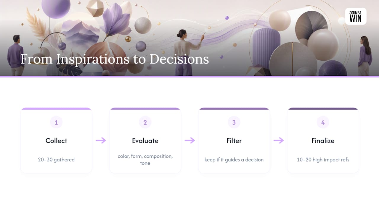
Practitioners advise limiting a mood board to 10 to 20 high-impact references, each one earning its place by contributing a specific decision about color, form, composition, or tone. That number isn’t arbitrary. It’s the point where a board still functions as a decision-making tool instead of turning into a second inspiration dump.
Core Elements to Include on a Branding Mood Board
A board that actually holds up under scrutiny needs more than pretty pictures. It needs receipts. A brand mood board should include color swatches with codes, typography samples, photography style references, textures and patterns, and short explanatory notes tying each asset back to the brand direction. Here’s what belongs on it:
- Color swatches: 2 to 3 primary colors and 2 to 4 secondary colors, each with HEX and CMYK codes plus a one-line context note (where it’s used, what it signals)
- Typography: a display font sample and a body font sample, with a note on when each gets used (headlines vs. paragraphs vs. buttons)
- Imagery: sample photos showing subject matter, lighting style, cropping preference, and any color treatment or filter
- Textures and patterns: for anything going to print, include physical finish notes, not just digital swatches
- Keywords and voice lines: three to five words that describe the brand’s personality, plus a one-line annotation on every single asset explaining its job
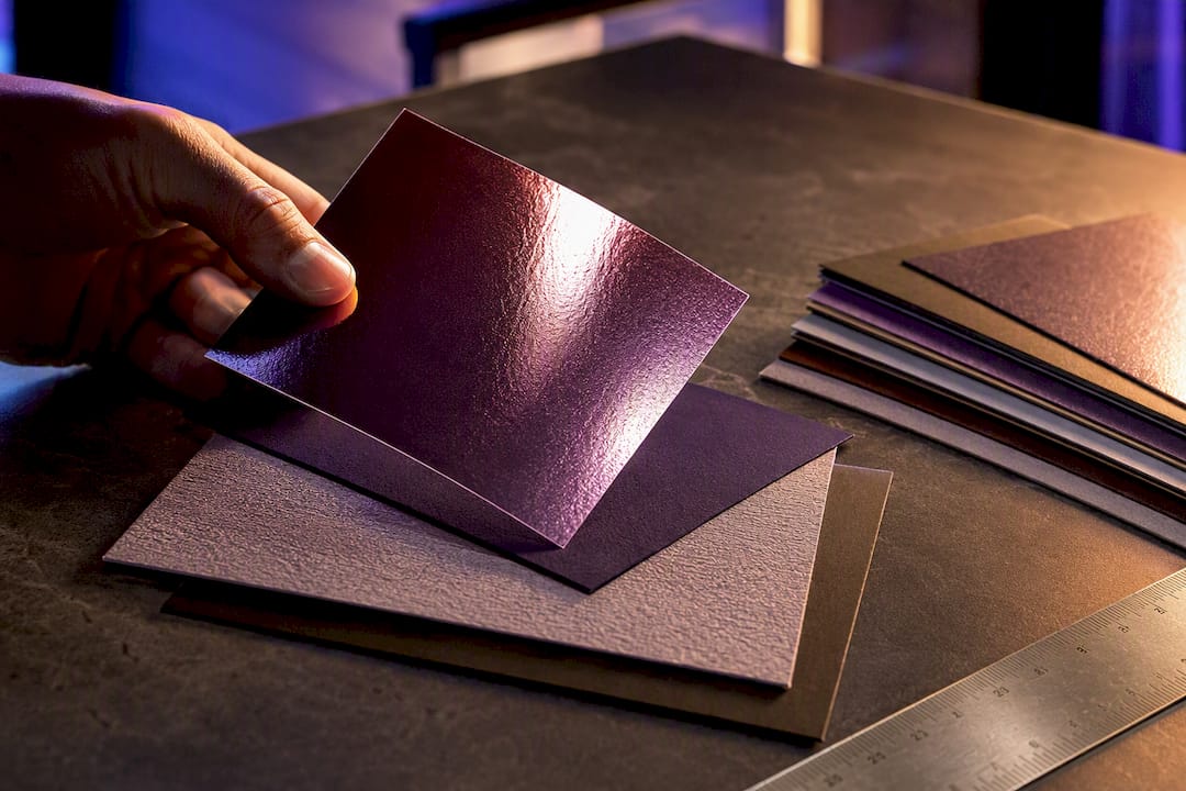
For print-ready work, always pair digital specs with physical material references. That means paper stock and finish samples alongside your CMYK and spot color values, and for digital-only brands, a HEX code plus an accessible contrast check.
Pro Tip: If you can’t write a one-sentence reason for why an image is on the board, cut it. “I just liked it” is not a design rationale.
How Do You Actually Build and Present a Mood Board?
The process breaks into five stages, and skipping any one of them is how boards turn into scrapbooks nobody trusts.
- Write a one-sentence direction. Name the audience, the feeling you want them to have, and the outcome (“Gen Z sneaker buyers should feel this brand is loud but never try-hard.”) Everything after this step gets measured against that sentence.
- Collect 20 to 30 references. Pull from anywhere: competitor sites, unrelated industries, texture photography, old print ads. Cast wide here, you’ll cut hard later.
- Tag every item by the layer it serves. Palette, typography, imagery, texture, or reference standard. If you can’t assign a reference to a layer, it has no job on the board.
- Cut to 10 to 20 load-bearing assets. Remove duplicates and anything that contradicts your direction sentence. This is the step most people flinch at, because it means killing images they personally love.
- Arrange by layer and present 2 to 3 directions side-by-side. Cluster palette, type, imagery, and texture together, and annotate each cluster. When you show options to stakeholders, put them on the same canvas so the client picks a whole direction, not a Frankenstein mix of pieces from each one.
| Stage | What you’re doing | Target output |
|---|---|---|
| Direction | Write the one-sentence brief | 1 sentence |
| Collect | Gather raw references | 20 to 30 items |
| Tag | Assign each item a layer | Every item labeled |
| Cut | Remove weak or conflicting items | 10 to 20 items |
| Present | Show directions side-by-side | 2 to 3 full boards |
Capture alignment in writing. A quick “approved direction B, moving to logo concepts” email from the client saves you from a revision fight three weeks later.
Should Your Mood Board Be Digital or Physical?
Texture-heavy projects, especially packaging or print-first brands, benefit from a physical board where you can actually touch paper stock and see how a foil finish catches light under different lamps. Screens flatten texture in ways that mislead decisions.
Remote teams need digital, full stop. If your design lead is in Austin and your founder is in Lisbon, nobody’s mailing swatches back and forth.
Tool choice depends on the job you need done:
- Quick gathering: Pinterest is fast for early-stage discovery when you’re just casting a wide net
- Collaborative freeform canvases: Milanote and PureRef work well when multiple people need to drag, tag, and rearrange references together
- Client-ready presentation: Canva, Adobe Illustrator, and Figma turn a messy collection into something polished enough to screen-share
- Strategy-carrying boards: Storyflow is built for when the board needs to hold rationale, not just images, so collaborators can read the “why” without a meeting
When you hand off to a design or production team, export as a PDF with embedded notes, list high-resolution swatch files separately, and link source files rather than burying them in a shared drive folder nobody opens.
What Do Real Branding Mood Board Examples Look Like?
Two contrasting boards make the method click faster than any explanation.
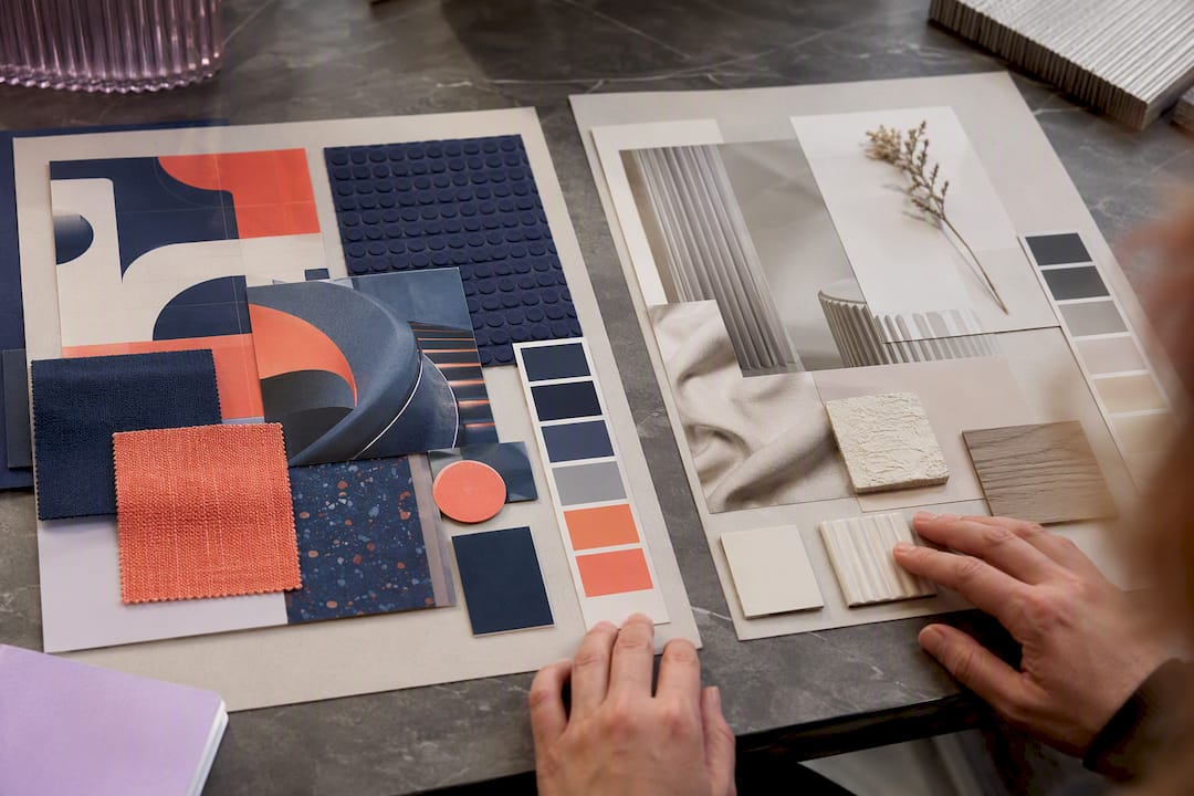
Board one, direction: “Confident but approachable fintech for freelancers.” Assets: a muted navy and warm coral palette, a rounded sans-serif display font paired with a humanist body font, photography of real hands at laptops (not stock-photo suits), a subtle grid texture, and the annotation “navy signals trust, coral keeps it from feeling corporate.”
Board two, direction: “Maximalist streetwear brand for skaters under 25.” Assets: clashing neon palette, a hand-drawn display font, raw grainy photography, scratched concrete textures, and the note “the clash is the point, this brand doesn’t apologize for being loud.”
Same method, opposite outcomes. That’s the value of tagging and annotating rather than just collecting.
The moment a mood board stops being a mood and starts being a set of decisions is the moment it earns its place in a real brand project.
A design engagement for an educational platform client followed this same arc: discovery conversations produced a direction sentence around “credible but never intimidating.” References got tagged and cut down to a working set, and the surviving palette and typography rules carried straight into the logo and course dashboard design without a single “wait, why does this look different from what we discussed” moment in review.
Common Mistakes That Undermine a Mood Board
Most failed boards die from the same few habits, and every one of them is fixable before you send anything to a client.
- Over-collecting without cutting. Fifty references with no editing isn’t a mood board, it’s a mood dump. Tag every item by layer, then cut ruthlessly to your 10 to 20.
- Skipping annotations. An unlabeled image is a guess dressed up as a decision. Label each asset with a short rationale, something like “warm low-contrast light, suggests approachability.”
- Letting inspiration live in five different places. A shared board prevents drift between what got discussed in a meeting and what shows up in the first draft.
- Confusing reference with copy. A mood board sets a standard to aim for. It’s not a template to trace. Say that out loud to clients before showing them anything.
Pro Tip: If a stakeholder points at a reference image and says “just make it exactly like that,” pause the meeting. That’s a sign the board is being read as a template instead of a direction.
Turning the Mood Board Into Real Brand Assets
A mood board that never leaves the deck is a wasted afternoon. The real test is whether it survives contact with production.
- Document color behavior everywhere it’ll appear. Note how the palette holds up in dark mode, in print versus on-screen, and run an accessibility contrast check before locking anything in.
- Convert imagery notes into a photography brief. Subject matter, lighting style, and cropping rules from the board become literal shot-list instructions for whoever’s behind the camera.
- Define a typographic scale. Write usage rules for H1 through H6 and body text so a developer isn’t guessing font sizes six months from now.
- Build a packaging handoff checklist. Paper stock, coatings, dielines, and physical color swatches all need to travel with the file, not live only in your head.
If your board covers a website launch, the palette and type rules should map directly onto how you align website design with brand values that actually convert visitors.
How Coumba Win Design Uses Mood Boards in Startup Projects
Mood boards sit right after discovery in our process: we talk to founders, land on a direction sentence, then build the annotated board before any logo work starts. Clients usually bring us existing brand assets, competitor examples they admire or want to avoid, and a rough sense of tone. We annotate every surviving reference so nothing on the board is a mystery by the time it reaches execution, which is part of what our brand identity checklist walks founders through before kickoff.
— Coumba Evelyn
Get a Mood Board That Actually Drives Your Brand Build
Mood boards can be treated as the contract, not decoration. That’s the real gap with a lot of freelance design work: a pretty board gets approved, then the logo and website drift from it anyway because nobody wrote down the rules. Every asset should be annotated so the palette, type, and imagery direction survives all the way to finished logo, site, and pitch deck.

A typical design process covers custom branding, website design, UI/UX, and pitch deck work, built from the same annotated direction so nothing ships looking like it came from three different designers. Color psychology backs this up too: choices that feel arbitrary in a deck can shift how customers perceive your brand the moment they hit a live product. If you’re a founder staring down a rebrand or a first launch, start with a brief on Coumbawin and we’ll walk you through what a working mood board looks like for your specific project.
Sources
- What should I include in my mood board and why? | UX Design
- How to Make a Mood Board (2026 Step-by-Step Guide) | Storyflow
- Brand mood board examples | VistaPrint
- How to Make a Mood Board | StudioBinder
FAQ
What Is a Branding Mood Board?
It’s a curated, annotated set of 10 to 20 visual references, colors, fonts, imagery, and textures, that defines a brand’s visual direction and gives every design decision a documented reason.
What Should Never Appear on a Mood Board?
Skip unlabeled images with no rationale, duplicate references that say the same thing twice, and anything that contradicts your one-sentence direction. An asset with no annotation is a guess, not a decision.
How Much Do Designers Charge for a Mood Board?
Pricing varies widely by scope and market, from a standalone deliverable within a small project fee to a bundled step inside a full branding engagement. Coumba Win Design typically builds the mood board as part of a broader brand strategy and identity project rather than pricing it as a standalone item.
Can You Give Examples of Brand Mood Boards?
Yes. A fintech board might pair navy and coral tones with humanist typography and real photography, while a streetwear board might clash neon colors with hand-drawn type and raw texture, each annotated to explain how the choices support a specific brand direction.


