Award-Winning Startup Websites: 8 Examples That Convert

Award-Winning Startup Websites: 8 Examples That Convert
Award-winning startup websites are defined by one core trait: they deliver quantifiable proof before asking for anything. The best examples of award winning startup websites don’t lead with beautiful visuals or brand manifestos. They lead with numbers, ratings, and verified client counts that make a skeptical visitor think, “Okay, these people are legit.” If you’re a founder trying to figure out why your site isn’t converting, the answer is almost always the same. You’re telling a story when you should be showing receipts.
What makes examples of award winning startup websites actually work
The design principle behind every top-performing startup site is the same: stack specific proof rather than lean on vague brand storytelling. Trustpilot ratings of 4.5 or higher, Google Play scores, App Store scores, and client counts above 600,000 all appear in the hero sections of the best startup sites. That’s not a coincidence. It’s a conversion strategy.
Here’s what the top sites do consistently:
-
Clear value proposition above the fold. Visitors spend fewer than 5 seconds on a hero section. Your headline has to answer “what is this and why should I care?” before they scroll.
-
Stacked social proof. One Trustpilot badge is fine. Pennylane’s approach of showing Trustpilot 4.5, Google Play 4.8, and App Store 4.8 in a single compact block is better. Multiple verified sources hit harder than one.
-
Minimalist page structure. Launch-ready sites need no more than 3–5 core pages and must load in under 3 seconds. More pages don’t mean more trust. They mean more confusion.
-
Feature-benefit messaging. Don’t list what your product does. Tell the visitor what they get. “Save 4 hours a week on invoicing” beats “automated invoicing software” every time.
-
Dual CTAs with trust microcopy. A primary CTA (“Start free trial”) paired with a secondary CTA (“See how it works”) reduces the pressure of commitment. Add a line like “No credit card required” and watch your anxiety-to-click ratio drop.
-
Mobile-first responsive design. Mobile-optimized sites with load times under 3 seconds retain users at a measurably higher rate. If your site looks weird on a phone, you’re losing half your audience before they read a word.
Pro Tip: Prioritize measurable proof over storytelling in your first screen. Founders love their origin story. Visitors don’t care yet. Give them a reason to stay, then tell the story.
8 startup websites that set the standard

These sites don’t just look good. They convert. Each one uses a specific combination of proof, structure, and messaging that you can study and apply directly.
1. Qonto
Qonto is a business banking platform, and its homepage is a masterclass in trust layering. The hero section leads with 600,000+ clients and a 3D-Secure certification badge. That’s two proof types in the first three seconds. The value proposition is specific (“the business account that saves you time”), and the CTA is direct. No fluff, no vague promises.
2. Pennylane
Pennylane stacks three verified ratings in one block: Trustpilot 4.5, Google Play 4.8, App Store 4.8. This is the gold standard for multi-platform social proof. The visual weight of three badges together signals credibility in a way that a single rating never could. Founders building accounting or fintech tools should screenshot this layout and keep it close.
3. Shopify
Shopify’s homepage has evolved over the years, but the core structure stays the same: a specific benefit headline, a single email CTA, and a trust line about millions of businesses. The simplicity is the point. Shopify doesn’t need to explain what it does in 500 words. It names the outcome and gets out of the way.
4. Alan
Alan is a French health insurance startup, and its site is a great example of balancing storytelling with proof. The homepage leads with a clear benefit (“health insurance that actually works for you”), then immediately backs it up with member counts and satisfaction scores. The design is clean and the color palette is calm, which matters for a health product where trust is everything.
5. Legalstart
Legalstart targets small business owners who are intimidated by legal paperwork. The site uses plain language, a specific price point in the hero, and a client count to reduce the fear of commitment. The lesson here is that concrete metrics build trust faster than any amount of reassuring copy. Showing “200,000+ businesses served” does more work than “trusted by thousands.”
“Effective startup website design balances visionary storytelling with rapid delivery of specific product benefits. The sites that win are the ones that name the numbers first and tell the story second.”
6. A membership startup with a navbar CTA
One standout example from conversion research shows a membership startup that placed a “Register Free” event CTA directly inside the navbar, before the hero section even loaded. That’s a bold move. It captures intent from visitors who already know what they want, without making them scroll. If you have a free entry point (a free trial, a free event, a free tool), put it in the nav.
7. Single-page award winners
Single-page sites like RiACT prove that you don’t need a complex architecture to win recognition. A one-page site works when it combines fast load times, layered proof, and a clear CTA sequence. The key is that every scroll reveals a new reason to trust you, not just more design. Think of it as a vertical pitch deck.
8. Early-stage startups with a homepage and access form
The most honest example in this list is also the most practical. Many successful startups launched with nothing more than a homepage and a “request access” form. No blog, no case studies, no 12-page sitemap. The focus was on being live, clear, and functional. Awards come later. Conversions come first.
How to structure your startup site for maximum conversion
The architecture of a winning startup website is not complicated. It’s just specific.
-
Home: Your value proposition, primary CTA, and stacked proof. This page does the heavy lifting.
-
Product/Features: Specific benefits, not feature lists. Show the outcome, not the mechanism.
-
Pricing: Transparent pricing reduces friction. Hiding your prices is a conversion killer.
-
About/Team: Founders and team photos build personal trust. Put real faces on the page.
-
Contact: Make it easy. A simple form beats a buried email address every time.
Navigation matters more than most founders realize. A CTA in the navbar captures high-intent visitors before they even reach the hero. Pair that with a clear primary CTA in the hero and a secondary CTA mid-page, and you’ve built a conversion funnel without a single pop-up.
Speed is non-negotiable. Pages that load in under 3 seconds retain users at a significantly higher rate. Use compressed images, minimal scripts, and a reliable host. A beautiful site that loads in 6 seconds is a beautiful site that nobody sees.
Pro Tip: Launch with three pages maximum: Home, Pricing, and Contact. Add Product and About once you have real user feedback. Speed to launch beats completeness every time.
Common mistakes that kill startup website conversions
Most startup websites fail for the same five reasons. Knowing them is half the battle.
-
Leading with brand story. Pages that open with brand narrative and delay proof consistently land in the bottom conversion tiers. Your story is compelling to you. Your visitor needs a reason to care first.
-
Slow load times. A site that takes more than 3 seconds to load loses a significant portion of its audience before a single word is read. Performance is a design decision.
-
Too many pages at launch. Eight pages with thin content is worse than three pages with strong content. Depth beats breadth for early-stage sites.
-
Weak or missing social proof. A site with no ratings, no client counts, and no certifications asks visitors to trust a stranger. Combining Trustpilot scores, app ratings, and client counts is the fastest way to fix this.
-
Ignoring mobile. If your homepage looks great on a desktop and broken on a phone, you’ve designed for the minority. Mobile-first is not a trend. It’s the baseline.
Founders also underestimate the power of authentic branding as a trust signal. Consistency in color, type, and tone across every page tells visitors that you’re a real operation, not a weekend project.
Key Takeaways
Award-winning startup websites win because they lead with specific proof, load fast, and make the next step obvious.
| Point | Details |
|---|---|
| Stack multiple proof types | Combine Trustpilot ratings, app store scores, and client counts in one visible block. |
| Lead with numbers, not story | Place quantifiable proof above the fold before any brand narrative appears. |
| Keep structure minimal at launch | Launch with 3–5 core pages; add more only after real user feedback confirms the need. |
| Put a CTA in the navbar | Capture high-intent visitors before they reach the hero by placing a CTA in the navigation. |
| Speed is a design decision | Pages loading under 3 seconds retain users; treat performance as part of the design brief. |
What I’ve actually learned from studying these sites
I’ll be honest with you. When I first started analyzing top startup websites, I thought the secret was in the visuals. The gradients, the 3D illustrations, the clever micro-animations. Nope. The sites that convert best are often the least visually dramatic. What they have is specificity. They name the numbers. They show the ratings. They make the next click feel safe.
The trend I’m most excited about right now is the move toward what I call “proof-first architecture.” Instead of building a beautiful homepage and then figuring out where to put the social proof, the best founders are starting with the proof and building the design around it. That’s a mindset shift, and it changes everything about how a site feels to a visitor.
I also think the single-page format is having a serious comeback, especially for pre-launch and early-stage startups. A tight one-pager with fast load times, layered proof, and a clear CTA sequence can outperform a bloated multi-page site every single time. Less is genuinely more when you’re still finding your audience.
The future of startup web design is going to involve more AI-assisted personalization and dynamic proof blocks that update in real time. But the fundamentals won’t change. Clear value, fast load, specific proof. That’s the formula. It was true five years ago and it’ll be true five years from now.
How Coumba Win Design helps founders build sites that win
Coumba Win Design works with founders who treat design as a competitive advantage, not an afterthought. If you’ve read this far, you’re probably one of them.
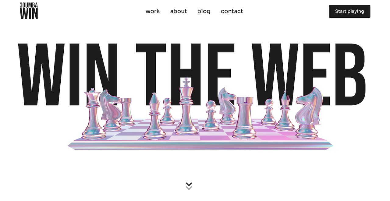
The Coumba Win Design style guide gives you a complete UI system built for consistency and speed, so your site looks like a real brand from day one. The Demo Day Kit gets you a pitch-ready website in 14 days, with components designed specifically for conversion. And if you want to see what this looks like in practice, the case studies show exactly how Coumba Win Design has helped startups sharpen their brand narrative and build sites that actually perform. No generic templates. No guesswork. Just design that works.
FAQ
What are the key features of award-winning startup websites?
Award-winning startup websites lead with a clear value proposition, stack multiple types of social proof (ratings, client counts, certifications), and load in under 3 seconds. Navigation includes at least one CTA before the hero section loads.
How many pages does a startup website need at launch?
A launch-ready startup website needs no more than 3–5 core pages: Home, Product/Features, Pricing, About/Team, and Contact. Starting with fewer pages and strong content outperforms a large site with thin content.
Why does social proof matter so much on startup websites?
Visitors arrive skeptical. Specific proof like Trustpilot scores, app store ratings, and verified client counts reduces that skepticism faster than any amount of brand copy. Stacking multiple proof sources in one block amplifies the effect.
What is the biggest mistake founders make on their startup website?
Leading with brand storytelling instead of quantifiable proof is the most common conversion killer. Pages that delay proof consistently underperform compared to sites that name specific numbers above the fold.
How do I design a startup website that converts from day one?
Start with a homepage that answers three questions immediately: what you do, who it’s for, and why you’re credible. Add a CTA in the navbar, compress all images for speed, and include at least two types of verified social proof before the first scroll.
Recommended